Visit my Patreon Page for more painting instruction and Paint Along Videos!

Tuesday, March 31, 2015

The Importance of Play in Painting

'Spring Play'               8x10               pastel             ©Karen Margulis
sold

 I didn't want to go out today. I was behind in several projects. I just wanted to stay home and work. But I had put off errands long enough. It was a beautiful spring day but I quickly went about my errands and headed back home....to work.

As I drove home I passed a playground full of children. Surrounded by the beautiful blooming trees of spring these children played without a care in the world.  I had a deep thought. Children play. It is their work. The learn and grow through play. We give them toys. We encourage them to play. When does it stop? When do we become too old to have toys and play?  I felt sad that adults don't get to play as much as children.

Then it hit me....We can play as much as we want if we make it a part of our lives. I am lucky to be an artist. I get to play every day. I have a lot of toys too (pastels, boxes and all kinds of art stuff) But too often we make art seem like work. We try too hard. We put pressure on ourselves to succeed. Sometimes it stops being fun.

'A Breath of Fresh Air'         5x7    plein air pastel        $45

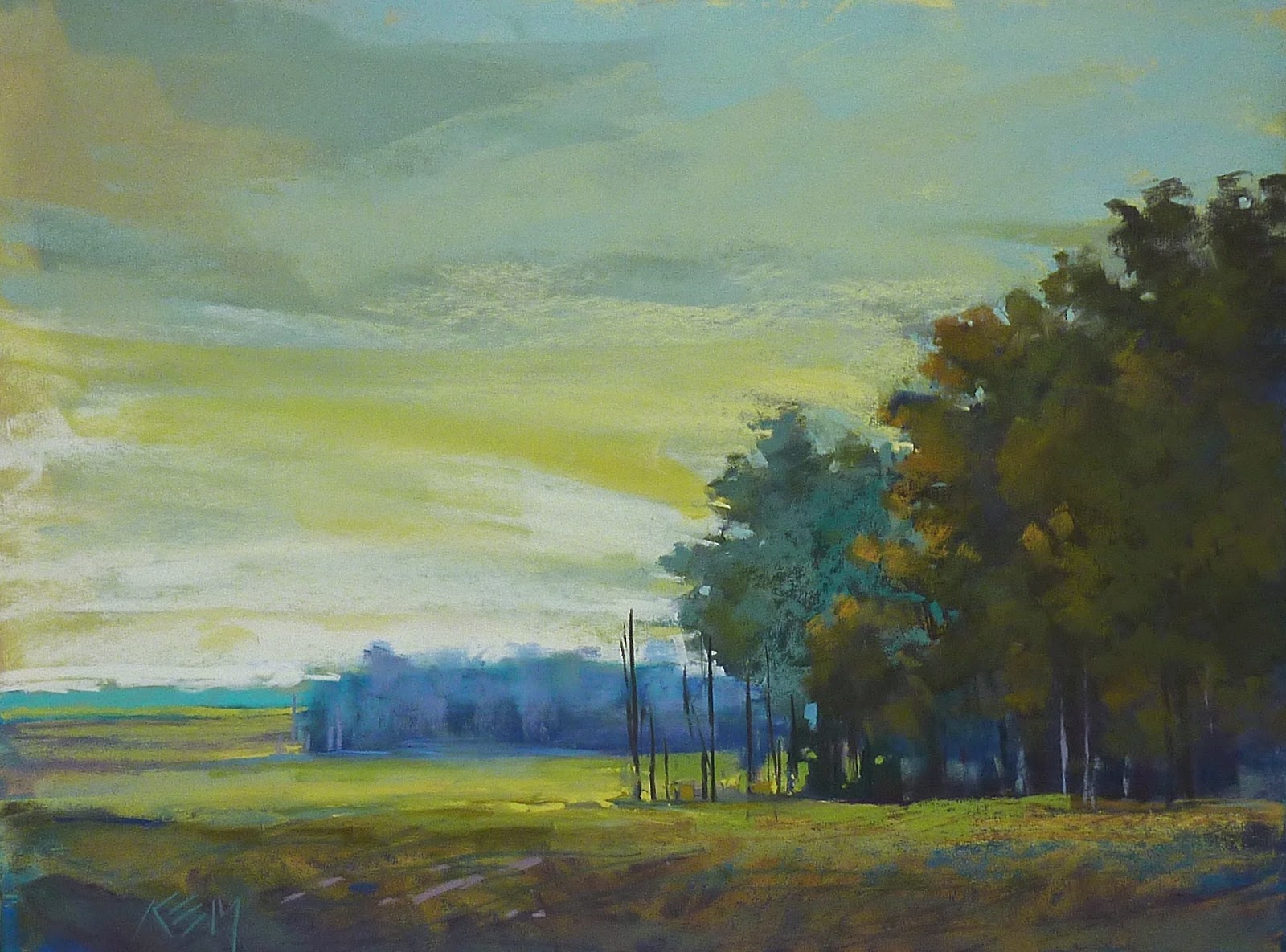
I decided that I would take time today to play. The projects could wait for a few hours. I took out a plein air study of a dogwood tree that I had painted last spring. I used it as a reference and painted it larger. I used a homemade support that I had toned teal blue.

I had fun just playing with the colors and textures in the painting. It was fun to be a kid again and just play. Play leads to growth. It sure is more fun than work!

My toned surface with the plein air study on the easel
 Have you just painted for the pure joy of it lately?  What are some of the fun discoveries you made?

Monday, March 30, 2015

Choosing the Right Pastel for Distant Mountains

'Blue Ridge Memories'               8x10           pastel             ©Karen Margulis
purchase this painting here $145
I am enjoying this blue pastel.  I don't remember what set it came from. I found it in my overflow box of blue pastels. I was looking for a distant blue mountain color. I do know it is a Terry Ludwig pastel.  I might try to find out the exact color number. But most likely I won't. I will just enjoy it until is is gone and then find another great distant blue. It keeps me on my toes. It keeps my palette from being too much the same for every painting.

I had a question this week about how I choose my distant mountain colors.
 It is simple. I know that most of the time, as objects recede they get lighter, cooler, more blue, duller, less contrast. For MOST distant mountains I look for blues that are grayed down, lighter, and cooler. There are always exceptions...sometimes they are brighter or darker or maybe even warmer depending on light and conditions. A variety of blues are needed!  I'd like to share a previous blog post I wrote about this topic. (read it below)

'Heavenly Path'           5x7         pastel           $50
I have been on a hunt.  Trying to find the perfect blue pastel. I have been looking for what I call 'Distant Mountain Blue'.  That beautiful blue of distant mountain ranges.  I have lots of blue pastels. Lots. But I always think there has to be the perfect 'distant blue' So I keep looking. And trying blues.


Really it isn't something I do for any other color. In fact I never keep track of color names and numbers.  I don't even make color charts with new pastels.  When I get new pastels the first thing I do is take the labels off, break them and put them in my box.  At that point on they become anonymous.

And that is fine with me. Sometimes students will be reluctant to take their new pastels out of their boxes and take off the labels. The big question... How will I replace a color when it is used up?  I don't worry about replacing the exact stick of pastel.  I just try to find one that closely matches the color, value and temperature of the stick I need to replace. And that works for me.

Except when it came to the illusive blue pastel. I wanted the perfect color and if I ever found it I planned to keep the wrapper!  But guess what?  After spending a month in the Southwest looking at those wonderful distant blue mountains and trying to paint them. I realized that one stick of blue can't possibly work for all the variations of blue I saw. It really is necessary to have a few different blues to truly capture the many variations. 

So my big blue collection with no names or numbers is really all I need!

Sunday, March 29, 2015

Video Demo Painting and Uart Pastel Paper Review

'River Reflections'                6x8                pastel               ©Karen Margulis
painting available on Etsy $75


Paper choice does matter! Choosing the right paper for our paintings can be a challenge. We have so many choices. Do we want sanded? Unsanded? What brand? What color?  I love paper so I have tried them all. I'll get the conversation going with a demo and review of my current favorite pastel paper on this week's video blog. Can you guess what my favorite paper is?


 If you can't see the video Click here for the link 

Below are some additional photos and resources. If you have any questions about Uart that I didn't cover in the video ask them in the comments below!

Visit Uart's website for more information including a FAQ page.


I did an alcohol wash underpainting on Uart 600 grade

I did a paper test on each grade of Uart paper. Click on each photo to see the details


800 is the smoothest grade. It is good for detail work

240 is the roughest grade. You can see the texture in my strokes
If you liked the video please share! I'd love for you to subscribe to my YouTube channel. You can keep up with the latest videos as well as watch them when you have the time! Visit my YouTube page and click on the subscribe button. Thanks for your support!

Saturday, March 28, 2015

Painting Large and Quick....My Top Tips

'Blue Marsh'               18x24            pastel             ©Karen Margulis
painting is available click here $350
 I love doing my daily quick studies. But they are usually small....5x7 or 8x10. Every once in awhile I make time do do a much larger quick painting. It is a great exercise for getting away from fussy detail. Painting large and fast has helped me become more expressive in any size painting I tackle.
Here are some tips that have been helpful to me.

  • Set a timer. The goal is to paint and respond quickly. 30-45 minutes is ideal. I prefer 18x24. It is not too large to handle easily but large enough to get your whole body involved in the painting.
  • Make a Plan! The key to painting a large painting quickly is to know what you plan to do. take time before picking up a pastel to plan the composition, value structure and colors. Know what your gal or concept is.
  • Do an underpainting of some kind. If you have your big shapes blocked in and a layer of color on the surface the painting will go faster. I usually do a 4 value block in and rub in the first layer for a dry wash.
  • Play music that makes you move! It really does help!
  • Paint with your arm not just your hand. Move your body and arm. You will make bolder and larger marks. You can't get too fussy when you are dancing with your pastels!
  • Have fun. It's not about creating a masterpiece....it is about creating a study and exploring a new way of making marks!

At the evaluation stage....can you spot the changes I made?

possible block in colors....I chose the blues!
Painting notes: Uart 500 paper with Terry Ludwig pastels.

Friday, March 27, 2015

How to Introduce Mystery into Your Paintings

'Buzzing in the Garden'              9x12                pastel                ©Karen Margulis
sold
Things started dripping. I could see stems and petals emerge from the paint.  As the paint dried a wet brush created even more interesting lines and spots. It was mysterious and exciting. I could imagine a wonderous tangle of flowers and grass and maybe a few bumblebees. The watercolor underpainting was doing its job. It was setting the stage for my impression of some flowers in a garden.

The watercolor underpainting on Uart 500
"A painting requires a little mystery, some vagueness, some fantasy. When you always make your meaning perfectly plain you end up boring people." Edgar Degas


 I agree wholeheartedly with Degas. I didn't want to paint perfect flowers and bees. I didn't want to copy my reference photo. I wanted to leave something for the imagination. The watercolor underpainting got me started in the right direction. The tangle of drips suggested the flowers and stems. The looseness of the watercolor encouraged me to keep my pastel marks expressive.

I tried to say as much as possible with few strokes. Keeping the mystery. Keeping things vague. My little bumblebees emerged from just 4 or 5 strokes of pastel. Up close they are a collection of marks. The colors and shapes suggest a bee and so they become bees.


Watercolor underpaintings are the perfect way to start a pastel painting with a little mystery! They drip and bloom and can't be totally controlled and predictable. The mystery begins as soon as the paint is applied!

Thursday, March 26, 2015

How to Finish a Painting with Purpose


'We Stop for Poppies'                18x24                pastel              ©Karen Margulis
sold
Knowing when a painting is done can be a challenge.  Overworking can sneak up on us. Especially when we are enjoying the painting process and not really paying attention to what we are doing. A good rule of thumb is to stop before you think you are finished. But then what?

I stop when I find myself mindlessly making marks. It is time to step back and evaluate the painting. I used to make mental notes about what I thought I needed to do to finish the painting. But if I was interrupted I would forget the list of finishing touches. Or sometimes I would get so involved with finishing an area I would loose sight of the other items I wanted to address.

I don't rely on mental notes.....I make real notes on my mini dry erase board.

Below is today's painting when I stopped to evaluate it. I decided on some areas of concern and I wrote down my solutions on the dry erase board.

stopped for evaluation part 1

My WHAT board helps me decide what I need to do to finish the painting

stopped for evaluation 2

I tackled these items one at a time. I changed the shape of the distant trees. I darkened the foreground grasses. I added some seed pods and another purple vertical flower to make a more pleasing arrangement of flowers. I changed the mountain color to a blue purple instead of green to push it back further.

I was pleased with the flowers but still didn't like the trees. The right side was too solid. I used sky color to break up the tree shape and added one more red spot of color. Now I was finished!

Painting notes: 18x24 on Ersta sanded paper with an alcohol wash underpainting

Wednesday, March 25, 2015

Want to Loosen Up? Here is Something to Try


'All Is Quiet in the Meadow'               11x14              pastel                 ©Karen Margulis
painting is available $165 sold
I want my marks to dance. I don't want them to be tight. I don't want them to be perfect. I want them to be expressive. I need to put the right color and value in the right place but I want each mark to look fresh. Planning is important. Knowing what you want to say and how you will say it helps. A plan gives you the freedom to explore your mark-making. So make a plan.

Then what? I have an idea for you to try. Paint on a larger piece of paper. Bigger paper means the chance for bigger marks. Bigger paper gives you freedom to move. Bigger paper lets you put your whole arm and body into your marks. It allows you to dance with your painting!

When I paint on a bigger surface I find my marks begin to unfold and loosen up. A flower on a small piece of paper may be a controlled dot. On a larger paper it becomes a bold mark.  


'The Beach Roses are Calling'          8x10         pastel       $145
In my pastel class today we explored mark making with pastels. My demo painting is at the top. It is 11x14. It is roughly based on the 8x10 painting above. I found I had more freedom with my marks in the larger painting. I had more room to be expressive. Now I want to try this scene even larger!

TRY IT:  Paint something you have done before but this time make it at least twice as large. If you paint large already....got even larger. When I want to play with large paintings but want to conserve my sanded paper I will use Canson.
If you already paint large try to paint smaller but be conscious of your marks. How large can you make your marks on a smaller piece of paper. Let your marks dance!


My students got a treat today! Thank you Terry Ludwig for the very special heart pastels for my class!

THANK YOU!!! I want to thank everyone who watched my first video blog yesterday. I appreciate the support. Your comments were wonderful and I am encouraged to make the next episode. I am going to try for one vlog each week to start. I will share the next one here.
If you haven't seen the video here is the link.https://youtu.be/m8VRQm-jzNE Please subscribe to my YouTube channel so you won't miss an new video!

Tuesday, March 24, 2015

New Video Blog Demo of a Quick Daily Painting

'Happy Meadow'            5x7             pastel             ©Karen Margulis
sold
 If a picture is worth a 1000 words what is a video worth? If blogs are great for sharing words and pictures imagine the possibilities for sharing through video! I am excited to share my entry into the world of video and YouTube with my first video blog episode. Here is the back story.

My daughter is an avid fan of certain channels on YouTube. She follows these 'vloggers' every day just as we read our favorite blogs everyday. She encouraged me to start my own YouTube channel and share my art life through video. At first I resisted. I have enough to do. I don't have the right equipment. I have no idea how to take and edit a video. Would anyone really want to watch?

I tested the waters a bit last year with a few simple videos on YouTube. The quality wasn't very good and the learning curve seemed steep so I let it slide. But then I needed a new camera for my upcoming art adventures. I thought it would be a good idea to get a camera that would be good for travel but would also take decent (and would be easy) to take videos....just in case.

my new camera
I got my new camera. I mulled over taking a video. And then it occurred to me. I can learn how to make and edit a video. It's just like painting. We need to learn the basics and then practice.....a lot. Things may be rough in the beginning but with practice they will improve. I have to take the plunge and just do it!

Video will be the perfect complement to this blog. We are artists....visual people. I can show so much more with video!

So I am pleased to share my first episode of my new video blog 'An Artist's Life'. I plan to add a weekly installment and I will share it here. I encourage you to subscribe to my YouTube channel so you won't miss an episode!

(if you are reading this post by email the link to YouTube may not work. Go directly to the blog at www.karenmargulis.com for the link or copy and paste this address in your search bar https://youtu.be/m8VRQm-jzNE)


I used my Great American Artworks Richard McKinley set for this painting 
Now that you have watched the video here are a few more tips for small daily painting:

  • keep them small 6x8 and 5x7 are ideal
  • keep them quick. Set a timer for 15-10 minutes
  • keep supplies set up even if it is just a small set that is easy to access
  • simplify! start with a few big simple shapes
  • create a roadmap of values....decide what is mostly dark, light and mid value.
  • choose the area of interest and put the most clarity in this area
  • leave some mystery....don't put in every detail. the time limit helps.
  • when the timer goes off STOP. Paint another one but don't fiddle with the painting 
  • evaluate the painting and decide on 3 marks to finish. place those mark and call it done!

Monday, March 23, 2015

Painting a Dogwood Tree in Three Easy Steps

'The Queen of Spring'            8x10            pastel              ©Karen Margulis
sold

My dogwood trees won't bloom. They are about five years old and every spring I hope they will but so far nothing but nice green leaves.  I will have to be satisfied with painting dogwoods in bloom. Flowering trees can be a challenge to paint. They are like giant bouquets of flowers.....plenty of details to get caught up in. It is so easy to get carried away and end up with a tree covered in dots and blobs of color.

I have simplified my dogwood trees into three easy steps.

1.  Paint the trunks. Dogwoods have trunks with character. The are lyrical and irregular. I use a dark blue or purple pastel and draw some lyrical painterly lines for the trunks. I make sure they get thinner as they get taller.

2. Block in the MASS OF FOLIAGE. I treat the flowers as a mass. I don't paint individual blooms. I put down the darkest colors I see in the mass. The flowers are typically a creamy white to pink. They may appear pure white especially against the dark backdrop of the woods....but the flowers are not really pure white.

I didn't use pure white for my flowers. I started with violets and dull greens of a medium value. As I developed the masses I used lighter values such as pale yellows and pinks. I also develop the background at the same time using the background colors to carve away at the flower masses making sky holes.

3. Refine the Tree. I continue to add lighter and lighter values to the flower masses. I am still keeping the large masses intact. I am careful to leave some of the dark showing. I am trying to create the form of the trees. I also work on the foreground bushes and add a few hits of azaleas.

Since I am working on Canson paper and I don't have a lot of tooth, I decide to use some workable fixative so I could build more layers. I finish the tree with some dancing flower shapes...these are my brightest and heaviest marks. I place them carefully so that they move they eye around the painting. I don't paint every flower. I want to leave something to the viewer's imagination.

The pastels I used for the dogwood blossoms

My initial block in...keeping shapes simple

Beginning to add the lighter values and creating volume in the tree
 Besides painting dogwoods I spent the day at the computer making my first installment of my video blog or vlog. I plan to share it tomorrow so don't miss my premiere!

Sunday, March 22, 2015

A New Camera for a New Adventure

'Welcoming Spring'            8x10            pastel             ©Karen Margulis
sold
It was time. I admit am a camera nut.  I have a few cameras and all serve their purpose. But it was time to replace my small Canon Elph. I have had it for years and it served me well. The screen has several big dead spots and it was just not responding as fast as it used to. I like to have a small point and shoot to throw in my purse or backpack so I considered just replacing it with an updated model.

Then I started to do some research. I really want to do more with video. I want to VLOG! Video plus blog equals a vlog. I have a YouTube channel and I have posted some rough videos done on my computer webcam. I needed to step up my game and do a better job so I decided to find a camera that would be small enough for travel but take great videos for my vlogs.


I settled on a Canon Powershot G7X. I am a Canon girl so it made sense. I know the dial and functions even though I can't see them without my glasses. It has a nice flip up screen for selfies and videos. I have a lot of reading to do to get the most out of all of the camera's features. I did manage to get the camera to connect to my computer and upload photos through wifi and I took a quick video and managed to upload it....so good progress!  I will report back and give a more complete review soon.

Look for my first Vlog soon. Help me make my blogs as helpful as possible. Share your ideas for subjects you'd like me to talk about!


Saturday, March 21, 2015

When a Painting is a Struggle...Some Advice


'It's a Sign of Spring'               8x10              pastel               ©Karen Margulis
purchase painting here $145
I should have known better. The painting began with a fight. I was using an old piece of Pastelmat paper that had some indentations. As soon as I put down my first layer I could see the marks. Interesting marks but they had nothing to do with my concept for the painting.  I kept going. It was a struggle and it went downhill quickly.

My underpainting layer. You can see the indentation marks on the paper
 I began with an idea for the painting. I wanted to paint the dirt road leading back into the distant trees. It was an early spring landscape but my concept was about the road and not really the hints of spring in my reference photo.  Ultimately  that was the cause of my struggle.

My reference photo and initial drawing. It is all about the road!
The road wouldn't cooperate. It wasn't in a good place. I tried to move it. I didn't like my foliage shapes. They kept growing. I kept cutting them back. I threw everything I had at the painting. It got too busy and the road disappeared. I wiped it off and tried again. The bushes grew again. I was very very close to giving up. I didn't want the painting to win. But that was exactly my problem. I was fighting the painting.

My painting wanted to go in a different direction. I wasn't listening. I was frustrated and I wasn't having fun. And then I had a thought. What if I listened to the painting and let it go where it wanted? This time I let the bushes grow. The painting became about them...the little hint of Spring became a full blown stand of Forsythia in bloom. That is what it wanted to be all along.

"I begin with an idea, but as I work, the picture takes over. Then there is the struggle between the idea I preconceived... and the picture that fights for its own life." George Baselitz

The next time you are in a struggle with a painting. Listen carefully to what it may be telling you. You never know what might happen if you pay attention!

Friday, March 20, 2015

A Must Have Pastel Set! Terry Ludwig Shades of Nature Review


'Shades of Nature'              16x20             pastel            ©Karen Margulis
sold
I opened the box with eager anticipation. All new Terry Ludwig pastels had arrived. As soon as Terry Ludwig announced the new 'Shades of Nature' set I knew I had to try them. They looked like perfect colors for my marshes and meadows. I could't wait to get painting. Below is my painting using only this new set plus 3 blue TL pastels for the sky. What do I think about this set?  I'll sum it up... Put them on your must have list!

Terry Ludwig's new set of 30 'Shades of Nature' pastels purchase here
Terry has created this set of new colors using the foundation of deep ochre. They are lovely muted colors that are perfect for the landscape. They are available only at TerryLudwig.com and are not in any other set. 

I wanted to give them a try so I chose a early autumn marsh landscape that seemed to have the same color palette as the set. I challenged myself to use ONLY this set for the painting. I did have to add three blue pastels for the sky and water. These colors were perfect for the dried grasses and muted fall flowers of the marsh!


I selected a piece of brown Canson Mi-Teintes paper. I did a quick drawing and blocked in the first layer. I was concerned that the darkest color in the set wouldn't be dark enough. But what happened was a wonderful lesson in simultaneous contrast. The darkest pastel wasn't very dark but in relation to all of the other colors I used it was the darkest so it LOOKED dark enough.


I rubbed in the first layer with the palm of my hand and finished the sky and water. I moved on to the marsh and began layering the wonderful oranges and golds.  I used some workable fixative to darken the foreground and to set up this area for some texture.

I repeated this process a few more times until I had achieved the level of detail I wanted. I love Terry Ludwig pastels. They are just the right size and shape. I can create broad strokes or fine lines. They have just the right amount of softness without being crumbly. The colors in this set are muted but so rich. They went on the Canson paper with ease. I'm in love!


I only used the Shades of Nature set plus three blue TL pastels for the sky.
click the photo to enlarge and see the details.

Thursday, March 19, 2015

What Can You Do With Your Pastel Bits?


'The Morning Gathering'          12x18            pastel             ©Karen Margulis
sold
 It is an inevitable result of painting. Pastels wear down. They break. We are left with bits and pieces of once favorite colors. My big studio box is filled with these tiny pieces. I can't bear to part with them. But they are really too small to use. Or are they?

Don't throw them out! Bits and Pieces of pastel can be used. We can always crush them and make new pastels. I have not done this but it is on my list of things to try. I use my pastel bits in two ways. I save them for my tiny travel kits.  I also put them in my 'spice jars'.

My collection of pastel spices
Every painting needs some spice. I consider spices the small finishing touches. Those bits of eye candy that help lead the viewer through the painting. Little spots of color that the viewer can savor. Spices can also be small areas of texture from a heavier application of pastel. Little bits and pieces of pastel are the perfect size to make these small spicy marks.

When my pastels get too small to hold comfortably I put them in little containers. I like to use plastic baby food containers. They are small, can stack and allow quick and easy access to the pastels. Any color can be used as spices. It depends on the painting. If you are organized you can keep colors separated. I am not that organized so I tend to have a mix of colors in my spice containers. I choose the spice color by scanning my containers and choosing the color that I think will work.

My color choices are mostly intuitive but if I am not sure of the right spice color I will use a color wheel. See my post on choosing spice colors here.

My big studio box is overdue for a good cleaning. I will take out all of the bits of pastel and replenish my spice jars!

Painting notes: 12x18 on mounted Uart paper which is what created the texture.

Wednesday, March 18, 2015

Why Your Wipes Should be 10 Feet Behind You

'To Infinity and Beyond'               18x24                 pastel           ©Karen Margulis
sold
It certainly would be more convenient. I have a shelf next to my easel. I keep things I might need on the shelf so they are in easy reach. While I am in the painting zone I don't want to stop and hunt for a needed supply. I keep a brush, ruler, charcoal, clips, fixative, banker's clip, magic rub eraser on the shelf. These are all things I might use in the heat of a painting frenzy.

I don't keep my baby wipes on the shelf. I keep these on a table about 10 feet away. I am a better painter because my wipes are not within reaching distance!

Yes I considered moving them to the shelf. But then I would not be forced to take breaks from my painting. The mini break that I take to walk over to grab a wipe is the perfect amount of time. It prevents me from fiddling. If I just had to reach for the wipes on the shelf I wouldn't get that break. Coming back to the painting with fresh eyes allows me to assess my progress. It prevents the mindless mark-making that we often fall into when painting.

Especially towards the end of a painting I remind myself that every mark must have a purpose. Stepping back allows me to evaluate the painting's progress.

Why use baby wipes? I tend to use a lot of wipes. I like the pop up hand and face wipes sold in my local grocery store. I don't wear gloves so my fingers need cleaning from time to time. I like clean fingers so that if I do touch the painting the color stays clean. (dirty gloves can also make a painting muddy if  the painting is touched) Clean fingers = clean paintings.

By the way this little trick works for anything you use frequently while painting....water, cup of coffee, glass of wine! Keep them 10 feet away! Take a mini break from your painting!

Painting notes: 18x24 Uart 500. I did a dry wash with warm and cool colors.

Tuesday, March 17, 2015

How Many Leaves Does the Tree Need?

'Forest Walk'               8x10               pastel                ©Karen Margulis
purchase this painting $100 click here
What happens when a painting just isn't working?  We typically ask the question "What does this painting need?"  Often this is followed by a flurry of painting.....adding another color here or maybe some more detail there. The more we add,  the more  the whole painting changes. The more the painting changes the more we have to 'fix' it. The result might be a great painting but often it ends in an overworked overly fussy painting.

Sometimes it isn't a matter of adding something.....it is better to take things away!

Today I revisited an old painting. It was done about 8 years ago on Pastebord. It was hidden in a pile of older work and recently resurfaced. I took a long look at it and decided it needed something...it needed LESS stuff!

the original painting done 8 years ago.
If I recall correctly this is a piece of white pastelbord with a watercolor underpainting. It was a very busy interior forest scene and I had trouble simplifying all of the trees. I remember adding lots of leaf shapes. I couldn't stop. In the end I felt like I got carried away and the result was a very busy and spotty painting. How could I simplify it? I wasn't sure then which is how it ended up in the 'pile'.


Today I decided to tackle it. I started by taking away some of the busy stuff by brushing off most of the leaf shapes with a stiff brush. I then sprayed the painting with some workable fixative to restore some of the tooth.
Next it was time to slowly rebuild the painting....keeping things simple.

Brushed off and fixed...ready for a new finish

  • I liked the colors and general spacing and composition of the trees. I liked the dappled light and shadows on the path. I liked the light coming in from the background. I want to keep these things without putting in too many details.
  • I began by putting in larger shapes of foliage...I began with the sunlit yellow greens in the background. 8 years ago I wasn't looking for big shapes. I went for the details first. I painted leaves and not big shapes. This led to the spottiness. Now I look for the big simple shapes first and then put in a few leaves. I build the foundation and then I can decorate!
  • This time I make use of Negative Space to create foliage. 8 years ago I painted each leaf as a positive shape. I have learned that it is often more effective to have a big shape of foliage color and carve into it with sky holes. This results in the suggestion of leaves...it leaves more to the imagination.
  • The original path is also too busy. It is also much too purple. I decide to simplify the path and make the color more believable. I used a darker value of path color for the shadows instead of purple. I scumble a veil of blue over the shadows to account for the influence of the sky.
  • To finish the painting I add a FEW small leaf marks. I make myself stop before I get carried away and overwork the painting. 
  • I soften the outer edges of the tree trunks so they don't pull the eye off the painting. I add a few blue spice marks and call it finished.
When I pulled out this older painting I saw things that I did that I thought I liked but as I have developed and learned more I realize that I work in a different way now. It was fun to go back and rework the painting trying to keep it true to my original vision.