Visit my Patreon Page for more painting instruction and Paint Along Videos!

Tuesday, February 28, 2017

The Use of Pearlescent Pastels

'Celebrate the Bees'      12x16      pastel       ©Karen Margulis
available $165
A little bit goes a long way. I have to remind myself of this point whenever I take out my pearlescent pastels. It is so easy to get carried away.  A box of pastels are often compared to a box of chocolates. Pearlescent pastels would then be the special chocolates....the ones with gold embellishment or in  special wrappers. They stand out from the others. They sparkle and shine and begged to be selected.

I keep my pearlescent pastels in a separate box. They tend to be softer and more crumbly and fragile than other soft pastels. I forget to use then since they are not in plain sight. When I do remember I tend to get carried away. They are just so much fun! For today's painting I managed restrain myself. I used a piece of pale green pearlescent pastel by Great American Artworks. I used in in place of a regular pale green in my flowers. You can see the shimmer in the photo below.

close up of the pearlescent pastel detail 
I like the shimmer of a pearlescent pastel in a painting when it comes as a surprise....when the viewer gets close to the painting and sees the subtle glint of the pastel. It's like a spice. It enhances the dish but only a small amount is needed so as not to overpower it.

Note: I have several brands of pearlescent or iridescent pastels. They are all fun to use and make a great addition to your collections. Here are some to consider:

New for 2016 Diane Townsend soft "Pearl Gems" 
Great American Pearlescents (love Sage and Grunewald)

Monday, February 27, 2017

How to Share Unframed Pastel Paintings


'Make a Little Magic'         5x7         pastel
sold
 It's a Daily Painter Dilemma.  How will I  decide what paintings to share and which to retire to the pile?  I paint just about everyday so that adds up to a lot of paintings. Sure some are just small studies and some have  been sold and some just aren't up to par.... but that still leaves quite a few paintings that need to be organized.

I certainly don't want to frame them all. The cost wouldn't be feasible. But I would like some paintings  available for easy viewing by studio visitors or at my workshops. How do I keep the pastel protected while still allowing for the painting to be handled?

I need  a good compromise! I think I found one.  A way to display unframed pastels while keeping them protected...and no frames are needed!

Crystal Clear Bags to the rescue!

A painting with it's foamcore and clearbag package
I've actually used this method of displaying pastels for years. And I can vouch that paintings left in the bags for years are no worse for wear. Here is what I do:
  • Order a selection of Crystal Clear bags to fit your painting sizes. I usually allow for a bag slightly larger than my painting size so it fit's snugly.  What are Crystal Clear bags? They are high quality clear bags with an adhesive flap seal. They are acid free and archival safe. They come in an huge array of sizes. I order mine from clearbags.com
  • Cut a piece of foam core the size of the painting. Slip this piece of foamcore into the bag.
  • Slip the painting into the bag. The foam core backing will provide support. Since it fits snugly in the bag there is no need to tape the painting to the board. Also the snug fir means the painitng won't move around and get smudged.
  • I take an extra step and include a preprinted slip of paper with my contact information and care instructions. I suggest that the bag be cut off and pulled away from the painting. You can take the painting out without cutting the bag if you are careful.
Yes you do get some residual pastel dust on the inside of the bag but it isn't enough to make a difference. The key is to make sure the painting and foamcore fit snugly inside the bag. You do not want the painting to be able to slide around.

To give you an idea I order bag B75 for my 5x7 paintings. They measure 5 7/16 x 7 1/4
Here is the list of the bags I recently ordered:

B75 for 5x7
B86 for 6x8
B811 for 8x10
B1012 for 9x12
B11 for 11x14

(I ordered 2.5 x.3.5 inch bags for my minis but I didn't remember to allow room for the foamcore so they are too small!)


My new stash pf clear bags!


A basket full of older 5x7 pastel paintings

Sunday, February 26, 2017

Sunday Studio Facebook Live Video: Painting Mini Pastels

'Colorado Sunset'         2.5 x 3.5      pastel      ©Karen Margulis
available $20
I love painting minis. There is always time to paint a mini and it is such a great way to develop great fine motor coordination with fat pastels! I also love to paint minis as studies for future larger paintings. Why spend a lot of time and energy and supplies on a larger painting unless you have an idea of how it might work. Painting a quick mini allows you to work out composition and colors.


For this week's live broadcast on Facebook I painted a couple of minis and shared some tips on how I paint and store them. Scroll down to see a few of the minis I painted.

Watch the Facebook Live broadcast at anytime by visiting my Facebook page here.


I used my Terry Ludwigs for these minis. This is the Richard McKinley landscape set.


There are 10 new mini pastel paintings available for a limited time at a discounted price of $20 each . Click here to see them all in my Etsy shop.


In tomorrow's blog post I will elaborate on how I use Clear Bags for my pastels. Click on the photo to see the sizes I use and be sure to check back tomorrow for more!

Saturday, February 25, 2017

Inspiration for Artists

'Blue Highways'               5x7             pastel            ©Karen Margulis
available $125
 Enjoy this post from the archives:

An inspiring quote feeds the soul. Sometimes it comes at just the right time. Sometimes we just aren't ready for it. I like to give my class an art quote each week. I often will print them on small slips of paper so they can put them up on their easel. I didn't have a quote for this week. But I was confident something would come to me.

And it did. A wonderful quote from Mary Whyte fell out of a folder as I was cleaning the studio. It was just the right words I needed to read and share.  I strongly believe in what Mary says and it is a helpful reminder to all artists but especially we who paint from photos.

PAINT FROM YOUR HEART
"Never undervalue your emotions. They are the force behind every great work. You must strive to paint ideas and beauty, not things. Merely copying objects will lead to work that is journalistic rather than poetic, and the results will be paintings that never stand out from the crowd. When you paint  throw your whole heart into the creation and watch what happens."
-Mary Whyte

dry underpainting on Uart 600
I painted today's painting from one of my photos but I drew on my experience and feelings more than I copied every bloom and blade of grass. I was transported back to the day I took the photo. I was on a road trip out west with my VIP friends. It was early morning and we decided to get off the interstate and follow along on the access road. It was a wise decision. Yes it took us a lot longer to get there but we saw so much beauty what we would have missed if we were going 80 mph. This field of blue wildflower was one of the spots of beauty on the blue highway.

Do you paint from your heart? Or do you let the reference photo get in your way?

Friday, February 24, 2017

Refreshing an Old Painting...Behind the Scenes


'At the Forest Edge'          8x10         pastel        ©Karen Margulis
available $150
 It had good bones. There were things I liked but there were also many things that I didn't really like. I came across the older daisy painting hiding in a pile of unfinished and discarded works. I must have abandoned it in frustration a few years ago. But several years of daily painting have given me the tools I needed to refresh and revive this daisy painting.

I brushed off some of the pastel simplifying the painting and allowing me to address some of the issues that were now obvious to me.

The painting before a refresher
Here is a list of the issues I saw and what I did to fix them. The result was a much fresher and expressive painting....more to my liking.
  • There was nothing holding the flowers. They seemed to be floating on a bed of green. I added some darks underneath the grass to provide better structure.
  • The background trees had too many details. The dark tree trunks and branches were too dark and didn't make sense. I simplified these trees and got rid of the branch marks.
  • The sky was too dark. I used a lighter value blue and cream to brighten the sky.
  • The flowers were just ok. I didn't like how they were placed. The four in the middles were all the same size and formed a square. I brushed them out and rearranged them. I also brightened them up a bit.
  • The grasses were too stiff and what's up with the vine cutting through the middle of the painting?  I got rid of the vine and created more lyrical grasses.
  • I love purple but I wasn't enjoying the purple flowers. They looked like blobs. I vaguely recall adding them in frustration when I last worked on this painting. It was time for them to go. Instead I added a few subtle dots of violet and yellow to hint at other wildflowers in this patch.

After the brush off  and the new placement of daisies
Try this: Pull out a painting that you did at least 5 years ago that you were not happy with. If you haven't been painting that long pull out one of your older ones (even if it isn't that old!)  Challenge yourself to find at lease one thing that you now see is wrong or could be done better. Brush it off and give it a refresher!

Thursday, February 23, 2017

The Best Thrift Store Find Ever!

'Reach for the Sky'        8x15      pastel       ©Karen Margulis
available  $150
Well maybe I exaggerate. The best find would be a full set of Terry Ludwig pastels. Actually I'd take a full set of any pastels. So maybe it wasn't the best thrift store find ever but it was pretty good!  Last night Michael and I were out for dinner and decided to pop into a local thrift store. You never know what treasures you'll find so I love thrifting!
I was poking around in the bag section (I can't help it but I am addicted to bags and shoes) when Michael came over to me with a bag of paintbrushes. At first glance I thought they were just junky cheap brushes although I'd be happy with those too. But upon closer inspection I could see through the plastic that they were good brushes! And the price was even better.....just 20 cents for the bag.  It turns out that there were 31 brushes of various sizes and types including some sables and other really nice quality brushes. I could tell they were well loved and cared for. Twenty cents!!!

20 cents for the lot!

I had to use one for today's painting. I decide to use one of the cheaper bristle brushes to do an alcohol wash underpainting. Using one of my California reference photos and a scrap of Uart paper. I blocked in some Eucalyptus trees using Derwent Inktense sticks.

The block in stage

After the alcohol wash
The stiff brush was perfect. It allowed me to push the wet pastel around. I was left with some interesting drips as well. After the alcohol wash dried I continued the painting using soft pastels. I used mostly Terry Ludwig pastels with a few Diane Townsend soft form pastels.

I need to spend some time organizing the brushes to see what I have. I feel good that I am now their owner. I'd like to think that their previous ownerwho took such good care of them would be happy.

Wednesday, February 22, 2017

My Top Tip for Exciting Color

'Drama in the Afternoon II'          9x12         pastel        ©Karen Margulis
available $150
 It's fun to play with color. I've been sharing my studies based upon color scheme experiments. Working with the color wheel and color schemes opens up the wonderful world of color to us and gives us tools to move away from local expected color. But how do we make these color schemes work? It isn't enough to choose the colors and throw them on the paper. Where does each color in the scheme go? It is very simple.

It's all about Value. Value is the key to success with color.

You've probably heard the saying the VALUE does all the work but COLOR gets the glory. Commit it to memory. If you create a strong map of values....dark shapes, light shapes and middle value shapes. All you need to do is follow the map with the appropriate value pastel. Trees can be green or fuchsia but as long as the value is correct it will look like a tree.


Demo painting form my Florida workshop
Value allowed me to experiment with color in these two paintings. I started both with a two value (notan) underpainting of black and white. I was able to follow this map with dark and light value pastels. I tried a different set of colors for the painting at the top of the page. The result was a completely different mood. Value doing the work!

Tuesday, February 21, 2017

Art Blogs You Should Follow


'The Journey'           6x8          pastel       ©Karen Margulis
available $95
Thank you Readers!  I am excited to share the news that my blog has been selected as one of the top 75 art blogs by Feedspot. My blog came in at number 15!  This blog has been a tool for me to keep my painting everyday.  I am happy to share my journey as I strive to be the best artist possible.  The blog gives me a chance to share what I discover.  Thank you for being a part of my journey!

I am in excellent company on this list of art blogs. There are many that are new to me and I am excited to discover new ideas and artists. So get comfortable, grab a cup of your favorite beverage and prepare to discover some wonderful art blogs!


Thank you very much to Feedspot for including my blog in your list of the top 75 art blogs. I am honored!


Painting notes: Today's painting is another study done on Pastelmat paper. 

Monday, February 20, 2017

Does Pastel Paper Matter?

'Late Afternoon Impression'        8x6      pastel      ©Karen Margulis
available $95
 Of course it matters. Even when we are just practicing or doing studies. Paper choice makes a difference in the outcome of the painting. And I am not only referring to the idea that you get what you pay for and professional, more expensive papers lead to better results. That idea has some truth although all paper can be used to create wonderful paintings....it depends on both the artist, the pastels and the technique.  I believe that paper choice matters for a different reason.

The paper type can influence the way we paint and the kind of marks we make.

I have noticed this before but never really gave it too much thought. Mostly because the difference in paper and mark making is pretty subtle. But today it was clear to me that the type of paper I was using was having a strong influence on the way I was painting.

The block-in on Pastelmat....I kind of like it the way it is
I was doing a few smaller studies for potential larger works and without thinking I had selected three different types of paper....they were at the top of the pile. I spent the morning on those three studies and while I was painting I realized that each type of paper had a subtle effect on how I painted. When I got to the last piece of paper (pastelmat) it really was obvious.

The Pastelmat paper with its smooth velvety feel allowed me to lay the pastel on like I was frosting a cake. It felt natural to block in big chunky areas of pastel. It felt great! I didn't feel the need to get too fussy with the first layer since the coverage was so smooth and even. After the block in I decided that I kind of liked how it looked. Almost an abstracted landscape. I knew it needed more but I was compelled to keep it very simple. I continued with the chunky strokes until I made myself stop.

The paper had influenced the way I felt about the painting and changed it's direction.  (I've noticed this before about Pastelmat ) Paper choice does matter!

TRY THIS: Try a simple painting on a few different types of paper. Pay attention to how it feels and how it influences the way you apply the pastel. What do you like best?

Sunday, February 19, 2017

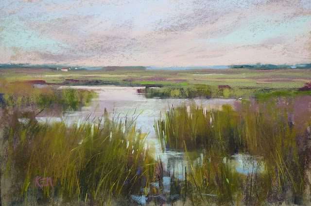
Sunday Studio Live Demo: Painting a Marsh and Playing with Color Schemes

'Changes'           12x18       pastel        ©Karen Margulis
available $165
I finally had a chance to do another Facebook Live demo painting. I had fun sharing my Color Recipe Worksheet and trying a Tertiary Triad color scheme. I put the unedited video on my Youtube channel so you can watch at your leisure.

Watch this painting from start to finish on Youtube. Click here for the link.

Here are a few photos of my planning steps before the painting. I explain all about them in the video.

The worksheet in action

testing the colors to see how I would use them

My palette.....Tertiary Triad of red-violet, yellow-orange and blue-green
Please share the video if you like it! And if you haven't tried the Color Recipe Worksheet here is the link. It is a 99 cent download. click here.

Saturday, February 18, 2017

More on Color Schemes: A Challenging Scheme

'Mystery 2'          12 x 18         pastel       ©Karen Margulis
sold
 It should be easy.  All you need to do is choose 3 or 4 neighboring colors on the color wheel. This makes up  an Analogous Color Scheme. How hard could it be then to pick the colors and get a good painting?  Not as easy as it looks.   We all have our favorite colors and color schemes (even if we don't know it or label it)   In looking over my work I have discovered that I never use a purely analogous scheme.

Analogous Color Schemes are restful. Since the colors are next door neighbors to one another they are harmonious and pleasing to the eye. This color scheme is often found in nature so it it a perfect color recipe to use for a landscape painting. Paintings using this scheme are serene, peaceful, calm.

But I find a pure analogous color scheme to be a bit too calm and serene.....they can easily become a bit too boring to my liking. When I find myself using analogous colors I tend to incorporate the complement and some discords for some color surprise.  This is known as Analogous-Complementary scheme and it is probably one of my favorites. I love using an the Analogous Color Wheel to help me.

How can we make a pure analogous scheme work ? I challenged myself to give it a try. It was difficult to stick with my chosen scheme of yellow, yellow-green, green and blue-green. I so wanted to take out some red- violet! I exercised restraint and in the end made it work. Here is what I learned:


My chosen colors are yellow, yellow-green, green, and blue-green


  • Choose one of the colors in the scheme to be dominant. I chose Yellow-green. 
  • Choose a second color to be a support color and use it in a smaller amount. I chose Yellow.
  • The third and fourth colors are used in an even smaller amount. These colors are accents. I used blue-green and green in the smallest amounts.
  • Contrast becomes important in an analogous scheme. Make sure the contrast of dark and light is strong enough.

My reference photo

This is the same scene using a Tertiary Triad color scheme
Changing the color scheme can totally change the look and feel of a painting. Have fun with color and take out a color wheel and challenge yourself this weekend! Pick the scheme that you never use and see what happens!

Try my COLOR RECIPE WORKSHEET to help keep track of your colors. Click here.

Friday, February 17, 2017

A Simple Tool for More Harmonious Color in Your Paintings

'Find Your Way'          12x18           pastel         ©Karen Margulis
sold
I love color. I was just discussing this with a friend. We decided that we are both drawn to pastels because of the ease of obtaining color. No need to mix....just select from a box. (which leads to pastel addiction which is another post!)  Having color at our fingertips is wonderful but it can also cause problems obtaining pleasing and harmonious color. It is too easy to have too many colors in one painting or too many unrelated colors leading to color chaos.

I shared color problems and solutions in my recent workshop on color and I'd like to share one of the exercises we worked on with you. One of the ways we can move beyond  uninteresting local color and achieve more interesting and harmonious color solutions is to work with the color wheel and choose a color scheme for the painting. I like to call them color recipes.


My painting with planning tools....thumbnail, color worksheet and color map

Color schemes/ recipes are combination of colors based upon their relationship on the color wheel. They are balanced and work well together. There are simple color schemes such as complimentary using just two colors but they can get more involved with triads and tetrads. And even more complicated. How about an Adjacent-Complementary Tetrad?  Working with color recipes are fun but I find it challenging to keep the colors in my recipe in my mind. I need to see my color choices! Especially as I move into the more involved recipes.

I came up with a solution...a COLOR RECIPE WORKSHEET.

Read on to see how it works.


My Color Recipe Worksheet

  • You need a color wheel to help you choose the color recipe you want to use. If you aren't familiar with color theory or working with color schemes I recommend you get a good book. I highly recommend Nita Leland's books on color: "Exploring Color Workshop 30th Anniversary Edition" and "Confident Color" These books are my go-to books on color.
  • Once you have selected the recipe or scheme you want to use it is time to pick your palette of pastels that fit the scheme. This is where it is easy to get confused. I find that if I make little marks or color swatches I have a visual reminder of the colors I can use in my scheme.
  • I like worksheets. They keep me focused, organized and on task. They make me PLAN rather than skip over or forget an important step. I created a worksheet for using color recipes/schemes. The worksheet gives me a place to make marks of the colors I will use and I can refer to the worksheet as I paint making sure I stay true to my scheme.
  • TIP 1: The worksheet allows you to choose your main colors and gives you room to make swatches of the variations of these colors. A color scheme can include a variety of values and intensities of each color. For example if blue is in your scheme you can have pure intense blues as well as grayed blues....light blues to dark blues. This adds variety to your scheme while keeping  color harmony.
  • TIP 2: A scheme should have unequal amounts of each color and usually have one color as the dominant color.
  • Once the colors for the scheme are selected I like to make a quick and very rough color map to show how the colors relate. See below.


Rough color map using the colors in my recipe

I'd love to share my Color Recipe Worksheet with you. I am always looking for ways to help me plan my paintings and I have enjoyed using this worksheet. I am making it available in my Etsy shop for just 99 cents as a PDF download. You can download the worksheet and make copies for your color recipe explorations. Click here to purchase the worksheet: https://www.etsy.com/listing/499438924/color-recipe-color-scheme-painting

Thursday, February 16, 2017

Finishing a Workshop Demo: Back to the Plan!

'Drama in the Afternoon'           16x20         pastel         ©Karen Margulis
available $250
 You really never know how it will turn out. Painting in front of a group of artists and trying to be in the zone while at the same time trying to verbalize what you are doing is challenging.  Sometimes the demo goes as plans but sometime it takes on a life of its own. Sometimes it becomes only a teaching tool and then painting is not really a painting but rather a visual aid to help explain concepts.

I am always happy when a demo painting is successful and especially when it finds a good home with  someone in the workshop. The demo paintings that come home with me are usually finished after some time and evaluation.  Today's painting is a finished demo from my recent Florida workshop. On evaluating the demo I realized I had strayed from my initial plan.

The  painting as it stood at the end of the demo.
I like to start a painting with a plan. "Make a Plan and Plan to let Go" is my mantra. In the workshop. I go through a variety of techniques for making a plan. As I paint sometimes a painting strays from the plan. Sometimes that is a good thing. I like to listen to a painting when it starts changing. It might be a better solution. But often the plan was solid and getting back to it will improve the painting.

I decided that the demo had moved away from the plan slightly. It wouldn't take much to bring it back. I made notes about what I needed to do. Have a look below at the plans.....The reference photo is at the top. A 2.5x3.5 inch color study is below. The two value NOTAN thumbnail is below. My concept for the painting was the contrast of the light behind the dark trees...the drama of light and dark.  The demo painting had become too light and bright. The drama was missing. Here is what I did:

  • I sprayed the trees and ground with workable fixative to darken these areas.
  • I used a couple of dark value pastels to darken the foreground. (burgundy and blue)
  • I added a dark tree shape on the left increasing the area of dark vs. light.
  • I added more interest to the trees with some darker and warmer greens.
  • I kept the light on the grasses confined to a smaller area on the upper left rather than allowing the light to extend to the bottom of the painting.
  • I added more bight spots of light behind the dark tree trunks making the negative spaces more interesting.


The planning stages for the painting

After spraying a darkening the foreground and adding a dark tree on the left

Wednesday, February 15, 2017

Mini Pastel Demo: Light on a Meadow


'Beyond the Tangle'        8x6       pastel      ©Karen Margulis
available $95
I made time today for a quick daily painting. But it took me longer than I had  planned. Sometimes that happens. Actually it happens more often than not. I start out with a plan and good intentions and sometimes the plan doesn't unfold without a struggle. In this case I struggled with the bits of snow on the ground of my reference photo. In the end the snow decided to become spent wildflowers...white puffy seed heads. Here is how the painting evolved....


It began on the right track. I was using a piece of pastel paper that I treated with clear gesso to give some random texture. I blocked in the shadowed areas with cool (blues) and the sunlit area with orange.


I continued working with warm and cool to keep the feeling of sunlight on the grasses and trees in the distance. I used pale orange and pale blue to block in the bits of snow on the ground. I added the tree trunks. So far so good.


I continued the warm and cool layers. I liked the texture of the gessoed board.


I painted  the blue sky and carve the distant tree. I haven't yet worked on the field or snow.


I added some violet to the grasses for interest and darkened the area around the snow pieces.


I started to add the grasses and this is where I ran into trouble. The snow didn't look like snow. It kept wanting to look like flowers. I brushed out and sprayed and tired again....and again....and again. There are no photos because I was too busy trying to resolve the snow in the foreground.  I was getting frustrated but determined to make it work!


At one point I thought I was happy with it but it seemed confusing to me. Was it snow or flowers?
I tried once more to make it snow. No luck. The bits of white fluff wanted to be flowers or seed puffs and I wasn't going to stop it any longer.


Since I was committed to redoing the foreground I  decided to place them in a more pleasing arrangement and added some darks and some stems. This quick daily painting was finished!