Visit my Patreon Page for more painting instruction and Paint Along Videos!

Wednesday, December 09, 2015

How to Paint a Bumblebee with Pastels

'Bumblebees Welcome'          12x24         pastel         ©Karen Margulis
available in my Etsy shop $350
 I remember coming to a stopping point in this painting.  I remember thinking that it would be fun to put some bumblebees and ladybugs and butterflies in the meadow. I painted a butterfly and hid a few ladybugs in the grass (can you find them?)  but I wasn't sure how to go about painting a bumblebee. So I put the painting aside....and forgot all about it.

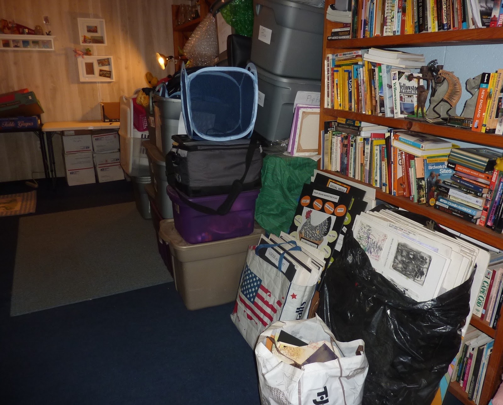
I don't throw anything out. If you've been following my studio clean up saga than you know this is true! I don't throw out paintings. If they aren't finished or I am not happy with them I stack them in a pile on a shelf....foamcore and all. Today it was time to tackle this huge pile of foamcore and unfinished or just plain bad paintings. (11 years accumulation)

Recycling the old pieces of foamcore

I found several paintings that I want to finish. I now know what to do! I was happy to find this meadow painting because now I knew exactly how I wanted to paint the bees.  I have learned how to simplify and to say more with less.

Bumblebees are just a collection of a few carefully placed strokes.


  • I use just a few pastels for the bees....a dark purple (Terry Ludwig eggplant) a dark blue Nupastel, a warm and cool yellow (very soft), pale lavenders and a bright blue.
  • I decide where to place the bee and make a small mark with the dark purple. I don't do any drawing! It is all a matter of making marks.
  • I place two small marks next to the purple with the warm yellow. I add a touch of the cool yellow. Softer pastels such as Schminkes are perfect for the bees. They leave a nice juicy mark. 
  • I make these marks and leave them alone.
  • I use the pale lavenders to suggest the wings.
  • The hints of legs are done with the sharp edge of the dark blue Nupastel.
  • I use the bright blue for an accent on the dark parts of the bee.
  • Each bee is a collection of about 10 strokes.


Close up of the bees. Click to enlarge


Sorting through the old paintings
 I am making good progress in the gallery room. I now have an entire shelf unit free of foamcore. I can make better use of this space. I have tons of frames and misc. supplies to sort still. Whew!

Tuesday, December 08, 2015

A System for Storing Finished Pastels

                                     'A Shore Thing'           5x7         pastel       ©Karen Margulis     $65


Slow and steady wins the race. It would be nice to blink my eyes like I Dream of Jeannie and have the studio rooms Pinterest-worthy. But then I wouldn't have the pleasure of discovery. Today I uncovered a rolling tool chest FULL of pastel bits and pieces. You know you have a lot of pastels when you actually forgot you had a stash! These pieces are the halves and thirds of sets purchased in my early pastel days. I will not allow myself the pleasure of sorting through them until I am finished cleaning! That will be my reward!
I also discovered a few boxes of older paintings. I enjoyed finding a box of small pastel paintings of food. I used to enjoy the occasional still life and painted the usual apples and pears but I also painted candy. I thought I'd share a couple here. I added some of my metallic silver pastels to the Hershey Kiss.  Now onto the progress I made today.....starting a new system for storing finished paintings.

'Chocolate Break'           6x6         pastel         ©Karen Margulis  available $50
Storing Finished Pastel Paintings

 There are many ways to store finished pastel paintings and many systems for keeping records of those paintings. I have tried many. I admit that I am not a very good record keeper when it comes to my paintings. I always start the year with good intentions and spreadsheets and codes....but I quickly get behind and give up. I have decided that I need to pick my battles and this is just one that I will never win.

So I need to be as organized as I can without stressing over perfection. I am happy to say that today I finally have all of my finished paintings together in one room! That is an accomplishment. I have set up a loose filing system.

  •  The paintings from the last two years are all stored laying flat in boxes with glassine or plain newsprint in between paintings. 
  • I am using produce boxes from Costco with index card labels on card tables....for now. It isn't pretty but it is functional. I would love some better shelves and cool boxes but this solution will do for now.
  • The paintings are separated for the most part by SIZE. I have a box for each of the sizes that I paint. I have further separated a few of my most crowded subjects such as Marshes, Southwest and Wildflowers. When I need to find a painting I navigate to the appropriate box.
  • I do have some paintings stored in clear bags with foamcore backings. These are paintings that I bring to demos and workshops. It isn't cost effective for me to put every painting into a clearbag.(I paint a lot)
  • I am storing 18x24 and larger paintings taped on foamcore with glassine protection. These are placed against the wall. (not seen)
  • Paintings older than 2 years are kept in ikea boxes out in my other studio room soon to be known as the gallery.


My new system for storing my daily paintings.....not pretty but it works!
 After I finished filing my paintings I decided to tackle the outer studio room. It was a pleasant 70 degrees today and this room has no heat....or air conditioning which is why I don't use it for anything but storage. It used to be my studio when my current basement room was a daycare/preschool classroom. Now it is a neglected mess.

shelves of all kinds of art and craft stuff
The room is lined with shelves. The shelves are filled with stuff. Art magazines, acrylic paints, clay, sketch books, empty pastel boxes (I can't throw them away) a beading loom (never used), sewing machine..... you get the idea.


This room has potential. I am going to transform it into my personal gallery space. I will clean out the shelves and consolidate the stuff and then have fun displaying some of my work and other fun goodies I have collected.  It is falling into place....my studio, my studio annex and my gallery space. I have a plan! Come back tomorrow for another installment.

Monday, December 07, 2015

Behind the Scenes of a Messy Artist

'Reflection'         9x12      pastel       ©Karen Margulis
available $145
Warning. This post contains graphic photos! Seriously scary. Especially for my neat and organized friends. But this is what happens to your studio when you are away from home more than you are home and when you choose to paint over cleaning.  

 Oh, I would tidy up every day. I am fortunate to have two spare rooms next to my studio. These became giant junk drawers. But after awhile the mess builds until there is no where else to put it all. The junk drawer was full! So I decided to devote the month of December to purge and organize. It is a bit overwhelming so I thought I'd share the process with you.

My main studio and classroom
 The photo above shows my main studio and classroom with the cleanup in progress. It's a great space but I have spread out everywhere and it is not as efficient as it could be. I have some ideas for organizing the space better but first I have to move some of the things that could be stored elsewhere....such as my finished paintings. Relocating and organizing finished paintings is my first step. Where will they go? I have just the place.


The 'Wildwood/Ebay' Room looking like a candidate for 'Hoarders'
I first need to reclaim my Wildwood Room. This nice sized room is next to my basement studio. It is actually the garage. We converted into a teen room for the kids years ago. The room had a beach theme with memorabilia from Wildwood New Jersey. The kids moved on and the room next became the 'Ebay Room'. My sister and I sold interesting junk on eBay and this was our storage and shipping space. My sister moved away and the room gradually became the junk room. If I didn't know where to put something it went into the "room". The room got so cluttered that it was a candidate for an episode of Hoarders. :(

Yesterday we set to work and cleared everything out of the room which I will now dub the Studio Annex. We piled everything up outside so my husband and I could sort the piles....trash, Goodwill, sister who still does Ebay, kids stuff, art stuff....  Heidi didn't seem to mind the mess. She managed to find her bed under a pile of stuff. She actually seemed bored with it all.

Heidi found a place to rest in the thick of things
 Progress is being made! We cleared out the room and I rearranged some furniture. My plan is to pull all of my finished paintings and keep them in this new Studio Annex. Currently they are spread out in my studio and my other studio room (more on that room tomorrow). When I sell a painting I have to look in several places. I need to be more efficient!

Today I worked on this consolidation goal. I have made good solid progress and I will share my new system tomorrow. I have also found some more UFO's. Today's marsh painting was wrapped and hidden. I always liked this one so it was fun to find it!

Ahhhh Much better! Not perfect but on it's way!

Remnants of the Wildwood Room....newly unearthed.

Better. At least I can walk to the back of the room.
I have visions of a Pinterest worthy organized studio space for this room but that takes time and money. I am happy to first get things organized. Then I will work on making it look cool! I have so many books I am not ready to part with and I need to find a better way to organize my teaching visual aids. Baby steps!

Back to work! Come back tomorrow to see more progress!


Sunday, December 06, 2015

A Tip for Trying New Color Schemes


'A Change of Seasons'          11x14     pastel          ©Karen Margulis
available   $165
I am buried in boxes and bags and crates of stuff today. Not only am I cleaning my studio I decided to take on the herculean task of cleaning my two storage rooms. I will take you on a tour of this process tomorrow. It is going to take awhile to put everything back together again.

So today I am sharing the demo I did a couple of weeks ago for the last pastel class of the year. We were working on color theory and using advanced color schemes. I like to call them color recipes and I love to use them to help me come up with more interesting color ideas. The basic color schemes such as complementary and analogous are easy enough to use but I love to play with the more challenging schemes such as Adjacent-Complementary Tetrad!


My color recipe worksheet

That's right! adjacent-complemnetary tetrad or how about analogous-complementary or split-complementary tetrad? Theses schemes sound complicated but they really can lead to some wonderful color combinations. The really aren't that hard to use with the help of a color wheel and a piece of scrap paper.

TIP: Decide in advance the colors that will make up your recipe and make color notes on a piece of scrap paper. Don't rely on your memory. Take notes!

  • I also remind myself that I can use variations of the color in my recipe. In other words if one of my colors is yellow I don't have to use the pure yellow we see at the top of the color wheel. I can use a variety of values and temperatures of yellow. I can use pure yellow and grayed down yellows. I have choices!  
  • Making color swatches or notes allows me to see my choices on paper. I can see how the colors work together and I can remember which colors to use. (I won't forget about my recipe and add unrelated colors because my ingredients are already selected!)
Using a color scheme allowed me to completely change the mood and season of today's painting. The original and local colors in my reference photos were warm autumn tones of orange, reds, violets and golds. I turned the scene into spring with new color choices.

If you are looking for a great book on color and color schemes I recommend Nita Leland's books. I used the book 'Confident Color' to help me decipher these advanced color schemes

Saturday, December 05, 2015

When You Want to Paint it All!

'First Snow IV'           2.5 x 3.5         pastel         ©Karen Margulis
click here to purchase $35
I have over 35,000 photos on my computer. All my own. Yes I love taking photos. So I am never at a loss for reference material. In fact my problem is just the opposite. I want to paint it all!  I could spend hours browsing my photo files finding hundreds of potential paintings. But I don't. I would spend too much time that could have been spent painting.

What I usually do is pick a theme or place that I want to paint. I find that folder on my computer and only choose about 12-20 photos. I print them out on regular printer paper fitting 9 photos to a page. They are about 2x3 inches each. I cut them apart and use only this small stack of photos to paint from.

working on some studies using mostly Terry Ludwig pastels....Richard McKinley set
This method of limiting my choices works well for me. I am not overwhelmed and it is easier to slip into the mood and feeling of a single place rather than jumping all around to different subjects. I will often paint several paintings in a row based on one set of photos. Then I feel ready to move on. I file the photos in small plastic envelopes labeled with the place/theme . I know at some point I will want to return to them.

Sometimes even with this limited selection of photos I still want to paint them all and I don't know where to begin!  This is when it helps to do small studies. This is a good time to sit down with some small papers (2.5 x 3.5) and a limited selection of pastels and paint several studies. This allows me to work out composition and colors. It helps me get into the mood of the place. I will then often use these studies as reference and not the original photos.


For the mini paintings in today's post I couldn't decide on just one scene to paint so I painted several. I was drawn to the idea of capturing a first snow....I experienced this last November in Chicago. It was a beautiful light snow which was made even more special because the colors of fall were still in place. It was the changing of seasons and I was privileged to witness it.

All of these small paintings are available in my etsy shop. Click here for details.


Friday, December 04, 2015

How Many Pastels Do You Need in Travel Set?

'Cardinal Greetings I'             5x7       pastel        ©Karen Margulis
sold
I am making my list. It is the time of year of sales and free shipping so it is when I usually stock up on pastels and paper. I am still deciding on my Terry Ludwig pastel selection. I got some new Diane Townsend pastels and I just got an email from Dakota with their sale. It's a dangerous time of year....but how many pastels do we really need?

I am asked this question often especially by artists new to pastels. It is expensive to build a collection of quality pastels. We want to make good choices. Often the cheaper student grade pastels offer sets that seem like a good deal but they usually have a fatal flaw.....the colors and values are not comprehensive. There is often too many middle value, intense colors. There is often a lack of rich darks and colorful lights and colorful neutrals. I will write more on choosing a basic set later so stay tuned. 

Today I want to talk about my travel set. My go-to travel box is a Heilman Single sketchbox. For years I have used a simple cigar box lined with foam but last year I upgraded to the Heilman. It is the perfect size to throw in a backpack or even a large purse. I have loaded it with about 126 small pastel pieces. These are small worn pieces from my regular studio box. Most pieces are 1/2 inch or less. When a pastel breaks or gets worn down I put it aside for my travel box. I have 126 in my box but you can get away with around 75 pastels for a comprehensive set. (I have often worked with much less but this is the ultimate paint just about anything set)

My Go Anywhere pastel selection
 How to decide which pastels to use?
It takes a little time but it is actually quite simple. Take out a color wheel and your spare pastels. (if you don't have spare pastels yet but want to stock a travel box consider breaking some of your regular pastels or look into some of the half stick comprehensive sets. I like Unison and Great American half sticks.)

  • Take each color on the wheel and choose about 6 - 8  pastels. Choose a warm and cool version of the color and choose a light, dark and middle value of each. Make sure you have some pure color as well as some grayed down colors. Look at the blues in my box....I have some cooler blues and some warmer more turquoise blues. I have some darks, miss and lights and I have some bright blues as well as some grayed down blues.
  • Do the same thing for each color. Do one color at a time so it isn't overwhelming!
  • Choose a few bright intense colors...artificial greens, oranges, red and hot pink for spices.
  • I usually revisit my travel box before a trip and add any colors that I think might be needed for my destination.

painting at the dining table
 I don't always reserve my travel box for travel. It makes a great tabletop box. Today my studio was cold and I didn't want to put on the heat so I painted upstairs at the dining table. The travel box had all I needed to paint these cardinals!

'Cardinal Greetings II'        5x7       pastel       $75

'Cardinal Greetings III'        5x7     pastel    sold

Thursday, December 03, 2015

Adding a Metallic Touch...with Henri Roche Pastels


'A Touch of Silver'       2.5 x 3.5      pastel        ©Karen Margulis
available for purchase $35
I didn't want to try them. I had amazing self control. Even when in Paris at La Maison du Pastel with Isabelle Roche behind the counter I was able to resist. This while my friends all made pastel purchases. But I stood firm. I knew I would love them but I didn't want to have an expensive new love. So I have resisted the urge to try these expensive pastels. Until now.

In the barrage of Black Friday deal emails was one from Fineartstore.com and they were offering a 3 piece set of Henri Roche metallics....a silver, copper and gold. I couldn't resist. Metallic pastels are best used as accents and spices so I figured a little will go a long way. So I ordered them.

Set of 3 Metallic pastels from Henri Roche Pastels
The set arrived today and I was anxious to give them a try.  I couldn't wait to take one out of the box and make a mark. It was delightful. Soft and rich and smooth yet not at all crumbly. I decided to put them to work on some minis. (I'm afraid to use them up too fast!)

I haven't used them long enough to give a thorough review. I will do that here soon but in the meantime you might like to read a comprehensive review of the metallics on Robert Sloan's blog here 

Adding a touch of silver
I used the metallic pastels as I would normally use a spice or accent color....at the end of a painting. They were the final marks. The metallics added a very subtle sparkle. In fact it is difficult to see the sparkle in the photos but in the right light they ad the perfect note of class to my little paintings. It reminds me of the metallic sheen on the wings of some butterflies....subtle but beautiful when it catches the light.

'Summer Forest'     3.5 x 2.5   pastel     $35


'Copper and Gold'        2.5 x 3.5     pastel      ©Karen Margulis   $35

I used the copper and gold pastels in this Autumn scene. Click to enlarge and see the sparkle in detail.

Gold and Copper are needed here!

 I have used other metallic pastels in my work. I have Diane Townsend, Great American and Sennelier metallic pastels. I tend to put the boxes on the shelf and forget to use them which is a shame. They make wonderful spices. My mind is spinning now so I am sure I will be dusting them off and finding more uses for metallics!


Wednesday, December 02, 2015

The Making of a Daily Pastel Painting....step by step demo


'Along the Back Roads'          5x7        pastel         ©Karen Margulis
painting available $75 
If only I could feel as motivated to workout everyday!  I often say that painting everyday is a habit I've developed and it is much like a good exercise program.....I feel bad if I don't get to paint. I will make time to paint despite things that pull me in different directions. If you have a good exercise habit and routine the same thing happens....you will make time to work out.

So today despite the messy studio (clean up in the works) I had to stop for a 30 minute painting break. I don't take time to plan a painting for these quick dailies. I just grab a piece of paper and a reference photo from my stack and put them on the easel. I use whatever pastels that are out from previous paintings. It is a matter of simplification and  expression...playing with colors and marks.

I thought you might enjoy the making of today's quick daily painting. My comments below:


My reference photo. This is a scene from my recent trip to Nebraska.  I loved the hay bales and the colors of the hay and foliage against the blue sky.


I picked up a piece of Uart 400 sanded paper that I had already toned gray with Art Graf. I chose it simply because it was at the top of the pile which I never do when planning a painting but often when I am just playing. I did a quick drawing with a Nupastel setting up my design and big shapes.


I begin by blocking in the dark areas of the painting. The trees and sides of the hay bales are all upright planes so they are the darkest shapes. I use a dark peach, dark purple and blue. I then use a middle dark blue violet to push the trees back.


I start to add some of the local colors in the trees....the greens. This will be covered with some warmer colors since I want to capture the feeling of warm sunlight on the trees.


Next I move onto the light areas....the sky. The sky was also warm so I chose some warmer blues and peaches and layered them together in the sky.


Above is a photo showing the sky colors and the rusts and peaches in the trees. I start to put in some peach in the grasses but I decided to put down a layer of cool color first.


Since I knew the grass would be warm oranges I decided to underpaint the grass with the complement of blue. I would leave some of the blue in the shadows/ The orange on top of the blue will make it more exciting than just orange on its own.


Now I develop the grasses and set up the hay bales. Theses hay bales will go through some transformations. I even had to move some around to make a better pathway into the painting. I also tried to keep the principles of aerial perspective in mind making the bales get smaller and duller and lighter as they recede into the distance.


More development of the grass and hay bales. I am trying not to cover up all of the blue.


 Now I am using yellows and greens on the hay bales. I also add more warm colors to the distant trees.


 I am almost finished. The next step is refinement and adding a few details and spices. I use the sky colors to add some negative spaces in the trees....skyholes. Add a few bits of pure color in  a few key areas....where I want the eye to stop. Can you find these spice colors?


Finished daily painting. Ahhhhh. Now I can sit down and have a piece of chocolate.  Hmmmm or maybe I should go ride the stationary bike?


Tuesday, December 01, 2015

You Need These! And Today is the Day to Get Them!

'Woodland Beauty'           10 x 10        pastel         ©Karen Margulis
painting available $165
It was quite a compliment. Someone recently asked me if my business cards were for sale. I don't know if they didn't realize they were business cards or they liked them so much they wanted more than one. Either way it is a tribute to Moo.com and their product.

 I want my business cards to be keepable. What's the point in giving out business cards if they end up in the garbage. Business cards need staying power. You never know when your art or services may be needed. If your business card is a keeper it is more likely to be there when the need arises. And you don't need to sell your work to have business cards. The are also calling cards. You need to have cards to share with friends and fellow artists!

I am a big fan of Moo.com.  If you are a regular reader you know this! I love their business cards and I am always trying the latest products.  I was excited to try the new square business cards. They measure about 2.5 x 2.5 inches. I got my first order and love them so much I've reordered them twice now.

Square cards are cool!

I think these cards will be keepers! I decided to showcase about 50 different wildflowers paintings on the front of the cards. The great thing about moo cards is the ability to use up to 50 different images on one batch of cards. There is no set up fee or extra image fees. It is a very simple upload process. The back of the card has my contact information. You get full color printing on both sides for no extra charge.

I am very pleased with the printing and color reproduction. The card stock is heavy and feels expensive. You can even upgrade to an even more luxurious card stock.

The quality of Moo cards is wonderful

Now is the time!  Moo's Cyber Sale is extended. Moo Cards are 30% off until midnight December 2 2015

If you don't have business cards or need to get new ones consider giving Moo cards a try. If you use this link to create your cards you will get 10% off your first order.  Click here for the link.

If you don't have business cards or make your own, treat yourself to some really nice business cards. You are your own brand and your business cards reflect you as an artist. You DESERVE nice business cards!