Visit my Patreon Page for more painting instruction and Paint Along Videos!

Sunday, January 31, 2016

From Small to Large....Painting Big Pastels

Study for Summer Song      6x8       pastel      ©Karen Margulis
available $95
Today was wrap up day. The month of January has been a whirlwind of painting and emailing and working out details of my big projects. I finished on time and all the paintings have been approved. So between varnishing acrylics and wrapping up pastels I am taking a break to share the results of the big pastel paintings.  I posted photos and answered questions at the beginning of the project. You can read about it here: http://www.kemstudios.blogspot.com/2016/01/large-pastels-paintingsyour-questions.html

Below is a photo of the results. It is a good thing I organized my studio in December. I had room to work on all four 30 x 40 paintings at one time. In the end the client was pleased with the paintings. I had to make some small adjustments to the foreground details and I was ready to get them wrapped and shipped. I will share that process in another post. 

Making use of all of the easels!


'Under a Summer Sky'       30 x 40       pastel 

'Another Beautiful Day'      30 x 40     pastel

'Marsh Music'       30 x 40       pastel

'Summer Song'      30 x 40   pastel

Below are the 6x8 studies for the larger pieces. They were helpful in creating the larger paintings. I found myself working from the studies and not the reference photos. It was an interesting process to size up from 6x8 to 30x40. It is easy for one mark to suggest a clump of grass in a small painting but it doesn't quite translate to 30x40! I hope you enjoyed this peek at the finished paintings! It was an exciting project!


 Don't forget that my 30 in 30 oil paintings are on auction at Daily Paintworks. Opening bids start at $30! Click here to see and bid on them.

Saturday, January 30, 2016

How To Get it All Done....Reflections on the 30 Paintings in 30 Days Challenge


January Oil Paintings  all 5x7 on panel      ©Karen Margulis
available on Daily Paintworks Auction  $30 starting bid
What is it they say about the best laid plans?  I began the month of January with nothing on the schedule except a trip to Chicago to visit my granddaughter and teaching a one day workshop. I knew I would have plenty of time to participate in Leslie Saeta's 30 Paintings in 30 days challenge. It was going to be my month for devoting myself to getting comfortable with oils. 

I started strong. I made it to 14 oils paintings. I even added to the challenge by doing both an oil and pastel of each day's study. The pastel study helped me understand the oils better. 

But then opportunity knocked on my studio door in the way of two big commission projects requiring some very large paintings. Great news of course.....but they both had a deadline of the first week of February! The 30 in 30 challenge would have to wait. 

Somehow I still continued to paint as well as work on the commissions and at the end of this very crazy month of painting I managed to finish 56 paintings.....14 small oils, a variety of miscellaneous pastels, 4 30x40 pastels, 16 2x5 foot acrylic panels. Whew! It was a fun and productive month and I have gotten quite a few questions about how I manage to fit it all in. Read on for some tips!

All challenge oils paintings are available through Daily Paintworks on auction. In honor of the challenge the opening bid will be $30 each!


Tips for Getting More Painting Done
  • Make painting a priority. I speed through my chores and household obligations so I can paint.. If you want more time to paint find ways to optimize your time spent on other obligations. You can't really do it with 100% effort but I choose to put more effort into painting than cooking and cleaning (and happily my husband totally supports this!)
  • Organize your studio or painting supplies. This is so important especially if you have limited painting time or no real studio space. If you spend time fiddling with supplies it takes time away from creating. I spent a month organizing my supplies and it made a world of difference in how efficient I was able to be this month.
  • Keep a checklist and do the hard stuff first. The first thing I do each day is look at my checklist and tackle at least two of the hard things...things I put off or dread (which for me is usually paperwork) This clears my head and makes room for art. I find that the longer it stays on my list the more I dread it until it finally begins to bog me down. Don't put off the hard stuff and painting will feel like a reward.
  • Find a support system. You can't do it alone! Being an artist can be lonely. Having non-artist family members makes it even harder. Do what you can to have the support of your family. make sure they know how important time for art is to you. Find other artists to help you stay focused and just share the journey. Local art groups, online art friends, workshops ...make it a priority to find your art family!

Some of the 56 paintings completed January 2016

Friday, January 29, 2016

Choosing the Right Painting Music


'Southern Spring'        8x10         pastel         ©Karen Margulis
sold
My paintings have soundtracks. I can look at a painting and hear the music that I was playing when I painted it.   When I have selected the right music for the painting it shows in the work. The painting flows and it becomes part of the dance. Music brings in another sensory experience to the mix.  But it has to be the right music.

I like to pick music that fits the theme or concept of my painting. If I am painting a Southwestern landscape I love to listen to Native American flute music. It puts me right in the middle of the desert. When I returned home from Iceland I began listening to Icelandic bands as I painted from my plein air studies and reference photos. The music took me back and became intertwined with the painting.


The Right Music

This week I have an epic project going on in the studio. Sixteen huge panels fill my studio and one by one I am painting them with southern landscapes in acrylic. It requires an epic soundtrack. I found the perfect 'Painting Large' music on Spotify. I created my own station consisting of epic movie soundtracks.....think Star Wars, Hunger Games, Pirates of the Caribbean. Big soundtracks played loud!  It elevates me and helps me rise to that task of big bold brushstrokes.

I am working on the last set of panels tonight and all I need to do is turn on my epic music to put me in the right frame of mind. Here are a few progress shots of painting #7

The block-in is the pink. I am starting the trees and background

Adding foliage and shadows on the path

Getting ready to paint the sky holes.

Finished! There is glare in this photo. I'll be sharing final photos soon
What do you listen to when you paint? I listen to music most of the time but sometimes I listen to talk radio or podcasts. I love listing to the radio program Artists Helping Artists with Leslie Saeta. Leslie and her guest hosts always have such great interviews. I am very excited to be the guest next Thursday February 4th so be sure to tune in!
http://www.blogtalkradio.com/artistshelpingartists/2016/02/04/a-conversation-with-artist-karen-margulis

Thursday, January 28, 2016

A Simple Tip to Improve Watercolor Underpaintings

'Just Add Sunshine'      6x6     pastel         ©Karen Margulis
available  $75
I read about a great watercolor tip yesterday and had to give it a try. The watercolorists out there will probably laugh at my naiveté about watercolors but it was an AHA moment for me so I thought I would share it.

If you are like me you may have experienced less than satisfactory watercolor underpaintings as a set up for pastels. Mine were always pale and washed out. I couldn't get the punch I wanted. I got some artist quality watercolors and that helped some. I also learned to paint darker and more intense than I wanted. With practice my underpaintings have improved. But this new tip might just help me even more.

'Sunny Days'      4x4      pastel      $45
 WATERCOLOR TIP:  I like to use pan watercolors for my underpaintings. Using tube paints can often lead to the paint being applied too thick. I want to be careful to keep the paint thin so it doesn't fill the tooth of the paper. Pans help but here is the tip.......Spritz the pan paints with water before starting to paint. Allowing the paint to be pre-wet will result in more vibrant color.

I tried this tip with a set of cheap watercolors. The pre-wet color was indeed more vibrant. I will have to give it a try with my good watercolor set. I do carry a small spritz bottle with my watercolors. I use  it to create interest and texture. Now I will also use it to pre-wet the paint.

Sampling some inexpensive watercolors
Painting notes: the two daisy paintings are both painted on Uart paper with watercolor underpaintings.

Wednesday, January 27, 2016

Pastel Demo: Nantucket Island Meadow on Canson

'Watching Life Unfold'           18x24         pastel          ©Karen Margulis
Sometimes you have to heed the call. I am in the middle of my acrylic panel project but I happened upon one of my Nantucket photos and it just called out to be painted. I have until Friday to finish the panels so a little detour to Nantucket wouldn't hurt.

I decided to take progress photos of the painting so I hope you will enjoy this mini demo. I used a piece of Moonstone color Canson Mi-teintes paper which I find to be good for quick paintings....except for some reason I wanted to go large! I cut the paper to 18x24 and taped it to my board.


I did a quick drawing with a pencil indicating the major shapes and flow of the painting. I like to visualize how the viewer's eye will travel through the painting.


I blocked in the big shapes with some Nupastels. I chose these colors based on value and a start to some of the intense colors that I want to peek though my pastel layers.


I rub in this first layer with a piece of pipe insulation foam. A reader recently wrote and asked me what this is made of and I don't really know. I threw out the bag and haven't had a chance to research it. I know that it works without shredding!


Next I block in the dark shapes with softer pastels. I spray them with workable fixative so I can get a feeling of texture in the foliage. I add some mauves and pinks in the meadow. Next I begin the sky.


I didn't intend to have a pink sky. I thought it would be a pale sky....maybe pale blue or even pale yellow. But the underpainting color was pink and I really liked it. So I went with the pink and pulled my marks down leading into the meadow.


The next part of the process it to work from back to front painting grasses and trying to create depth with the colors I choose and marks that I make.


Once I got to the foreground I started to add more detail and clarity to the foliage. I don't put detail at the edges or bottom of the painting. This area is out of focus so we can move into the important parts of the painting.

The last step is to add the final details....the icing on the cake which are the beach roses. I save them for last so that I can place them where they will lead the viewer into the painting.

That was fun! Now that I got that out of my system I can return to my panels!


Tuesday, January 26, 2016

A Beautiful Mess...Making Sense of a Messy Palette


'Fall Fantasy'          5x7          pastel         ©Karen Margulis
available $75
It happens every couple of weeks. I start out with a clean slate....or clean butcher trays!  I like to begin a new painting by choosing the pastels I will use and putting them in a tray. Having a limited palette forces me to have some control over my color harmony. It helps me approach a painting with a plan of sorts. And for me having the plan is like having a map.....I have directions in case I get lost....but I am always open to taking detours!

I know many artists don't care for this way of working. It seems confining or maybe too involved. There are many valid reasons for not preselecting a palette and wonderful paintings are created from what seems to be an overwhelming choice of pastels. I believe it takes a lot of experience to be able to confidently choose the right colors without any advanced planning.

Until we have the many miles of canvas that is required for true intuitive color confidence....an organized palette is the key to success!

A Beautiful Mess!

The day I began to choose my pastel palette before a painting was the day I finally felt in control. It has made all the difference in the world in how I paint. But after a couple of weeks of daily painting and filling all my butcher trays....I am faced with color chaos. Trays filled with pastels used for the past week's paintings are now mixed up and dirty.  I spend a few days working with them like this as a challenge. It makes me work to find the right colors and values. It keeps me on my toes. It is good for a change of pace.

But I don't care to work this way for long periods of time. I like to make sense of a messy palette so I take time to clean each pastel by wiping it off on a soft towel and putting it back in my big box. It is definitely time after the frenzy of the 30 painting challenge!

Messy trays from a month of painting. Time to clean them and put them away!


I used an older unfinished underpainting for today's pastel


Monday, January 25, 2016

How to Find Simple Shapes in a Painting


'Cliff Edge'       5x7       pastel       ©Karen Margulis
available $75
Big. Simple. Shapes. I repeat these three words when I start any new painting. It is so easy to get caught up in the details. Especially with some of my favorite subjects. Flowers-filled meadows are full of 'stuff'.  It is challenging to simplify and suggest but it all begins with big simple shapes.

Block in a painting with just a few big shapes for a stronger painting. 

Squinting is a very good way to simplify a scene whether you are painting on location or from a photo. Squinting removes a lot of the detail and color allowing you to see the masses of light and dark.  Another good way to see big shapes is to use a scrap piece of glassine or tracing paper.


Glassine is just right for obscuring details. It isn't clear yet it isn't quite opaque either. Place a piece of glassine over your reference photo and it is like looking at the photo with really dirty glasses. Like squinting it allows you to only see the big shapes of light and dark.

For today's painting my concept was the contrast and drama of the setting sun illuminating the flowers at the edge of the cliff leaving much of the hillside in shadow. I used a piece of glassine to create a black and white notan thumbnail.  The glassine was helpful in allowing me to decide what needed to be left in the shadows and what areas should be light.

So don't throw out those scraps of glassine paper. Save them for help with shape finding!  Glassine paper is useful to cover finished pastel paintings. I keep a roll handy and cut pieces as I need them.


My daily 30in30 oil painting '  field study'      5x7    oil

Sunday, January 24, 2016

When Should You Stop Taking Art Workshops?

'Winter Forest'         8x10       pastel        ©Karen Margulis
available  $150
Are you ever too experienced to take a Painting workshop? Or maybe you feel your aren't good enough yet to pay for a workshop? Is there a certain point in your art journey that you no longer need them?  I have heard a few different thoughts on the subject and have given it a lot of thought as well.  

Since I am in the midst of making travel arrangements for the workshops I will be teaching this year, this question is heavy on my mind.  Some experienced artists try to limit the number of workshops they take in a given period. Some feel as though they would rather spend their time painting more....allowing them to put together all they they have learned over the years. And this is valid. It does take putting in those miles of canvas and spending quality studio time to take your work to the next level. 

I have been painting now for 11 years. I have taken many workshops with some wonderful instructors. I teach my own classes and workshops. Should I take more workshops or should I just paint?  My answer is  do both....paint and take more workshops! Here's why.

Oil Stain Underpainting using red, blue and yellow traditional oils


  • PRUNING TIME No matter how experienced we are we can always learn something new. I was listening to an art podcast and the artist who was very successful and respected talked about how he likes to take workshops form other artists he admires because it helps "prune off the dead wood" What a great thought.  We are always growing as painters and sometimes we grow branches that we don't need or that are weighing us down. It sometimes takes some new thinking or another experienced eye to see what we need.
  • Fresh eyes.  When you are a new painter taking too many workshops can often be confusing because everything is so new.  Experienced painters can benefit from workshops because new information or something put in a new way will be more obvious.  You may hear something you already knew explained in a different way. All of the sudden a lightbulb may light. It could make all the difference in something you are struggling with.
  • Workshops give us time to paint. Sometimes experienced artists get caught up or bogged down with things other than studio time.....marketing, business, art associations, galleries,teaching.  Attending a workshop is a way to give you some dedicated painting time. And the bonus is that you might learn something new.
  • Networking and the camaraderie of other artists. One of the benefits of attending a workshop for artists of any level is the opportunity to spend time with like minded people. There is something special about meeting other artists and immersing yourself in all things art for a few days.  Learning from other artists is often just as valuable as learning from the instructor.
  • An excuse to travel. This is one of my favorite reasons. A workshop is a great excuse for a road trip with my art friends!
  • NEW ARTISTS! The right workshop can be a big help to boost your skill or just to help you feel like you really are an artist! I love having new painters or artists new to pastels in my workshops. We all learn from one another.


If you would like to make time for a workshop this year please have a look at my offerings. I have new material to share along with my usual approach to simplifying the painting process. Details here or places email me with questions. karenmargulis@gmail.com 


Saturday, January 23, 2016

Behind the Scenes: Warm Up Exercises for Painting Large


'A Special Kind of Quiet'           18x24          pastel        ©Karen Margulis
The fun continues. The plan was to paint two of the commission paintings every day until I am finished. They are taking longer than planned but only because I have discovered a great warm-up exercise...painting a pastel first.

I know it may seem crazy but there is a method to my madness. The panels I am using for the paintings are big. 4 x 5 feet is bigger than I have ever painted and they are acrylic. Both of these things are out of my comfort zone. It is a bit daunting but painting a pastel version first allows me to step up to the big white panels with confidence.

Return to your comfort zone to warm-up for working in new and uncharted territory.


close up detail
Today's scene is a marsh with a warm yellow sky. I have painted it before much smaller. I decided to do an 18x24 pastel version using the same underpainting colors as the acrylic. I even used acrylics for the pastel underpainting. After I finished the scene was fresh in my mind. I knew the colors I wanted and how to layer them.  I took some progress shots. Enjoy!


Add caption
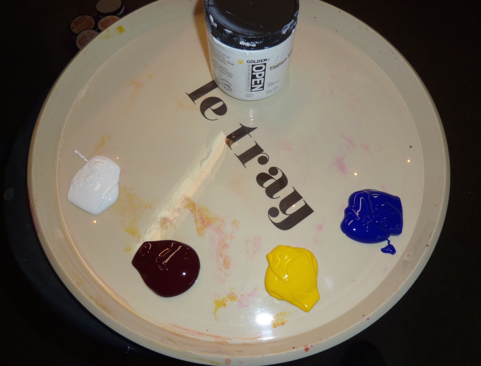
I am using Golden Open acrylics. I got this great tray at the Goodwill. It is perfect for mixing paint!
I am only using this limited palette. Keeping it simple!

The underpainitng. I needed to cover up the white panels so I am using warm colors so help give the final warm glow I want.


Next I block in the darks. I am working the exact same way I did with the pastel. I am just using a big brush instead of a pastel stick.


Here are all of my reference paintings. I really don't look at them. The image is now in my head and the panels take on a life of their own.


The finished panels. The details are hard to see in the photo. The client wants the painting to look fresh and simple. They want them to have a care free plain air feel to them. They don't want them to be overly detailed. I will let them decide if I need to add anymore. On a commission I would rather stop sooner than finish it off and overdo it.
Whew! Now I move on to number four!

Friday, January 22, 2016

Try Something Different for Pastel Underpaintings

'Simple Pleasures'         8x10       pastel        ©Karen Margulis
available $150
 I met an artist with a fantastic goal. He'd made a list of every medium. He was going down the list creating a piece of art in each medium. I love this idea but it got me thinking. How many different mediums can we use for underpaintings for pastels? Most of us are familiar with the usual underpainting choices....watercolor and alcohol and pastel. But we have so many other options.

I love to experiment so when I am restocking my supplies I always look for something new to try for underpaintings. My latest purchase were some Intense Blocks by Derwent. Intense products are not new but I have not yet used them for underpaintings so I purchased three blocks to give them a try.

Derwent Inktense Blocks
 They are called Intense Blocks although they are the same size and shape as NuPastels. They come in pencil form or sticks in 72 colors. Here is some information from Derwent:

Watercolour Inktense blocks combine the brilliant colours of Inktense pencils with the freedom of blocks making it easy to cover large areas really quickly. You can use these watercolour blocks dry or add water to create deep, intense colour washes. Once dry Inktense becomes permanent and you can work over the top of it so it great for layering and for use on silk and cotton!

Experimenting with three sticks and some water
I selected three darks...purple, blue and black. In a previous experiment I tried black Sharpie marker for value based underpaintings. I loved the effect but I wanted something archival. I wanted to try ink but then found these Intense sticks. They would be easier to use and more portable!

I tried the three colors  on a piece of Uart paper. I liked the richness of the ink once it was wet. Pressing harder created darker values.  Adding more water created lighter value washes.
I used a brush and water to create the ink washes. I also went back into the wet washed with the sticks to create lines. I liked the effect of the wash and I even got a few interesting drips!

The underpainting with the Intense wash

The key to any underpainting is how well the pastel can be layered on top. I found the inktense blocks did not fill the tooth of my sanded paper so I was able to paint without any noticeable change in paper texture. I got plenty of layers and even was able to brush out and repaint the foreground.(another story!)

I am intrigued by the possibilities of the Intense blocks and I will definitely try some of the other colors. I can see using them instead of hard pastels and water or alcohol wash. 

If you are also intrigued check out this Pinterest page devoted to the Intense products. There are many possibilities!

I used Richard McKinley's set of Terry Ludwig pastels exclusively for this painting.
QUESTION OF THE DAY:
I am making a list of media we can use for pastel underpaintings. Help me and share your ideas in the comments.