Visit my Patreon Page for more painting instruction and Paint Along Videos!

Wednesday, February 27, 2019

New Video Demo Release on YouTube: Painting a Winter Landscape


'The Road Home'               6x8             pastel              ©Karen Margulis
available. $95

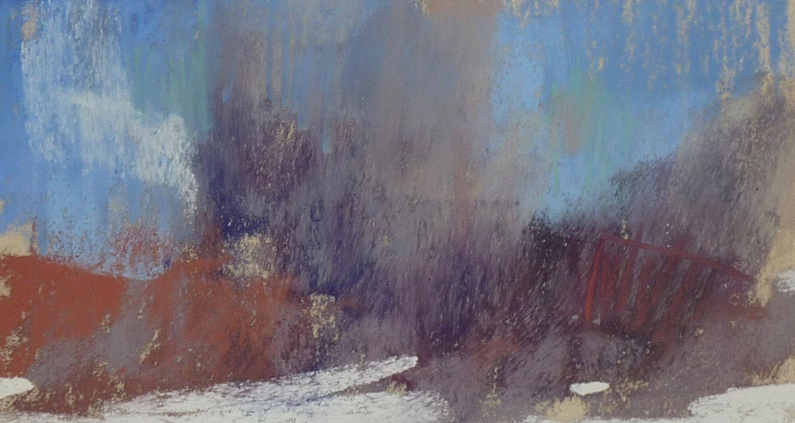
I know that I have spring fever. I am sure many of you do as well. But I couldn't help sharing one last winter painting before we move on! There is a method to my madness though!  March will be 'Beach Month' both here on the blog and over on my Patreon Page.  Did you know that many of the techniques used to paint snow can also be applied to painting sand?  I will show you how in the coming days!

To get you started check out this winter landscape demo video that is now available on my YouTube channel. This video was first released on Patreon and is now available on YouTube.


Be sure to subscribe to my YouTube channel so you don't miss a new release!  Thanks for watching!


My demo board


Thanks for your support on Patreon! If you haven't given it a try yet consider heading over to check it out. In March we will explore painting shadows, painting beaches, a paint-Along video series, an in depth member painting critique and much more! www.patreon.com/karenmargulis


Monday, February 25, 2019

Thoughts Behind the Finishing Touches of a Painting


'Summer Profusion'               12x16                pastel           ©Karen Margulis
available $195
I used to stop too soon. Only I didn't know it. I thought I was finished. Or at least as finished as I knew how.  I had the passion part down. I painted fast and furious and with the conifidence of someone who didn't know any better! I had fun and my paintings were not terrible. But they could have been better. I just didn't know it.

It has taken me a long time to realize the importance of slowing down. Even when I was told I should consider slowing down and being more thoughtful I dismissed it. I didn't want to slow down. I wasn't ready and I really didn't know what I was supposed to do once I did slow down!

I get it now. And I enjoy slowing down for those important finishing marks. I allow myself the passion part of painting and then I take time to slow down and be mindful of my marks when I near the end of a painting.  Have a look at the painting in the photos below. This was one of my demo paintings from my workshop last week. It is almost finished. At one time I probably would consider it finished. But now I know better. I took it home and made some finishing marks.

Scroll back and forth to see if you can spot the refinements I made. I will share them below. 


The not quite finished demo painting. 12x16 on white pastel premier sanded paper with a black Art Graf underpainting

  •  I wanted more texture in the grass so I sprayed some workable fixative and layered more green pastel. I used warmer and ore intense greens. 
  • I wanted more flowers! One of the things I was attracted to was the profusion of wildflowers but I didn't quite capture that feeling. I added more flowers especially some tiny ones in the distance to give the illusion of depth.
  • I added some linear marks to suggest grasses. 
  • I sprayed the tree with workable fixative and added a few layers of warm green in the sunlit areas. I also offed some smaller leaf shapes......just a few!
  • I pushed back the distant trees with a light scumble of gray blue.
  • I added some linear pale yellow marks in the sky. These are not visible in the photo but add just a bit of interest to the sky.
  • I added a few purple flowers and some pale purple in the sky.....just for relief from the green and to connect the earth and the sky.

Two spaces opened up for my workshop in New Jersey at the Goshen School of Art!! I would love for you to join us!! This is the place where it all began for me so I am excited to share it with you. You don't want to miss it!! Details here: www.stansperlak.com

Sunday, February 24, 2019

An Ikea Hack for Displaying Pastel Paintings

'Reach to the Sun'           8x6           pastel           ©Karen Margulis

What do you do with all of your unfinished paintings? I have a multi step approach to painting storage and the first step is courtesy of IKEA. Many artists like to keep finished paintings around the studio before framing and storing so they can evaluate them with fresh eyes. This is a challenge with pastels because they need to be protected so leaving them sitting around the studio is inviting damage (especially when you have curious cats & dogs) So I discovered a great way to keep paintings in view but up and out of the way. It is a wire curtain line from IKEA.
My Hanging System courtesy of IKEA


This curtain wire is easily attached to the wall on two sides and mine stretches 12 feet. It comes with clips that hook onto the wire so it is simple to clip your painting and hang it on the wire. Extra hooks are available. I find I can hang about 30 paintings 11x14 or smaller...perfect for a month's work. Having them hanging all month gives me a chance to revisit them and make changes as I see fit. Looking at a month's allows me to see what I am pleased with and what I want to work on. At the end of the month I take them all down and file them away in boxes. I am now ready to start the new month. I find it helpful to keep my current work handy and in view. 

This wire is available at Ikea stores. It is called a DEKA Curtain wire and it includes clips. Here is the link for the curtain wire from the Ikea website.https://www.ikea.com/us/en/catalog/categories/departments/living_room/18894/

Friday, February 22, 2019

A Very Simple Way to Make a Collage of your Paintings

A few of my daily paintings from January
I wanted to simple way to see my monthly progress. I had recommitted myself to daily painting this year and I was on a roll. I had paintings all over the studio! I had to store them and put them away but I wanted a way to see my progress. One great way to see daily painting progress is to hang them up in the studio. That post is coming! Another way is to see them digitally...in the form of a photo collage.

It is always a good thing to take some time to review the work you do over the course of a few weeks. It helps you to see what you did well and what you might need to work on. One way to do this is to physically set out your paintings ....line them up against a wall and study them. Take notes. Is there a common thread that runs through all of them? Is there something that you are doing consistently well...or not so well?

Ideally, this evaluation should be done every few months. There is a simple way to do this instead of taking the paintings out physically.....create a digital collage. I discovered a very easy to use collage maker online and it is FREE called www.befunky.com. 

All you do is upload the photos you wan, choose your layout and either auto fill or drag your photos where you want them in the layout. Simple. The collage can be saved as a jpg and can be used in many ways...make cards, Facebook banners, promotions of all kinds. It is also an excellent way to see a collection of your work all in one place! 

Patreon members can get a head start! We will be doing collages for our next challenge!
www.patreon.com/karenmargulis

Wednesday, February 20, 2019

Leave the Wrappers on These Pastels!


Enjoy this post from the archives!

I don't want to take the wrappers off my pastels.  I don't even want to take them out of the box they came in. It's a nice wooden box and the pastels are so beautiful all lined up and nestled in the foam.

 Aren't we supposed to take the wrappers off?

You hear it all of the time (including from me)  Take the wrappers off new pastels. Break them into smaller pieces. Take them out of the original box and mix them with your other pastels. Arrange them by value and color to make it easier to paint. 

It makes perfect sense.  It is even great advice. It does help you paint more efficiently.  Using pastels in smaller chunks without wrappers allows you to actually paint with them...make broad marks of color.  When the wrapper is on you only have a small amount of pastel to work with. You tend to draw with them. Sometimes you might even get more detailed than you want.  Which is great if that is your intent.

Keeping the Wrappers on doesn't work for my way of working but I still don't want to take the wrappers off! 

My prize from the PSA show a few years ago
 I have this wonderful 108 piece set of Sennelier pastels that were a part of my prize at the PSA show a few years ago. I haven't used them. Why?  Because I don't want to take the wrappers off! I like to take them out occasionally and just look at them.  That is silly....but I know you understand!   I have plenty of pastels so I don't need to put them in my big box.  So I decided today....

I won't take the wrappers off but I will use them.  I am going to use them for my spices. Read about spicing up your paintings in my blog post here:http://kemstudios.blogspot.com/2014/01/my-favorite-way-to-spice-up-boring.html

I don't need the wrappers off to make the small and bold spice marks.  Sennelier pastels are very soft and very richly pigmented. They are perfect for making juicy spice marks!  Have a look at my marsh painting and see if you can spot the spice marks. I can use them with the wrappers on for the purpose of creating final marks and details.


I am leaving the wrappers on!
I still recommend taking the wrappers off your pastels especially if you are still building your collection. But it sure feels good to leave them on occasionally!

Monday, February 18, 2019

Important Tips for Using Reference Photos

'Poppy Profusion'              8x10              pastel           ©Karen Margulis


 The Secret to a good painting is a bad photo

That might be an over-simplification but a less than perfect reference photo can actually free you up and allow you to be more expressive.  After all you won't want to copy a bad photo....you can only make it into a better painting!

This is great news for us artists who are not photographers. We don't need to get the perfect shot. We only need photos as Memory Joggers. I have written before about how I use reference photos. click here to read.  My secret is to work ONLY from my own photos.

So often I hear artists say they don't have any of their own photos. So they use magazine images (not a good idea) or royalty-free images. Both of these solutions aren't as good as using your own photos. If you didn't take the photo then you can't replay the scene in your mind.

Everyone can take a good reference photo....because it doesn't have to be perfect!

This photo has inspired several paintings....a variation on the theme!


Think of reference photos as snippets of information that can inspire a painting. Maybe it is a color or the light and shadow pattern or maybe an interesting tree. Snap a photo. It can be used in a painting. Here are some tips:
  • Smartphone camera:Any camera will do. In fact I most often use my iphone camera. If you have a smartphone, get to know it's camera. It is usually always handy for a quick photo.
  • Cheap Digital camera: If you don't have a smartphone get a small digital camera and keep in in your bag/purse/pocket when you go out. So many good inexpensive cameras are available. The trick is to get one small enough that you won't mind keeping handy.
  • Automatic: There is no need to get involved with all of the settings (unless you want to of course) Most cameras do an excellent job on auto....besides you don't need perfect photos!
  • Ipad camera:  Don't forget about your ipad camera. Sometimes I see something interesting and the only thing close enough is my iPad....I get the shot! Don't have an iPad? Now you have a good excuse to get one!
  • Printing photos:  If you aren't comfortable with uploading and printing photos don't worry!  I often work right from my camera/ipad/phone screen. The photo is small but even better for me to be expressive. You can't get bogged down with details that you can't even see! I prefer to keep the printed photos no larger than 4x6.
  • Walgreens: If you do want prints but don't want to fuss with the computer you can email your photos from your phone and Walgreens will print them. Some stores have photo kiosks which allow you to use your camera's SD card to print photos. Other store offer these services but I am most familiar with Walgreens.

So get out there and take photos of the things that inspire you. They will lead you to your best work.

Saturday, February 16, 2019

My Thoughts About Mark Making

'Beautiful Interlude'                  5x7             pastel            ©Karen Margulis
available $95
I never would have thought it was possible. How can a chunky stick of pastel make such a variety of marks?  Even more amazing, how can it make such delicate and tiny marks?  I would have thought I needed a finer tool such as a pastel pencil to make detailed marks.  But I have learned that it isn't the case.

Big pastels can make any kind of mark you want.  It just takes practice . And some fine motor coordination!

When I first picked up a pastel stick it felt a little strange and clumsy. What do I do with it? Do I use the tip or rub it on it's side. Then of course don't I just blend everything in? (that's a topic for another post) And the big question was how did an artist get small marks from a fat stick?

I learned by doing. I painted something every day. They were not always keepers but with each painting I developed more control over the fat stick. I learned just how much I needed to lift it off the paper to get the size mark I wanted. I played with my marks. I tried linear strokes and chunky strokes. I learned how to blend without my fingers using just the pastel.  I watched other artists but I really learned what worked best for me by Painting. A . lot.

Now it is second nature to me. I can make any type mark I want with any size pastel stick. My marks come natural to me and are unique to me.  If you are new to pastels I encourage you to paint often and let your own way of making marks emerge. Embrace it and practice!  And if you are experienced....go outside of your comfort zone and try another way of making marks for a fun change of pace. You never know what you might come away with.


Painting notes: Today's 5x7 painting was a timed 20 minute daily painting study. Painting a small daily study was key for developing my mark making technique. 

Thursday, February 14, 2019

The Secret to Painting Luminous Reds

'Just Add Sunshine'                      8x10                 pastel            ©Karen Margulis
available $160 email for information
It's the season for Red! I love red so it is easy to get excited about painting red things. Red can be overpowering though. And since I like to build up my color with layers of pastel I don't want to jump right in with the 'Power Red'.  I have a technique for working with red that allows the most vibrant reds to really glow.


The color chart above shows my technique. The trick is to start layering with a duller and darker red. I sometimes even begin with a dark purple. Here I began with a dark brick red. I selected two other dull cooler reds for the middle layers. I reserved the most vibrant and warmest (orange) reds for the final layers. You can see these bright reds better when they are layered over the dark cool reds. In contrast if you just go right to the brightest red it isn't as interesting!

Depending on how much warm light there is in your scene you could take it a step further and add some red orange and even push it to go with some orange and yellow orange as I did in the poppy painting. You are moving toward the yellow of the sun!

I am sharing more on this concept on Patreon this week! Join us! www.patreon.com/karenmargulis

Tuesday, February 12, 2019

A Key Tip for Painting from Reference Photos

'Sea of Poppies'        9x12               pastel            ©Karen Margulis
available   $165

I love painting from photos.  Most of my paintings are done from reference photos.  I do love to paint from life but I am not a plein air purist. I rely on photos.  I  see students struggle with their paintings and most of the time part of the problem is caused by the reference photo....relying too much on the photo for their painting decisions.

Have you ever heard yourself saying "I put 'x' in the painting because it was like that in the photo"?  

Photos have their own issues and if we copy what we see in the photo we often create problems in our paintings...color, value, composition problems are easily transferred if we try too hard to paint what we see in the photo.  Read on for my tip for avoiding this potential problem.

My demo board for the video

 USE PHOTOS THAT YOU HAVE TAKEN YOURSELF AND USE THEM AS A MEMORY JOGGER

Think of your photos as if they were video thumbnails. You look at a photo which is simply a moment frozen in time. You took the photo so you were there. You experienced the scene with all of your senses. If you look at the photo you can turn on the video....replay the scene. Try to remember the colors you saw, the interesting shapes, the sounds, the warm or the cool, the breeze, the smells. Allow the photo to take you back. 

Now when you are ready to paint look at the photo and  try to pull out the things that you recall. These are the things you want to put in the painting. Everything else isn't as important. Allow yourself to simplify or rearrange the elements in the photo to best express your scene.

 How did I use this tip for today's painting?


My reference photo
  • I took the photo of these poppies early in the summer. They were in the median of a busy highway. I had to stoop down low to get the road out of the photo!
  • I looked at the photo and I replayed the video in my head. I felt the breeze. I smelled the grass. I remember crouching down to frame the flowers. I was there!! 
  • When it was time to paint I looked at the shapes of the trees and hills and decided how to rearrange them to make an interesting composition. I pulled out some of the color I saw and enhanced it. I changed the orientation of the composition. 
  • I put the photo aside and allowed the painting to develop from my memory. I made it personal and not a copy of a photo.

You can see this video demo on my Patreon page this week. www.patreon.com/karenmargulis

Sunday, February 10, 2019

New Video Tip: How To Create and Avoid Mud with Pastels


Have you checked out my YouTube videos lately? I just released a new quick video tip that you might like. If you are a Patreon member you had the first look at this video when we were exploring the subject of making mud. You can now see the video on my You Tube channel here:


Please be sure to subscribe to my channel so you get the latest videos!


Here is some more important information about making mud:

 Making mud is easy.  It usually happens when we don't want it.  All of the sudden that fresh beautiful color turns dull and muddy....dirty looking color.  Yuck.  It is frustrating and we work hard to avoid it.

Sometimes it is good to make mud!

My favorite place to mix up some muddy color is in my clouds.  Whether they are stormy tormented clouds or just the shadows in white clouds, we need to use gray.  But I really don't like to use gray. I have discovered that gray can be beautiful. It depends on what colors go into the makeup of the gray. This is where making mud comes in.

There are grays made from mixing black and white. I call them B & W Grays.  They work to show the value changes in clouds but they aren't very exciting or interesting. I prefer Technicolor Grays!


Technicolor Grays are a mix of colors that when layered together turn gray (or muddy but this time we make them on purpose)  Technicolor grays are rich and interesting to look at.  You can make your grays more colorful a couple of ways:

1.  Take your B&W gray and layer some other colors on top. The colors you choose depends on the mood you are trying to create.  Keep the colors the same value of the gray. You don't need to blend the layers with your fingers...simply layering the colors will blend them together.

2. Make your own grays by layering three or more colors of the same value. Again...keep layering repeating the colors until they blend.  Whenever you mix the complements together they become grayed so any three colors are bound to create mud...I mean gray!  I love to layer the tertiary colors of orange, green and purple.

How do I choose the colors to go into my technicolor gray mix?  I like to look at the ground....what colors in the ground could I use in the makeup of the clouds? This helps my painting have color harmony and good relationships between the ground and sky.

Friday, February 08, 2019

Three Tips for Starting an Art Blog


'A Summer to Remember'              5x7              pastel on board           ©Karen Margulis


So maybe you want to start a blog for your art.  Or maybe you have one but don't see how it is helping.  As a blogger since 2005 I'd like to share some things I have learned along the way. First if you aren't convinced an art blog is for you then you might like to read my post about the benefits of blogging HERE.  There are lots of things I could share about blogging but I will narrow it down to three things.  Consistency, Content and Clarity.

1. CONSISTENCY:  You should be prepared to post on a consistent basis. You don't have to post every day. (It is a habit for me)  I would recommend a new post every week. 2-3 times a week is better but once a week is a manageable goal.  Why post consistently?  One of the benefits of having a blog for your art is to establish connections with collectors and other artists. You want people to check in and follow you.  If you are sporadic or erratic in your posting you risk losing your audience. You may have wonderful work and interesting posts but if there is nothing new on your blog week after week, your readers will stop visiting. If you are always pressed for time you can write several posts when you have time and save them as drafts. Then you have new material to spread out and share when you are short on time.

2. CONTENT:  Your readers not only want to see your work they want to hear what you have to say. I am not interested in following an artist who posts nothing but images with prices. I want to read about the art or the artist.  A blog is your opportunity to connect with others. Take the time to write something to accompany your art. I recommend starting by writing about the piece, how you did it, the inspiration behind it. Once you start writing the ideas will flow. Just be yourself! ( I took a blog triage course 2 years ago with Alyson Stanfield and she recommended that we decide who are audience is and write to them...I decided to focus my posts on information of interest to other artists)
Another reason for including content is to help you get found. The search engines like content. I will be talking more about search engine optimization in another post.

3. CLARITY:  Make sure your blog layout reflects your art. I try to have my blog clean and easy to read. I don't like to have a lot of clutter on the sidebar, just the essentials. I could do a better job though!  Make sure you have good photos of your art. Make sure the photos are clear and in focus with accurate color.  I have discovered that some Blogger templates allow the photos to show larger so be sure to test out the template you plan to use to make sure the photos are big enough.


I will be presenting a personal development class at the upcoming IAPS convention. I'd love for you to join me but if you can't I'd like to have your help!  What questions do you have about social media for artists? Your questions will help me develop a comprehensive presentation!  Ask your questions in the comments or send me an email karenmargulis@gmail.com

2 Hour Seminar, Saturday, 8:00 am - 10:00 am . . . $70
Social Media Savvy for Artists

Spend less time on social media and more time creating. Social media is important for artists but it doesn't have to be overwhelming. Karen will share her strategy for social media success and will demystify the world of Facebook, Instagram, blogs, Pinterest and more. Learn how to share your work and art story with Karen’s simple approach.

Thursday, February 07, 2019

A Quick WIP Collage: Warm Light on a Marsh

'Great Beginnings'.         9x12               pastel           ©Karen Margulis
available $165

I wanted to capture the feeling of warm sunlight on the marsh. Where I was standing it was cold. In fact the ground was covered in frost. But the marsh was lit by the morning sun and it was making its way closer to me. I have painted a smaller study of this scene before but I wanted to go a bit larger. This version is 9x12 but I plan to go even larger. I took photos of my progress and put them in a collage. (www.befunky.com)

I decided that the best way to showcase the play between the warm sunlit areas and the cool frosty areas was to block in the painting with warm Nupastels for the sunny parts and cool Nupastels for the frosty and shadowed parts. This warm/cool block in gave me a road map to follow and really helped me push the warm /cool feeling. The warm tone of the paper also helped. (Wallis warm mist seconds)

To keep things simple I limited my palette to the Terry Ludwig red Rocks set of pastels. They were perfect for this painting and are not just for Red Rock Country!

What about the frost? In the small study I had attempted to paint the frosty foreground but it just didn't translate. It looked like water and then it looked too washed out. The painting needed the dark foreground to enhance the light so I kept it dark and simple and eliminated the frost.


I hope you enjoyed the little collage WIP. I have posted an in depth version over on my Patreon page today. www.patreon.com/karenmargulis


Monday, February 04, 2019

Monday Inspiration from Van Gogh


'December Fog'             12x9           pastel           ©Karen Margulis
available $165

"If you hear a voice within you saying 'You are not a painter', then by all means paint, and that voice will be silenced"   Vincent Van Gogh

I love this quote by Van Gogh. Some may disagree but if you paint or create art ...you are an artist.  You may be new at painting or you may be at a cross roads in your journey but as long as you continue to make art I believe you must consider yourself an artist.

I often see hesitation in my students to refer to themselves as artists. Perhaps they believe that they aren't good enough to be able call themselves artists. But this hesitation can prevent growth.  In order to grow as an artist you must work hard at your art. Being afraid of failure or of not doing it right or not being good enough can be paralyzing. This fear stops many from painting.

I am going to give a copy of this quote to my students. I want them to believe in themselves and know that if they paint they are artists. The more they paint the faster their skills will grow.  Thanks Vincent for the inspiration!


Painting notes: This painting is on Part 400 with an alcohol wash underpainting. I used a pale green pearlescent pastel to paint the fog!

Saturday, February 02, 2019

A Quick and Easy Tip for Choosing a Color Palette


Color Study Abstraction.    3x6            pastel            ©Karen Margulis

Before I start a painting I always like to select my pastels. I want to have a limited palette. But how does one decide what pastels to use? I like to see how my color choices will work. It is better to see this BEFORE starting the painting rather than testing and potentially overworking the painting. The more you test and try colors on the painting the more you risk getting muddy and dull results.

I like to do small color studies before I start a larger painting but sometimes I am anxious to get started and don't take the time to do a mini painting. I have a solution.....I make color notes. I make a mark with the colors I think I want to use. This way I can see how my color choices work together. It saves a lot of frustration...and paper.

IMPORTANT: Color notes need to be done on the same color paper as you will be using. For example making color notes on white paper when you will be painting on black will give you conflicting information. For today's painting I was using a middle value tan paper so my color notes need to be done on the same color paper.

Today I am sharing one of my color notes for a new Paint Along Video series I just finished filming. The more I looked at the swatch of colors the more I liked it for it's abstract quality.I am thinking I might use this swatch as inspiration for a future abstract painting!

The photos below are a sneak peek at the newest addition to my Patreon Page.....a Paint-Along Video series! If you join at the Silver level of $6 a month you will have access to the series. I will break down the painting into four parts (videos) making it  easy for you to paint along with me! I will take you through the planning stage, the underpainting stage, the painting and finally the resolution of the painting. If you have been thinking about trying Patreon now is a great time! The first video in the series starts this week!  www.patreon.com/karenmargulis