 |
| 'Old Timers' 16x20 pastel ©Karen Margulis available $250 |
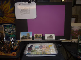
I don't know what possessed me. But when I saw this piece of bright purple paper I knew I had to use it. It actually was a good choice for my subject of yellow green trees. The purple paper would make the yellows more interesting because they are complementary colors. The challenge would be getting enough layers on the unhanded surface. This is a piece of Canson Mi-Teintes unsanded paper.
What I learned: The color of the paper can make I difference in your painting. It can either enhance it or even lead to bad color harmony! Choose the color of your paper with care.
 |
| Purple paper!!! |
If you are a Patreon member be sure to check out this month's paint along video series. I take you step by step from the planning stages to the finishing marks! Share your work on the community page for feedback. Join us at www.patreon.com/karenmargulis
 |
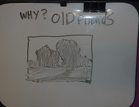
| Making a plan |

Karen this pastel is beautiful. I would never have thought about purple paper for the underpainting. Hope you are having a delightful fall day.
ReplyDelete