 |
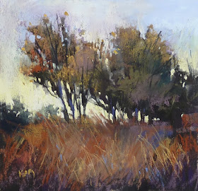
| 'Hanging On' pastel 7x7 ©Karen Margulis sold |
I was recently asked to share my favorite underpainting techniques. I love to experiment but if I have to be pinned down Art Graf would be my favorite. Enjoy this post from the archives which shows you the Art Graf in action!
The best laid plans go astray when inspiration strikes. I am often asked how I come up with ideas for daily blog posts. It is easy when you have great blog readers who are a constant source of inspiration! One painting will often lead to another painting idea. Or a reader will ask a equation or make a comment that gets my wheels turning. The black underpainting idea has taken a life of it's own and so I feel I need to explore it while my interest is there.
It began with doing a black sharpie marker notan on my pastel paper. A reader comment led me to try a more archival technique and so I tried black pastel. I liked both and so I tried to think of other ways I could get an archival black underpainting. Readers suggested inks. I could try ink or thinned acrylic, gouache, oil and even watercolor. (and I will!) But I have another product that I decided to try first.
 |
| Read more about Art Graf HERE |
I decided to try the black Art Graf block to block in my painting. I used it to lightly block in the dark areas of my design.
 |
| Art Graf applied lightly with a start to wetting it down with water |
I then used a brush and water to liquify the pigment. I like how I was able to get some strong dark areas along with some softer drippy areas. When the underpainting was dry, the black areas were fixed into place. It would be a good base for my pastel. It did not fill the tooth of my Uart sanded pastel paper.
 |
| Liquified pigment with a brush |
I used the underpainting as a roadmap. I began with the dark areas and added some purples, greens and orange dark value pastels. The camera flash makes the photo below lighter than it really was.
 |
| Adding the darks |
Next I added the light pastels in the sky. I used these lighter sky colors to start carving the shapes of the autumn trees.
 |
| Time for the lights! |
The roadmap of values was a big help. It helped me keep my values close together. I avoided having too many different spots of light and dark. The underpainting helped me keep it all together. Starting with two values has been fun and so simple! And thanks to my readers I have even more ideas to try!


Bravo Karen your painting art work is very wonderful !!!
ReplyDeleteThank you for introducing me to Art Graf years ago. My favourite is the Dark Brown and it changed not only the look of my paintings but my approach and feel overall. It feels odd not to use them when begining a painting. Thanks and keep up the good work.
ReplyDelete