 |
| 'Winter Visitor' 9x12 pastel ©Karen Margulis available $165 |
Photos are best used for inspiration. But you need to know what the inspiration is!
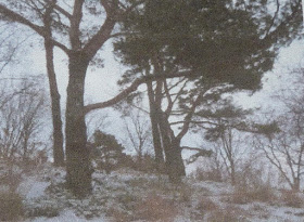
I was drawn to the photo that inspired today's painting. There was something about it that was exciting. It certainly wasn't the multitude of tangled branches and trees. I was so captivated by the wonderful contrast of the yellow light at the horizon agendas the darks of the trees. In fact I didn't even notice how busy and complicated the photo looked until my friends pointed it out. "I would have never chosen that photo! " they told me.
 |
| the original bad reference photo! |
I didn't notice the challenging aspects of the photo because I was so focused on the light at the horizon. That was a good thing though because I had a concept for the painting. I wanted to portray this light and the drama of the touch of warm light against the dark and cold. Knowing what I wanted to say allowed me to decide how I would say it.
I took a few minutes to think about how I would go about getting my message across. I decided I needed to simplify the trees and branches and even the snow on the ground. I would go crazy trying to put in all of those branches and they weren't really necessary.This would allow me to focus on depicting the light.
How to simplify? I blocked in the big tree shape with a piece of black Art Graf. This gave me a nice two value underpainting....dark and light. I added some darker value neutrals to the tree mass before breaking up the big shape with the sky color. It was a slower than usual process as I used negative painting to carve the branches into the tree. I had more control this way and didn't get a tangle of branches that looked stiff and unnatural.
For the distant bare trees I didn't paint individual branches. Instead I used a very light touch and added a middle value shape. This light touch allows the sky color to peek through giving the illusion of bare trees.
Starting with big shapes of light and dark and gradually carving into the shapes was a great way to depict winter trees. It helped me keep them simple and I didn't go crazy trying to copy all of the branches in a way to busy photo. The fun part was capturing the subtle yellow glow that drew me to the photo in the first place.

Chilly !!
ReplyDeleteAwesome !
Thank you, I enjoyed this one immensely. Beautiful. One of your best as far as explaining how it was done, etc, as well as the gorgeous results.
ReplyDelete