 |
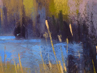
| 'Into the Tall Grass' 11x14 pastel ©Karen Margulis sold |
"To interpret what we see before us, to distill its essence, to point out the wonder and omit the mundane, these are the greater truths that make up the artist's long and honored tradition" Ted Goershner
Photos are great for bringing the memories back. They are great in a photo album or a slide show....memories of times past. But photos are not always so great for painting references. Especially if we try to copy exactly what we see. Do you ever put something in a painting just because it was there in the photo? Do you ever have to explain something in your painting by saying "it was like that in the photo".
I think we are all guilty of this at some point but as we learn and grow as an artist it becomes easier to let go of the photo and just use it as a starting place....as inspiration.
Today I am sharing my reference photo for this painting to show you how I chose to interpret it.
 |
| reference photo...Pawleys Island South Carolina |
The photo has some problems common to bad photos. More on this in a future post.
- The sky is over exposed...you can barely see it. I don't want to paint it this pale washed out color!
- The horizon is slanted. Marshes have to be straight and level so I don't want to copy this slant!
- Bright spot of grass cuts off the left corner. Not the best composition.
- Color of grasses is uniform throughout....hard to establish a sense of depth.
What do I like about the photo:
- I love the blue water and how it leads into the scene.
- I like the colors in the grass.
- I love the sense of the wide openness of a marsh.
- I remember that chilly morning walk where it felt good in the sunny spots.
Now look at the work in progress photos and detail photo below to see how I resolved these issues with the photo.
- I decided to do a warm underpainting since I wanted it to have a touch of the warm sun as I remembered.
- Taking my cue from the meandering creek I slightly altered it's path and brought it into the foreground. I wanted to prevent a look of a fence or barrier of grasses that is present in the photo.
- I made the sky a gentle blue with a deeper blue at the top so that it would make sense to reflect the blues in the water. I also added a warm pale yellow n the sky to relate to all of the yellows in the grasses.
- I straightened the horizon and changed the shapes of the distant land masses so they would be more interesting. In the photo it is heavily weighted to the left.
- I added touches of color in the distance to suggest buildings and boats.
- I developed the grasses first as shapes of color. I decide to put in some individual stalks of grass in places that I hope will lead the viewer through the painting.
- I purposely lef the immediate foreground dark and without detail so it wouldn't stop the viewer from entering the painting. This is in contrast to the photo which has LOTS of grasses and stuff in the foreground! I tried to exercise restraint but it is so easy to get carried away! You have heard it before....leave something to the viewer's imagination!


Thank you for your daily paintings.
ReplyDeletethey are very inspirational and today's has some great hints to correct the bad photo effect.
Thsnks Nan in Australia
This post is so very helpful! I'm a new pastel painter and I struggle with breaking free from merely copying my photo references. I suspect this is due to timidity and the drive to "get it right!"
ReplyDeleteSo helpful! Thank you for your generosity in explaining what you did and why.
ReplyDelete