 |
| 'Take Me There' 9x12 pastel ©Karen Margulis sold |
Today's painting began as a demo for a private student. She is a very talented portrait artist but wanted to include landscape backgrounds in her portraits and figurative work. She needed some quick landscape basics. My goal for the demo was to illustrate the principles of Aerial Perspective...creating depth in a landscape and ways to suggest details rather than paint them in a detailed fashion. The goal was to give her the tools she needed to have a suggested backgrounds that do not detract from her figures.
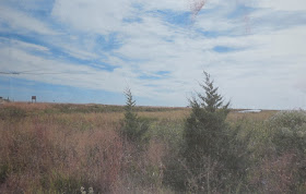
I selected a photo which depicted a simple landscape with a few big shapes. Sometimes the simplest landscapes are the trickiest. Deciding how to make it interesting without putting in too much detail is the challenge.
I decided to use Canson Mi-Teintes paper in Moonstone for this painting and blocked in the shapes with 4 values of red orange. I knew that I would have to exaggerate the effects of aerial perspective in this scene to create depth. If I copied the colors in the photo my painting would most likely look flat. Notice how the colors in the photo appear the same from front to back. I made the field in the distance lighter and cooler, even adding a distant blue landmass. I staggered the trees using slightly different greens in each tree.
I stopped the demo at this point (see above photo) but I knew the painting was not finished. I worked on it for about 30 minutes after the student left.
I decided that the painting needed more texture. The foreground was a big uninteresting shape. I wanted to make an interesting lead in to the painting with out overdoing the grasses and other foliage.
- I sprayed the foreground and trees with workable fixative. This allowed me to build more layers of pastel. I put in more darks and added some peach and lavender.
- I revisited the background. I felt that it needed more punch and few distant bushes or trees. I added a nice heavy mark of yellow orange around my focal trees.
- Then back to the foreground. It still needed something. So I sprayed more fixative letting it dribble. I love dribble texture.
- I added some light flowers...actually dried weeds. I placed then in a way that helps direct the viewer to the trees.
I was now pleased. I always forget just how much I enjoy working on Canson paper. It has a nice soft touch which lends itself to quiet landscapes.


I like reading this and will be looking forward to more.
ReplyDeleteDo you have a favorite brand of fixative?
This is beautiful. Thank you for sharing the lesson. I love Moonstone. It's still my favorite Canson Mi-Tientes color and I often leave part of it showing depending on the subject. Just the right value, hue and intensity to balance values and color against it no matter what I'm doing. Gorgeous painting.
ReplyDelete