 |
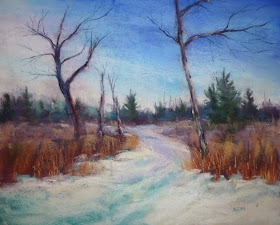
| 'Winter Walk' 16x20 pastel ©Karen Margulis available $275 |
I have been having fun uncovering many of these lost daily paintings. Today I found a stack of larger forgotten paintings. Most of them were pretty bad! But there was one done on Pastelbord that caught my eye. It was 16x20 and probably one of my first winter landscapes. It still had potential so I pulled it from the pile.
Here is the original painting done probably 10 years ago:
 |
| The original painting from the early days |
Here is what I did:
- I made the distant trees lighter and cooler to add more depth to the scene.
- I refreshed the sky adding some pale yellow instead of the pink to make a visual connection between the ground and the sky.
- I refined the trees adding more color and detail. I also added a third small tree.
- I refined the grasses adding more color and more delicate grass marks. (the original ones were to clunky)
- I refreshed the snow and snow shadows and worked more snow into the grassy areas.

And you brought in some violet in the grasses, shimmering strokes that almost seem like an afterimage but liven it all up wonderfully. Great improvements! The color harmony is a lot richer with those violet accents.
ReplyDelete