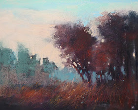
It's fun to play with color. I've been sharing my studies based upon color scheme experiments. Working with the color wheel and color schemes opens up the wonderful world of color to us and gives us tools to move away from local expected color. But how do we make these color schemes work? It isn't enough to choose the colors and throw them on the paper. Where does each color in the scheme go? It is very simple.
It's all about Value. Value is the key to success with color.
You've probably heard the saying the VALUE does all the work but COLOR gets the glory. Commit it to memory. If you create a strong map of values....dark shapes, light shapes and middle value shapes. All you need to do is follow the map with the appropriate value pastel. Trees can be green or fuchsia but as long as the value is correct it will look like a tree.
 |
| Demo painting form my Florida workshop |
Value allowed me to experiment with color in these two paintings. I started both with a two value (notan) underpainting of black and white. I was able to follow this map with dark and light value pastels. I tried a different set of colors for the painting at the top of the page. The result was a completely different mood. Value doing the work!


Ooooohhhhh both of these are fabulous, Karen!
ReplyDeleteWonderful examples of an all-important principle! You really can use any colors, and the way you use color often involves punching up what nature gives us. The top one reminds me of some of the prettier mornings around the farm here. I've seen many of these combinations in nature, but the way you combine colors within the masses definitely punches up some subtle effects to noticeable.
ReplyDeleteIf you look at the world closely enough, there is a lot of orange in green foliage and there are violet tree trunks and so on. I often lean toward a secondary triad in pastel painting because that works so well, but you refined it by tweaking over to a blue-green that carries the sky as well in a previous demo. That has me thinking about jazzing up my skies too!
Pastel shines best when color gets to dance within a strong, clear value pattern. The spices and odd little color tweaks become natural in context. The painting exists in its own world, a happier, saturated, gentle world of broad strokes and interesting textures.
Right now, the trees are a bit unprepossessing. There are a lot of dull brown leafless trees that haven't gotten the notice that it's spring, they mass together sometimes and look like a pile of junk interfering with lovely conifers that have many different shades from lighter yellow greens to deep blue greens and sometimes orange - the cedars are blooming so they have masses of orange on about half of them. I'm not sure if that's the female cedars or the males, but one gender is blooming furiously. They jazz up the conifers around them, which are very varied, not all the same sort of pine. That makes those perfect - but those bare brown leafless trees need to be simplified or left out when I paint the scene. If I'm doing a portrait of place, which I often do, then I want them in, but I'll still simplify and be very careful choosing what's within the painting's borders.
It really depends on what I'm doing for the painting. Am I going for a general landscape or is it a record of a particular place and season? Even with the latter, that involves a lot of design choices and it's similar to what I'd do if I wanted to use a good camera to get a good, publishable photo of the place. So folks concerned with realism - that can still be done, it's just a matter of paying attention to those times and sometimes minute to minute lighting can give you the moments when Nature does paint something awesome.