Visit my Patreon Page for more painting instruction and Paint Along Videos!

Friday, February 28, 2020

Paper Choice Does Make a Difference!


'Treasures of the Marsh'           7.5x5.5            pastel              ©Karen Margulis
available $125

I used to pick the first piece of paper from my pile. I didn't give it much thought. After all paper is paper. Right? But I learned that I was not giving my paintings a fair chance. I discovered the paper choice does make a difference in the overall look and feel of a painting. Pastel application is different on textured papers versus smoother papers. Colors will look different on various colored papers. The more I experimented and explored different papers and colors the more I started to understand the differences and I was able to make more intuitive choices. 

I know this now but it still hit home when I was painting these cattails for my Patreon Paint Along videos this month. In the Paint Along we explored  adding texture to our surface. The texture was fun to work with but a challenge at times! When I finished the painting and editing the video I started to wonder 'what if'  I tried the same painting on just regular sanded paper with no added texture? 

I took out a scrap of sanded Ming Art paper and painted the cattails again. This time the pastel went on like a hot knife through butter! It was such a different feeling to the pastel application and of course the resulting painting had a different look and feel. I found I actually enjoyed painting them both but I also added to my knowledge of how pastel looks on various papers. 

TIP: The more you explore and experiment with various papers and colors the more knowledge you accumulate. This allows you to make more informed and intuitive paper choices for each painting. Paper choice does matter

Join us on Patreon to paint along! www.patreon.com/karenmargulis
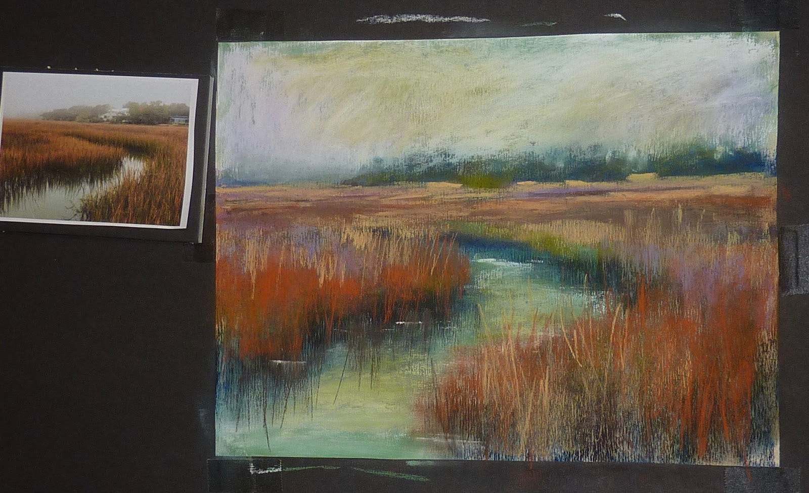
10x8 pastel on textured board


Making a video!

Wednesday, February 26, 2020

New Video Release! Strategies for Using Reference Photos


'A Magical Day'            12x9            pastel           ©Karen Margulis
sold

 Shave pastels!  Yes that's what I said and if you are looking for a twist on pastel painting then you should get ready to shave some pastel dust!   If you been a regular blog reader then you have probably read my posts on the Dusting technique.  It is actually an old technique of applying pastel to paper. I discovered it a few years ago and I have been having fun with it ever since.

What is Dusting?  It is simply another way of applying pastel. Instead of making lines of thick marks, or dots and dashes, the pastel is shaved with a blade or edge of a palette knife and allowed to fall onto the paper (which needs to be flat)  You can either build up a painting with many layers of this shaved dust or you can use the dust for special effects which I did for this wildflower painting.

Dusting can also be used to create snow or water foam and spray. While it is a useful technique it needs to be used with restraint. Too much and it looks like a gimmick. But just enough and used occasionally it creates a magical surprise. 


Below is a photo of the painting in my newly released video demo. This is where the video ended. The video was not about dusting rather it was about using reference photos more effectively. But when I came back to the painting the next day I felt like it needed some punch It was quite blah!  Dusting to the rescue!


You can watch the video here. Be sure to like, comment and subscribe!!!


                                                         https://youtu.be/Ig1rkNRvcU4


I have a box of older pastels that I save for dusting. They happen to be Jack Richeson Hand rolled pastels. I like them because they are the right consistency and the colors are intense....perfect to add punch to a painting. 

HOW TO DUST:  It is simple. Lay the painting flat. Hold the pastel over the painting and use a palette knife to shave the pastel letting the dust fall on the painting. After I am finished dusting I use a piece of glassine paper and the palm of my hand to rub the painting which pushes the dust into the paper. 


                 https://youtu.be/Ig1rkNRvcU4               

Tuesday, February 25, 2020

Revisiting the Dunes with a Limited Palette

'Serenade by the Sea II'            9x12           pastel               ©Karen Margulis
available $175
 I learned something valuable with this exercise. I learned that I can be resourceful. I learned that I didn't need to have hundreds of pastels to paint a successful painting. I challenged myself with this painting and it felt great. It is easy to paint something you've painted many many times. You intuitively know what pastel sticks will give you the right effect. When you have access to all of your pastels you can reach for your old favorites....the ones that already worked.

Something exciting happens when you take those old favorites away. When you are given a challenge of working with a palette of pastels that is limited in colors....both in intensity and in value. I wondered what I would be able to paint with them. I had to work hard. I had to think things through. In the end I had a painting that I liked more than the same scene I had painted with access to all of my pastels.
                                Tip for working with a limited palette of pastels
Ask yourself questions such as :Do I need this area to be lighter? darker? more intense or more dull? Warmer? Cooler? If you need to adjust the value do it by layering lighter or darker values or use black and white. If you need something to be duller try to layer multiple colors or the complement all will create a more neutral color. 


The Aftermath! I used this set of 16 assorted pastels by Daler Rowney

The underpainting is an alcohol wash with a dark blue Nupastel
This is the version I painted with  a larger palette of Terry Ludwig pastels
Which version do you prefer?  You can see the entire step by step demo of the top painting on my Patreon Page. www.patreon.com/karenmargulis

Sunday, February 23, 2020

Working on a Thickly Textured Surface with Pastel


'Beyond Serenity'                   8x10               pastel              ©Karen Margulis
Available $165
One of the things I enjoy about oil paint is the texture. It is easy to apply the paint thickly to get deep and interesting textures. It isn't as easy to get this result with pastel. If you apply the pastel too thickly there is a chance that some of it will fall off since it is a dry medium.

We can get an illusion of which texture with pastel by creating a textured surface to work on. There are several products that are available as pastel grounds that can be applied to a board or paper to give that surface ground for pastel application. Some of these grounds can be applied thickly. When it is dry it provides a textured surface to work on.

I applied a pastel ground of gesso and pumice to an Ampersand Pastelbord. I applied it thickly. But it was almost too thick! I had trouble adding pastel and the surface used up my pastels quickly! It was a frustrating experience. But I did find a solution!

TIP: When the grooves are deep on a textured surface try to add several layers of pastel and push these layers into the grooves. After several layers the application gets easier and you still have a feeling of texture without the rough surface eating your pastels!

close up of texture
I will be sharing this painting as a step by step demo on my Patreon Page in April! Consider joining us! www.patreon.com/karenmargulis

Saturday, February 22, 2020

Remaking Demo Scraps with a bit of Alcohol part II

'Serenity by the Sea'              8.5 x 8.5             pastel             ©Karen Margulis
sold
You know me. I don't like to waste good paper. I often use scraps of pastel paper to illustrate lessons. They are not even complete demos. I call them demo scraps. No matter the size of these scraps I will find a way to reuse the paper even if it means cutting them down to mini size.

Recently I did a video review of a Daler Rowney set of 16 soft pastels. In the video I used a piece of Canson unsanded paper and a piece of Uart to show how the pastels performed on the different papers.  I painted a quick apple demo on each piece.

I decided to reuse the papers. I brushed off as much pastel as I could. Then I used a brush and rubbing alcohol to liquify the remaining pastel to create an interesting underpainting. I used very very little alcohol on the unsanded paper and it did great....no buckling.

Here is what the underpaintings looked like once they were dry.

Remaking demo scraps! 
For the second underpainting I decided a dune scene would work well in the square format. The hints of red and violet provided interest among the green foliage. I added back some red violet which hinted at some of the colorful grasses on the dunes.

Friday, February 21, 2020

Smooth or Bumpy....What Side of Canson do you Like?

'By the Sea'                     9x12              pastel                  ©Karen Margulis
available $175
 I'm taking a poll. What side of Canson Mi-Teintes paper do you prefer?  Answer in the comments if you'd like to share. I am curious to see what most artists prefer.  If you aren't familiar with Canson there is a bumpy side with a honey comb-like texture and a smooth side. Officially the bumpy side is considered the right side or the painting side. If you purchase Canson by the sheet the label is on the smooth side which is considered the back.

Can you tell what side of the paper I used for today's painting of these wildflowers by the sea?

The bumpy side is on the left and the smooth side is on the right


I chose to tone my paper with some bright artificial greens
Here is another poll question: How many times have you started a painting only to discover you were using the bumpy side?  Most artists I know prefer  working on the smooth side of the paper. It is challenging to fight the bumpy texture. I usually work on the smooth side.

So imagine my surprise when I began applying pastel to my wildflower painting. It was the bumpy side! How did I manage to do that! I am usually very careful but in my excitement to start the painting I didn't check.  I had a decision to make. Should I turn the paper over and start again?  I really didn't want to because I had already started toning the paper. Usually that wouldn't stop me. It is much easier to start over at an early stage of a painting.  But  this time I had a 'what if' moment and decided to see what would happen if I continued on the bumpy side. In this case I liked how the bumpy texture enhanced the texture of the flowers.


A close up of the flowers. Can you see the bumpy texture?

Wednesday, February 19, 2020

The Power of Suggestion When Painting Rocks

'Million Dollar View'                 9x12               pastel                 ©Karen Margulis
available $175
 Do rocks intimidate you? Are you frustrated with the rocks you paint? My rocks used to look like potatoes!  They looked like rounded squishy looking blobs of brown. And when I tried too hard to make them better they didn't look like the rest of the painting. They were overly detailed and they didn't fit in with the looser marks I used for the rest of the painting.  I avoided landscapes with rocks.

Then I learned about the power of suggestion. I realized that I didn't need to render the rocks with great detail. I didn't need to paint every nook and cranny. I also started to look at the planes on rocks. I started to notice the big patterns of light and shadow. If I could suggest these planes of light and dark with simple marks with the side of my pastel....I could suggest the rocks.

"Suggest and let the viewer do the rest"

Look at the photo below. I didn't draw these rocks and color them in. I simply made marks to suggests the darker shadowed areas and marks to suggest the light on the rock planes. Taken out of context they don't look much like rocks. But in the landscape painting the viewer can deduce that these marks are indeed rocks.


A quick alcohol wash underpainting

Monday, February 17, 2020

What Do You Do With Demo Scraps? Part I


Today I am sharing the second remake of a demo scrap paper. If you missed the first post here are the details. 

You know me. I don't like to waste good paper. I often use scraps of pastel paper to illustrate lessons. They are not even complete demos. I call them demo scraps. No matter the size of these scraps I will find a way to reuse the paper even if it means cutting them down to mini size.
Recently I did a video review of a Daler Rowney set of 16 soft pastels. In the video I used a piece of Canson unsanded paper and a piece of Uart to show how the pastels performed on the different papers.  I painted a quick apple demo on each piece.
I decided to reuse the papers. I brushed off as much pastel as I could. Then I used a brush and rubbing alcohol to liquify the remaining pastel to create an interesting underpainting. I used very very little alcohol on the unsanded paper and it did great....no buckling. 

Here is what the underpaintings looked like once they were dry. 


This demo scrap was a bit tricky. Because I couldn't really spread the color with a larger amount of alcohol I was left with a red blob on my paper. How could I use this red blob?  I looked through the pile of marsh reference photos since I was still working on a marsh series. I found a photo with a Great Blue Heron on a a small island in the marsh. I could incorporate the red blob into the grasses and the island. 

I did a quick drawing to place my heron. The rest of the painting came together with several layers of soft pastels. I used Nupastels for the details in the grasse. This one was fun!


Saturday, February 15, 2020

New Video Demo: My Tip for Painting Vibrant Reds!


'Color Me Happy'                10x8                pastel                  ©Karen Margulis
available $155

I was in the mood to paint some poppies yesterday. I decided to run the camera and found that I couldn't stop talking! I made it into a video. You can see it on my YouTube channel. The link is below:


YouTube is a great resource! If you have not checked out the wealth of art videos on YouTube be sure to give it a try. I have a YouTube channel and I try to post something new every week. This is in addition to my regular Patreon videos and lessons. I'd love for you to subscribe to my YouTube channel and check the notification bell so you know when I upload a new video!  


Friday, February 14, 2020

A Few Tips for Painting Poppies

'Joyful Garden'               11x14       pastel               ©Karen Margulis
available $175

It is Valentine's Day! How about a garden instead of a bouquet of flowers? I had another piece of paper that I used for a demo/lesson and I didn't want it to go to waste. I brushed off the pastel and lightly wet it with alcohol. It was Canson Mi-tientes so I couldn't get it too wet. I was left with a gray underpainting. It was now ready for a beautiful garden of flowers! My reference photo had pink poppies but I made mine red.....because I could!  Here are a few more tips for painting poppies. 

  • I don't draw the flower first. I simply draw a circle shape where I want the flower to go. Then I use the SIDE of my pastel to paint large shapes that make up the petals. If I draw my flowers I tend to want to color them in and they look stiff.
  • I use three or four values of the poppy color to develop the flower. Even if I don't see it in the photo I like to begin with a dark, brick red shape (for red poppies). I add middle values to create the form.
  • I avoid using a pale or very light value red to paint the highlights. I find light pastels with too much white in their makeup lead to washed out flowers rather than vibrant flowers.
  • If I want my poppies to appear sunlit I will use a warm color such as red-orange for the light areas.

Wiped out a demo for this painting 

Thursday, February 13, 2020

Does the teacher ever take a workshop?


I am excited about my workshop schedule for 2020! I have 7 workshops planned and I am finalizing my agendas for the workshops. I can't wait to share in person! If you are considering an art workshop this year have a look at my schedule.

I get this question occasionally.....do I ever take workshops? I used to take on workshop every year and they have enriched my work and my knowledge immensely. Recently I haven't had as much time as I'd like but this year I am doing something for me! I am going to attend the Plein Air Convention in Denver in May. It will be my third PA convention and I always learn so much from the presentations and demos and just watching and talking to other artists. I am looking forward to being a student!!

If there wasn't a conflict with my trip to the Plein Air convention I would definitely be attending this workshop by Olga Abramova! I met Olga at the IAPS convention and fell in love with her work. I would love to take her workshop! Here is a link if you are interested in learning more https://www.redrockpsnv.org/event-info/olga-abramova-workshop-emotional-light-and-color-in-florals-and-more-1


Tuesday, February 11, 2020

Pushing the limits of a Budget Pastel Set

'Simple Pleasure'                 9x12                 pastel                  ©Karen Margulis
available $175
 I was a bit worried. Did I over promise? Would I be able to deliver? This month I have been working with a set of 16 assorted soft pastels by Daler Rowney. They are a challenging selection of bright middle value colors. I challenged myself to do a demo video using ONLY the set. Whew!

It was a lot of fun though. I didn't have any light value pastels for the sky and water so I knew I would use the white pastel to lighten my colors. I went out on a limb and added some yellow and green to the sky. Did it work? I think it creates an interesting mood!

TIP: Because of the limited value and intensity range of this set I had to make use of the dark blue and the white to change the value of some of the colors. I also needed to layer colors to dull them down. It was a great learning experience!

The reference photo and painting WIP
I know many of you are Patreon members so be sure to see this video demo of this painting. If you aren't members maybe this is the month to join! Especially if you have been wanting tips for working with a budget set of pastels. www.patreon.com/karenmargulis


The aftermath.....Daler Rowney Pastel set of 16 assorted pastels

Sunday, February 09, 2020

Trying Hand Made Paper for the First Time


'Snow Day'                8x10 Pastel on Handmade Paper       ©Karen Margulis
available $175

I bought this paper last year but it sat on the shelf. It was buried under a pile of other papers so I had forgotten about it. I was excited to try it....Shizen Designs handmade paper from India. I was intrigued by the deckled edges of the paper. I was imagining how it would be interesting to mount the painting and frame it so the edges would show! But how would the paper take pastel? It is advertised as pastel paper. Have a look:


I decided to give the paper a try with a simple snow scene and using a limited palette of  neutral colors. I also decided to use charcoal to sketch the trees and add detail. It was an interesting departure fro me.  I enjoyed the soft feeling of the paper. The uneven surface was tough enough to grab the pastel. It was not an even texture which added to the charm. I like the neutral colors in this pack. I will definitely do more experiments with this paper and will report back!


Friday, February 07, 2020

Time to Reimagine a Big Painting!


'A Little Piece of Heaven'                    18x24                pastel                ©Karen Margulis
available $425
  Should a Demo painting be finished? Often I do not finish a demo in a workshop or presentation. Demos are teaching opportunities. Their purpose  is to help me demonstrate concepts. I like to talk about what I am doing and answer questions. In a workshop  I  also like to make sure the students have time to paint so I don't wish to take up hours to demo. 

On Tuesday I had the honor and pleasure to do a presentation and demo for the Booth Artist Guild in Cartersville, Georgia. It was so much fun! I shared a lesson on how to create better landscapes and I did a pastel demo with a watercolor underpainting. I was running short on time so I didn't get to finish the demo. Here it is in the photo below.


The original demo

I had to decide if I wanted to finish the scene I had started in the demo......or REIMAGINE and create a new reality. The demo served its purpose....teaching my technique for a pastel painting but I wasn't excited to finish it. It was time to reimagine.

 re·im·ag·ine
ˌrēiˈmajən/
verb
  1. reinterpret (an event, work of art, etc.) imaginatively; rethink.


    When I brushed off the pastel and added some alcohol to create a mysterious underpainting I had to find a subject to fit this new ghost image.  I gapped to pull out the perfect photo. It fit almost exactly to the underpainting. It was meant to be!  I truly enjoyed the challenge of reimagining the painting and taking advantage of a nice big mounted bart board!


Brush off the pastel and wet with alcohol

Reimagine the subject

The first few layers blocked in


Evaluating the painting to decide on finishing touches

Wednesday, February 05, 2020

Have You Tried a Baby Wipe Underpainting and Didn't Like it?

'Serenade by the Sea'               9x12               pastel              ©Karen Margulis
available in my Etsy shop $175
 I have used a baby wipe for underpainting in emergency situations. They are great for doing a wet underpainting when you don't have access to a liquid. But I have heard from others who have tried this fancy technique that they didn't like it!  The issue was that the baby wipe was hard to use on sanded paper and caused the wipe to break up and leave fuzz.

I get it. It is strange to have a paper covered with soft fuzz. But I encourage you to embrace the fuzz! I do and I like the results. If you consider the fuzz to be simple added texture you might see the benefits!

Take today's dune painting. I did a baby wipe underpainting and I did end up with a bit of fuzz covering my paper. As I painted with my pastels they fuzz was moved around the paper and actually acted like little piece of pastel spreading color in unexpected ways! I created interesting texture that I enjoyed.

What about the fuzz the finished painting? Most of it fell off as I painted and anything piece that remained were easily removed. In the end the fuzz was fun! So if you tried a baby wipe underpainting and didn't like it why not give it another try!

After using the wipe to wet and spread the pastel


Sunday, February 02, 2020

New Video Review Series: Pastels Under $50!


What can you paint with 16 pastels? That is the topic of the month. Today I am sharing my video review of a budget set of assorted pastels.  I will be reviewing pastels to fit all budgets but I begin with a budget set.  Click on the link below to watch the video.


If you'd like to see what you can do with this set in more depth consider joining us this month on Patreon.  www.patreon.com/karenmargulis