Just a quick update today. I am off to paint and teach my workshop at Woodville House. I had a fun day yesterday painting around Wexford. I wrote a great long post that disappeared because my blogger apps no longer work with IOS 11. So I am trying a new app. I'll try to give a better report tomorrow! Follow me on Instagram @karenmargulis for more trip photos!
Monday, July 31, 2017
Saturday, July 29, 2017
Packing Pastels for Any Type of Trip
![]() |
'Summer Breeze' 2.5 x 3.5 pastel ©Karen Margulis |
If you have followed my blog then you probably know I have made it a priority to downsize my pastel supplies for traveling. I have been through so many boxes and bags and easels that I have lost track. I have come to the conclusion that there is no one size fits all solution for plein air set ups and supplies. Every trip is different. Some trips are not even dedicated painting trips so how do we decide what to bring?
No matter what the purpose of a vacation or trip it pays to keep your supplies light and simple. I call it Plein Air Lite.
My pastels supplies
No matter what kind of trip I am taking I always throw in my Heilman single sketchbox (Love!) I will be able to paint some 5x7s as well as my minis (2.5 x 3.5) Everything fits into a soft sided lunch box. I have a 5x7 portfolio book filled with paper which doubles as a finished painting holder, a piece of foamcore backing board, baby wipes, a washcloth to protect my painting surface and some mini Bankers's clips to clip my paper to the board.
The small zippered pouch on the right hold the precut paper for my mini paintings and an extra packet of wipes.
Along with the pastels I sometimes bring some sketching tools for the times when I just want to sketch.In the photo below I have a small sketchbook and watercolor postcards along with a set of Caran d'ache watercolor pencils and a water brush as well as some black vision pens. These sketching supplies vary depending on my mood and supplies I am playing with!
The lunchbox with pastels and the zippered pouches all fit nicely in my backpack. I also have room for some art books and magazines. I have all of the supplies I need for a creative and relaxing....and LITE vacation. I can easily throw one of these items into my beach bag to backpack when going out for the day.
Below are a few mini pastels. I like to do these small studies using the lunchbox pastel kit. Each one measures 2.5 x 3.5 inches.
Friday, July 28, 2017
Tips for Flying with Pastels
![]() |
'Summer Blues' 2.5 x 3.5 pastel ©Karen Margulis |
As I write this post I am hearing the news that electronics larger than a cellphone will need to be taken out of your bag at airport screening. Ah the joys of air travel! Going through airport screening doesn't have to be something to dread. You just need to be prepared.
When I travel with pastels I usually bring them in my carryon. (Not always though but I have hard sided luggage and have never had a problem with pastels being crushed or broken) But 98% of the time I carry on my pastel box. I don't take it out of my backpack and would say that I am stopped for extra screening maybe 10% of the time. Most of the time I go right through! Here are a few tips:
- Allow extra time to go through security.The last time I was pulled for screening it took the agent 20 minutes just to get to my bag. Imagine the stress if you are cutting it close to your flight time! Give yourself a cushion. It is much better to get to your gate early than stressed in the screening line.
- Label your box. I have a label on mine that reads: Artist Chalk Pastels along with my contact information.
- The TSA agent will want to open your pastel box. You are not allowed to touch it and you can nicely offer to explain how to open the box. Some agents will be nice about it and some not as pleasant. Be pleasant no matter what!
- Watch for packing stacks of books or magazines. The last couple of times my luggage was pulled it wasn't the pastel box that they were concerned about. It was the pile of books in my suitcase!
Below I am sharing photos of the pastels I am bringing to Art in the Open. I am bringing both of my Heilman sketchboxes....the double for use on my tripod and the single for the times when I just want to sit at a table and paint. I have a selection of Terry Ludwig pastels in the bigger box and Giraults in the single box.
For more information on flying with pastels check out this great article by Richard McKinley:
http://www.artistsnetwork.com/articles/art-demos-techniques/pastel-frequent-flyers-tips-for-navigating-air-travel-with-art-supplies
Thursday, July 27, 2017
Packing for a Plein Air Festival
![]() |
'Passing By' 2.5 x 3.5 " pastel ©Karen Margulis |
You might think that I am good at packing with all the traveling I do. In reality it is very much a learning process that is complicated by the type of trip I am taking. If I am driving then I am free to take as much as I can fit into the car! If I am teaching a workshop in the US I usually ship a box of supplies including bigger paper and my visual aids. If I am teaching overseas I have to downsize considerably. And pair a workshop with a week of painting in a Plein Air festival and it is a challenge to keep it all light and manageable.
It took me a full day to pack my art supplies for Art in the Open. I took pictures of my progress as part of an Instagram story (stories disappear after 24 hours) so I thought it would be fun to share them here along with a little explanation. Enjoy!
I am teaching two 3 hour workshops during the festival but I will also be painting everyday. So I'll need enough art supplies. I also want to travel light with only one suitcase and my painting backpack.
I will have my pastel box and paper in my backpack which I will carry on the plane. I will be able to paint even if my suitcase is delayed (I won't say the 'L' word)
I have some handouts and goodies for the workshops. I always carry on the handouts and my folder of travel visual aids so I can teach even without luggage. One must always be prepared.
To optimize space in my suitcase I put things in baggies and roll anything I can. I will also roll my clothes and put them in packing cubes.
![]() |
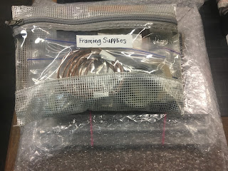
Framing supplies: wire,wire cutters,framing tape,backing paper precut, double sided tape, scissors.This bag has to go into my checked suitcase but I will carry on the frames. |
This is a Plein Air Festival and there will be an exhibition at the end of the week. This means I need to have frames with me! I plan to paint small....5x7 and 8x10 do I have three lightweight frames with me. They are wrapped in bubble wrap envelopes. I will carry the frames in the plane. I will be bringing a tote bag on the plane in addition to my backpack. I don't really want the extra bag but I need it this time. I got a fantastic Baggallini tote on eBay which makes it easier:)
Above is a photo of my painting backpack. This is an Orivs Businessman backpack recommended by Stan Sperlak. It is a great bag! You can see that it fits my Heilman double sketchbox, tripod, easel mast (in the blue bag) , bag of painting extra supplies and first aid kit. There is still plenty of room for miscellaneous gear....snacks and water. I love this backpack because it sits flat on the ground.
The new Baggallini tote will not only hold my frames and handout packets but it will hold my comfort items for the flight and beyond. I am taking my iPad mini, camera, notebook, umbrella, travel blanket and inflatable pillow infused with lavender, snacks, miscellaneous comfort items.
One of the most important things to pack for a Plein Air Festival are pastels and papers. It took another full day to choose the pastels for the trip. I'll share that process in tomorrow's post.
NOTE: I will do my very best to post to the blog while I am away. Sometimes time and technology don't allow it. I will also be posting updates and photos on Facebook and Instagram and I'd love for you to follow along there. Facebook: Karen Margulis Instagram: @karenmargulis
Wednesday, July 26, 2017
Have You Tried Multimedia Artboard?
![]() |
'Summer Memories' 8x10 pastel ©Karen Margulis available $145 |
I first tried Multimedia Artboard several years ago at a Bill Creevy workshop at IAPS. I forgot how much fun it is to use. If you are looking for a support that will not wrinkle and warp, a surface that is practically indestructible then you need to give this board a try. I remember Bill telling us that even acid wouldn't destroy it! All I know is that it will take all the abuse you can dole out.
Multimedia Artbboard makes a sanded surface for pastels as well as a non sanded surface. It is as thin as paper but stiff and very light. I found the sanded surface not gritty enough for me so I had taken the liberty of brushing on my own pumice and guess mix. I tinted some boards red violet and some orange.
Read more about Multimedia Artboard here:http://multimediaartboard.com
![]() |
Multimedia Art Board with tinted pumice-gesso ground |
I selected a piece of the purple toned board. I was excited to see how the random brushstrokes would work for my painting. I liked the texture but decided to push the first layer of pastel down into the grooves. I used my fingers. I used several applications of workable fixative to build up layers and create more texture.
Since this board take a lot of abuse I could have easily done a wet underpainting. In fact I could do as many wettings as I wanted and this surface would not buckle. This is the kind of surface that should net be thrown away. There is always something that can be done to rescue a failed painting even if it means trying another medium on top!
![]() |
Block in....click to enlarge and see texture |
Tuesday, July 25, 2017
Warming Up for a Plein Air Adventure
![]() |
'Gentle Beauty' 5x7 pastel ©Karen Margulis available $65 |
Read all about Art in the Open here:
Since I am already packed I decided to practice my small and quick field study approach....warming up with some moody green landscapes. So far there appears to be no sun in the forecast but I am prepared for any weather!
![]() |
The block in for a quick study |
![]() |
another quick study |
Monday, July 24, 2017
Some Important Thumbnail Advice
![]() |
'Walk on the Wild Side' 9x12 pastel ©Karen Margulis available $165 |
" There seems to be several ways to do a thumbnail ....a bit confusing!"
I agree! It can be confusing. Every artist has their own way of doing thumbnails. And if you study from other artists pretty soon you will have learned several different approaches. There are no right or wrong ways to do a thumbnail. Some may be more effective than others. Some might work for you but not for me.
My advice to my reader was to find a way to do thumbnails that makes sense and works and stick with it at least until you master it. We run into problems and get confused when we try too many things without mastering any.
I have been using the same thumbnail technique consistently for the past several years. I do a small 3-4 simplified value study. I now sometimes to a 2 value study. I like to use index cards and I like to draw a box for my thumbnail. That's it. I haven't varied from this method. I am comfortable with it and I know it helps me simplify and give the painting a good start.
It is easy to get confused when presented with too many choices. Pick one. Master it. Then worry about trying something else.
Remember this:
![]() |
Starting the painting using the thumbnail. The reference photo is on the right. |
I have been using the same thumbnail technique consistently for the past several years. I do a small 3-4 simplified value study. I now sometimes to a 2 value study. I like to use index cards and I like to draw a box for my thumbnail. That's it. I haven't varied from this method. I am comfortable with it and I know it helps me simplify and give the painting a good start.
It is easy to get confused when presented with too many choices. Pick one. Master it. Then worry about trying something else.
Remember this:
"You can do anything but not everything" David Allen
![]() |
My three value thumbnail on an index card |
![]() |
I did a wash with Caran D'Ache Neocolor II crayons and water |
![]() |
The dried underpainting....ready to paint! |
![]() |
The first layers. I started with the darks. |
Saturday, July 22, 2017
Three Good Reasons to do Your Thumbnails
![]() |
'A Beautiful Life' 8x10 pastel ©Karen Margulis available $145 |
It is friendly reminder day! Maybe you have been very good and consistently do thumbnails or small value studies before painting. Or maybe you are like me and often skip this important step. I don't know why I don't make it a part of my studio painting routine. I do thumbnails for plein air and I know they help. As I shared the importance of doing black and white thumbnails with a student it reminded me just how much they do help!
![]() |
I use an index card and mat board frame for my thumbnails |
Remember to take the time for thumbnails. They don't take long and it will be worth the effort. Here are three reasons:
A simple 4 value thumbnail |
1. Thumbnails save you time and paper. It is much better to figure out if your composition will work in a quick study than to waste good paper making corrections to a composition with issues. In my thumbnail (above) I saw immediately that the mountain shape was the same as the shape of the treeline. I also didn't like the shape of the water. I made adjustments when I blocked in the painting.
2. Thumbnails help us simplify a busy reference. My photo was filled with lots of bushes and trees...lots of spots of light and dark. The black and white thumbnail allowed me to simplify the busy stuff into a few bigger simple shapes.
3. Thumbnails make you a better artist. Doing thumbnails is like doing pushups....they make you a stronger painter. They are exercises that gradually build your ability to see value and shapes and what makes a good design. Thumbnails add up...so don't neglect them!
If you would like to explore more about doing thumbnails and a method for using them you might like to read my thumbnail posts here:
Five Steps to a Good Thumbnail
How to Make Thumbnail Studies Fun
Friday, July 21, 2017
Friday Fun: Embrace Paper that you Hate
![]() |
'Discovering the Magic' 9x12 pastel ©Karen Margulis available $145 |
Hate is a strong word. I try not to use it. Maybe I should say strongly dislike but when you are painting on a paper that you struggle with it is easy to say the 'H' word! I am often asked about my pastel paper preferences....my likes and dislikes. I try to be diplomatic with my answer because everyone has their own preference. If I hear a student complain about a paper brand I usually try to encourage them to find a way to make the paper work....try another pastel type for example.
But I am going to share a deep dark secret......I do have a paper that I strongly dislike. I today I thought it would be fun to confront my aversion and make it work. And in the end I discovered something new.....I don't really dislike the paper at all!
![]() |
my reference photo |
For today's Friday Fun painting I decided to try a piece of my nemesis.....Art Spectrum Colourfix. It has not been a favorite of mine and so I haven't bought any in years. I was recently given some paper and pastels (more on this soon) and there was a pack of Colourfix in the pile. It was time to revisit this paper. Scroll down to see the progress on this light blue piece of colourfix 9x12.
*****The response to my question about signing your work has been fantastic. I will need more time to compile all of your answers. Thank you so much for your response!
Thursday, July 20, 2017
When Do You Sign a Painting
![]() |
'Return to the Marsh' 8x10 pastel ©Karen Margulis available $145 |
Signing my painting is an important ritual. It means I am feeling good about it. It means I will stop and evaluate before making another mark. Signing slows me down!
After I sign the painting I take a break. I give myself some time and distance. I leave the painting on the easel and glance at it from time to time. I will return to it and touch it ONLY if I know exactly what I need to do. Usually I never touch it again. It's funny how a painting is often finished before we think it is. Signing and stepping back keeps the painting from being 'finished off'.
![]() |
My signature is my initials....Karen Elizabeth Margulis |
CAN YOU HELP?
I am working on a blog post and video on signing paintings and I'd love to hear from you. If you'd like to share your answers to the following questions pleas do so in the comments.1. How do you sign your name? Initials? Full name? First name only?
2. What do you use to sign your name?
![]() |
Isn't this the coolest bag? |
Painting notes: 8x10 on Uart 500. Schminke pastels for the yellow flowers. Terry Ludwigs and Diane Townsend for everything else.
Wednesday, July 19, 2017
A Treat for Artists!
![]() |
'Garden Party I' 8x8 pastel ©Karen Margulis available $145 |
I was organizing supplies and listening to the program stopping now and then to jot down something interesting. It was a great topic and I was happy to learn of some blogs I wasn't familiar with. As I listened I was completely surprised to hear my name mentioned! I was one of the blogs being shared on the show! What fun!
In the last few days I've been going back and listening to some of the programs I missed. They are all filled with great information and Leslie and her cohosts are so enjoyable. It feels like you are listening to old friends!
Below is the link to the program on top art blogs. You can also visit Leslie's website and the section on AHA or Artist Helping Artists. http://www.saetastudio.com/artists-helping-artists
Tuesday, July 18, 2017
A Tip for Painting a Very Busy Landscape
![]() |
'Down in the Clover' 10x8 pastel ©Karen Margulis available $175 |
I've decided I like my meadows wild and free. The more tangled and out of control the more I intrigued I am. It isn't easy to paint though. I don't want to totally tame it but I also don't want to get lost in the busyness of the scene. We know it is important to simplify. But how do you simplify and still keep the feeling of the freedom of the flowers and grasses of the meadow? The answer is easy.
Paint the flowers and grassy stuff last.
Too often we get excited about the colorful flowers and interesting shapes and textures of the grasses. We rush to put them into our painting. The problem we run into is that the flowers are not anchored.....they are floating on an unfinished background. We then have to add all of the grassy stuff and before we know it we have a overly complicated overworked painting.
In today's painting I simplified the busy meadow by painting the big simple shapes of the background first....the trees and the dirt. Scroll down to see the progress shots.
![]() |
my reference photo....another Maine summer meadow |
![]() |
block in of the big shapes using three values |
![]() |
Staring with the trees and the sky |
![]() |
midway through the painting |
Then and only then will I put in the details of the grasses and flowers. I use harder pastels for these calligraphic marks. I am free to put in as much detail as I want. For today's painting I decided to put in more detail in the grasses than I usually do and had a great time!
![]() |
close up |
Subscribe to:
Posts (Atom)