Visit my Patreon Page for more painting instruction and Paint Along Videos!

Sunday, September 30, 2018

Can You Do An Oil Underpainting with Water Soluble Oils?

'Together Forever'              12x9        pastel        ©Karen Margulis
I had been experimenting with oil stain underpaintings last month and had a good question from a reader. Have I ever tried an oil underpainting for pastels with water soluble oils? I've never tried it so I didn't have an answer. My initial thought was that while it would certainly work , the results might not be as interesting as regular oil paint. Part of what makes the interesting spider web like drips with oil paint is the reaction that occurs when the mineral spirits evaporates. Would water do the same thing?  I had to find out.

I took out some old water soluble oil paints to give them a try. The results were very strange. The paint didn't want to stick to the paper. It would go on but when I trued to brush more paint on the sanded paper paint would come right off. In the end I was left with this very strange underpainting.

the underpainting done with water soluble oil paint
Now you know I don't like to waste good sanded paper. In this case I had used Uart 500 sanded paper. So I let the underpainting dry and set it aside. I decided to use it for today's tree painting. As I painted I kept on thinking that the results were strange. The paint should have stuck to the paper. Maybe the drips wouldn't be the same but the paint should have stuck! I was a bit disappointed. 

As I wrote this post and had a closer look at the photo of the underpainting I think I know what might have happened! In my haste to try the water soluble oils I didn't remember that they were water soluble......I think I used odorless mineral spirits instead of water. I am not sure that is the case so further experimentation is in order!  I did have quite an interesting underpinning to respond to and in the end that is really what matters!

half way through the painting 
Have you tried water soluble oil paint for underpaintings? Share your experience with us in the comments.

What is happening on Patreon this month
The month of October is devoted to studio practices. I will be answering those important questions such as how to photograph your work, storage, shipping pastels, signing work and much more! In addition I will have painting demos such as a photo demo for today's tree painting. Join us for just $4
www.patreon.com/karenmargulis

Thursday, September 27, 2018

Underpainting 101: The Alcohol Wash


'Ribbons of Gold'       12x12       pastel       ©Karen Margulis
available $195
Baby Nora is here! My granddaughter was born yesterday so I am away from my studio :)  Enjoy this post from the archives and baby photos coming soon!

The very first underpainitng technique I ever tried was a simple alcohol wash. I loved it but thought I was cheating! It seemed as if my painting was half done after the underpainting was dry! I have now experimented with many underpainting media and techniques but I still enjoy the good old alcohol wash. So tonight after a long day of non painting chores I decided to play with this favorite!
Here is the resulting underpainting. I used Nupastels and 70% rubbing alcohol.


12 x12 on Uart 500 grit sanded paper

  • An ALCOHOL WASH is simply a technique used to liquify pastel creating a wet underpainting. Using a paintbrush and 70% rubbing alcohol the artist wets the pastel creating a wet wash. Pastel can also be liquified with water and Odorless mineral spirits with slightly different results. ( I have also used vodka which works great!)
  • Sanded paper or paper that can take a wet wash is needed. Note that some sanded papers do not take a wet wash. (LaCarte)
  • It is best to use a harder pastel for an alcohol wash. The softer pastels with more pigment than binder tend to get thick and gummy when wet. I have had success with softer pastels when I apply them very lightly.
  • Take your time! You are turning pastel into liquid paint....like gouache ...so take advantage of this and slow down and use the brush to paint! Use brushstrokes to help describe what you are painting. It is not just a matter of getting everything wet....slow down and make the underpainting just as important as the pastel application.
  • Embrace the drips! One of the wonderful things about wet underpaintings is the opportunity for the unexpected! Let the pigment drip and mix and mingle!
Do you have any tips for doing an alcohol wash? Feel free to share them in the comments!

If you would like to explore underpaintings in depth then I invite you to try my Patreon page.We are just wrapping up 2 months of study on all things underpainting! www.patreon.com/karenmargulis


Tuesday, September 25, 2018

One Great Reason to Love Pastels

'Symphony of the Seas'        16x20         pastel         ©Karen Margulis
available $300
 There are many reasons of course. Pastels are quite easy to love once you get your hands on some good ones. They are vibrant and luminous and intense and subtle. They are versatile and can be used in so many ways and with so many other materials. I could go on and on singing the praises of pastel.
But today I was reminded of yet another reason to embrace pastels.
 Pastel is a very forgiving medium.

If you aren't happy with a painting it is very easy to make corrections.  There is no such thing as the point of no return with a pastel painting.  There are always ways to revive a painting gone bad. (I have done my fair share of putting this to the test!) You can even paint over a painting without having to scrape or wait for it to dry. It is the perfect medium for impatient artists like myself.

I pulled out an older unfinished demo from my pile. It was a beach scene and I had added some pink beach roses to the dunes. The painting wasn't finished and frankly it was a mishmash of things that I was demonstrating at the workshop. Demos can be like that.....tools to show certain concepts or techniques.  The painting had good n=bones but it needed help.

The original unfinished demo painting
I decided that I wanted to get rid of the pink flowers. I wasn't feeling them!  I looked through my beach photo pile and found one that I could use for inspiration. I likes the subtle colors in the photo and the Queen Annes lace rather than bright colorful flowers.

I sprayed soem workable fixative over the dune grasses of the demo painting and set to work to recreate the scene. It was very easy to go over the original painting with fresh pastel marks. I did use some workable fixative to restore some tooth in the grassy areas but other than that I just painted right on top of the original.  It was like the original painting became my underpainting. I love that about pastel!

my inspiration photo for the redo
What's happening on Patreon?
We will be exploring studio practices for the month of October. I will be sharing tips for signing your work, correcting mistakes, photographing work, shipping, storage and more. Be sure to sign up to join us! It is a $4 monthly subscription and as always I appreciate your support both here and on Patreon! www.patreon.com/karenmargulis

Monday, September 24, 2018

Free Yourself with a Random Underpainting

'Welcome Autumn'            6x8           pastel          ©Karen Margulis
available $125
“It is very good to copy what one sees; it is much better to draw what you can’t see any more but is in your memory. It is a transformation in which imagination and memory work together. You only reproduce what struck you, that is to say the necessary.”-Edgar Degas

 It really is amazing. We have the ability to retain so much information and to recall it at will. This ability can help us create stronger paintings if we let it. But we often don't allow it to happen. We become slaves to our references. If we work from photos they often become a crutch. It is a scary thought to put the photo away and work from our memory and experience with the subject  of the photo. But giving ourselves the freedom and permission to put the photos away can result in paintings that have more meaning. We tend to only include what we remember....what meant the most or made the biggest impression.

TRY THIS:  Create a random underpainitng of any type. Don't plan for what you will paint on the underpainting. Just play with shapes and colors. I call these Random Underpaintings. When the underpainting has dried look at it and see what it reminds you of. Then paint that place or thing from your memory. My random underpainting reminded me of yellow fall trees    maybe the cottonwoods of the Southwest. I based my painting on memories of these trees.


My random underpainting


Saturday, September 22, 2018

Quick Photo Demo and Tips for Painting Grass


'Summer Tango'        16x12       pastel        ©Karen Margulis
available $175
My grass painting has evolved. I have gone through the stages from painting every blade of grass with stiff fence-like marks to big swaths of green with no detail. As my style evolves the grass goes along for the ride! Lately I am interested in getting more depth in my grassy areas of a painting. Even in closeup viewpoints I want the viewer to feel like they could put their hand in the grass and not just on the top layer.  To do this I have to build up many layers of complexity. I thought it would be interesting to show you a step by step build up of these layers.

Here are a few tips to help your treatment of grass in a painting.

  •  Avoid painting individual blades of grass. Think instead of the big underlying shapes or blocks of grass. Pull out and paint a few blades. Allow the viewer to participate and fill in the rest. A few well placed blades will read as grass.
  • Using the long edge of a soft square pastel use the press and lift method to leave a print of a piece of grass. Do a few but be careful not too have them spaced too evenly or all marching in the same direction.
  • Use the top edge of a harder round pastel and roll it leaving a broken line of grass.
  • Lay down a block of color and then draw some lines of grass with a thin hard pastel. Draw a SENSITIVE line. Have a light responsive touch so the line isn't to thick or regular. Practice sensitive lines.
  • Paint on a heavily textured surface. Glide the pastel over the texture and it will look like grasses without putting in a blade!
  • Underpainting! I like to use an alcohol, turpenoid or oil stain and allow the drips to create the grasses.


The underpainting is really just an old painting that I wet down with
rubbing alcohol to create a wet wash. There are no drips because the pastel was so thick.

The beginning stages.I black in the flower placement and use several layers
of dark pastels to make uptake 'dirt' in the grass. The dark that will hold all of the grass together.

I build up more layers of dirt using workable fixative to
give me more tooth for even more layers. I also build up the flowers and layer blues in the sky.

Next I start to add the thicker excess of grass and weedy foliage.
See how the green pops against the dark 'dirt'. 

Once the larger pieces of grassy stuff are in place I start to cover them with thinner marks of grass.
I use a variety of hard pastels to paint some 'dancing' linear grass marks.
You can see that the grass in made of layers form dark to light and from no detail to more clarity.

The finished painting.

Thursday, September 20, 2018

Simplifying a Complicated Landscape

'The Way Through the Woods'           9x12           pastel         ©Karen Margulis
available $165
 This is another landscape that I have been wanting to paint. But it was too complicated. I avoided it. Every time I leafed through my stacks of photos it would call to me. But I put it aside. Too many trees and much too busy. Today I decided that it was high time to paint it. All I really needed to do was simplify it. Simple right?

Well it turns out that it wasn't as complicated as I thought. All I really needed to do was look at the big picture. Instead of counting every tree trunk, branch and twig and instead of painting every individual leaf I looked at these things as simplified shapes. I painted with the side of my pastel for as long as I could so that I could make broad flat strokes.

I began the painting on a piece of Wallis seconds (I still have a stash) I used hard pastels to block in the simple shapes that made up my forest scene. I Indicated the darkest shapes of the tree trunks, the lightest shapes which was the peeks of sky and the large areas of fall foliage and grass with some yellow and green. I rubbed in this layer with a piece of pipe insulation foam. This step gave me an immediate simplified roadmap to follow. Just seeing all of the details as simple shapes helped me get stated on what had been a daunting reference.

Blocking in the big shapes
Just think of your block-in or first layers of the painting as a flattened simplified collection of related shapes. It is almost as if I took my finished painting and put it thorough a machine that squeezed out the details and left me with simple flattened shapes.

Once I had this simple block-in it was much easier to gradually add smaller and smaller marks on top of the flat shapes. These smaller marks of different colors and values allowed me to have control over the level of detail I wanted.


At the halfway point
I could have added more leaves and branches and twigs but I wanted to leave something to the viewer's imagination. I wanted the viewer to fill in the blanks. Starting flat and simple was the key!


Tuesday, September 18, 2018

Tips for Preserving an Oil Stain Underpainting


'October is Calling'           11x14        pastel         ©Karen Margulis
available $175
Have you ever done a really cool underpainting and then proceed to cover it up completely? Have you ever applied your pastel so thick that you can't even remember what type of underpainting you did?  Take heart if this has happened to you. It happens to me more than I like. I try to preserve an underpainting but it takes a huge amount of RESTRAINT. And that is something I don't always have.

Here are a few tips I have discovered that make it easier to keep some of the underpainting visible: 
  • Slow down after you have a light layer of pastel over your painting. Decide where your focus is and develop the focal areas.
  • Use a VERY LIGHT touch when applying pastel...whisper. You want to be able to see the colors and layers underneath so whisper on a thin veil of pastel. One thin layer t a time.
  • Match the colors and values of the underpainting so you don't make drastic changes too soon. Make gradual changes rather than abrupt changes. Sneak up on the painting!
  • Step back at least every 10 minute. This will help you slow down and be more deliberate about the marks you make. 


The very first pastel layers

 I have gotten better at restraint and slowing down. Both are important to preserving an underpainting. Do you want to get better at keeping an underpainting visible? I just posted a new video on Patreon that shows you how I add pastel to this painting. I will also be sharing my step by step thought process for the finish. I'm sharing some tips here on the blog but I'd love for you to check out the much expanded content on the Patreon page. It is the blog on steroids!
www.patreon.com/karenmargulis  Just $4 a month and you can cancel at anytime.


The painting at the end of the demo video

Close up.....look at how lightly I apply my pastel layers

Monday, September 17, 2018

Have You Tried the New Terry Ludwig Pastel Set Yet?

'Along the River's Edge'          9x12          pastel        ©Karen Margulis
available $165
 I have been patiently waiting to try my new pastel set. I know I don't need any more pastels but I do have a duty to try them so I can share with you! (sounds good to me) Fortunately I did win a Terry Ludwig award this spring so I used my gift certificate to purchase the newest set from Terry Ludwig....The Red Rocks Landscape set. Here is a description from the website www.terryludwig.com

From The Garden of the Gods to the Ridgebacks, this set was inspired by the majestic Colorado red rocks to capture the vibrancy of the landscape.  This 60 piece set includes all new colors and was designed as a stand-alone for the artist to work straight from the box to capture water, land and sky.  This set was released, July, 2018.

I am sure it will be perfect for red rock country but I can tell that it will be good for a lot more landscape settings. Over the next few weeks I will be working with this set exclusively as much as possible to test my theory. Of course I will be reporting my experience with the set here. I am also planning to take the set to my upcoming workshop in New Mexico so I want to be familiar with these all new colors!

Terry Ludwig Red Rocks Landscape Set

I made my color chart and even laminated it!
 I selected a photo from my workshop in Pecos New Mexico last fall for my first trial painting. I found the set to be very useful for the subtle autumn colors near the Pecos River. It was lacking a deep dark such as the Terry Ludwig eggplant so I had to supplement from my regular studio box. Remember that these are all new colors! I also needed a brighter, warmer intense yellow for the big yellow trees.  I will be making notes of the extra colors I use. Of course it all depends on where and what you are painting but overall I enjoyed the colors in this set.

So far I am very excited about the new set. Of course what's not to like about a new box of Terry Ludwig pastels?!

The early layers before adding the light!

Saturday, September 15, 2018

The Power of Suggestion in Painting

'Lowcountry Magic'            9x12            pastel           ©Karen Margulis
available $175
I have wanted to paint this for several years. Ever since I took the photo one gorgeous morning in the South Carolina Lowcountry, I've kept it near the top of my reference photos pile. But I was intimidated. It had too many trees and too many trees equals too many leaves! I loved the colors and the mood and I loved the trees.....I just wasn't sure how to tackle them.

I have been painting more trees lately though so it was time to tackle this one. I have figured out ways to suggest the details in trees rather than try to paint every leaf. I had this photo as one of the choices in a recent workshop artist choice demo. Of course it was the photo the artists selected! So I tackled it on stage in front of a group of artists! At the end of the demo time I was satisfied but felt I could have been a bit less fussy.

"Suggest and let the viewer do the rest"

So I brushed off much of the pastel from the painting and wet the rest down with some leftover gamsol. This fixed the pastel into place and gave me a simplified roadmap to follow.

Underpainting ready for fresh pastel after a Turpenoid wash
  The 'fixed in place' pastel layer allowed me to rebuild the layers of color in the trees. I alternated layers of pastel with a light spray of workable fixative. This gave me another fixed layer and the pastel glided over the bottom layers leaving the suggestion of small leaves. Look at the photo below and you can see that I didn't have to paint single leaves yet the trees look like they are full of foliage!

At the finish of the painting I added a few small marks to indicate single leaf shapes. Our eye sees those leaves and fills in the blanks. We now can believe that this leaf belongs to an entire tree full of leaves. That is the power of suggestion. Harness it when you paint!

close up
We will be spending the month of November exploring trees in detail over on my Patreon page! Join us! www.patreon.com/karenmargulis

Friday, September 14, 2018

Stopping at the Underpainting

'Beneath it All'             6x8            pastel         ©Karen Margulis
available $150
I had a little underpainting party the other day. Just me. I turned up the music and just made underpaintings with some leftover oil paint. I didn't have a plan for any of the underpaintings. For a couple of them I had some ideas from my imagination....lavender fields, aspen trees... for others I just painted shapes and colors. When I ran out of paint I was still on a roll. I didn't want to stop!

I had another idea. What if I used the rest of my Gamsol to wet down some old unfinished pastel paintings? I pulled out a couple of 6x8 pieces of Uart that I had used for some quick flower demos. I used my brush and the Gamsol and wet down the pastel letting it drip.

You can see the underpaintings in the photo below. Look at the board on the right....these are the 6x8 OMS (odorless mineral spirits) wash underpaintings. I was intrigued by the results of the OMS wash.

A collection of oil stain underpaintings waiting for pastel
In fact I was so intrigued that I wasn't sure I wanted to cover it up with pastel! Every once in awhile you get an underpainting that stands on its own as an interesting painting.....usually an abstract but still it works as a finished painting. I am usually very quick to add the pastel to my underpaintings. Even if I have an interesting abstract U/P I never leave them alone.

This time I decided to leave this underpainting alone. I didn't want to rush into adding pastel so I set it aside for a couple of days . When I pulled it out again i gave myself permission to leave it as an abstract. To make it an 'official' pastel I needed to use 80% dry pastel. I did this by adding a light layer of pastel matching exactly the color and value of the colors of the underpaintings. The painting at the top of the page is the result.

Have you ever stopped at the underpainting? Were ever you tempted to leave an underpainitng alone?

Thursday, September 13, 2018

A New Spin on an Familiar Motif.....Oil Stain Underpainting


'She Dances Through My Dreams'       9x12        pastel      ©Karen Margulis
available $225
I was excited by this underpainting! I did an oil stain which is a very intense and vibrant way to do an underpainitng for pastels. I was using up some extra oil paint after my video demo. I didn't use a reference photo but I had a general idea that I wanted to try a lavender field with the oil stain. So this underpainitng was pulled from my Provence trip memory bank!  I think having painted several versions of the Provence lavender fields helped me have a vision for this underpainting.

The oil stain underpainting....look at the cool spider webbies!
I used only three colors of oil paint for this underpainting....alizarin crimson, cadmium yellow medium and ultramarine blue. I worked on a piece of Uart unmounted paper. You never know what you will get with an oil stain so I was very happy with the interesting spider webbies that developed! Click on the photo to enlarge.

Close up of the pastel over the oil
Once the underpainting was dry I was ready to paint. I pulled out two photos from my Provence trip to help me develop the painting. My goal was to try hard to allow parts of the spider webs and drips to show thought the pastel. A very light touch over the lavender was the key!

The finished painting 
*** See the step by step photo demo of this painting over on my Patreon page this week! **

Wednesday, September 12, 2018

My Largest Pastel Paintings EVER! Tips for Painting LARGE


'Forest Dreams'      each 60 x 18       pastel          ©Karen Margulis

I was excited when I heard the commission request. I couldn't even imagine painting as large as the sizes requested but I couldn't wait to try!  The request was for five paintings that measured 60 inches wide /tall. Three would be a triptych and would need to flow together. Each of these would be 18 inches wide and 60 inches tall! The other two would be 36 inches tall by 60 inches wide.

I did some research and some math and decided on a roll of Uart sanded paper in the 500 grit. The roll would allow me to get those 60 inch pieces with some paper left over to spare. The request was for pastel on archival paper and they were to be unmounted and unframed. Fortunately I wouldn't need to frame them! I could concentrate on the fun of painting large.

The first thing I did after my small studies were approved was to prepare the paper. The Uart paper comes on a tight roll so I needed to cut my paper to size and let it relax and flatten or at least start to uncurl. I used a ruler, pencil and sharp scissors to cut the paper. I used books to keep the paper flat and spread out while I measured and cut.

Cutting Uart paper from a roll using books to flatten the curl
The next thing I did was to IMMEDIATELY tape the paper to prepared foamcore boards. I had ordered a box of large 32x40 foamcore boards and used packing tape to make boards slightly larger than each painting size.  I taped each piece of paper using white artist tape using the hinge method. I used a tape hinge every few inches so the paper was flat and secure to the foamcore. After all paper was attached I placed the boards in a pile under some very heavy art books. I left them this way for a week.

I am very happy to report that the paper stayed flat and never tried to curl away from the tape even once the books were removed and while I worked on the paintings.

Taping the paper to large pieces of foamcore using hinged artist tape

Once the commission was approved I ordered some new pastels for the project. I like to use Mount Vision pastels when I paint super large. They are great pastels....a generous size pastel that is soft yet firm. They go a long way. (after 5 60 inch paintings I didn't use up a single pastel!) I looked at what I had on hand and chose around 20 pastels open stock to fill in the gaps.  I set out my palette in a couple of butcher trays. I used the same palette give or take a few for all 5 paintings.

I did use some Nupastels for the initial underpainting and I pulled out some Terry Ludwig pastels for some of the finishing touches.

My pastel palette for all of the commissions.....mostly Mount Vision pastels
The next step was to figure out how I would arrange the boards for the painting process. Fortunately I have a large studio and several metal easels. The boards were too tall to work on the easels so I leaned them up against the easels. I taped a box to each easel mast to make the surface touching the painting board flush. I used a box under each board to catch the falling pastel dust and protect my floor. I clipped each study next to each painting so I could see my reference. I used the approved small pastel studies as my reference.

I was now finally ready to paint! I decided to do a dry wash underpainting to cover up the light tone of the paper. I used a variety of Nupastels to create a rough value underpainting. I used warm colors to give me a head start on the warm spring day and to give relief to the greens to come.  I rubbed in the first layer with pieces of pipe insulation foam. This gave me a good foundation on which to build the paintings with the softer pastels. I didn't want to do a wet underpainting because I didn't want to risk having the paper buckle or wave.

The underpainting stage....a dry wash with Nupastels and pipe insulation foam
The Layering process......
For the next step I decided to work on all three paintings at the same time. This way I could be sure to have them flow together. Using my limited preselected palette also helped. I put on some music LOUD music so I could get into the paintings. It was a very physical painting process with a lot of up and down....squats! For these paintings I played the soundtrack for the movie 'The Theory of Everything'.

I began by reinforcing the darks in the tree trunks with a variety of dark values. I painted all of the tree trunks before moving on. Next I wanted to paint all of the soft out of focus backgrounds. I started with the painting the left. I began at the bottom with the shadows and grass and worked my way up into the painting using a variety of similar value pastels.

Somehow I ended up finishing the whole tree. I wanted to see how it would all come together. Once I was satisfied I went on to paint the two remaining paintings working on them at the same time.

All three in the studio. I used boxes on the floor to catch the dust


Below are some close ups. You can se how I made large marks to represent the flowers and leaves. They are very much suggested and not detailed. I fond it very interesting to scale up and to retain the impressionistic feeling of my studies. One flower mark on the large painting was the same size as a tree in a smaller painting!

As I painted I constantly moved back to view the paintings from a distance. Luckily I have enough space in my studio! It was important to step back a lot to see how everything was coming together.

close up detail

close up of the bottom part of a painting
So What did I learn from working on these large paintings? 

  • UArt paper on a roll was better than the last time I tried it. It seemed more relaxed and I was able to get it to lay flat. I think cutting the paper and taping it down right away followed by heavy books really helped. 
  • Using a combination of harder pastels for the underpainting and Mount Vision pastels for the book of the layering was a cost effective way to paint large. I saved my softer Terry Ludwig pastels for some of the final layers and finishing touches.
  • Doing a dry underpainting helped give me a good foundation. I had to use less of the more expensive softer pastels. *if I was using mounted paper I would have done a wet wash*
  • Working from pastel painting studies helped me stay loose and painterly. I wasn't tempted to put in details of a photograph. 
  • Painting to loud music that was majestic and upbeat allowed me to feel the movement that I needed. I wanted to paint large and expressive marks. It was much like a dance! So much fun!
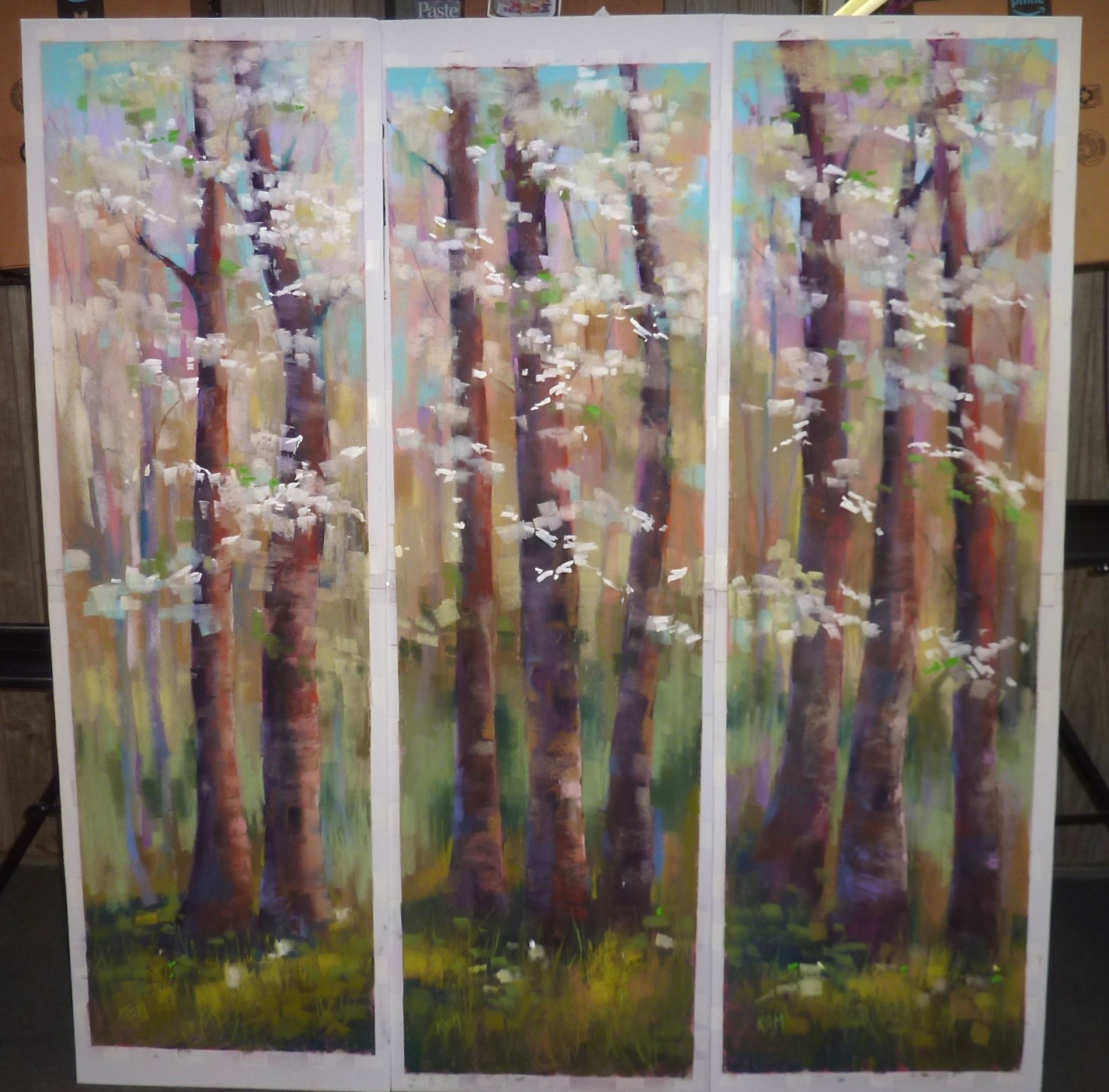
All three together

See Behind the Scenes videos on my Patreon page! I take you behind the scenes and discuss this project in a 2 part video series. This series is a new addition to my Patreon page. A few times each month I will take you behind the scenes in my studio! Give Patreon a try for just $4 a month
www.Patreon.com/karenmargulis

Monday, September 10, 2018

I Never Thought I had a Chance.....on entering an IAPS exhibition


'Before the First Snow'        10x 8      pastel      ©Karen Margulis
available unframed $450
The time to enter is now! The deadline to enter the International Association of Pastel Society's webshow is September 15th.  I always seem to wait until the last minute to enter. Thoughts run through my head like...... I don't really have any painting good enough to enter or What if I paint something worthy after I've entered? or I never get anything accepted so why bother?

I shared reasons for everyone to enter a juried exhibition last week. If that wasn't enough to convince you let me share a quick story. Have a look at the photo below. This is my painting hanging at the IAPS exhibition held during the last convention. It was a great honor and felt good. But there was a time a few years ago when I didn't think I would ever have a chance to get in an IAPS show. (or any show for that matter)


I've been painting with pastels since 2005. I started from scratch. I didn't know anything about pastels or painting concepts. But I had a dream. I had goals. I wanted to get better. So I worked hard. I took classes and workshops and I read everything I could about painting. And I practiced. Every day. I had this little thought in my head that one day I would like to paint something as good as the paintings I saw in Pastel Journal and the IAPS and PSA shows. .....But I never thought I had a chance to get a painting in one of those shows!

Until a friend reminded me.....you can't possibly get in if you don't enter. Of course! So I entered one of the IAPS shows. I didn't get in. But the fear was gone. I didn't lose anything but a few dollars and a moment of disappointment. I felt like I joined the club and entering a juried exhibition wasn't so bad after all. So I entered the next one. No luck. I entered the next one and BINGO! I had a painting accepted. Hard work and persistence paid off.

During the next few years I continued to enter with varied success. Eventually I accumulated enough points to achieve Master Circle status. But there were definite ups and downs along the way!

My painting along with the story about my inspiration
I share this story because there was a time not all that long ago that I thought I never had a chance. But I shook off the fear and doubt and kept trying. If one of your dreams or goals is to have a painting accepted into an IAPS show. Now is the time! Remember you have to enter to have a chance.

Follow this link to get the details for entering the IAPS webshow: http://www.iapspastel.org/exiaps_upcoming.php