Visit my Patreon Page for more painting instruction and Paint Along Videos!

Wednesday, November 18, 2015

My Favorite Color Tool Comes to the Rescue

'Waiting for Winter'            9x12             pastel           ©Karen Margulis
click here to purchase $145
Color choices are not always easy. Especially if one wishes to be more expressive with color. It is easy enough to look at a reference and find the colors to match what is in the scene. But what if we want to go beyond this color? What if we don't want to copy the colors in the photo exactly? Maybe we even wish to change the colors completely? How can we play with color yet still be successful?

Color sense can be developed. The more we know about color...the more we understand the color wheel and color relationships....the more fluent we will be with using interesting and exciting color. No, it does not always come easily but it can be nurtured.

Color wheels and other tools can help and I have a favorite.


Using the Analogous Color Wheel
 I have blogged about this color wheel in the past.
Here is a link:http://www.kemstudios.blogspot.com/2015/01/my-favorite-color-tool.html

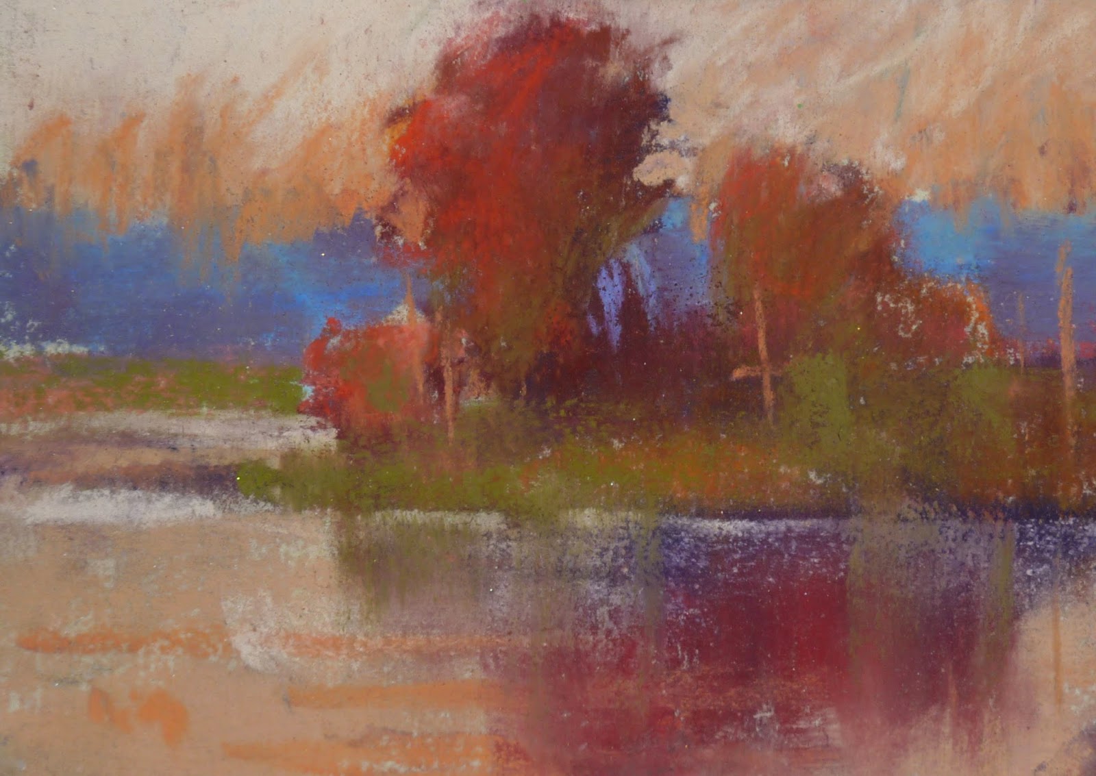
I decided to use this color wheel for today's pastel class demo. We are working on Color and color schemes. We worked on monochromatic, complementary and triadic schemes before trying an analogous color scheme.
I love working with analogous color.....using colors that are next to one another on the color wheel. They are restful, calming and work well for many landscapes. The problem is they can also be a bit too restful and calm. Sometimes they seem to lack a little punch or excitement.

 The Analogous Color Wheel comes to the rescue by suggesting colors that will add to the scheme and create a more pleasing painting. According to the information printed on the wheel "... a painting should have most of its colors on one part of the color wheel along with neutral grays to enhance them and a small amount of the dominant hues's correct complement."

How does the wheel work?


For today's demo I decided to use the wheel to create a more interesting analogous scheme....I call it Analogous Plus.

  • I am disregarding the colors in the reference photo and I choose Green, Yellow Green and Blue Green as the dominant hues. I turn the wheel placing them at the top.
  • The wheel suggests that the complement of the green is red violet (not that this wheel is based on the Munsell color system (another blog topic!)
  • I decide to use the complement of Red violet for the first layer (underpainting) I use 4 values of red-violet.
  • I used various values of green, blue green and yellow green to develop the painting. I use both pure intense green and grayed down neutral greens.
  • Discords are also suggested by the wheel. Discords are the spices....colors used in small amounts often near the center of interest. Discords add interst (spice) to the painting. The discords suggested for my scheme is red-orange and blue-violet. Can you see where I used them in my painting?

Tuesday, November 17, 2015

Mini Week. Six Steps to a Mini Pastel

'Morning on the Marsh'             2.5 x 3.5           pastel              ©Karen Margulis
sold
Have I convinced you yet? Have you tried painting a mini? Mini Week continues with a look at a simple way to paint small. There are so many ways to paint with pastels. There are hard pastels, soft pastels, Pan pastels, pastel pencils.....anything goes. It can be overwhelming. Sometimes I just want a simple method. This is a quick look at my favorite method ....6 Steps to a Mini. 


1. Quick light drawing of the big shapes with pencil.


2. Block in the dark shapes.


3. Block in the light shapes.


4. Block in the most intense color.  


5. Fill in the rest of the paper. Usually middle value.


6. Continue developing the painting and clarifying the focal area.


This is a quick look at this technique. It is a helpful way to simplify a busy reference photo and it works for any subject. I painted a snowman for my class showing them how this method still works!  If you would like to see it in more detail you might like to explore my pdf demo available on Etsy.

Monday, November 16, 2015

How to Store and Display Mini Pastel Paintings


'Fall Fantasy 13'              2.5 x 3.5         pastel          ©Karen Margulis
sold
Mini Week continues with a look at how to store and display these wonderful little gems. I am sharing an older post with some new paintings. Enjoy!

I admit it. I am a paintaholic. I paint for the sake of creating. I am compelled to take up my pastels everyday and paint something. Once they are finished I am ready to move on to the next one. It is the process of creating that interests me not the final product. Having a good painting is certainly the ultimate goal but the fun is in the journey to get there.  Every once in awhile I become attached to a particular painting but for the most part I am happy to share them with others or hide them away in boxes. 
 I love painting these miniature pastels. They force me to simplify and I learn so much from doing them. They are also very relaxing to paint which is why I like to paint them while on vacation!  I encourage you to try to paint a few minis!


The official rule for these minis often called ATC (Artist Trading Cards) or ACEO's (Art Cards Editions and Originals) is that they measure 2.5x3.5 inches. That's it. They are actually quite easy to store and display. It is a great way to add a touch of original art to your space. And they make wonderful gifts.

Last year I made a You Tube video on storing and displaying these mini pastels so I thought it would be a good time to share it again!  Enjoy the video and paint some minis today!


Sunday, November 15, 2015

Mini Week: 10 Reasons to Paint Small part 2

'Fall Fantasy 6'         2.5 x 3.5
sold
How small can we go? Have you tried painting a mini pastel? I used to think 5x7 was small until I gave minis a try.  I choose 2.5 x 3.5 as my mini size because ready made frames and mats are available. I will share storage and presentation ideas later this week. Mini Week continues with a look at 5 more reasons to paint small. If you missed the first 5 reasons click here to read them.

6. Economical. Minis are great because they don't cost much in materials. I don't use much pastel at all and I cut my scrap papers into 2.5 x 3.5 pieces. I buy my pastel paper in full size sheets and cut them down to size. I am always left with thin strips. I save these strips until I need paper for minis then I cut them down to size.

'Fall Fantasy 7'           2.5 x 3.5 

7. Eco-Friendly. Save the environment and recycle paper for minis. Not only do I use my paper scraps, I also recycle failed paintings and cut them up for minis. Instead of throwing away a failed painting I do an alcohol wash over the offending painting, let it dry and cut it up. I get lots of nice dark toned paper to paint on!

'Fall Fantasy 8'          2.5 x 3.5

8. Fine Motor Practice. Painting small is one of the best ways to develop and fine tune control over your pastel sticks. Sometimes a chunk of pastel can seem awkward and unwieldy. It take practice to figure out just the right touch to make the marks you want. 

'Fall Fantasy 9'          2.5 x 3.5 

9. Experiment. Painting small leads to getting more creative and experimental. I find it less daunting to experiment on a scrap of paper. If it doesn't turn out I didn't waste much. I have tried many interesting techniques on a mini before I did a larger version.

'Fall Fantasy 10'           2.5 x 3.5 

10. FUN!  The best reason of all to paint minis is because it is fun and relaxing. I like to sit when I paint the minis. I find that the more I do, the more I want to do. The more I do the more expressive they become.  Working small allows me to gain experience with the important parts of good painting....composition, value, color, drawing. I learn while I am having fun....can't beat that!


Thursday, November 12, 2015

Painting Minis on a Blustery Day

It's Mini Week! I will be sharing some older posts about painting mini pastels while in Chicago visiting my grandbaby Greta. Today we went to the Nature Museum and played hard. She took a long nap so I decided to take out my pastels and paint some new minis. I always take my precut mini papers and some pastels with me no matter where I travel. They don't take up much space so I always have some supplies if I get the time to paint.

It was a cold and blustery day in Chicago. We weren't the only ones with the idea to go to the museum so parking was a challenge. We found a spot but had a bit of a walk through the park. It was fine with me because I was thrilled with the mood and colors of the day. I took a few pictures as we hurried through the park. They were the inspiration for the 6 minis I painted.


I didn't have my usual travel pastel box with me this time. Since I was coming from my workshop in Nebraska I had only my demo pastels with me. They consisted of a couple of small boxes of pastels preselected for my demo paintings. I was very limited but the colors worked perfectly for my blustery day paintings.

There is a prairie garden next to the nature museum. I love seeing it in the fall season. The colors and textures of the dried grasses are wonderful and I love to paint them! These are the kind of scenes that make my heart sing!

All paintings in today's post are 2.5 x 3.5 inches and are available for $35 each.


Wednesday, November 11, 2015

Mini Week ...10 Reasons to Paint Small

'Fall Fantasy 1'            2.5 x 3.5            pastel            ©Karen Margulis
sold
Why would you want to paint so small?  This is one of the questions I get when someone sees me painting these mini pastels. I can think many reasons to limit the size of my paintings every once in awhile. I've boiled them down to 10.  Enjoy my latest mini pastels as I share 5 of the top ten reasons to paint small (2.5 x 3.5 inch artist trading card size)

1: Simplify. Limiting the size of the paper limits how much I can put in. It forces me to simplify and pick out the big simple shapes. It is easier to suggest details in a smaller space. This is great practice for seeing simply that can be transferred to larger paper.

'Fall Fantasy 2'   2.5 x 3.5    

2. Color Studies: Trying out color schemes on small paper saves time and frustration. It is quick and easy to try several color scheme possibility in a mini painting. I get a good idea of the color choices before investing time and supplies on a larger painting.

'Fall Fantasy 3'         2.5 x 3.5

 3. Affordable: I love having small affordable originals for my collectors. These minis are affordable for anyone to add fine art to their home. It's a win-win. I learn from painting them and collectors enjoy collecting them!


'Fall Fantasy 4'       2.5 x 3.5 
4. Gifts:  Not only are mini pastels affordable for collectors they are great gifts for anyone. I love to gift my minis throughout the year but especially for the holidays. They are great to give to children as an introduction to collecting original art. I have also used them as table place cards for the holiday table. Put them in small frames for a great party favor!

'Fall Fantasy 5'          2.5 x 3.5 

5. Portable: This is probably my favorite reason for painting small.... I can take them with me anywhere!  I have a small pastel kit that I keep in a zippered book cover. It holds a small box of pastels, 2.5 x 3.5 inch papers, wipes and a small piece of foam core.....I can throw this in my car or backpack and I am ready to paint anywhere!


Sunday, November 08, 2015

Thanks Nebraska! Workshop Review

Nebraska was on my list. I have 6 states left to visit so when I was asked if I wanted to come teach a workshop in Nebraska I didn't hesitate. I'm glad I came. It was a fantastic time! Nebraska is my kind of place....wide open spaces and big gorgeous skies. And the people were wonderful! I had such a great time sharing with a great group of artists!

My adventure began with a day to explore the area. One of the artists took me on a great photo safari. Her son is a photographer and mapped out our route. (Thanks Connie!) Here are a couple of my photos... I can't wait to paint them!


The workshop was in Beatrice Nebraska, a small town about an hour from Lincoln. The 14 artists were eager to learn more about pastels. Some were new to pastels so I made it my goal to convert them to the dusty side! I tried to fit as much information as possible into our two days. I was so excited to see the wonderful paintings that were done! Here are some of my demos:

Now I head to Chicago for some Grammie time! I have some posts scheduled for next week but will be home in a week!


Saturday, November 07, 2015

Warm Light vs Cool Light...an Experiment

'Along Silver Creek'             11x14            pastel           ©Karen Margulis
available $165
 Some concepts don't come without a struggle. When I began painting the concept of Value eluded me. I had no idea what the fuss was all about. It took a few years of painting and hearing about value in different ways before I finally got it.

The same is true with the concept of temperature....especially temperature as it applies to the light source. I know intellectually the idea that warm light = cool shadows and cool light = warm shadows. I even understand the science behind it. Putting that knowledge into practice was quite another thing. Understanding something and actually making good use of it in a painting is a challenge.

It all boils down to practice. The more you consciously make use of the concept the more it makes sense and the more you will be able to make use of it intuitively. Read about a concept. Understand it and then PRACTICE it!


The original painting had a warm early morning glow
I decided to test my understanding of the idea that COOL LIGHT = WARM SHADOWS. I had been painting a lot of landscapes with warm light....early morning and late afternoon scenes where the sun was low in the sky and the light was warm...yellow-orange, orange, red.  I knew that to make the landscape appear to be lit by this warm sun I needed to use warm colors in the light and cooler, duller colors in the shadowed areas.

But what about cool light? What happens when the sun is high in the sky...noonish? Or when it is cloudy or overcast and the light is cool and silvery?  I wanted to practice a scene with cool light so I decided to change an older painting from warm to cool light.  Here are the changes I made:

  • I changed the sky color from blue to green and pale silvery gray almost white. I used my Terry Ludwig heart pastel which was the perfect color for a cool sky.
  • I changed the water color to reflect the new sky colors.
  • I toned down the warm orange yellows in the trees to a duller, cooler peach.
  • I cooled off the warm green trees and used a cooler green.
  • I made sure that the areas in the shadows were kept warm.
  • I covered the sunlit peachy grass with some gray violet since there was no longer a shaft of sunlight.
  • I added an egret....just because.
This was a valuable exercise. Having to make changes caused me to be very much aware of the color and temperature choices that I needed to make. 

TRY THIS: Take a landscape that you have painted and determine what time of day it is and what is the temperature of the light. Now paint it again (or over it) changing to the opposite temperature.


Thank you Terry Ludwig...this heart pastel was just what I needed!

Frame courtesy of Michaels

Thursday, November 05, 2015

The Secret to Painting Sunshine


'Fall Fantasy'              5x7            pastel            ©Karen Margulis
available $50

My infatuation with red trees continues this week. Painting red trees always reminds me of the idea that objects under warm light will have cool shadows. Yesterday's blog post addressed the way to create a red tree with a warm glow. Yesterday's post about painting warm sunlight

We focused on this idea in this week's pastel class. I shared a few more tips for painting the illusion of warm sunlit trees. Here are a couple of those tips:


  • When painting a landscape it is important to know what time of day and what weather conditions you wish to portray. Warm light occurs in early morning and late afternoon (sun is low in sky) Cool light occurs mid day and overcast conditions.
  • The idea that warm light = cool shadows means that if the light source is warm the shadowed areas will be cool (not just the cast shadows on the ground....but any area not lit by the sun)
  • The secret to painting warm sunlight is to use a warm color in the areas KISSED BY THE SUN and use a cooler/duller color in the areas not kissed by the sun.


My display for this week's class

Wednesday, November 04, 2015

How to Make a Red Tree Glow with Pastels


'Dressed for Fall'                8x10              pastel              ©Karen Margulis
available $145
I love red.  I have a little maple tree outside of my studio. It turns the most brilliant red in Fall.  I can't wait to paint it this year.  But red is hard to paint. I want to paint a red tree that glows.  I want the tree to look like it's on fire.  But so often when we paint red trees they look dull and washed out.  How do we get them to glow?

Just think Sunlight!  Turn towards the sun!

My chart illustrating how to make foliage glow
When we are painting foliage that is getting sunlight we often think we should paint the sunlit leaves lighter than the foliage in shadow.  So if we have a green tree we may choose a light green (think mint) for the sunny leaves.  If we are painting red foliage we might choose a pale red or a pinkish red.

Now our tree looks like it has volume and shape. It has a light side and a dark side. But something is missing. It looks pale and boring. How can we make it look lit by the sun?

The sun is our answer. The sun is a warm light...most of the time. If we want the foliage to look sunny then choose a color that is WARMER and not just lighter.  As our foliage moves out of the shadows and into the sun use progressively warmer colors.  Note: The sun is warm when it is low in the sky...early morning and late afternoon. During this time the light is warm and the shadows are cool...more on this later.

Our red tree then will start out with cool brick red and even purple foliage in the shadows. As the foliage gets closer to the sunlit side, we can use warmer reds. And in the sunniest places we can even use an red orange to orange.

Try a sample...paint two red shapes. Use a pale red/pink on one and an orange red on the other. See the difference a little warmth makes?