

I miss in person classes and workshops! One of the things I miss is the live give and take when I would do a demo. I enjoy talking while I paint and that is a hallmark of my video demos but it is no substitute to a live demo when I get to field questions! I thought it would be fun to post a Q&A session from a live class. The painting I did was different but the questions apply to this latest painting.
Q: How do you go about choosing the colors for the painting. Do you think about the value of each color?
A: When I paint a landscape I think about value and color. I also think about the layering I will do. I ask myself what colors will go underneath my final colors. I begin by choosing these 'underneath' colors. I choose block- in colors. I then choose the darkest values I will use. This is what I call my 'dirt'. Then I choose the colors I will use for each element of the painting.....the sky, the grass, etc. keeping in mind the layers I will use for each element.
Q: Do you worry about the values of each element?
A: Yes to some extent. I know that each element will have a range of values. The sky for example often has darker to lighter values. I make sure I have a range of values as well as colors.
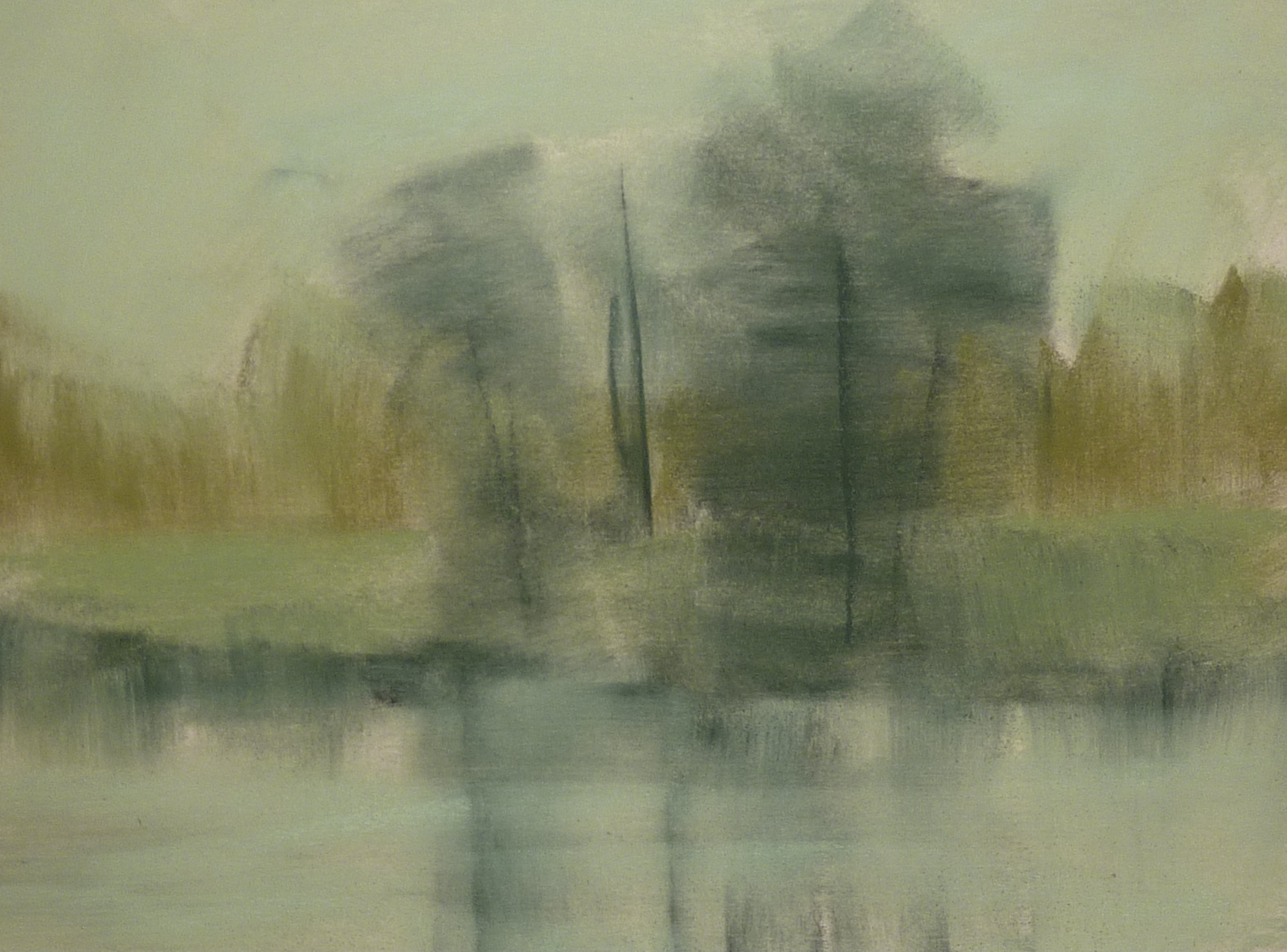
Q: The Sky in your photo isn't as dark as the water. How do you deal with that?
A: The color of the sky is reflected in the water. Sometimes you wish to show more water than sky. In this case I remind myself that a typical blue sky will get darker and cooler as it gets higher. As a result the water will reflect the dark blue in the foreground (even though we don't see it in the photo) And as a reminder we often make blue skies too dark because the photos show them as a dark clear blue. This leads to paintings that look more like twilight than daytime.
Q:Which comes first the reflections or the water?
A: I like to block in the reflections with downward vertical strokes first. I then blend them downward with my finger. Next I put in the water with horizontal strokes. If there are things floating on the water they are put in last.
Q: How do you simplify a busy photo? There are so many leaves and changes in light and dark in the photo it is hard to know how to simplify it.
A: It begins at the beginning! I block in the painting with big SIMPLE shapes. I look at the grouping of trees and notice that they are mostly a darkish mass. (although not as dark as the photos suggests) I block in the tree shapes with one dark value. Then I adjust and add the lighter leaves.
I usually take some liberties with the photo. I don't copy it exactly rather I prefer to interpret it with my own marks. I try to create a visual journey for the viewer.

Here is the value thumbnail I used to help me start the painting
I began this painting with a simple four value block in using 4 values of green.
WHAT'S HAPPENING ON PATREON?
It is Value Bootcamp month! Join us to dive deep into the concept of value with lessons, demos and challenges! www.patreon.com/karenmargulis
No comments:
Post a Comment