Visit my Patreon Page for more painting instruction and Paint Along Videos!
Showing posts with label sunset. Show all posts

Tuesday, August 16, 2016

Sky Painting Tip #5 Painting the Sunset

'A Beautiful Ending'           12x18       pastel       ©Karen Margulis
available $160
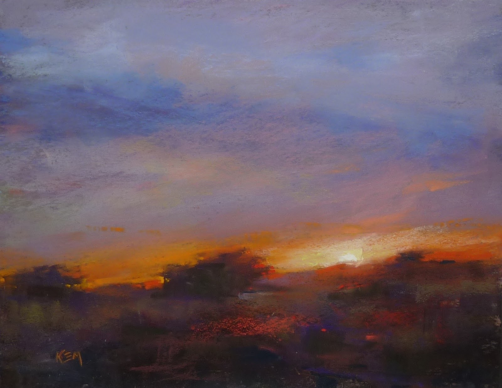
I love sunsets. But they can be tricky to paint. It is always a danger that they will look cliche. And it would seem almost impossible to capture their fleeting and ever-changing beauty. It doesn't keep me from trying though! I have painted many sunsets and learn with each one. I have shared my sunset painting journey over the years on the blog. I thought it would be helpful to compile a list of my favorite sunset blog articles.  Click on each link to read the post.

Choosing the right pastels for a sunset

A Favorite Tip for painting the sunset

Tips for a Magical sunset

Painting more authentic sunsets


TIP: If you go directly to my blog at www.karenmargulis.com you can search for any topic in the search bar on the right. I have 11 years of postings and might have addressed your questions at some point.

'Morning Splendor'        11x14       pastel       $160
Visit my etsy shop to see all of my SKY paintings. Take 25% off the price of any sky painting this week using coupon code BIGSKY click here to see paintings

Saturday, November 28, 2015

Tips for Painting a Magical Sunset

'Canyon Country Magic'               11x14            pastel          ©Karen Margulis
click here to purchase at 50% off
 Chasing sunsets. One of my favorite pastimes. It isn't something that is easy to do here in North Georgia....land of the hills and trees. Last night looked like the sunset was spectacular from what little I could see through the veil of trees in my backyard. It's frustrating!
 But when I travel I chase the sun!  I especially love visiting wide open spaces such as the Southwest where the sun really puts on a show and you can see it unfold. I have many favorite sunset spots (and photos) from my travels. These sunsets begged to be painted.

I want to paint Magical Sunsets. 

I want my sunset paintings to capture the colors and fleeting drama of the real thing. It is a challenge to turn some pigment and paper into a memory of a magical moment. It is so easy for sunset paintings to turn cliche.  I have figured out some little things that can make a big difference in creating the magic.

Terry Ludwig's 14 piece sunset collection


  • It begins with the right pastels. The best dramatic sunsets are painted with rich and intense color. The best artist grade pastels will do the best job. I also prefer to use soft richly pigmented pastels for the fire of the sunset. I want my marks to be rich and juicy and inexpensive or very hard pastels make it difficult to get the effect I want. I prefer using Terry Ludwig pastels. I used his 14 piece sunset set for the reds and oranges in today's painting. He now has a new sunrise/sunset set that is on my wish list!
  • Don't be afraid to be bold! I will reach for the most intense colors for the warmth of a fiery dramatic sunset. If you are painting a fiery sunset look for intense reds and oranges and yellow-oranges. Save the pale peaches and pinks for the subtle and softer sunsets. Even for the softer sunsets I will often start with a bright fluorescent pink and peach as a base. Remember you can always tone it down! Be bold!
  • Balance bold with dull. If everything is bright and intense nothing will glow so be sure to balance the fire with some ice....use the duller gray blues and violets to suggest the illusion of the light.


  • Watch where the sun places kisses. The glow of sunlight can often be seen on the ground....in the trees, on the edges of shrubs and grasses...whatever the light touches. Show the kiss of warmth with reds and oranges. Paint the glow!
  • The actual ball of sunshine is not necessarily bright yellow. Often we want to paint the sun yellow. This is the shortcut color we use for the local color of the sun. If we really want the sun to glow start by painting the area around it darker....darker yellow-oranges and yellows and end with a pale pale yellow to almost white. Try it both ways and see what a difference this makes!
  • Photographs don't help!  Photos often lie. The colors and exposure are often off especially for a high contrast scene such as a sunset. The ground is often a silhouette....black!  When we paint the ground black or too dark we end up with the typical cliched sunset and not the drama or magic of the real thing. Make adjustments to the painting based upon real life observation. Copying the photo can lead to trouble.


11x14 pastel

These paintings are available in my Esty shop at 50% discount until Monday November 30 at midnight. I have a big selection of original paintings available in my Thank You Sale Event. Use coupon code HOLIDAY50 at checkout. Visit the sale section of my shop HERE

Thank you very much to all of you who have purchased a painting this weekend. I look forward to you seeing them in person!

Saturday, October 31, 2015

Another Great Pastel Set for Autumn Colors


'When the Magic Happens'                  8x10              pastel               ©Karen Margulis
available for purchase $145
Today I turned up the volume. I put on my favorite music. Loud. I took out a new set of pastels and spent a fun afternoon painting. Yesterday was mellow. My palette was soft and muted. My fall painting was understated and quiet. (see the post here)  Today my palette is quite different. I love that about pastels. We can easily be inspired by looking at a box of colors. There is no need to figure out how to mix a color....they are all there in front of us like a box of chocolates. The trick is deciding which ones to use!


Unison Special Collection 1-18

I had purchased this box of pastels at an art material expo last February. I am just now getting around to trying out some of the supplies I bought. I have a basket full of goodies!  I couldn't resist this box of Unison pastels. The colors in the Jack Richeson Special Collection 1-18 are luscious and rich. I loved every single one. So the set came home with me.  It would be the perfect set to use for some fiery autumn colors!

The block in

I selected a piece of Uart paper that I had already toned yellow. A warm tone would work well with the fiery colors in my sunset lit trees. I decided to to an alcohol wash so I blocked in the big shapes with a few hard pastels....orange for the trees, blue for the sky and water and dark blue for the trees in the shadows.

The finished underpainting

I chose an alcohol wash so that I could incorporate the watery drips into my tree reflections. I got some good drips this time!  Once the underpainting was dry I started layering with the Unsion pastels. I used the oranges and purples in the trees and the blues and greens in the distant trees.

Since these colors are all pretty intense I needed some quieter colors for balance. I used some pale peaches for the sky and water and some muted purples for the shadowed grasses.

I used some of the bright blues for my spices. Can you find them?


close up detail. 

Thursday, August 20, 2015

Choosing Pastels to Paint The Glow of Sunshine

'A Little Slice of Heaven'               4x11                 pastel             ©Karen Margulis
purchase painting on Etsy  $75
 It is a must have color family. It is a bit illusive much like the effect that it helps capture in a painting. There is nothing quite like the warm glow of the sun as it gets lower in the horizon. Everything it touches glows with its warmth. No wonder it is called the Magic Hour!  But how do we capture this glow in a painting? What color is it? Salmony- pinkish -orangey -yellow?

A reader asked: "Can you recommend source for the light peach colours you use? Looked at portrait sets. Other sets seem to have dark yellows or oranges, not that lovely light peach colour."
There is a certain color family that I like to use for the glow of the setting sun. It really isn't one particular color or brand even. 

Since I don't write down color names or numbers it is always a gamble and often a surprise when it is time to replace a well used color. My goal is to find a color  and value to match as closely as I can. I do have several brands that I like to choose from. 

I browse through color charts online and order my selections open stock. I may not always get the exact color but I get something close and it keeps my palette fresh.  Here are a few of my favorite brands along with the color ranges I select from for the sunset glow. Click on the links to see more about each brand.

Unison pastels Red 1-18 www.unisoncolour.com

Unison pastels Orange 1-18 www.unisoncolour.com

Terry Ludwig Vibrants www.terryludwig.com


Great American Artworks  www.greatpastels.com


Schminke pastels   www.schmincke.de
As you can see I am showing a variety of colors from pink to peach to orange-yellow. I like to stock a variety of these colors. I use them not only in sunset clouds but also on the edges of tree trunks or anywhere the sun kisses. 

Do you have a favorite peachy color? I'd love for you to share in the comments!


Friday, August 14, 2015

My Favorite Tip for Painting Sunsets


'Unexpected Beauty'        18x24          pastel           ©Karen Margulis
click here to purchase painting $375
"O setting sun! though the time has come,
I still warble under you, if none else does, unmitigated
adoration. from Song at Sunset, Walt Whitman
Sunsets...hard to capture in a painting. Even photos don't always do them justice. But there is something about them that compels us to preserve our experience through pictures, poems, songs. In a recent post I lamented about the difficulties of making a sunset painting believable. Today I would like to share one of my favorite tips for painting an authentic sunset.

It begins with careful observation. The next time you are privileged to witness a sunset do not take photos. Instead be present and pay attention to how the sunset unfolds. Look at the colors. Not only the colors in the sky but what is happening on the ground. Ask yourself what colors and values do you really see. This is important!

close up detail of the colors in the dark areas

Now that you are armed with careful observation of a live sunset you will be better prepared to interpret your sunset photos. Very often photos of sunsets underexpose the foreground /ground area. Objects on the ground are often dark silhouettes. Sometimes the camera makes things so dark they appear black, especially in our printed photos.


Look at the photo above. See how dark the beach and palm tree look? When I printed the photo these areas were rendered as black. It makes a dramatic photo but in real life I saw much more color and light in these areas.

For a more authentic painting I need to adjust the values and colors in the dark areas. Instead of choosing black pastels (or even the wonderful Terry Ludwig eggplant) I chose several sticks of a dark value dull colors such as navy blue, purple,brown,and green. Layered together these colors form more interesting dark areas. Pure black tends to look flat and dull. Layering dark values is more lively. And after all the sunset is very much alive!

'Sanibel Time'          5x7        pastel          $50

Pastels used for the dark areas....no black!


'Under a Sanibel Sun'          5x7           pastel           $50


Sunday, October 26, 2014

Studio Essential: Sticky Notes Help Improve Paintings


'The Cloud'                   18x24                 pastel            ©Karen Margulis
sold
 Sticky Notes get a lot of use in my studio. I leave my notes everywhere. They help me stay on track. When they multiply too rapidly I know I need to slow down and prioritize but they do help me get my thoughts on paper.  One of my favorite uses for sticky notes is to help me resolve unfinished paintings.

Have you ever looked at an unfinished painting  and finally figured out what it needed but then forgot what that was once you had time to paint? 

Sticky notes to the rescue!  Yesterday I had a wonderful time teaching a workshop at the Cockerill Gallery in Austell Georgia. Ann Cockerill was fantastic and I had a chance to share with a group of talented artists!  I came home with three demos....almost finished but not quite. Each one served its purpose in my lessons but needed tweaking to be considered finished.

Before my finishing tweaks
In the morning I set them up on easels in my studio and studied them. What did they need? What didn't they need? What did I need to do to resolve them?  As the possible answers and solutions came to me I wrote them down on a sticky note and stuck the note to my painting board.  Now when I get a chance to paint I won't forget my thoughts about how to resolve each painting!


My possible resolution ideas for 'The Cloud'
Later in the day I had some time to paint so I returned to my paintings and notes and was able to put my ideas in action. Thank you Sticky Notes!

Painting notes: This was my lunchtime demo painted while my students enjoyed their lunch. It is on Uart paper 18x24. I blocked in the painting with reds and pinks and rubbed in this layer with pipe foam. I used Terry Ludwig pastels to finish.

Thursday, May 01, 2014

An Idea for Painting the Sunset


'Sunset Series I'            5x7          plein air pastel           ©Karen Margulis
available for purchase $50

 We knew it would be a challenge. We were ready!  We already knew where we would set up. We arrived about 30 minutes before the sunset time. We wanted time to set up our easels and supplies and be ready for the dramatic light of the sunset.

How to best capture something as fleeting as the sunset en plein air....in real time as it unfolds?  We discussed it. Some of us wanted to get the main shapes and composition blocked in so that when the fireworks of the sunset began all would be necessary would be to capture the light and colors of the setting sun.

I decided on a different approach. I would paint the sunset in a series....as it unfolded. This way I would force myself to really observe and capture the subtle changes in the colors and light. I spent about 10 minutes on each painting. Working quickly prevented me from getting bogged down with details. I only wanted to capture the shift in colors. (the paintings are in the order they were finished and are all 5x7 except the last two)


After the sun went behind the mountains it was getting more difficult to see my pastels so these last paintings were done quickly but I had already warmed up!  I loved seeing the twinkling lights come on in the distance.
I am happy I chose to paint the sunset in a series of quick studies. It was a wonderful learning experience and since the sunset was a gentle and subtle rather than a dramatic fiery one, it was even more of a challenge.  I'd like to do this again!

All sunset paintings available in my Etsy shop. Click here to get a closer look.

Friday, March 28, 2014

Improve your Paintings with this $1 Investment

'Silent Awe'               9x12              pastel           ©Karen Margulis
available for purchase $145
 Did you ever ask yourself why?  Why did you chose the subject to paint?  Why were you drawn to it? Did you have a reason for wanting to paint it?  Picking a subject because it seems easy isn't a good enough reason. Picking it because it is on top of the pile of reference photos isn't a good enough reason.

Having a passion for your subject leads to more passionate paintings.(tweet this) 

Being drawn to a subject isn't enough.  We need to know WHY we are excited about it before we can figure out how to express it in the painting.

My WHY BOARD with the 'why' for the sunset painting
We can think about why but it is better to verbalize it and even better to write it down!  So I came up with The WHY BOARD.  It is a simple 8x10 white board. I got it at the Dollar Tree for $1.  It is cheap but it does the job. It is very light weight, comes with a pen and an eraser and a magnet on the back. The pen even works!  A bargain price but priceless for the help it will give.

How to use the Why Board:

  • When planning your painting it always helps to start by asking yourself why you are drawn to your subject. Now instead of thinking it (and possibly forgetting) you jot it down on the board. I even wrote down a potential title for the painting. 
  • Prop up your Why Board near your easel. As you paint you should be stepping back. When you step back glance at your board. Are you still on track with your 'Why'?  Do the choices you are making fit your initial concept ? 
  • If you have gone off track you can at least decide if you like the new direction. If not you can evaluate and decide how to get the painting to better express your concept....your WHY.


Now simply erase the board when you are done and it is ready for the next painting!  I love the Dollar store!