Visit my Patreon Page for more painting instruction and Paint Along Videos!
Showing posts with label watercolor underpainting. Show all posts

Sunday, May 15, 2022

What You Need to Know about Watercolor Underpaintings for Pastel ...A Mini Demo

'Summer Loving' 5x7 pastel ©Karen Margulis
sold
Why bother with a watercolor underpainting? I am often asked why I would choose a watercolor underpainting for a pastel painting. For me it is the unpredictability of the watercolor. It is exciting to apply the paint and watch what it does. It drips and blooms and creates washes and new colors. All of these things create a more exciting base for my pastels. I can now respond to this underpainting and create a painting that has more of my input than if I just copied my reference photo. This wet, drippy underpainting frees me from the photo and allows me to truly interpret my subject. In yesterday's post I wrote about the supplies you will need. Now I would like to share some tips for a successful watercolor underpainting.
step by step demo of a watercolor underpainting
  1. (top left) After a loose pencil sketch, I begin by putting in my dark value watercolors. I use a mix of dark blues, reds ,greens and oranges. This is opposite of usual watercolor technique but I want to be sure I get nice strong darks. (I have the painting upright on an easel)
  2. (top right) Wait a few minutes for the darks to start drying. The paint doesn't have to be bone dry but you want it to loose the sheen. PATIENCE is the key. If you add more watercolor too soon it will drip onto your darks and wash them out. Now I add more color above the darks....I want some of this to drip.
  3. Close-up of the two layers of watercolor. You can see the top layer beginning to drip onto the first layer. What will happen? This is the exciting part!
  4. I need to wait and let this next layer lose it's sheen and start drying so I add some greens for the flowers. By chance a bead of paint formed at the base of each flower so I let these drip to become the stems. Fun!
  5. I add some red flowers and let them drip.
  6. Now the first layers that I applied are slightly wet so I draw into it with some green paint, I get some paint lifted and some stems. If it is too wet, this won't work. You can use a dry brush for texture of a spritz bottle for drops of water. I don't want to overdo the texture at this point.
  7. Close-up of the flower heads. Now I patiently wait for everything to dry further. Again it doesn't have to be bone dry you want it almost dry so that when we wash in the sky, it won't erase the flowers. I add a pink wash for the sky.
  8. Finished underpainting.
watercolor underpainting for an 18x24 pastel
Here is the finished underpainting. It is a large one for me 18x24. I will be working on the pastel application this week and I hope you will check back to see my progress. If I could give you only one tip for doing these w/c underpaintings it would be to have patience. I used to get very wimpy underpaintings because I was always in a rush to finish and so each wash of watercolor would erase the previous wash as it slid down the paper. Once I learned to let things get dry I have had better results!

Wednesday, April 12, 2017

Get Beautiful Watercolor Underpaintings en Plein Air


'Promises'    9x12         plein air pastel             ©Karen Margulis
available $165
I like to keep my plein air supplies simple. Everything need to fit into a backpack. I even like to keep my plein air paintings simple....small field studies with no fancy underpaintings. But every once in awhile the subject and conditions allow for a more developed underpainting and that is when I have to get creative with bringing those extra supplies.

I love doing watercolor underpaintings. There are many small travel watercolor sets so it is easy to bring watercolors along. I use the water from my water bottle and a collapsible cup and I am ready to paint. I probably have 4 or 5 different travel watercolor sets but when I saw my favorite underpainting watercolor set in a small size I just had to add another set to my collection!

available at Blicks .com 
I love using Cretacolor Aqua Briques for underpainting. I have a set of large Aqua Briques and these are my go-to watercolors. I love their richness and vibrancy. It is easy to get rich dark colors in the underpainting with these briques.  They also can be used like crayons and then wet with water so they are quite versatile. Read my other post about the Aqua Briques here.

set of aqua bricks in a tin
 The mini set of Aqua Briques are perfect for plein air. They come in a tin that measures 5 inches by 4 inches and 1/4 inch thick. The lid serves as a great palette.

I used my set for one of my demos at last weekend's workshop in Texas. I worked on a piece of white Pastel Premier paper. My goal was to let the underpainting show through the pastel in as many areas as possible but especially in the background. I painted an intimate closeup of some native Texas milkweed that was just about to burst into bloom. I was drawn to the wonderful yellow green against the dark tangle of grasses.

Close up. See the watercolor wash in the background 

Friday, March 10, 2017

Listening to an Underpainting


'Serenity         8x10        pastel        ©Karen Margulis
sold
Oh the wonderful surprises I find in my studio! Actually in my studio storage room. We converted our garage into a hang out room for the kids when they were teens. Now I have taken over the space with art stuff. I'll show you a picture someday but it is a scary place!  The other day I uncovered this board with three different underpaintings. I used it for one of my early pastel classes. I think it is time I just paint on the samples!


A selection of underpainting techniques to try: wet pastel, watercolor, oil stain and a mystery

The problem is I no longer have any idea what I was trying to paint. The reference are long gone and forgotten. Not really a problem! It is actually a gift. Now I can look at the underpainting and let it speak to me. What does it suggest? What do the colors want to do? What does this underpainting want to be?

It is clear to me that this wants to be a marsh. So I took out my marsh photos and chose one with warm autumn colors. I decided to go with  autumn golden grasses with a subdued sky.  It was fun to let the underpainting guide me and I can't wait to do the next one!

Tease: I used a special pastel sent to me by a friend. I'll share more soon!


watercolor underpainting on Uart 5oo
 Try this: This weekend why not take out some paper and paint and just do underpaintings. Don't worry about painting with pastels just play with underpaintings. Put them aside for a week or so and THEN paint on them letting the underpaintings guide your choice of subject.


Friday, March 03, 2017

A Surprising Watercolor Underpainting


'Welcome to the South'           8x10        pastel        ©Karen Margulis
available $150
It was a surprise for a couple of reasons. I had completely forgotten that I had done a watercolor underpainting for a Spring landscape. I just never got around to finishing the painting and it got buried in the pile of unfinished objects. (the UFO pile) When I found it today I was surprised for another reason. The underpainting had some cool crystal- like marks. How did I do that?

The watercolor underpainting
It took me a few minutes but then I remembered that I had experimented with watercolor and salt. The result were these pretty flower-like crystals in the dried paint. If you are familiar with watercolor then you already know about this technique. But have you thought about applying it to a watercolor underpainting for pastel?

the magic of salt and watercolor
 How about giving it a try? The results are unpredictable so I suggest lots of experimenting. Here are some tips:

  • Start the watercolor underpainting as usual. While the paint is still wet sprinkle the salt where you want the special effect.
  • Try different size salt....Kosher salt makes different marks than table salt.
  • Apply the salt with the paper flat.
  • Try tipping the paper and letting the salt slide.
  • Wait until the paint is dry before brushing off the salt.
  • Try different paper to see the results. Todays painting is on Uart sanded paper.
I tried to keep my crystals showing in my painting but ended up covering more than I wanted. That's OK> I am excited to experiment more!


Monday, February 06, 2017

A Fun Way to Start a Pastel Painting

'Garden Delight'        9x12      pastel       ©Karen Margulis
available $145
I've been wanting to try this. I have been reading about watercolor techniques to give me a better understanding of the medium . I love using watercolor for my sketchbooks and I want to become more proficient with them. Not only will it help my sketching it will enhance what I do with pastel underpaintings.  So today I took out a piece of watercolor paper and had some fun.


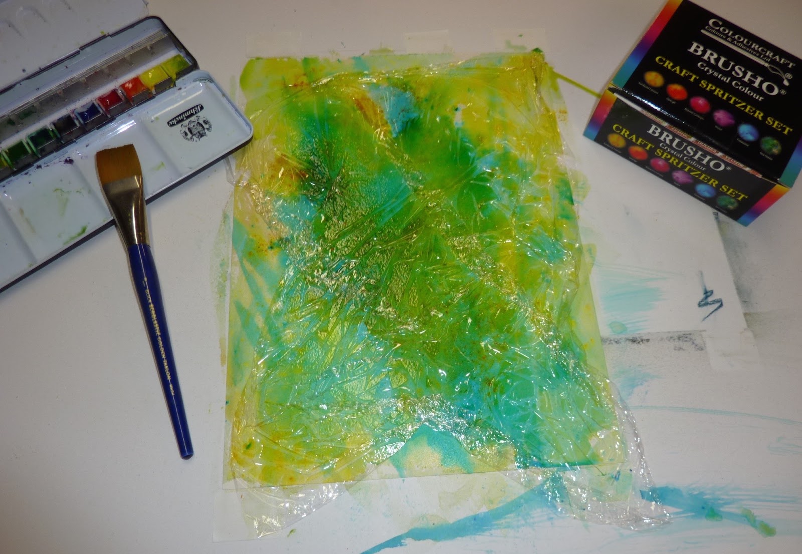
watercolor, Brusho crystals and cellophane wrap
 I wanted to create an interesting washy looking background for a flower painting. What I discovered is that I need more practice in creating those wonderful ethereal washes I see in books!  My wash was awful and the more I added the worse it got. But I am not one to give up. I took out my box of Brusho crystals. These are pigment crystals that can be mixed with water and sprayed on or just sprinkled. They explode with color.

But  I went too far. I sprinkled too much and the effect was ruined. OK. Another lesson learned. So I took out some cellophane wrap and arranged it on top of the painting and let it dry. The result was an interesting background with a feeling of texture. Now I had something to work with! To give the paper some tooth for pastel I quickly brushed on some CLEAR GESSO. This gave the watercolor paper just enough tooth for a few layers of pastel.

The result after the cellophane wrap

Now I had an interesting background for my flowers. As I developed the coneflowers I made an effort to leave some of the background alone. At the very least I used pastels of the same color and value as the background. Even though I didn't have immediate success, I enjoyed playing with watercolor and seeing what would happen. It was fun and freeing. Now I will go back to the books and practice!

Start drawing the flowers

Begin with the centers

Thursday, October 06, 2016

A Must Have Treasure for Watercolor Underpaintings on the Go

'My Florida'          8x10         pastel         ©Karen Margulis
available $150
 I had to do it. I only have a day to unpack from Charlotte and repack for my workshop in New Mexico but I had to make  a trip to Hobby Lobby in search of a treasure. I am so excited that I found it (two actually and I bought them both)  If you follow my blog then you may know that I love using Cretacolor Aqua Briques for watercolor underpaintings. They are so rich and vibrant! Read more about them here.

I brought along my set of aqua bricks to my Underpainting workshop for the Piedmont Pastel Society. It is a bit of a big tin but worth it for the results so I don't usually mind making room for them. But imagine my surprise and delight when one of the artists in the class showed me her little treasure.....baby Aqua Briques!  That's right. She found a small travel size set of Cretacolor Aqua Briques. The tin measures just 4x5 inches. I knew I just had to find a set. She had purchased hers at Hobby Lobby so I made the trek there today and found them! I did a happy dance!
Of course I had to try them out on a painting and now I am very behind in my packing!

I also found some other cool art stuff at Hobby Lobby but it will all have to wait until I get back from New Mexico!

Cretacolor Aqua Briques.....minis! Click here to see them at Blicks

The watercolor underpainting on white Pastel Premier paper

Art Haul from Hobby Lobby. Fun Stuff!

Saturday, October 01, 2016

A Great Idea For Daily Painting Practice

'Daisy Dance'         6x6       pastel       ©Karen Margulis
available $75
 Why paint just one when you can paint two? You already have the painting time set aside. You have your pastels out and your paper ready to go. What is stopping you from putting up two pieces of paper? I don't know why I don't do this more often!  It is a great way to learn by creating a variation on a theme.

I had a request for a daisy painting. I wanted to do a watercolor underpainting but the painting was only going to be 6x6. Did I really want to take out the watercolors and make a mess for one small painting? I was feeling lazy. Then it hit me.....why not paint two daisies paintings!  That would make taking out the watercolors worthwhile.

'Daisy Dance II'         6x6       pastel        sold

I had a great time with the daisies. Painting two at the same time allowed me to use the same pastel palette. I worked on them both at the same time and pretended that they were one big field of daisies. I suppose I could have painted one large painting and cut it in half but it would not have been the same. Painting two separate paintings allowed me to play with marks and composition to give each one variety. It was a fun learning experience and now I have two paintings for my effort!


The watercolor underpaintings on Uart pastel paper

The initial pastel layers

Starting to develop the flowers
I will be teaching a workshop for the Piedmont Pastel Society this week. I will do my best to post an update during the workshop. Then I head to  New Mexico for my next workshop!

Thursday, August 04, 2016

Comparing Underpainting Techniques part 2


'Summer Heat'        12 x 12          pastel           ©Karen Margulis
available $165
It is said that a picture is worth a thousand words so I will let the pictures do the talking today. For my daily painting I continued my underpainting experiment. I wanted to see the difference an underpainting makes to a finished painting. You can read part one of this post here

The difference is obvious and I'll let you look at the pictures and see what you prefer. Keep in mind that I used the same paper (Uart 500) and the same pastel palette. The only thing I changed was the underpainting. Today's painting has a watercolor underpainting and yesterday's painting has an oil stain underpainting.

My conclusion after the experiment ....something that never really occurred to me. The underpainting influenced my mood and attitude towards the painting. The underpainting affected my energy level. I never realized or noticed this response to an underpainting so this discovery is very intriguing. My attitude and energy surely had an effect on how I approached the painting! Here is what I discovered:

Oil Underpainting: I felt bold, confident and full of energy and excitement. I painted fast with a lot of energy.

Watercolor Underpainting: I felt calm, serene, quiet, gentle. I wanted to preserve the softness so I found myself painting quietly and even slowly.


Inexpensive watercolors work fine

The finished watercolor underpainting

The same pastels were used for both paintings

This is the painting done with an oil stain underpainting


Both underpaintings seen side by side. What is your opinion? Do you have a preference?

Wednesday, May 25, 2016

The Magic Word for Artists

'Summer Love'         9x12       pastel         ©Karen Margulis
available $165
I didn't have an answer right away. My head was too full of inspiration and I couldn't choose just one thing to share. But as I thought about everything I had learned from my weekend as a volunteer at Richard McKinley's workshop for the Southeastern Pastel Society, one thing kept cropping up. It was something Richard repeated several times. I realized that it was the key! It was a single word which means so much. I will go as far to say that it is the MAGIC WORD for artists.

We all want to be the best artists possible.  We may have different goals but we all want to improve and grow. We want to get better! We want our paintings to speak...to express what is inside of us. Most of us want to move beyond having technical proficiency and create paintings that move others.  In order to do this we need the magic word....We need to give ourselves PERMISSION.


Watercolor underpainting on white Wallis paper

Permission. It's simple really but hard to do sometimes. We need to give ourselves permission to try things, to experiment with techniques, with color, with design. We need to give ourselves permission to play. We learn the most when we are having fun and letting go. We need to give ourselves permission to move away from the reference photo....we don't need to be literal to the scene. It's OK to let the painting lead us in a different direction. Let it happen! Don't hold back!

I love that Richard reminds us that we can give ourselves permission to think outside of the box and to follow our own voices. We need to enjoy the journey and with time and practice it will all fall into place.


2.5 x 3.5 inch color study

I decided to continue my exploration of this familiar subject and interpret it in a new way. I printed my reference photo in black and white so I could create a new mood with cooler colors. My previous painting was a warm sunset mood. For this painting I did a watercolor underpainting on white paper. I took the time to do a small color study to test out my color ideas. I gave myself PERMISSION to play and explore this scene in a new way.

black and white reference photo


Monday, May 09, 2016

Mini Demo: Pastel Painting From a Watercolor Sketch


'The Evening Show'         8x10        pastel         ©Karen Margulis
available $145
 It was a fleeting moment. Made even more precious since I only saw it from the car window as we drove on to our destination. I did manage to take a quick  (but terrible) photo on my phone. But the image haunted me. The drama of the sky and the intense orange at the horizon continued to dance in my head. When I had a chance I set the image to paper in my sketchbook.  I made a quick watercolor sketch and wrote down some notes. I ended the notes with this thought "I want to paint this!"


This scene was the obvious choice for one of my first paintings since returning home from 4 weeks of wandering. I decided I would do a watercolor underpainting on Uart paper. I used my sketch as a guide to the colors. Watercolor works differently on sanded pastel paper than on white watercolor paper. I didn't quite achieve the same effect as my sketch but I did get the shapes in place. I have to remember that watercolor dries lighter. I could have made the dark areas a darker value. Lesson for the next time!


The watercolor underpainting while still wet!

Dry watercolor on Uart paper

I began the pastel application by reinforcing the dark areas. I layered several colors of the same dark value to create interesting and rich dark trees and foreground. I used blue, purple red and orange...all dark values. I also used the Terry Ludwig eggplant for my darkest accents.  I also added the orange 'flash' at the horizon since this was the most important area of the painting. (it was what excited me about this scene)

Adding pastel to the trees and foreground
Next it was time to work on the sky. Once I began painting the sky I got so involved that I forgot to take photos! That happens sometimes.  I began painting the sky by tackling the cloud shadows first. I layered violet, green and orange to create the grays. I then worked up from the orange horizon using a yellow orange and then yellow. I added the blue sky areas in between the clouds and finally pulled the lightest pale yellow over the blue. I continued using these colors to gradually model the clouds. I occasionally used a finger to lightly soften some of the clouds.

The last thing that I did was to add the telephone poles and wires and the spice colors.  I didn't want to draw the pole and wires because I wanted them to be mere suggestions so I used the edge of a square pastel to press and drag forming a broken line.

close up detail of trees

What I learned from this painting: I had enough information to paint using my notes and watercolor sketch. I believe that working from a simple sketch allowed me to recall what was most important to me. I didn't get caught up in the details that might have been in a photo. This was my memory of a scene that spoke to me!


Tuesday, April 26, 2016

Success with a Watercolor Underpainting

'Under the Desert Sun'          8x10          pastel        ©Karen Margulis
I guess I was never quite patient enough. I have had some success with watercolor underpaintings and I knew a few tips and tricks courtesy of watching Richard McKinley work his magic....but the failures far outnumbered the successes. I didn't let it stop me from trying but I wasn't going about it the right way.

The Plein Air Convention opened my eyes in many ways. I have a book filled with notes that I haven't even had a chance to review but I know that I am on the verge of some wonderful things that will help both my paintings and how I teach!  It all began to click at the last paint out of the convention.

under the pavilion with my fellow artists
I was feeling energized yet a bit tired from several very early mornings in a row. So I was content to just sit at the picnic table to paint. I usually am in a hurry to paint as many studies as I can. Perhaps it was because I was tired or maybe it was because I had been painting the desert for several days and was settling down....but I was moving very slow.

Slow was the key! Taking time with a watercolor underpainting is the key to success. (I knew this already but rarely slow down long enough to do it!) Taking time to let the darks dry before adding another wash...Adding layers of colors and letting them mingle.....using a thin brush to draw into dry areas....slowing down to allow things to happen and allow myself to enjoy the painting process was an amazing experience.


the finished watercolor underpainting
When the watercolor was finished I was almost reluctant to add pastel. I wanted to save it as a reminder of what I try to accomplish every time I do a watercolor underpainitng. In the end I did add some pastel but not much. It was a wonderful day of painting for me and one that I will always remember.

There is a lesson in my story and I actually learned it several years ago but I wasn't quite ready. This lesson was driven home by some of the things I learned at the convention and now I am not only ready to implement them but to pass them on to others. (more on this soon)

Wednesday, March 23, 2016

A Playful Approach to Underpainting

'Welcome Spring'        8x10        pastel         ©Karen Margulis
available $145
 I took the day off yesterday. I had good intentions but instead it was a day of doing nothing. So this morning I entered the studio with renewed energy.  I was anxious to paint something fun. Something just for me . Something with no intentions other than enjoying the process of painting. It was time to play!

Spring is evident here in North Georgia so painting a spring landscape was an obvious inspiration.  I selected a photo of some blooming trees and made my plan. I decided my focus would be the two big trees and the light and ethereal blooms.....but how could I best get this effect?

gouache and salt...an underpainting recipe
Deciding on an Underpainting Technique
As we discussed in my recent workshop there are so many ways we can start a pastel painting. There are  many techniques we can use for that first layer....the underpainting. We could be precise and very methodical and set up the painting to solve potential problems. Doing a value underpainting by creating a value map does this. Choosing colors to help create aerial perspective is another. This type of underpainitng is very controlled and has a purpose.

Sometimes though it is just good to let go and play. Try something and see what happens. It gives you freedom. It helps you interpret your subject instead of being too literal. Maybe there will be some happy accidents. A playful approach to an underpainting allows you to enjoy the painting process without concerns over the results. When I play a decent painting is a bonus because the true joy comes from the process.

For today's underpainting I decided to try some Pelikan pan gouache, a tube of white Holbein gouache and some coarse salt. I was hoping for some suggestion of texture from the salt on the wet paint which did occur. I used the white paint thinly in some areas to start building up the blooms in the trees. I used white Pastel Premier paper.


click to enlarge to see the texture

It the end I had an interesting underpainting which made the pastel application fun. I have a basket full of art supplies which can be used for playful underpaintings. They come in handy for days like today when I just want to play. (They are also good for days when I just can't seem to get inspired or motivated to paint....just take out some supplies and see what happens!)