Visit my Patreon Page for more painting instruction and Paint Along Videos!
Showing posts with label technique. Show all posts

Sunday, May 15, 2022

What You Need to Know about Watercolor Underpaintings for Pastel ...A Mini Demo

'Summer Loving' 5x7 pastel ©Karen Margulis
sold
Why bother with a watercolor underpainting? I am often asked why I would choose a watercolor underpainting for a pastel painting. For me it is the unpredictability of the watercolor. It is exciting to apply the paint and watch what it does. It drips and blooms and creates washes and new colors. All of these things create a more exciting base for my pastels. I can now respond to this underpainting and create a painting that has more of my input than if I just copied my reference photo. This wet, drippy underpainting frees me from the photo and allows me to truly interpret my subject. In yesterday's post I wrote about the supplies you will need. Now I would like to share some tips for a successful watercolor underpainting.
step by step demo of a watercolor underpainting
  1. (top left) After a loose pencil sketch, I begin by putting in my dark value watercolors. I use a mix of dark blues, reds ,greens and oranges. This is opposite of usual watercolor technique but I want to be sure I get nice strong darks. (I have the painting upright on an easel)
  2. (top right) Wait a few minutes for the darks to start drying. The paint doesn't have to be bone dry but you want it to loose the sheen. PATIENCE is the key. If you add more watercolor too soon it will drip onto your darks and wash them out. Now I add more color above the darks....I want some of this to drip.
  3. Close-up of the two layers of watercolor. You can see the top layer beginning to drip onto the first layer. What will happen? This is the exciting part!
  4. I need to wait and let this next layer lose it's sheen and start drying so I add some greens for the flowers. By chance a bead of paint formed at the base of each flower so I let these drip to become the stems. Fun!
  5. I add some red flowers and let them drip.
  6. Now the first layers that I applied are slightly wet so I draw into it with some green paint, I get some paint lifted and some stems. If it is too wet, this won't work. You can use a dry brush for texture of a spritz bottle for drops of water. I don't want to overdo the texture at this point.
  7. Close-up of the flower heads. Now I patiently wait for everything to dry further. Again it doesn't have to be bone dry you want it almost dry so that when we wash in the sky, it won't erase the flowers. I add a pink wash for the sky.
  8. Finished underpainting.
watercolor underpainting for an 18x24 pastel
Here is the finished underpainting. It is a large one for me 18x24. I will be working on the pastel application this week and I hope you will check back to see my progress. If I could give you only one tip for doing these w/c underpaintings it would be to have patience. I used to get very wimpy underpaintings because I was always in a rush to finish and so each wash of watercolor would erase the previous wash as it slid down the paper. Once I learned to let things get dry I have had better results!

Wednesday, July 05, 2017

Three Simple Tools You Can Use to Blend Pastels

'The Sea Beckons'              8x10         pastel        ©Karen Margulis
available $150

 I don't blend very often.....but when I do I only use the finest tools. 


a few simple and cheap blending tools

Not really!  I don't blend often... that part is true but when I do blend my pastels I use only the most simple, readily available and inexpensive tools!  My favorite tool is always HANDY. Sorry for the corniness but it makes it easy to remember that one of the best blending tools is actually your own palm and fingers. It is all in the technique. (video demo coming!)

Of course you can purchase blending tools of all kinds and I am sure they work great but I have had success with a few cheap tools that you may just have in your home. If not they are easy and inexpensive. Read on for the details!

Putting down the first layer of pastel
The first step in successful blending is to have enough pastel on the surface to blend. I like to blend the first layer of pastel to create an out of focus underpainting. In the photo above I have added pastel to create the first layer. I have used a light touch but there is still enough pastel to blend.

Using a piece of foam core to blend and suggest the sea oats

 TOOL #1  A small piece of foam core board. I used a scrap of foam core and cut it with a utility knife to make into small brush shaped tool. I used this tool to blend the grassy areas of the painting. I was able to pull up some pastel marks to suggest the beginning of some grasses and sea oats.
Tip: I get my foam core at the Dollar Tree. It isn't archival but it is surprisingly decent!


Using a piece of pipe insulation foam to blend the sky

 TOOL #2   My old favorite tool! Pipe insulation foam. I get this at any hardware store and cut it into small pieces. It is a great tool that doesn't shred on sanded paper and doesn't remove too much pastel. It can even be washed and reused!
Tip: use this tool like a brush. You can easily tear it and make thin and thick brush tips!


Using a wadded up piece of Viva paper towel to blend the sky
TOOL # 3  The artist's favorite paper towel brand! Good old VIVA paper towels work great for softening and blending. I used a wadded up piece of paper towel to soften and blend the colors in my clouds.  Viva is strong so it holds up to sanded paper and doesn't leave a trail of paper!

What other cheap blending tools do you use? Please feel free to share with us in the comments!

Painting notes: I used a piece of the YI CAI sanded paper and Terry Ludwig pastels.

Saturday, May 14, 2016

Try This: An Interesting Technique for Painting Grass with Pastels


'Hidden Marsh'      12 x 18        pastel           ©Karen Margulis
available $165
It was all about the texture. One of my favorite things about my foray into the world of oils was the ease of creating texture. I crave texture in my pastel paintings. I do what I can to give the illusion of texture. Building layers of increasingly soft pastel and working on a prepared textured surface are just two ways.  But what about on regular sanded paper such as Uart?  Sometimes I want more physical texture!

Yesterday I was doing laundry when something on the shelf caught my eye. It was a tube of Gel n Dry medium from Sennelier.  Bill Creevy used it during his IAPS workshop several years ago. I bought a tube but never used it much. It was time to take it out and see what would happen!


Unfinished demo that needs help

I had the perfect candidate for the experiment. It was an unfinished demo from my Chicago Uart workshop. It was a quick demo to illustrate the effect of underpainting colors. It had decent bones but needed help. It needed texture in the marsh grasses!

Giving Sennelier Gel n Dry Medium a try
 I squeezed out some of the Gel n Dry into a container and with an old bristle brush applied the medium to the foreground grassy areas.  It wet the pastel and made it much darker and richer.  I brushed the medium on with random brushstroke. The soft pastel became like paint. I then used the end of the brush handle to draw lines into the wet pastel. I could see the brush handle cut through the pastel leaving tracks. I was getting physical texture!

After the Gel n Dry

I let the painting dry overnight. I am not sure how long it actually took to dry but it was at least 3 hours so this is not a quick technique. It was nice and dry in the morning and my unmounted Uart paper was perfectly flat. The wet medium had no effect on the paper which is good to know.

I reworked the painting adding layers of green and peach pastel over the grassy areas. I was excited to see the pastel stick to the raised areas leaving the dark values in place. I had raised pieces of grass courtesy of Gel n Dry. Cool!


Pastel on top of the grooves left by the Gel n Dry medium

more textured grass


Wednesday, May 11, 2016

Three Reasons Why I Love Pastels

'When the Autumn Winds Blow'          11x14        pastel          ©Karen Margulis
available in my Etsy shop  $165
It occurred to me today that Pastels Rule!  I already knew that of course but sometimes I take for granted just how wonderful they are. It was a busy day, my daughter graduated from college this morning (and got a job offer an hour later!) I only had a few hours in between the ceremony and our dinner plans and I wanted to paint. I took out an unfinished demo and spent an enjoyable afternoon painting and reflecting on how great it was that pastels allow this spontaneous interlude of fun! In case you need to be convinced let me share three reasons why I love pastels.

1. Pastels can be revisited at any time and nothing changes.  I can leave out a tray of pastels and not worry about them drying out or ruining brushes because I don't have time to clean them. The only thing I have to think about are my cats jumping on the table! This makes pastel the ideal medium for busy people or those who just want to paint but not spend time with the clean-up of wet media.

2. The colors! Of course a box of pastels are better than a box of chocolate and seeing all of the wonderful colors together are intoxicating.

3. And finally my favorite reason....the beauty and ease of making marks.  Pastel allows for so many variations in marks from thick to thin to detailed to wide and bold. Pastels come in hard and soft and round and square and even in pencil form. This allows for a wide variety of mark-making (brushwork in wet media)  This variety of marks adds interest to a painting. It is so easy to change the type of marks which makes painting with pastels so interesting and gratifying.


I took my unfinished demo painting and used a wide variety of marks to create more interest and add the finishing touches. Have a look at the above photo to see the type of marks I used.

What is your favorite mark -making technique?

Before adding the finishing marks

Thursday, May 08, 2014

An Easy Way to Create Texture with Pastels

'Beyond the Tall Grass'              18x24           pastel           ©Karen Margulis
available for purchase $350
Imagine you are an insect.  You are clinging to a blade of tall grass peeking through many layers of grasses into the distant marsh. You are surrounded by a tangle of weeds and grasses of all sorts. It is rich and colorful. The view beyond the tall grass is expansive but you are content to sway in the breeze and enjoy the view.

That was my concept for this painting. I needed to find a way to create the tangle of grasses with pastels. It called for some texture. Yes I could suggest texture through the linear marks of my pastel strokes. But I wanted physical texture...impasto. I wanted a thick build up of pastel.  It was time to experiment.

4x4 plein air study
I wasn't satisfied with my initial attempt at the grasses. They were not dimensional enough.

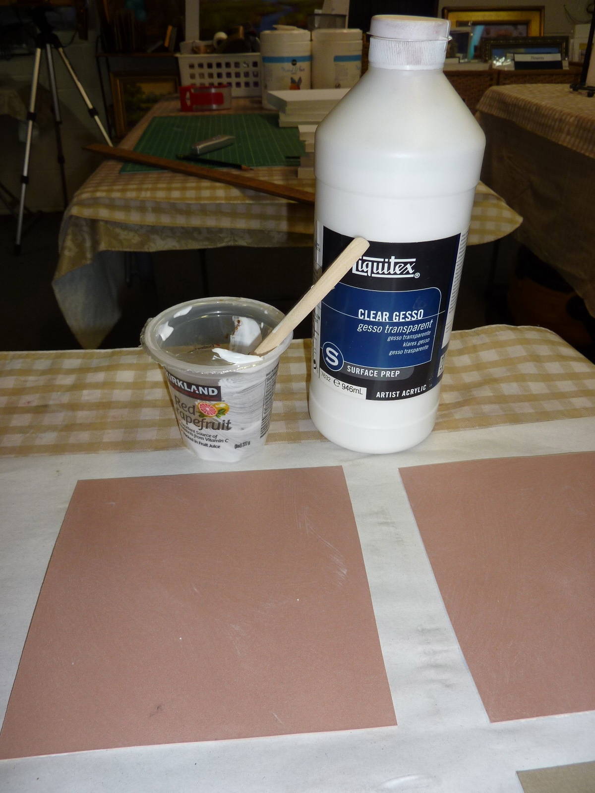
  • I decided I would use clear gesso and a stiff brush to paint over the grassy foreground. (see photo below)
  • I let it dry and then went back over the area with the side of my pastel letting it glide over the nooks and crannies left by the brushmarks and gesso. 
  • I repeated this several times until I got the textural quality I wanted.
This worked well for me but on the same day I was working on this painting, Richard McKinley's Pastel Pointer blog addressed this very topic of creating impasto texture with pastels. I will be trying his techniques soon!  Here is a link to Richard's post on impasto.


applying clear gesso to the foreground 

close up of the texture in the foreground
I used clear gesso which has a bit of grittiness to it. You could also experiment with pastel grounds or for even more fun try any of the acrylic grounds by Golden. There is no limit to the fun you can have!

Friday, February 28, 2014

Revisiting the Watercolor Underpainting...a New Approach

'Morning Meditation'            5x7         pastel        @Karen Margulis
click here to purchase $45
 He must have read my mind!  As I was preparing for my class on watercolor underpainting I happened to take a break to read Richard McKinley's latest Pastel Pointers blog post.  It was exactly what I needed to try...and pass on to my students as well.   Thank you Richard for your timely and wonderful post on Pastel Underpainting Freedom.  I love this twist on a watercolor underpainting!  Here is the link to the post.  Allow me to share my experience.

Watercolor Underpainting for 'Morning Meditation'
 I love underpainting with a wet medium such as watercolor but so often I end up covering it all up with  pastel.  I know I am not alone. Sometimes no matter how careful I am I end up covering all of the wonderful drips and washes of the watercolor.

Richard points out in his post that this is very often due to the fact that we have lost the value structure or never had it in the first place and we need to establish it with pastel....hence often covering up the underpainitng. Aha!!! That makes so much sense.

In his post Richard shares a technique he is using to have a strong value map in place that will not wash away with the wonderful wet underpainting.

Step One: To accomplish this he begins with a loose value drawing on the surface with a pastel pencil. Next the drawing is sealed with a coat of clear gesso.  The clear gesso has an additional benefit of being slightly gritty. This grittiness adds interesting texture to the painting. You can exploit this by the way you paint the gesso over the drawing. Your brushstrokes and the thickness of the gesso will have an effect on the way the pastel layers will look. Click on the painting below to see the texture of the gesso.

'Dance in a Meadow'           5x7          pastel
sold
 Step Two:  Once the gesso is dry it is time to apply the watercolor. That is a lesson all to itself which I will share in an upcoming pdf Demo. I do begin with dark colors and allow the darks to set up before adding additional washes. I encourage drips and blooms.  The wonderful thing about this technique is you are not left with a washed out or wishy washy watercolor underpainting. You still have the value map for the painting which has been preserved under the clear gesso.  See the painting below which is now ready for the pastel application.

underpainting for an unfinished work
Applying the pastel still takes restraint and thought to prevent overworking but everything is in place for a better chance for success. This is fun! I am headed back to the easel for more!

Wednesday, January 15, 2014

A Simple Technique for Painting Falling Snow with Pastels...demo

'On the Way to Grandmother's House'             9x12          pastel         ©Karen Margulis
click here to purchase $125
Want to paint snow with pastels?  Forget about trying to paint every snowflake. I have a quick and easy way to create a snowy landscape.  All you need is a very light value pastel and something with a sharp edge. I like to use a palette knife.  A piece of glassine or tracing paper is helpful but you could do without it in a pinch. Read on for details.


I am using a light gray piece of Canson Touch paper that I also coated with some clear gesso for a bit more texture. I used only my softer pastels, Terry Ludwigs and Diane Townsend lights. I blocked in the darkest shapes with some blues and purples.


I block in the sky with pale pink and pale yellow bringing it down into the trees.


I finished the snow covered foreground and mid ground using blues for the shadows on the snow and pale yellows and pinks for the snow color. I don't use pure white at all.


I refine the trees by using the sky color to create some airy and lacy branches. I also lightly draw in some branches with the sharp edge of my pastel. I refine the trunks and aadd some bits of color to the trees. Now I am ready for the falling snow.


I lay the painting flat. Using my flat palette knife and a pale pale pastel (not white) I shave the pastel over the painting where I want some snow to fall. I dig into the pastel stick to create some larger snowflakes. Once I am satisfied with the amount and placement of the snow I put down the piece of glassine paper and press down with my palm all over the paper to push the pastel dust into the paper. I also use the palette knife to push the bits of pastel into the paper. I also use the palette knife to draw in some branches like scratch art.

Voila...now you have falling snow!  Easy and a lot of fun!


Thursday, November 07, 2013

Painting Grass....How Much is Too Much?

'Pawley's Pleasure'             12x18           pastel           ©Karen Margulis
sold
 Water and Grass....two things that can be a landscape challenge. In my classes this week we have been working on water. Specifically water that winds through a marsh. You know...those creeks that run through the marshes, some deep and some shallow but all interesting and challenging!  But I realized that we can't do a good job with the water without dealing with the surrounding grasses!

How much grass should we paint? How many blades of grass are enough?  My answer is that we don't need as many blades as we usually put it.  I remind myself to SIMPLIFY and STOP OFTEN.

reference photo
Here is my reference photo for today's painting. There is a lot of marsh grass here!  It is so easy to get caught up in the fun of painting the individual blades of grass. Before we know it we have overdone the grasses and we have a busy painting. Unless your goal is to have a very detailed photo realistic painting it isn't necessary to put in all of the grass blades you see in the photo.  I have a few thoughts that I keep in mind when it comes to grasses:
  • I use big chunks of grass color rather than a lot of linear marks. I begin layering my darkest base grass color and gradually getting lighter/brighter.
  • I then decide where it would be good to put in a few blades of grass. These are my 'hints'. My goal is for the viewer to see these hints and fill in the rest of the area with grass. 
  • I use the edge or tip of my pastel to make painterly grasses. I never use a pastel pencil. I want my grasses to be lyrical.
  • I only make a few blades then STOP, step away and evaluate. When I don't make myself stop I find that is when I get carried away and paint too many blades. Remember...make a few blades, Stop and see where more are needed.


close up detail of the grasses
 Another issue that often arises when painting water and marsh grass is what to do with the foreground. If we put in a foreground full of grass it might create a fence or visual barrier. Look at how I treated my foreground in today's painting.  Tomorrow I will share my favorite tip for foregrounds.

Tuesday, September 17, 2013

Three Tips for Dealing with an Uninteresting Foreground

'Beneath the Autumn Sun'            11x14         pastel          ©Karen Margulis
click here to purchase $175
Foregrounds in a landscape can give me fits.  I don't want to make it too busy and detailed  or it might stop viewers from moving beyond it.  I want to invite them into the painting.  In my hesitation to put too much stuff up front, I am often left with a big boring foreground area. It's a dilemma.

I noticed that some of my students were struggling with this same dilemma at last week's workshop. It happens often especially when working from photos.  They were seeing all of the grasses and other 'stuff' and were creating a barrier with all of the grasses they were putting in.  I wanted to show them how to balance boring and empty with the right amount of grasses.  So I took out some paper and did an impromptu demo.  Here are the tips I tried to illustrate:


  • Plan the foreground area. I try to visualize what I want to happen in the foreground. How will I break up a big empty space? How will I arrange the elements?  How can I use these elements to lead the viewer through the painting?  If I wait and try to wing it I don't have as much success than if I had an idea of how I will treat it.  I sometimes like to block in a path of dark that will get covered up but will subtly move the eye back into the distance.
  • Less is More when it comes to grasses and flowers and other bushy stuff. Keep in mind that our brains will fill in the missing pieces if we suggest just a few. A few blades of grass or flowers placed in the right places are more effective than worrying about putting in every blade of grass. Be mindful of where you plant things. Avoid putting in random flowers. Put them where they add to the painting.
  • Don't give up on a foreground that isn't working. Some of the foregrounds I am most pleased with come from the second or third attempt. If my foreground ends up too busy I will often brush it out or spray it with fixative or wet it and try again. This often gives me a textured look that suggests grassy stuff without having to paint them!  (I sprayed this demo with workable fixative)
Do you do anything special to deal with a boring foreground? I'd love to hear about it!

Thursday, July 11, 2013

Simplify Your Reference Photos part 2

'Sedona Morning Walk'           8x10           pastel         ©Karen Margulis
painting available on Etsy $125
 I am always looking for ways to help me simplify things.  From organizing my supplies to simplifying my paintings. I find myself wanting to declutter!  So I really enjoyed Marla Baggetta's demo at the IAPS convention.  She shared ways that she uses to help her simplify a busy landscape. In yesterday's post I shared one approach (click here to read) Here is another with my twist.

We know that it helps to simplify a busy landscape and do thumbnails and value studies.  We know we should find the big simple shapes and block them in before we get too involved with details. I try to narrow it down to 4-5 big shapes rather than a bunch of small shapes.

 But how do we decide on what these big shapes should be?  Try this tip:

OUTLINE THE BIG SHAPES

My outlines on glassine paper
Take you reference photo and squint at it. Look for the big dark shapes, the big light shapes and big middle value shapes. Try to combine or mass shapes that are close in value. Remember you want to narrow it down to 4-5 big shapes.   It is very easy to get too many little shapes of light and dark. Remember that you will block in the big shapes and then as your painting develops you will be able to model the shapes and add the details.

My Twist:  I decided to put a piece of glassine or tracing paper on top of my photo and draw my outlines on the paper. This way I don't mark up my photo and have more freedom to move things around. A bonus is the glassine blurs the photos making it easier to see the big shapes. The details are obscured!

Below is an illustration of how I used the outline to block in and start my painting.


Friday, February 15, 2013

Friday Feature...The Secret Formula for Homemade Pastel Surfaces

'Winter Aspens'          8x10        pastel       ©Karen Margulis
click here to purchase
 It has been a fun week in my studio. I've been making a mess trying several recipes for homemade pastel surfaces. I really enjoy painting on a homemade surface....the texture and the excitement of the random brushstrokes make it fun to work on.   I love the control I have over the outcome when I make these surfaces. I can have smooth or canvas like marks or rough and crazy marks!  But I don't enjoy taking the time to prepare them....or the mess.

Ingredients for a homemade pastel surface...pumice and gesso
I have a solution!  I was so excited to discover that clear gesso makes an excellent ground for pastel. Right out of the jar....no mess, no fuss and with the benefits of other homemade surfaces.

The secret formula!  Clear Gesso 
I'll be talking about using clear gesso for pastels on today's Friday Feature You Tube video. I'd love for you to tune in for more information. If you would like to comment after the video with your email I'll send you a handout with the recipes for the pastel surfaces I've experimented with!

Thursday, February 14, 2013

Using Homemade Surfaces to Spice Up Your Painting

'Winter Woods'           8x10          pastel          ©Karen Margulis
 I love bad photos. Dull poorly exposed and blurry photos make me happy.  I wouldn't want to put them in a photos album but they make the best reference photos!  Why is this?  A bad photo gives me permission to make it into a better painting. If the photo was National Geographic material then I might be tempted to copy it. How would I be able to improve upon it?

A bad photo on the other hand can give me just enough information to get my imagination going. It might have a piece of something that inspires me to get me started. My goal is to make the painting that is better than the photo. If someone tells me my painting looks just like the photo...then I have failed.

reference photo
Take today's painting. The photo shown above was my reference photo. My son took it on a walk in a Chicago park.  To be fair his photo was actually good. But my crummy printer cropped it and did a terrible job reproducing the colors. I could have painted from my iPad where the photo looked good. But then I wouldn't feel the same freedom I have when I looked at the bad photo.

It was the warm light peeking through the trees that initially attracted me to the scene so that is what I started with. I decided that a warm red textured surface would be just right for my vision. Since I am experimenting with homemade surfaces I decided to use Susan Ogilvie's recipe. Visit Susan's website at www.susanogilvie.com


Making a homemade surface using the Susan Ogilvie recipe
 Susan's recipe uses Golden's Fine Pumice gel, some water and some powdered pumice.

  •  I prepared a batch by mixing some of the Fine Pumice Gel with water and stirring until the pumice separates. Then I add pumice powder and stir. I start with a teaspoon and adjust until the mixture is the consistency of heavy cream. 
  • I use a piece of Gatorfoam for my support that I have already primed with a coat of regular acrylic gesso. 
  • I tone this board by squirting some Golden liquid acrylic paint and spreading it around with a brush.
  • Once dry I apply the pumice mixture with a wide stiff brush using random brushstrokes.
I loved using this surface. It gave me an exciting surface to work on and didn't let me get bogged down with too many details. 

Tomorrow I will share another recipe as well as my next Friday Feature You Tube video!


Wednesday, February 13, 2013

3 Tips for Painting Winter Trees in Pastel

'Towards the Light'          8x10       pastel on homemade board     ©Karen Margulis
Bid Here at Daily Paintworks
Trees are hard to paint.  I hear this from my students all the time.  I think sometimes we make it more difficult than it has to be.  Take trees in the winter landscape. I am referring to those bare branched deciduous trees.  You would think that they would be easier to paint than a tree full of leaves. After all it is just a few branches which can be easily drawn in with a hard pastel, right?

But it is the bare branched, lacy looking tree that can be the most challenging. Why? Because we try too hard to put in every branch and twig and we end up something looking like a stick poking out of the snow.

Another challenge is to get the bare trees to look like they are part of the landscape and not 'stuck' on the background. Again, we sometimes try to hard and spend all of our efforts painting the tree and branches and forget about the background. Then try to put it in around the tree. Challenging!

How can we avoid some of these winter tree challenges? Here are my top three tips.


  • For those lacy looking bare branched trees in the distance:  It is easier to suggest the laciness. It is all an illusion. I like to scumble a nice muted distance color such as a muted purple or grayed green up into the sky. Then I pull some of the sky color on top of the trees muting them even more. The next step is to take the sky color and put in a few well placed sky holes to break up the  mass of the tree. Finally I take a sharp edge of a pastel or a Nupastel and draw in a trunk and a few very light branches. I use very little pressure because I want these branches to be light and airy.

  • For the larger bare trees in the foreground : When blocking in the painting if I have any larger bare trees I roughly block in the trunk and any big main branches. I then develop the painting as usual. I complete the background...what is behind the tree whether it be sky or more 'stuff' BEFORE I work on the tree itself. It is much easier to paint the smaller branches and twigs OVER the background rather trying to paint the background up to the branches.

  • TRY A HOMEMADE SURFACE!  If you find that you get bogged down with the details of a winter tree and you want a more suggestive impression of the tree....try a homemade surface with an irregular texture. The rough brushstrokes of the ground won't allow you to get too nitpicky with details. The surface can do a lot of the work for you if you let it! (see the top painting which is on a homemeade surface)
Yo can read more about homemade surfaces in this post HERE  I will also be posting more homemade surface information this week so be sure to come back. If you haven't signed up for email updates have a look at the sidebar on the right and sign up!  Thanks!