Visit my Patreon Page for more painting instruction and Paint Along Videos!

Thursday, January 31, 2013

Love Pastels? Here's a Great Way to Show it

'In My Box'          6x6          pastel    ©Karen Margulis
I try to be a Pastel Ambassador.  There are so many misconceptions about the medium. You've heard them. "Pastels aren't as good or valuable as oils"  "Pastel paintings are very fragile"  "Pastels are the same as chalk" "Pastels are pale colors"  Whenever I have the chance to talk about pastels or do a demo, I like to share all of the wonderful things about pastels.....

  • Pastels are made with the same pigments as oils and other paints....just made with a different binder. Simply put we are painting with dry sticks of pigment.
  • Treated properly pastels won't dade, crack or yellow and will remain as vibrant as the day they were painted.
  • Pastels do need to be framed under glass but they are a lot more resilient than many believe. You can't just blow a pastel painting off the paper.
  • Pastels come in hard and soft and in all shapes and sizes. Best of all they are made (many by hand) into the most brilliant and beautiful colors. They can be an addiction for the pastel artist!
Last week I had a thought....I need to design a sticker or button that will help me promote pastel as well as show my love of the medium.  So I came up with my 'Get Dusty' Collection. Here is the sticker.


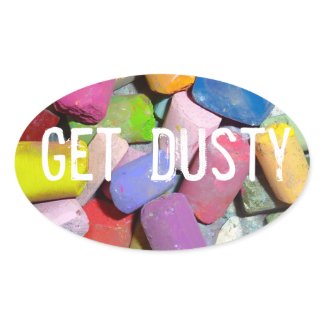
I used a photo of my own pastels and designed the sticker at Zazzle. I just received my order and I am thrilled with the color and quality of the sticker and the button. I put a sticker on my Heilman Box and I'll put one on my car and on my suitcase. I put the little button on my painting apron.  If you share my love of pastels and 'Getting Dusty' these items are available in my Zazzle store.  I'll be adding more items to my Get Dusty collection. I am also working on stickers with some other art sayings.

A Get Dusty button or sticker is a great icebreaker and will open up the conversation about pastels. The perfect opening for a pastel ambassador to share the wonders of pastels!

Put your 'Get Dusty' sticker on your pastel box


Put your 'Get Dusty' button on your painting apron

Wednesday, January 30, 2013

Celebrate Inspire Your Heart with Art Day

'All Is Right in my World'          8x10           pastel      ©Karen Margulis
sold

Inspire Your Heart with Art Day!  Now that's a great holiday. I didn't know that it was a holiday until I got my Cesar Milan newsletter and he was sharing dog art.  So I looked it up and thought it would be a good thing to share with artists and art lovers everywhere!

"Inspire Your Heart With  Art Day is a day to celebrate all forms of art and the effect it can have on your heart. Regardless of the piece, Art is valued and appreciated for all sorts of reasons by many different people."

Take time today to look at a piece of art and ask yourself these questions: What is is telling me? How does it make me feel? What emotions is it evoking inside of me?
By the way, if you are an artist these questions are excellent ones to ask yourself BEFORE you start on the painting. If you can't answer the questions for yourself then it will be difficult to get your message across to your viewers. 

'Wander Through the Daisies'      11x14       pastel
$155 in my Etsy Shop


'To Dream Among the Aspens'         8x10         pastel
$75 in my Etsy Shop
Whether you're an artist,  art lover, or enjoy a piece or two, take time today to enjoy art in all of its beauty and enjoy it with all of your heart. 

If you are looking for some online galleries then I highly recommend visiting both of these Daily Painting websites.  Artists (including me) post new work every day. You can get a daily  email showcasing all of the latest work.


Tuesday, January 29, 2013

Why You Should Shave Your Pastels

'Summer Buzz'            16 x 20      pastel        ©Karen Margulis  sold
 Shave pastels!  Yes that's what I said and if you are looking for a twist on pastel painting then you should get ready to shave some pastel dust!   If you been a regular blog reader then you have probably read my posts on the Dusting technique.  It is actually an old technique of applying pastel to paper but I only discovered it last year. I have been having fun with it ever since.

What is Dusting?  It is simply another way of applying pastel. Instead of making lines of thick marks, or dots and dashes, the pastel is shaved with a blade or edge of a palette knife and allowed to fall onto the paper (which needs to be flat)  You can either build up a painting with many layers of this shaved dust as I did for this Pear demo, or you can use the dust for special effects which I did for the Queen Annes Lace painting.


Shaving a pastel with  a palette knife

Painted with layers of pastel dust pushed into the paper  with a palette knife
 I have two suggestions for the effective use of the dust in a painting.

  • Dusting can be used to unify and simplify a busy area in a painting. Say you have an area that has been overworked or has too many busy details. You could brush it out and start over but instead consider dusting a thin veil of pastel in a color that will unite the various elements in the busy areas.  I did this in the top painting. I had too many weeds and colors going so I shaved some green pastel to give a haze of color which harmonizes and pulls everything together.

  • Dusting can be used to make interesting pops of color.  If you would like to add some hints of color in a painting such as hints of wildflowers in a field. You could just paint the dots of color but they might look stiff and unnatural.  If you dust on some small bits of pastel and press them into the paper they will look less contrived and more natural.  I used this effect in the above painting to make some of the little hints of hidden wildflowers. 
This week my classes are working on the dusting technique.  I invite you to follow along with us and give it a try. You can read more about how it is  done in a past blog post

Tomorrow I will present another way to paint with pastel dust! 

Monday, January 28, 2013

The Importance of Mystery in a Painting...Inspiration from Degas

'Emergence'          12x16          pastel over watercolor       ©Karen Margulis

"A painting requires a little mystery, some vagueness, some fantasy. When you always make your meaning perfectly plain you end up boring people." Edgar Degas

I love a good mystery story. Something that pulls me in and makes me think. I like it when a writer can give me just enough information to keep me hooked. I want to keep reading.  I'd like to be a mystery painter!  I'd like to tell a good mystery story with my painting.  It is my goal to put in just enough detail to tell the story but not to give away the ending right away!  I want the viewer to linger and to discover the bits and pieces that tell the story of the painting.

This quote from Edgar Degas speaks to me. It is something I have been working on and sharing in my classes.  Last week we worked on watercolor underpaintings with the goal being to let the underpainting suggest details rather than trying to paint every blade of grass.  This week we will be exploring the possibilities of the Dusting technique to help us introduce mystery into our work. 

Today's painting is the demo I did at the Red Cockerill Gallery last weekend. I did a watercolor underpainting and tried to leave some areas to the imagination. Here are some close-ups:


Not every petal is painted and I only used a thin veil of pastel over the watercolor

Very soft edges hint at a flower. Soft edges add mystery

I tried to be  loose and free with my strokes. Bolder more opaque pastel contrasts with the thin pastel over watercolor

Would you like to be a Mystery Painter?  Be sure to visit the blog this week and try out Dusting with pastels. It is a fun technique and one sure to add some mystery to a painting!

Sunday, January 27, 2013

What I am Listening to in the Studio (and how it will make me a better painter)

'One Summer in Maine'       9x12         pastel       ©Karen Margulis
available through Daily Paintworks $150 click here
Talk radio isn't going to make me a better artist.  But it is what I usually listen to while I am in the studio.  I think partly because it can be a long and lonely day in the studio and sometimes it is nice to hear adult conversation.  But I was at a loss this month when the regular radio lineup changed. I had lost my friendly radio voices. What was I going to listen to?

Music?  I love music and listen to music when I am painting something big or important like a commission. My choice in music changes and I often pick something that suits the mood of the painting.  But when I am puttering around the studio I prefer talk.

This week I stumbled on my new love.....Art Podcasts!  I know you are thinking I must have been hiding under a rock. I didn't realize there was such a treasure trove of art talk podcasts out there.  I have listened to 3 so far this week and it has been the best discovery. Not only do I get to hear adult conversation....it is conversation among artists. I listened to a wonderful interview with Quang Ho and the Evolution of Seeing and had to stop and take notes!  Even if I played it more than once I'm sure I will learn something else. Here is the link to this show 

I plan to listen to as many podcasts as I can before I am caught up. Even if I am busy painting or doing other tasks, it will benefit me to hear art related information. And they are fun!  I'm so excited!

Here are the two websites that offer art podcasts that I have found. If you know of others I'd love to learn more!

  • Artists Helping Artists with Leslie Saeta.  This fantastic show is the #1 art show on Blogtalk radio. You can visit the blog and see what is coming up as well as sign up for updates and listen to past shows. http://artistshelpingartistsblog.blogspot.com
  • Artist Mentors Online AMO Art Chat with Linda Fisler.  Here is the link to the website where you can read about the programs as well as listen on demand to the programs  http://www.lindafisler.com/amo-art-chat/

Saturday, January 26, 2013

When are you Finished with a Painting?

'Persevere'         9 x 12     pastel     ©Karen Margulis

It is so hard to know when to stop!  You know the feeling.  You are painting and you come to the point when you don't quite know if you are finished. You aren't sure what else to do and so you just keep fiddling...adding marks here and there without focus.  Before you know it you have not only finished the painting you have 'Finished it off' as we like to say here in the south. The painting has been overworked and you have lost that freshness that it once had when you weren't sure if you are done.

The advice I have heard is that if the little voice in your head wonders if you are done....it is a good time to stop. Take a break. Come back to the painting with fresh eyes. Put a frame or mat on it and see just how much more or less it needs.

If you do end up overworking a painting like I did on last week's demo (see photo below) Don't give up on it.  I know you want to rip it up and put it in the trash but you can learn so much by working through it and making new choices. Don't let it defeat you. Learn from it!


Overworked Demo
I overworked my demo last week. Partly because I was talking and trying to teach things so I got too much pastel and busyness going on.  I took it home and thought about cropping it (see line)  I liked the top but the bottom was a mess.  Instead I realized that sometimes we need to take something away rather than add more stuff so I brushed out the bottom of the painting.

I gave it a spray of workable fixative and I reworked the grasses. I simplified them and added some sparks of color to help the eye move up to the top. I like it mush better and it was a good feeling to know that I didn't give up!

If you would like to learn more about watercolor under paintings you may like to read my other posts.
http://kemstudios.blogspot.com/2013/01/what-comes-after-underpainting-part-1.html
http://kemstudios.blogspot.com/2013/01/tips-for-paper-choice-watercolor.html
http://kemstudios.blogspot.com/2013/01/the-two-ps-of-successful-watercolor.html

Friday, January 25, 2013

Great Egret Painting Step by Step Demo


'Visitors in the Marsh'           12x14           pastel          ©Karen Margulis
What a fun day in the studio!  I packed up my supplies for a demo tomorrow at the Red Cockerill Gallery in Austell.  I prepared for next week's class on dusting.  I prepped a board for a southwest painting I have on my mind. And I finished this commission of a Great White Egret.  I'd like to share some photos and thoughts on the painting as it developed.  
There is a surprise marsh visitor hiding in the marsh. Can you spot him?


 Step One:  I am working from a plain air painting of an egret that I did while on Pawleys Island last Fall. I am using a piece of Uart paper.  I drew the egret with a pastel pencil then started to block in the dark grasses.  But them I remembered that I wanted to tone the background with shades of orange Nupastels. I rubbed this layer in with a piece of pipe insulation foam.

My pastel palette for this painting. I choose the colors before I start painting.


Now I block in the dark grass shape. I use three dark greens, Diane Townsend and Terry Ludwigs. I start adding some lighter greens. My goal is to make the grasses look out of focus so I paint them as big shapes rather than blades of grass. I chose to put in this dark background first so that I can paint the egret's feathers on top, integrating him into the landscape.  This way he won't look pasted onto the background. See my hidden visitor?


Now I paint the eye and beak.  I want to get his face and expression correct before I spend time on his body. Now he is looking at me as I paint him! I use a dark Nupastel for the eye and the sharp edge of a Mt Vision pastel for the beak.


Next step is to paint the egret's body.  I begin with some cooler blues, purples and greens in the shadowed areas of the body. I also add some peaches and yellows since these colors will be reflected on the white feathers from the grasses.  I don't use any pure white even though it is a Great White Egret!


Continuing with the egret, I put down a few light layers of cooler lights in the sunlit feathers. I am using a pale blue and lavender. I also scumble these colors over the shadowed area.  The cooler whites will be a good contrast for the warmer lights yet to come.
I also work on the bottom dried grasses.  I start with several light layers of oranges, golds and warm greens, I am making loose, wide strokes in these layers. I put in a pop of blue and purple in the grass. I just felt like it needed it!   Then I worked on the legs putting down a darker and lighter purple and blue.


For the finish, I use my lightest warmest white which is actually a pale pale yellow Diane Townsend. I use this to paint the lightest area of the egret and to pull out the longer feathers on the front edge.  The finishing touches are in the grasses. I use a bright yellow orange to put down a few bold marks and thinner grass strokes. That was fun!

I love doing commissions so if you have an idea that needs to be painted let's discuss it!

If you enjoyed this demo please feel free to share. I'd love for you to follow the blog. Sign up on the right. Thanks!

Thursday, January 24, 2013

Art Tip of the Week.....Removing Stubborn Watercolor Lids

'Poppy Beauty'         9 x 12    pastel over watercolor       ©Karen Margulis
purchase with paypal here $125
I found a wonderful tip on my friend Paula Ford's facebook page. It saved me at least $45 and I'm sure it will save me more in the future. In her post she was asking for tips on removing stubborn paint tube lids.  Many artists commented and gave tips about using pliers and vaseline but one tip saved the day for me!

I have been working on watercolor underpaintings this week. In going through my supply of watercolors I came across 4 tubes of Schminke watercolors that I haven't been able to use because I couldn't get the tops off!  I tried pliers, my trusty jar opener tool, a piece of rubber, rubber bands. Nothing worked. All I managed to do was twist the tube until I thought it might explode. So I gave up, drooling over the colors I could not  open.

watercolor underpainting for another poppy pastel

Two ways to open a watercolor tube
I was excited to try the tip I read on Paula's thread.  It was simple and it worked!  All I did was soak the tubes in a container of warm water for about 30 minute.  The lids came off effortlessly. It was amazing! After all the struggling I was finally able to use these tubes of paint!

Speaking of watercolor paint I prefer to use the pan watercolors for underpainting but I make my own by filling wells of a palette with my colors, letting them dry and wetting them when I want to use them.  I am using Schminke and Daniel Smith watercolors but you can have a successful underpainting even with the cheap student pan watercolors.

I have several posts about watercolor underpaintings. If you'd like to read more search for watercolor underpainting in the search box on the sidebar. (right)


Artsy gifts for the Art Spirits ...love the gift wrap!
On another subject, I wanted to share the wonderful wrapping paper we used to wrap gifts for our UnChristmas party this weekend. Every year a group of my art friends get together in January to catch up. We share our work and play games and win prizes. This year we wrapped the prized in pages torn from magazines. The best designs came from collage magazines but interesting wrap could be made from all kinds of magazines and best of all we recycled and it was free!


Wednesday, January 23, 2013

What Comes After the Underpainting? Part 1

'Hollyhock Heaven'         11x14          pastel over watercolor  $165 Etsy
You are standing in front of your now dry watercolor underpainting.  You worked hard and took your time and it really isn't too bad. You have your apron on and your pastels out.....Now What?

Deciding where to put that first pastel mark can be intimidating. Especially if you have an underpainting that pleases you. First, remind yourself that it is only paper and that you are having fun!  Then study the underpainting and decide where it might lead you. It may suggest something very different than your reference photo  and that is OK. That is the beauty of a WU....it can help you become a more expressive painter.

But the time does come for you to make your first mark. I have discovered that there are two ways that work for me. I can either develop the painting as I usually do by laying in the dark shapes and working all over the painting or by painting the star first. The choice depends on how much of the underpainting I want to preserve.  Let me describe the star method first. (I will detail the first method in part 2)

watercolor underpainting for a hollyhock painting
Paint the Star First
If I have an underpainting that I really like. Maybe it has cool drips or interesting colors. Maybe I was successful in suggesting details with the watercolor. I know that I don't want to cover it all up with pastel. It is so easy to get too heavy handed and overwork the pastel and before you know it those yummy drips are gone! (trust me I have done it more often than not)  Here is another approach:

  • Decide on your center of interest and chose the element that is the most important. In the hollyhock painting it was the flowers.  Paint this thing first. 
  • Be sure to keep a very light touch. Whisper your pastel at first. You can always add more pastel but you want to build it up gradually.
  • After painting the center of interest then evaluate the painting to see where else you need pastel. You are working out from your center of interest.  If the underpainting is working consider leaving it be or adding a light glaze of pastel so as not to obscure the watercolor.
  • TIP:  If you like a color in the underpainting and wish to keep it, find a pastel to match it in color and value. If you lightly apply the pastel it will work beautifully with the watercolor.
I used this approach with today's hollyhock painting. I painted the flowers first and built them up with several layers of pastel. I only used light layers over the rest of the painting especially the sky area.  I like the way the transparency of the watercolor and thin pastel contrasts with the heavier flowers.

Tomorrow I will cover my more typical approach to the pastel application.

Tuesday, January 22, 2013

Tips for Paper Choice ...Watercolor Underpaintings for Pastel

'Gently Through the Meadow'      8x10      pastel over watercolor       ©Karen Margulis
purchase through Daily Paintworks  $145
It's all about the tools!  Isn't that what is fun about creating art?  The chance to try different materials and see the results is one of the highlights for me.  It is through this experimentation that you discover what works and what doesn't.  I have learned some things about the paper I choose for watercolor under paintings (WU)

watercolor underpainting for above painting
What kind of paper does one use for a watercolor underpainting for a pastel?  

  • First and foremost it has to be a paper or surface that can get wet. 
  • Most sanded pastels papers except Sennelier LaCarte can take a wet wash.  Some do better for me such as Uart which tends to stay flay even when wet.  
  • Boards such as Ampersand Pastelbord are an excellent choice.  
  • You can even use watercolor paper or mat board.  Here is a little trick to give these more tooth...brush on a coat of clear gesso. (more on this later)
But paper type is only one thing to think about. You also want to consider the color of the paper. It does have an impact on the results of the watercolor. Have a look at the samples below. You can click on it to enlarge.


sample WU done on various color papers
I prefer doing a WU on a WHITE surface.  I like the way the light goes through the transparent watercolor to the white paper and just glows with light. White paper just makes the watercolors brighter, cleaner and more vibrant.

The second sample was done on a manilla color sanded paper. It was fairly light so the results are not too bad. This would be my second choice.

 Now have a look at the third sample done on Wallis Belgian Mist paper which is a medium gray. Look how dark and dull the color looks compared to the white sample.  I used the exact same colors and painted them at the same time.

To sum it all up.....have fun experimenting with papers to see your results but consider the ability of the surface to get wet and don't overlook the importance of paper color.  Now go have some fun!

Today's painting was the demo I did for my Tuesday class.  My goal was to leave much of the underpainting showing.

Monday, January 21, 2013

The Two 'P's' of Successful Watercolor Underpaintings

'Lady in Red'       8x8       pastel       ©Karen Margulis  
purchase in my Etsy shop  $75
It's Watercolor & Wildflower Week here in my studio.  In my pastel classes we will be focused on the watercolor underpainting for pastel so I will be sharing my week with you.  I have had many failed watercolor underpaintings.  In fact when I first tried them they were so awful and washed out that I wondered why I even bothered.  I thought it was a waste of time and paint.  That is until I discovered a couple of tips from Richard McKinley.  I call them the 2 P's of watercolor underpaintings. (WU)

First have a look at two of my under paintings.  The top one I feel is a success. The colors are rich and vibrant and the darks are strong. I can still see that it is transparent. I have an idea of color and value yet it isn't too detailed.  The bottom underpainting is poor.  It is just a wishy washy shapeless blob. This is what all of my watercolor under paintings looked like before the 2 p's.

A Successful Watercolor Underpainting

A Poor  Watercolor Underpainting
I learned so much about doing a WU when I attended a Richard McKinley workshop in Lake Tahoe. (what a fantastic experience!)  These two guiding principles have helped me create stronger under paintings. Here they are:


  • PRACTICE  It makes sense. If you want to get better at something then you must practice it. Richard recommended that I set aside time to paint just the WU....lots of them and not to worry about ever putting pastel on them. The only way you can understand how the paint and water react and how you can get certain effects is to see it happen...more than once.  So plenty of practice will make you more confident with your materials. And while you never can truly control watercolor you can at least guide it somewhat!
  • PATIENCE  Slow down. Don't rush the underpainting.  I use to see it as a way to get some color down quickly so I'd slap on some paint. I was anxious to get to the pastel.  The results revealed my impatience.  I watched Richard demo and he took his time with the watercolor. There was no rushing and his results showed!  (I'll be giving more tips about WU later this week)  So the lesson is to make the underpainting process just as important as the pastel. Take your time with it!

All set up for underpainting practice!
Be sure to come back this week for more on the Watercolor Underpainting and painting wildflowers!

Sunday, January 20, 2013

Art Quote of the Week ... on Simplification

'I Can See Forever'        16 x 20    pastel    ©Karen Margulis   $250 Etsy shop
Wouldn't it be nice to start the week with an inspiring art thought to give us a little food for thought. Welcome to my new weekly blog feature.  I will search for and share a quote that will provide us with inspiration and something to consider as we create art during the week.

Today's quote is from Edgar Whitney and his book 'Complete Guide to Watercolor Painting'  which by the way is a wonderful book full of his teachings that apply not only to watercolor.

"When you work from the whole to the parts, expressing the large gesture first, you frequently find when you get to the parts that the subconscious has beautifully suggested the details"  Edgar Whitney

'Marsh Study'   6x8   pastel     $55 Etsy shop
I love this quote!  This is exactly what I was trying to share at both my SPS demo and classes last week.  We want to suggest details rather than spell everything out and by starting with the big simple shapes first we have a better chance of stopping before we overwork the painting.  On the other hand if we start with the little details we may end up with a busy overworked painting with no strong structure to hold it together.

The painting I am sharing today was the demo for the Southeastern Pastel Society. My goal was to show ways to simplify a busy landscape and to find ways to suggest details. I began by painting the big simple rectangle of dark earth and blue sky.  I then added the color in the grass with broad strokes of pastel.  I worked from the whole to the parts as Whitney suggested in his quote.  I'd like to think that my subconscious suggested the details!

This week we will be working on watercolor under paintings and I will let this quote guide me!

Saturday, January 19, 2013

Three Things I've Learned about Painting Cats & Dogs

'The Boys'              11x14           pastel         ©Karen Margulis   SOLD
 It all began with cats.  My return to art that is.  I was a busy mom with no time to paint so when my kids reached high school I decided it was time to get back to art. I began doing colored pencil drawings of my cats. They weren't very good but it was enough to whet my appetite .  I moved on to pastel and landscapes but I still enjoy a return to painting animals one in awhile.  I have learned some things that I'd like to share.

working from photos and a color study
Three things I've Learned about Painting cats and Dogs
  • Paint the eyes first!  But if you do have open eyes go ahead and get them right at the start.  The eyes are what give life to your animal so it is important to capture them.  I will put in the eyes and get them complete but will always come back and reinforce them at the end of the painting.  This way I don't have to look at a lifeless animal while I paint. Once the eyes are there I have tackled the hardest part.

  • Don't wait to put in the background. Decide at the start what kind of background you want. Will it just be blocks of color or will it be representational in some way?  If you want to paint things in the background such as furniture, windows etc.  take care not to make the things too detailed or have hard edges.  You don't want the background to take away from your star (the animal)  I like to suggest the things by painting blocks of color and shapes.  If I just want color I try to choose a color that either complements or is used in the animal.  I ALWAYS stat putting in the background as soon as I block in the painting. I work on the background at the same time as I work on the animal.
  • Think beyond Local Color.   Stop before you reach for the brown pastel!  or black or white or yellow.  Fur color is much complex than the local color names we give it.  Black for example has blues, red and purples in it. White can have pale values of any color.  I have written a post about painting fur color that you might like to read HERE.


These Siamese Cat paintings are available on my website.http://karenmargulis.weebly.com/animals.html

If you would like to discuss a pet portrait commission email me for details kemstudios@yahoo.com

Friday, January 18, 2013

Exploring Hot Pastels...Review of Diane Townsend Hot Colors

'Here Comes the Sun'          8x10           pastel      ©Karen Margulis   $75 Etsy Shop
It has been cold, damp, dark and dreary here in Georgia.  I am dreaming of warmth and sunshine.  After five days of rain I would like a little heat in the studio.  Today I saw my box of Diane Townsend Hot set of pastels on the shelf and thought they would be just the thing to play around with.

I always enjoy doing a red or hot pink underpainting for a landscape filled with green.  I looked at this set and all of the wonderful reds and oranges and knew they would make a great underpainting choice. So I went through my pile of photos and found  a field of sunflowers.  Perfect!  Lots of green and a sunny reminder of summer.  So how did these pastels perform?

Underpainting using Diane Townsend Hot Colors pastels

I chose a paper that I made myself by applying clear gesso on a piece of watercolor paper. I wanted to have some texture and a bit of an irregular surface.  I began with a quick sketch of the basics shapes to give me an idea of the composition.  I applied several of the Hot pastel colors with the darker oranges in the dark areas and lighter hot pinks in the mountain and sky. I put in some lighter oranges in the areas where I wanted flowers.  I then rubbed the pastel into the surface with a piece of pipe foam insulation.

I am left with a nice soft underpainting that will work well with all of the greens and blues  I will be using. Not only does using the complements in the underpainting help make the greens and blues more exciting, these intense warm colors add a feeling a warmth and sunshine to the painting.

Diane Townsend Soft Form Pastel 'Hot' colors
 So how did I like the Diane Townsends?  I am a big fan!  They have become one of my favorite pastels along with my Terry Ludwigs.  These are the soft form pastels. Read what Diane has to say about them on her website  http://www.townsendpastels.com/soft-form.html


  • They are just the right consistency for covering large areas such as under paintings. I love them for skies!  They aren't too hard and they aren't too soft and crumbly.
  • They have some pumice in them so are a bit gritty.  I love the feel of this though and the scratchy sound they make on the paper. This does help them cover the paper and will even open up the tooth of a non sanded paper to make layering easier.
  • I am a big fan of the light values. They are my 'go to' pastels for sans and clouds but I really enjoyed using the Hot colors. They are richly pigmented  and include some unusual colors such as the fluorescent pinks and oranges. I have an idea for another painting with these yummy colors!
If you think you might like to give these pastels a try, Dakota Pastels has them on sale! http://www.dakotapastels.com/pages/softpastels-townsendsoft.aspx


Thursday, January 17, 2013

My Favorite Trick for Painting Grass


'Autumn Warm Up'           12 x 12    pastel      ©Karen Margulis
painting available with Paypal   $165  click here
Many a good landscape painting has been ruined by grass.  It's true!  There is something about painting a field of grass that causes many artists to get carried away.  I do it myself when I am not paying attention.  Three things happen frequently when trying to paint a grassy area.

  1. The artist isn't focused and puts in blades of grass randomly. A piece here , another over there and before you know it there are spotty blades of grass with no purpose or direction.
  2. The artists gets so caught up in the painting of the grass blades that they over-do it.  Rather than putting in a few pieces of well placed grass...there are too many and not anything left to the viewer's imagination.
  3. The artist paints grass that looks like a child's work. I don't mean to sound harsh because it is something that happens without our knowledge.  What happens is that our brain tries to help us paint grass using the symbol we have...how we drew grass as a child. We end up with a fence of rigid rows of grass.
So what can we do to improve the way we paint grasses with pastels?   ROLL THEM!


Using the rolling technique
Rolling the pastel creates much more painterly grasses than when we just try to draw them.  You need to use a round pastel for this technique. Hard or soft will work with each giving a different result. (see chart below)  All you do is place the top edge of the round pastel on the paper and push and roll it across the paper until you get the grass length you need. Here are a few tips:

The results of rolling with some round pastels

  • Vary the pressure as you roll to get a broken line which looks more natural.
  • Change the direction of your marks so that you don't end up with a line of fence of grasses....this creates a visual barrier.
  • Use harder pastels such as Rembrandts and Art Spectrum to get a finer line with more control.
  • Use a softer pastel such as a Sennelier or Schminke for a chunkier grass. The softer pastel fives a more textured grass.
  • Pay attention where you place each grass.....every blade of grass should have a purpose. I like to use my grasses to help move the eye around the painting.
Have fun with painting grass and don't forget to Roll the pastel!  I will share other techniques in future posts.