 |
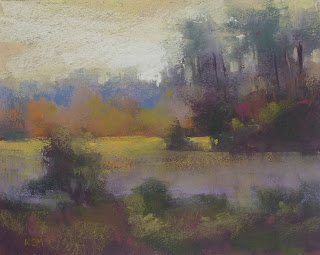
| 'Spirit Meadow' 8x10 pastel ©Karen Margulis click here to purchase $125 |
It wasn't too unfamiliar because I tend to work in a similar way. But there are some things Doug did that I will be using more often. He didn't do a wet underpainting but rather did a block in with four colors. Follow along with my demo for more.
 |
| The 4 pastels I chose for my block in. |
While looking at my black & white thumbnail I block in the big simple shapes with the four colors. I don't look at the reference photo for this step. I am using a piece of burgundy Canson Mi-Teintes paper. After blocking in the 4 colors I rub in the lights so the dark paper won't be distracting.
At this point I evaluate the design of the painting and it is just a matter of adding more color and details and refining the shapes. I put aside the thumbnail and work from my photo.
I add some dark greens to the trees. Add some yellows to the sky. I add some cooler colors to the distant tree line. I am using a light touch and glazing over the first layer of pastel.
I continue to refine shapes. I make more skyholes in the trees. I add the bright yellow green in the distant meadow. At this point I have to decide where I want to soften some edges and where I want to have the most clarity and sharper edges. Can you tell where I used hard edges? Soft?
More refining. I add some pale yellow to the sky and glaze some yellow green onto the purple grasses. I thought I was done at this point until I took a break and came back to the painting. I decided the painting needed some punctuation marks.....some little pops of color. I add them. You can see them in the top photo. Can you see where they are?
If you would like to read my day by day report of my workshop with Doug Dawson click here


1 comment:
Post a Comment