
 |
| 'Dune Colors' 10x10 pastel ©Karen Margulis sold |
There is a solution. It takes a little bit of planning and discipline but the resulting color harmony is worth it!
1. Have a plan for your color and do some small color thumbnail studies.
2. Work with a limited palette and choose the pastels you will use before you start painting.
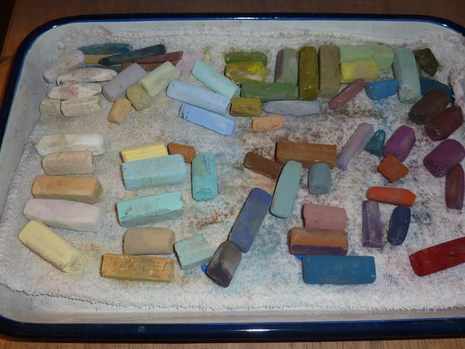 |
| My butcher tray of pastels used for today's painting |
 |
| Finished painting with the Black and white thumbnail and color study |
Sometimes I would also do a small color study but like value thumbnails I wasn't consistent with them. But I realize that when I do the value and color studies the resulting paintings tend to be more successful. It will now be a part of my painting process. I will consider them as a dress rehearsal for the actual painting....the warm up!
I will be posting more on doing color thumbnails after the A-Z Challenge so be sure to stay tuned!
8 comments:
Thank you so much for your wonderful art, blog, and videos! I'm new to the world of art and pastels, and I really appreciate your willingness to share what you know (especially about green)!
Thank you Kristin! I appreciate you visiting my blog!!
Hi Karen - I have a question. I noticed a little value scale square on one of your thumbnails. Can you explain why and how you use it? Thanks!
I'm heading to LA for a McKinley workshop all next week. I'm preparing intensely for it - re-reading his book, getting supplies organized. Very excited! I just watched your "greens" video - so very helpful once again!
PS: Looking forward to meeting you in person at IAPS!
For some reason it fascinates me to see artists' palettes alongside an image of a finished piece (beautiful, by the way, and very peaceful). Somewhere inbetween, magic happens.
Hi Beth,
How exciting to be going to a McKinley workshop! He's the best!!! The little value scale you saw is just a test of the colors I will be using for the block in. I chose 4 colors to match the 4 values I have in my black and white thumbnail. I will be writing more about this process soon!
Have a great time!!
Thank you Indigo for your comment!! Much appreciated and I apologize for the captcha thingie...I get way too much spam without it!
Dress rehearsal. That's a good description and reason to do it.
I just stumbled across your blog and really appreciate what you have to say! Thank you for this post in particular -- I'm an oil painter who has been trying to sharpen her sense of color, so this is just the tip that I needed -- a color sketch is brilliant! I too often find myself starting out a painting and half-way through realizing the colors aren't quite right. I will be trying this with my next work, thank you so much!
Post a Comment