Visit my Patreon Page for more painting instruction and Paint Along Videos!

Monday, March 31, 2014

Monday Mini Pastel Demo...Old Florida Fishing Shack

'Days Gone By'            16x20          pastel             ©Karen Margulis
sold
I started this painting a few years ago. I wasn't sure how to finish it and then lost interest in it. So on the shelf it went. I have a stack of unfinished paintings on a shelf still attached to foam core. Every once in awhile I pull one out and revisit it.  This is probably my oldest unfinished painting... started during my first year with pastels.  I was in my Florida phase. I only painted beaches, shells and shore birds. 

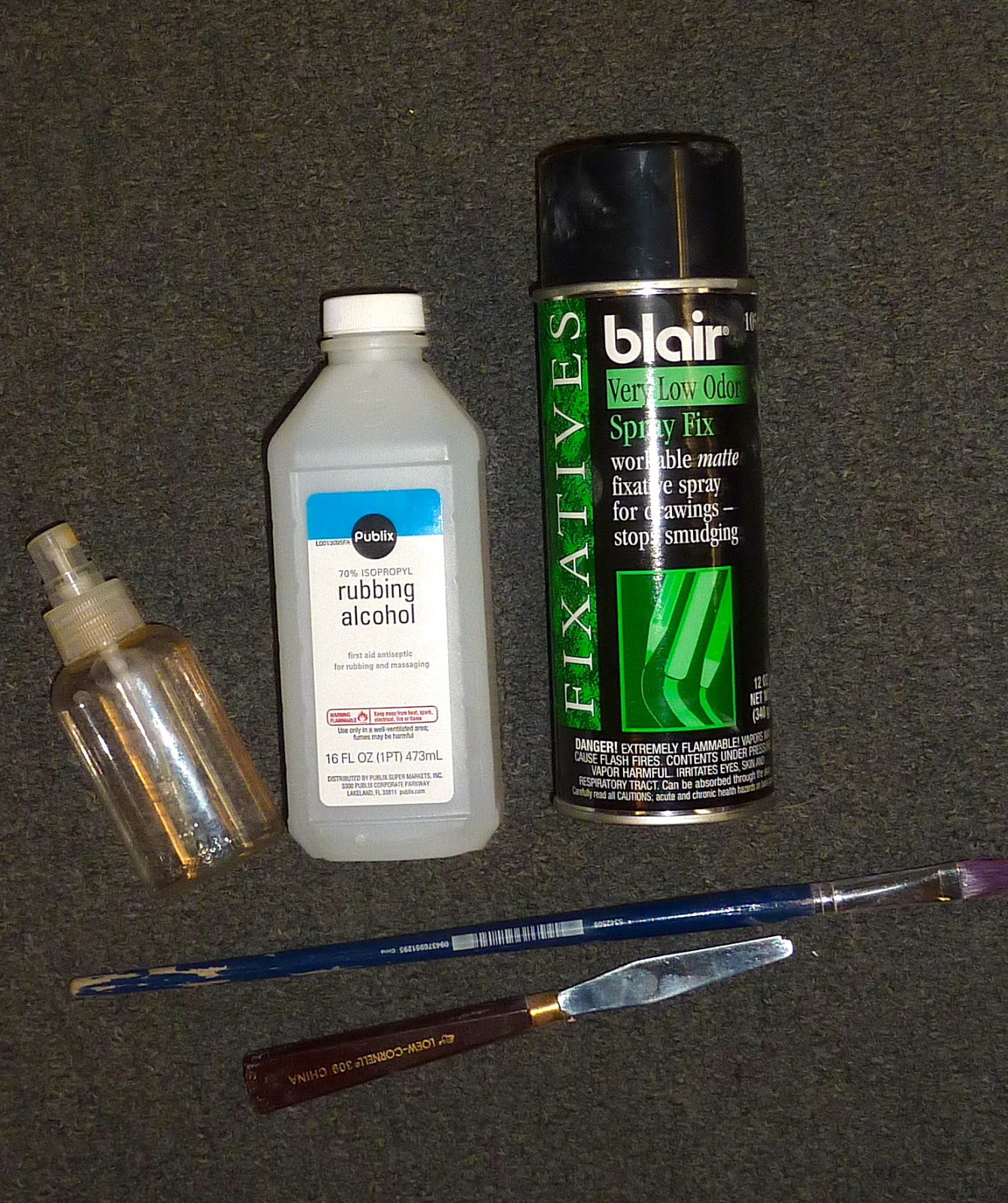
Since we are working on water in class this week I decided to revisit this Florida scene.  This old fishing shack was quite rustic and rickety but the view was amazing. I had started the painting with an alcohol wash. (see below) The reference photo had faded but I still remembered the vibrant colors of this wonderful place. The painting is 16x20 on white Wallis paper.


Where I left off 8 years ago.


I began by reinforcing all of the dark shapes with a deep blue, dark red and dark green. I put in my most intense color which was a bright coral.  Next I worked on the sky. I started at the top of the paper and put down some cool deep blue and gradually used warmer and lighter blues and yellows. I let the pastels blend themselves...no finger blending.


I continue with a cool green for the distant land and put in the first layer of water. I use a rich middle dark value blue. I will layer more blues in the water but I put in my darkest color first.


 I begin the reflections.  I pull the colors of the dock and pilings down into the water. I used vertical strokes and blend them downward with my fingers.  Next I add lighter bands of blue in the water. When I get to the area of reflection I choose a rich bright blue and make some current marks in horizontal strokes over my reflections. (see the finished painting for this)


 Before I finished the water though I worked on the palm trees. I added some brighter warmer greens and some oranges in the palm fronds. I used the sky color to create the fronds by negative painting.


The last thing I did was to paint the shadow and dock. It was an old uneven concrete dock.  I then finished the shack with some blues and peaches.  I stood back and decided that I needed a warmer color at the horizon so I scumbled some pastel peach over the yellow sky. 

I sure is fun to revist an old unfinished painting. It is the perfect opportunity to play without worrying about the results! 

Sunday, March 30, 2014

Why We Need to Seek Out Feedback


'In All Her Glory'                8x10            pastel              ©Karen Margulis
sold
Sometimes it is a simple bit of advice.  A few words. "Try this next time or look more carefully at that."   Something simple that you may have overlooked or maybe didn't even know. It doesn't matter how much experience we have. As artists, we are always learning and growing.  We need to continue studying and stretching ourselves. We need insightful feedback.


"A moment's insight is sometimes worth a life's experience." Oliver Wendell Holmes


 This is one of the reasons that I love taking workshops. I might just hear that one simple bit of advice that can make a big difference in my work. (I also love being around other artists who are all passionate about learning to paint better) 

I am taking a couple of workshops this year... Liz Haywood-Sullivan in May and Iceland with Stan Sperlak in June.  I can't wait to learn more and to get some feedback. Feedback is so important because we can't always see what we could be doing better.  It often takes another set of eyes.


Critique or feedback is one of the valuable benefits of a class or workshop. Having someone look at your work and honestly share their own insight is invaluable.  You don't always have to agree or you might not understand or be ready for the advice. This has happened to me often. I always take the feedback and file it away. Some I put it to practice right away and some advice might not be a fit for me....or might start to make sense at some point in the future.

I am fortunate to be able to take workshops and to have a great support system of local artist friends. It is worth the effort to seek out other artists in your area. Take a class or join a local art association. Often they offer critique sessions. Start your own critique group!  Or turn to the internet....when I was getting started with pastels I spent a lot of time in the pastel forum of wetcanvas.com.  I  posted my work for feedback and learned from other work posted. It is a great resource!

I understand the value of insightful feedback and I would love to offer another set of eyes for your work. Whether you are new to pastels or wanting to improve your work, consider my new online feedback sessions. Conducted by email, I will offer feedback on up to 3 paintings. Click here for more information or feel free to email me with additional questions. 

Saturday, March 29, 2014

Studio Tip...Get Ground Pastel Out of Your Carpet!

'Warm Wind'             5x7            pastel               ©Karen Margulis
click to purchase $45
 The blue pastels were fast and furious this week. We were painting blue skies and clouds.  Every once in awhile a pastel would take flight. Has this happened to you?  You are happily painting and all of the sudden the pastel just flies out of your fingers and lands on the floor....usually in pieces. A sad event and a messy one.

I have a new discovery that will take care of the pastel mess on the carpet.  And it only cost a dollar.  Yes I have been to the Dollar Tree again!  It is called LA's Totally Awesome Cleaner (as seen on TV) and I was skeptical. Would it live up to it's name?


Some beautiful blue pastel ground into the carpet
Awesome Cleaner to the Rescue! The results after only one treatment,
after the second treatment the stains were completely gone!
Yes It was Awesome!  It took care of the ground in blue pastel as well as some leftover red and yellow that I wasn't able to get completely out with other carpet cleaners. It bills itself as an all purpose concentrated cleaner, degreaser and spot remover. It is meant to be diluted but I sprayed it full strength on the pastel spots. It took two treatments...spray and wipe up with baby wipes.  The spots were gone!

I read about this cleaner on a facebook thread on cleaning up oil paint messes. This cleaner was recommended and I thought if it worked for dried oil paint it should work for pastel!  I even tried it on an old black acrylic paint stain on my carpet and it just melted the paint. The carpet was fine. Totally Awesome!

TIP: When cleaning up a pastel mess always vacuum with the hose to get up most of the dust. You want to get as much of the loose pigment up as you can otherwise you just turn it into more paint when you wet it. Suck up the dust first then treat the remaining stain. 

'Desert Patchwork'           5x7          pastel
click here to purchase $45


Friday, March 28, 2014

Improve your Paintings with this $1 Investment

'Silent Awe'               9x12              pastel           ©Karen Margulis
available for purchase $145
 Did you ever ask yourself why?  Why did you chose the subject to paint?  Why were you drawn to it? Did you have a reason for wanting to paint it?  Picking a subject because it seems easy isn't a good enough reason. Picking it because it is on top of the pile of reference photos isn't a good enough reason.

Having a passion for your subject leads to more passionate paintings.(tweet this) 

Being drawn to a subject isn't enough.  We need to know WHY we are excited about it before we can figure out how to express it in the painting.

My WHY BOARD with the 'why' for the sunset painting
We can think about why but it is better to verbalize it and even better to write it down!  So I came up with The WHY BOARD.  It is a simple 8x10 white board. I got it at the Dollar Tree for $1.  It is cheap but it does the job. It is very light weight, comes with a pen and an eraser and a magnet on the back. The pen even works!  A bargain price but priceless for the help it will give.

How to use the Why Board:

  • When planning your painting it always helps to start by asking yourself why you are drawn to your subject. Now instead of thinking it (and possibly forgetting) you jot it down on the board. I even wrote down a potential title for the painting. 
  • Prop up your Why Board near your easel. As you paint you should be stepping back. When you step back glance at your board. Are you still on track with your 'Why'?  Do the choices you are making fit your initial concept ? 
  • If you have gone off track you can at least decide if you like the new direction. If not you can evaluate and decide how to get the painting to better express your concept....your WHY.


Now simply erase the board when you are done and it is ready for the next painting!  I love the Dollar store!

Thursday, March 27, 2014

A Simple Way to Add Drama to Your Cloud Paintings


'Traveling Clouds'      11x14        pastel          ©Karen Margulis
available for purchase $165 click here
I needed some drama.  My clouds were too boring. The painting began as a demo on painting clouds. My goal was to share ideas for painting a fair weather day....blue skies and happy puffy white clouds. My demos are usually designed to teach something not to make a great painting. So as demos go, my clouds were just fine.  But as paintings go....the clouds needed to be energized.

Before....boring clouds
When my class was over I got  to work. How could I give some life and drama into my soft looking clouds?  I began by taking a paint brush and softening everything in the sky. I didn't brush it all out but just removed some of the pastel.
 
Next I worked on the land. I usually finish the sky and then work my way down but this time I wanted to have the sky work with the lighting and colors on the ground.

Now on to the sky.  I used some of the same ground colors in the sky. I used some peaches and yellows. It was better but still not enough punch. I needed something else..... I looked around the studio and spied the box of Schminke pastels I left out from earlier in the week. Super soft and buttery yellows! That is what I needed!

After....closeup of interesting clouds
 What a simple solution!  Using these soft and rich pastels allowed me to put down some juicy bits of color to my clouds. These textured marks were a nice contrast to the smoother parts of the sky.  In addition to the pastels being so buttery, I made bolder marks. I painted the clouds with the energy I wanted to portray.

The next time you are looking for drama.....try some super soft pastels and don't be afraid to make some bold marks!

reference photo


If you would like more information on mark making with pastels and creating bold 'shouting' marks you might like to see my You Tube video on mark making.  Click here to view.


Wednesday, March 26, 2014

Three Ways to Improve Your Sky and Cloud Paintings

'Speaking to the Sky'          8x10           pastel
available for purchase $125

Your Skies deserve the royal treatment.  They deserve more than a cursory treatment with a blue pastel.  Skies are important to a landscape painting. Even if they aren't the main focus of the painting, they provide the light and set the mood for the landscape.

I happen to love to paint the sky.  I am drawn to wide open spaces because I can see the sky. I am always looking for ways to improve my skies and clouds. I want my skies to be believable...to look like air...for my clouds to float and not look like potatoes or cotton balls!

I have collected some great tips and advice in the course of my studies.  There is obviously a lot more to learn about painting believable skies but currently here are three things I like to keep in mind when painting the sky:


1.  Be a good observer of the sky.  Go outside and make mental notes. Better yet go outside and paint sky studies. Notice the colors in the sky and clouds. Photos don't always capture the subtleties in the colors.  For example photos often show a blue sky oversaturated and polarized. As a result it is easy to paint a blue sky too dark if we rely solely on the photo reference. Taking the time to study the sky is well worth the effort.

2. Make your own grays for cloud shadows and dark stormy clouds. It is easy to reach for the gray and white pastels to paint clouds.  I prefer to use the more colorful grays (not the grays made from black and white) or better yet mix my own grays by layering colors until they make mud. More on this later this week.  Also I don't automatically reach for the pure white pastel for the light parts of a cloud.  I use pale values of colors such as pinks, yellows and peaches. I reserve the pure white for small areas on the clouds where I really want them to pop.

3. Make sure your sky and ground share a relationship. A stormy cloudy sky doesn't work with a sunlit ground plane.  They need to work together. They need to harmonize.  I often use colors in the sky that are in my ground. One of the first questions I ask myself when evaluating a painting is:  "Does the ground relate to the sky somehow?"

Today's painting is done on my homemade support using a pumice mixture on gatorboard. The pumice mix was toned orange before applying.  

Tuesday, March 25, 2014

What I Love About Plein Air


'In My Cherry Grove'          8x10        plein air pastel           ©Karen Margulis
available for purchase $125
The Cherry Trees were calling to me. They needed to be painted. I could take a hundred pictures of them but nothing could capture the way I feel about them like a painting them from life.  I needed to get out of the studio and stand under the trees.  I needed to hear the birds singing up in the branches.  I needed to feel the warmth of the beautiful spring day, to smell the neighbor's freshly mowed grass.  I needed to see the pale pink petals float gently in the breeze, carpeting the ground around me.

These are all things that a photo just can't do. A photo is flat and quiet. It is a piece of paper.  Painting outside among the trees makes me feel alive. My hand moves across my paper quickly...choosing the pastels to capture the colors I see in front of me.

My plein air pantings are not perfect. But they are real.  I never touch them up or finish them in the studio.  I want to remember exactly how I felt the day I painted them. I will use them as studies for studio paintings. The plein air studies capture a moment in time. To change them would erase the emotions that went into the painting.

I don't get outside to paint as often as I'd like. But when I do I am recharged and renewed. 

My Gogh box
Here is my set up: a Gogh Box (www.stansperlak.com) on an Oben travel tripod. I am using a Great American plein air half stick set which fits inside the Gogh Box perfectly. I will take the foam out of the box so I can fit more pastels in the box. I need my Terry Ludwigs too.   I will blog about the little black thing in a future post!
My paper is Uart 600 that I toned a warm brown with oops sample paint from Home Depot.


Monday, March 24, 2014

Monday Mini Demo...Trying Schminke Pastels

'Down to Earth'            8x10            pastel           ©Karen Margulis
sold
I am a pastel addict. I know this. I'm not sure what the proper treatment is but I continue to collect pastels even though I have more than I can possibly use.   I try my best to use them all.  Every once in awhile I visit my pastel shelf...where I store all of the random boxes of collected sets...and I choose a set to work with. I challenge myself to use the set in a painting.

Today I decided to try to incorporate these two sets of Schminke pastels into my latest marsh painting. I got these sets at the IAPS convention last June. (always a fun place for a pastel collector)  I like Schminkes. They are very soft and are perfect for my final marks...my punctuation.  For this painting I used them in all layers. They were wonderful for the sky. I may just have to get some more!  

Enjoy today's mini demo!


Two sets of Schminke pastels... Sky and Earth


 This painting is 8x10 on Uart 500 grit. I begin with a charcoal line drawing and a block in with 2 values of warm colors. I use hard pastels and rub in this layer with a piece of pipe insulation foam.


I start with the sky and work my way down to the foreground.  I use several of the blue Schminkes and a Terry Ludwig warm blue and a few Diane Townsend pale yellows. I don't blend with my fingers. The pastels are so soft that layering them lightly blends them . I pull the pale yellows over the blue sky to create the wispy clouds.
I also put in the distant land using a cool blue gray and turquoise. These are just marks since this land is far away. No details.


Next I put in some darks along the banks of the water. I use a rich dark green and purple. I pull the dark green down into the foreground area. See my posts last week on painting foregrounds.
The next step is to put in the water. I use the same colors that are in the sky....lighter near the horizon.


I go back to the distant land and put in some of the yellows and golds to suggest the distant grass. It is autumn so the grasses are all warm golds and peaches. I decide I needed another bit of water in the distance. I also start putting in some of the mid ground grasses with peach.


Now I lay in some of the rich rusty Schminke pastels in the foreground. They feel nice!  I am making my marks chunky and vertical.


I add some greens to the bushes and add some more chunky grasses to the foreground. I am having fun with these Schminkes!  After this step it was just a matter of refining the foreground with some smaller grass strokes using the sharp edge of the Schminke pastel.  I also added some yellow flowers by making some thick marks.  I also pulled some of the grass color into the water with my finger to make some reflections.  Finished!


If you like this painting and mini demo you may be interested in my pdf demo 'Painting an Autumn Marsh' available in my Etsy shop. I go into much greater detail with more photos. Marsh demo link

Sunday, March 23, 2014

A Simple Tip for Saving Money on Pastel Paper


'Take me There'            8x10          pastel           ©Karen Margulis
purchase here $125
You know you want it.  Sanded papers. Pastels and sanded pastel papers make a wonderful combination but paper can be expensive.  You might think that you aren't good enough yet to spend the  money on sanded paper. You might not be able to find it easily in your local art store or of you do it is only sold in the pricey pads.

I haven't bought a pad of sanded paper in years.  Instead I purchase my paper by the sheet and cut it down to smaller sizes. It is a huge money saver and I can mix and match paper brands.  It is even a better value when I use the VIP coupons that the big online art stores offer by email.

Cutting down sanded paper is easy.  All you need is a ruler, pencil and some scissors!


You don't need a paper cutter or cut it with an exacto knife.  A pair of sharp scissors does the job very nicely.  The paper will eventually dull the scissors and when mine get dull I buy another pair at the dollar store....for $1.  I thought I would buy a nice pair and sharpen them but the dollar scissors work great!

I like to buy full sheets 18x24 of Uart paper. (my favorite) I leave them as a full sheet until I need paper. Sometimes I will paint large and use the full sheet. Sometimes I like 16x20 or 11x14. Most of the time I cut a sheet into smaller pieces. I can get four 8x10's from one sheet.  I use the remaining scraps to cut some minis (2.5x3.5)

Buying sanded paper by the full sheet can cost anywhere from $6 to $15 a sheet depending on the sales. I always wait for a coupon. Consider getting together with friends to split a paper order. (splitting pastels is also another great way to add to your collection)


My favorite online store is Blicks.com. They have always been quick to deliver and correct any issues. I also like Dakotapastels.com as they always have everything a pastel artist needs!

Today's painting:  8x10 on Uart with a value alcohol wash. This was a demo showing how to create a path into a painting. 

Saturday, March 22, 2014

Just for Fun ...Surf's Up!

'Surf's Up'          6x6         pastel       ©Karen Margulis
click here to purchase $50
 Sometimes I have to paint something just for fun. It was like that today.  My to-do list is long and I really needed to get started on it. But I just felt like painting something for fun. Sometimes I feel guilty when I do that. Shouldn't I be painting something that would make a consistent body of work? Shouldn't I be more serious?  I feel like I should but the feeling quickly passes and I paint what I want.

Today I felt like painting some surfers at the beach.  I had taken photos of a group of surfers at Deerfield Beach Florida on my January visit.  I thought they would be fun to paint in a square format. I cut some grey Pastelmat into 6x6 squares and took out some Terry Ludwig pastels.

Pastelmat paper is fun to work on because it grabs the pastel so well. It is great practice for making bold strokes. You can blend on it but it seems like you need a few layers to allow the pastels to blend. I'd rather practice using less layers and more thoughtful strokes.

These were fun and I am glad I took a surfing break!  These little detours are needed and the downtime and play are what is often needed so the next breakthrough can happen.


'The Surf is Calling'          6x6          pastel 

Friday, March 21, 2014

Must Have Pastel Accessories

'Majesty'          11x14        pastel            ©Karen Margulis
available for purchase $150 click here
 I wouldn't trade anything for mine. There are less expensive alternatives. I have many of them.  But it's my Heilman Box that stands at the top of the heap.  It has been with me for eight years now and traveled all over the country and back and forth to weekly classes. It has never let me down.

I've written about the importance of organizing pastels by value and color in one box. (read post here)
I am always happy to share do-it-yourself pastel boxes. I have made many myself and use them for my extra pastels. But there is nothing better for your pastels than a Heilman Box. For me it is a Must Have pastel accessory.

Pastel artists know that pastels are expensive. We start out with only a few pastels but our collection inevitably grows.  We know we need a box but a nice box isn't always in the budget. But think of a good box as a protector of your investment.  We wouldn't  throw a good camera with expensive lenses in a thin cheap bag....so why would we take a chance with our expensive pastels. A good box like a Heilman is worth saving for.

My Heilman Box....Backpack size

8 years later and still going strong
Here are some reasons why I love my Heilman Box:

  • It is well padded with memory foam. I have dropped the box and had no broken pastels...not the case with my cheaper boxes.
  • It has plenty of room to organize my pastels by color and value. (I have the backpack size)
  • I like the turnbuckles on the lids....they are easy on the fingers and don't get loose.
  • I love that it has a catch on both sides to keep the box rigid when open. I can lift the open box to move it without it folding.
  • Quality materials and finish. I just looks great. I decorated mine with stickers from my travels.
  • It has a nice handle and carry strap and a lock (I don't use)
  • It isn't really too heavy as solid as it is.
  • It has held up well with no issues for the last 8 years! 
Yes, a good box is a must have for your pastel collection and the Heilman Box is definitely a box to consider! Available on their website:http://heilmandesigns.com

Thursday, March 20, 2014

How to Simplify a Foreground

'Marsh Madness'            8x10          pastel         ©Karen Margulis
purchase here $125
 Dark. Warm. Simple. I love this type of foreground.  It can be a bit mysterious. It should have some interest but not so much that is keeps you there.  It should lead you out of the darkness and into the light....into the rest of the painting. Like the opening chapter of a good mystery story it should entice you to read more and not give away the ending.  I call them DWS foregrounds. Dark, warm and simple.

It should be easy to create a foreground that doesn't have too much in it. But I find it to be a challenge. Sometimes I get lucky with a few successful strokes and if I recognize it in time I can leave it alone. But more often than not I end up overworking the foreground and put in too much stuff.

How can we simplify an overworked foreground?  Read on for some ideas.

close up detail of foreground stuff

some tools of the trade


  • The first thing I do for an overworked foreground is brush out some of the stuff with a stiff brush. Sometimes this is enough.  We tend to want to add things to make it better when we really should be taking things away!
  • If that isn't enough I will turn to workable fixative or rubbing alcohol.  A light spray of fixative or a spritz of rubbing alcohol will darken and fix the pastel so that subsequent layers will go on fresh and clean. The added bonus is a nice rich dark under the pastel and the pastel will have more of a textured look when applied over 'fixed' areas.
  • When I apply more pastel I am careful to make sure every mark I make has a purpose. I try to create a suggested pathway into the painting. I do this with value, color and details. It is easy to fall into the trap of putting in too much stuff....so I slow down and try to have restraint!
  • Often it takes more than one layering of fixative and pastel. I have often used several layers of both until I am happy with the results. I want it to be simple and yet complex. (see photo)
  • Once the pastel is built up I sometimes have it thick enough to scrape it to reveal some of the under layers. This adds to the texture and interest without being too obvious.
  • I will sometimes use the dusting technique using a palette knife to shave pastel dust to create foreground interest.


plein air frame from Blick.com
DISCLAIMER:  If you are going to try the workable fixative I recommend you practice with the spray before you spray the painting. Once you have the flow going then spray the painting. Spray lightly and not too close and keep the can moving.  Be sure to cover any areas of the painting that you don't want to spray!  This isn't a perfect technique and you may end up with too much spray or even spotty spray so be prepared to experiment!