
 |
| 'Beauty on a Quiet Day' 8x10 pastel ©Karen Margulis click here to purchase painting $145 |
Rain is moving in. The sky has been filling in with dense clouds with wonderful slivers of light and peeks of blue. I love these gray dreary days or as my daughter called it 'a white sky day'. The white sky isn't really white of course and it softens everything. The quiet neutral colors of a gray day allow me to appreciate the subtle colors and textures that are often overlooked on sunny days. Gray days also let me make use of my gray or neutral pastels.
I recently wrote a post about using brown. I had a request from a reader to share my thoughts on painting with grays. I found a perfect reference photo from my recent trip to Chicago for a gray day painting.
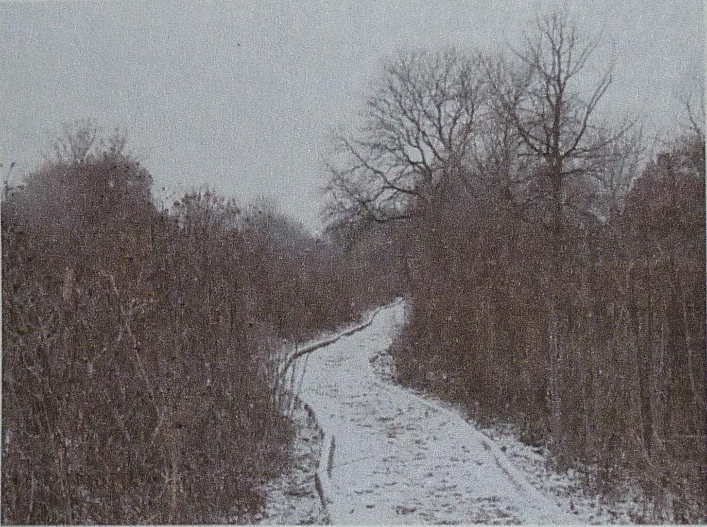 |
| a park in Chicago |
It was a dull, colorless photo but I remembered the richness of the soft neutral colors and the gently falling snow. I pulled out my drawer of neutral pastels and took out a piece of prepared board that was toned a warm gray. The challenge was to use only the neutrals for the painting. (See my post on Neutrals here )
 |
| a selection of my neutral or grayed down pastels |
- Value is the key to success. You can really use any color if the values are correct. I tried to keep my shapes simple with cohesive value. (not spotty)
- Since I don't have exciting color to spice up the painting I relied on punching up the contrast for interest.
- I looked for neutrals that had color rather than pure grays. The mix of subtle colors was more interesting than grays made from black and white.
- Gray day skies may seem white but I look for the subtle color in the white. I used a pale yellow-green for this painting. Consider pinks,lavenders, yellows, blue-gray for a 'white' sky.
- I tried to create more interest through my mark-making. I also used an iridescent pastel in the sky. When you don't have color....you need to find other ways to make the painting interesting.
- I used a gray toned board to keep the entire painting neutral but consider toning the surface with a more lively or intense color. It will provide some interest when it peeks through the neutrals.

TRY THIS: Take out a selection of neutrals. Make sure you have a range of values from dark to light. Hint: these are probably pastels you don't often use! The challenge is to paint a landscape using these neutrals. For an extra challenging exercise choose a reference photo that depicts a colorful / sunny day and turn it into a gray day!
2 comments:
I'll have to give this a try with my oil paints. Should be interesting.
What a helpful posting. Have wondered how I wanted to tackle a scene of the National Valley close to my home...now I have direction. Thanks.
Post a Comment