Visit my Patreon Page for more painting instruction and Paint Along Videos!
Showing posts with label winter. Show all posts

Tuesday, December 12, 2017

The Magic of Using Neutrals in a Winter Landscape Painting


'Glistening Splendor'            9x12       pastel        ©Karen Margulis
available $175
It was time to take out the Mouse Box. That's right I have a mouse box of pastels. It is really just a tray filled with my extra neutral or grayed down pastels. I call them the Mousey colors because they are the soft and dull colors that we tend to overlook....the mousey quiet colors. We love the pure, bright intense colors. They grab our attention but they need the balance of the quiet neutrals. The winter landscape is filled with these subtle and beautiful mousey neutrals or grays. They came in handy for today's painting.

My reference photo is from a trip to Crested Butte Colorado a few years ago

Here are some of the things I kept in mind as I painted with these neutrals:

  • Value is the key to success. You can really use any color if the values are correct. I tried to keep my shapes simple with cohesive value. (not spotty)
  • Since I don't have exciting color to spice up the painting I relied on punching up the contrast for interest.
  • I looked for neutrals that had color rather than pure grays. The mix of subtle colors was more interesting than grays made from black and white.
  • Gray day skies may seem white but I look for the subtle color in the white. I used a pale blue gray for this painting. Consider pinks,lavenders, yellows, blue-gray, even pale green for a 'white' sky.
  • I tried to create more interest through my mark-making. I also used an iridescent pastel in the tree trunks. When you don't have color....you need to find other ways to make the painting interesting.
  • I used a gray-blue toned board to keep the entire painting neutral but consider toning the surface with a more lively or intense color. It will provide some interest when it peeks through the neutrals.


My box of Neutrals or Mousey colors are perfect for the winter landscape
Patrons! head over to my Patreon page if you would like to see the step by step photo demo of this painting. www.patreon.com/karenmargulis  Join us! It is $4 a month subscription and we's love to have you!

Saturday, December 09, 2017

Three Steps to Finishing a Painting

'Winter's Palette'          11x14       pastel       ©Karen Margulis
available $175
It happens for every painting. I get to a point where I don't know what else to do. This is the time to stop! It doesn't mean you are finished but it does mean it is time to take a break and come back to the painting with fresh eyes.

When I am painting for a demo or for a video I am multi- tasking. I am painting and at the same time trying to explain what is going on inside my head. I get to the point where I need to step away and this is when the camera usually has to stop rolling. This is when I can slow down and really think about the steps I need to take to finish the painting.

I just posted the video demo for this painting on my Patreon page. The video stopped with the painting in the photo below. After we stopped filming and I took a break, I came back to the painting and refined three areas. Read on to see what I did to finish the painting.

The painting before the final marks

  •  Refine the Center of Interest or Most Important Area: I decided that the darker trees on the left were my focal area. I needed to refine this area while letting the other areas of the painting to have less information. I added more negative spaces in the tree trunks and more sky holes.
  • Create the Lead In to the painting and most important area. I needed to have a pathway for the viewer's eye to travel to my focal area. I enhanced the patterns of light and shadow on the snow and I added some detail to a few of the golden shrubs.
  • Add the Spices. I wanted to give the viewer a little treat when they arrived at the focal trees...a little eye candy! I chose red violet to paint some little accent marks on the tree trunks. 

See the 20 minute video demo on my Patreon page. $4 monthly subscription. www.patreon.com/karenmargulis


I did a quick color study to test my chosen palette

My reference photo Crested Butte, Colorado

Monday, December 04, 2017

How to Simplify Winter Trees


'Winter Mosaic'          9x12         pastel        ©Karen Margulis
available $155
It wasn't the best subject to paint for a demo. But in the end it held an important lesson about choosing reference photos and making them work.

Photos are best used for inspiration. But you need to know what the inspiration is!

I was drawn to the photo that inspired today's painting. There was something about it that was exciting. It certainly wasn't the multitude of tangled branches and trees. I was so captivated by the wonderful contrast of the yellow light at the horizon agendas the darks of the trees. In fact I didn't even notice how busy and complicated the photo looked until my friends pointed it out. "I would have never chose that photo! " they told me.

I didn't notice the challenging aspects of the photo because I was so focused on the light at the horizon. That was a good thing though because I had a concept for the painting. I wanted to portray this light and the drama of the touch of warm light against the dark and cold. Knowing what I wanted to say allowed me to decide how I would say it.

my reference photo
I took a few minutes to think about how I would go about getting my message across. I decided I needed to simplify the trees and branches and even the snow on the ground. I would go crazy trying to put in all of those branches and they weren't really necessary.This would allow me to focus on depicting the light.

How to simplify?  I blocked in the big tree shape with a piece of charcoal. This gave me a nice two value underpainting....dark and light. I added some darker value neutrals to the tree mass before breaking up the big shape with the sky color. It was a slower than usual process as I used negative painting to carve the branches into the tree. I had more control this way and didn't get a tangle of  branches that looked stiff and unnatural.

For the distant bare trees I didn't paint individual branches. Instead I used a very light touch and added a middle value shape. This light touch allows the sky color to peek through giving the illusion of bare trees.

Starting with big shapes of light and dark and gradually carving into the shapes was a great way to depict winter trees. It helped me keep them simple and I didn't go crazy trying to copy all of the branches in a way to busy photo. The fun part was capturing the subtle yellow glow that drew me to the photo in the first place.

You can see the development of this painting this week on my Patreon page!

Friday, December 01, 2017

My Favorite Tip for Painting Snow in Pastel

'Winter Song'    11x14         pastel        ©Karen Margulis
available $165
 It's December and I am ready to paint one of my favorite subjects.....The Winter Landscape. I love painting snow and bare trees and the muted subtle colors of the winter landscape. Every year I get recharged and energized by the winter landscape and can't wait to get into the studio and pull out my winter photos. I do another important task before I start a new winter series......

I make up a SNOW TRAY! The snow tray makes painting snow more efficient and successful.

What is a snow tray?  It is simply one of my butcher trays that I fill with all of the colors I think I might need to paint the actual snow and the shadows on the snow. I don't pull colors for trees or sky or water....only the SNOW colors. And it is important to note that I try to avoid using pure white. I prefer using very pale/light values of color. Look at the photo below and see what colors you can identify.

MY SNOW TRAY
There are reasons behind all of these color selections for both the shadows and the snow colors. In the  month of December I will  share more about painting the winter landscape both here on this blog and with expanded information with even more tips, videos and information on my Patreon page.

Here are some of the topics we will be covering: Aerial perspective in snow, shadow color in snow, bare trees, painting falling snow, painting white without white, using pure white to create colorful lights, the power of neutrals in the winter landscape, painting snowmen, figures in the winter landscape and more!

close up of my little cardinal
 Painting notes: 11x14 on mounted Wallis (old piece) with Terry Ludwig and Diane Townsend pastels.

Consider trying Patreon for the month of December. It is $4 for the month. If you find that it isn't for you it is very easy to cancel your subscription before the end of the month. We are building a great community and would love for you to join us! www.patreon.com/karenmargulis


Sunday, January 22, 2017

When the Star Wants to Shine....Thoughts on Focal Points


'Nestled'               11x14           pastel           ©Karen Margulis
available $175
The evolution of a painting is such an interesting thing. Sometimes the painting takes on a life of its own and moves away from the plan....no matter how hard you try to bring it back! Sometimes the star of the painting just has to shine. Even it was supposed to be the star!  This happened to me yesterday during the demo at my winter workshop.

I selected the subject because it checked all the boxes of winter landscape elements. I had covered my top 10 tips and techniques for painting winter landscapes and this particular reference photo covered many of them.....evergreen trees, bare trees, distant trees, sunlit snow, shadows in snow. I was excited about it.

I made my plan. I did a value thumbnail and a small color study. I chose my pastels. I started the painting with a warm and cool dry wash underpainting. My intention was to showcase the sunlit trees at the left end of the stand of trees. These trees would be the stars and I would direct my snow path to them. 

But the little evergreen tree grew larger as I added layer to my tree stand. I should have know it would happen by looking at my color study. I didn't intend for it to be the star but it was making its presence known. Once I added the snow to the branches it was all over. The tree was the star....or was it?

Painting with a Plan: thumbnail, photo and color study
After the morning session we took our lunch break. I studied the demo painting wondering what I would do to finish it. Back on the easel for the afternoon session I discussed the finishing process with the group. We all agreed that the evergreen had become the star. I had two choices.....make it the star and direct the viewer's eye to the tree of downplay the tree and clarify my original star.

With a flourish I took a piece of pipe foam and scrubbed the little tree until it was a shadow of its former self. I pulled some of the orange tree over the evergreen further diminishing it. (see photo above)  I made my point....have a plan and stick to it even if it means brushing out a perfectly good tree. But the story isn't over.

a quick color study 2.5 x 3.5 
This morning I was looking at the painting and it bothered me. I wasn't sure what it was but something was wrong. It was the evergreen. It really didn't look right hidden in the woods. It WANTED to be the star. So against the plan the painting started to come alive as I restored the tree to it's place as the star. I orchestrated some marks in the snow to bring the eye back to the tree. I added a  bit of bright now on the branches and called it finished.

Moral of the story: Listen to the painting. Don't fight it. When it starts to stray from the plan let it happen and make the new plan work!


Winter Painting Sale!
I have 25 pastel painting in all prices and sizes inspired by winter. I am offering a discount of 25% on these paintings for one week only. See them all in my Etsy shop and use coupon code WINTERART at checkout.  Link here:https://www.etsy.com/shop/KarenMargulisFineArt?ref=hdr_shop_menu&section_id=19718587

Monday, January 16, 2017

How to Create a Snow Storm in Pastel

'Hurry Home!'       10.5 x 7      pastel       ©Karen Margulis
available $165
 I still remember that day. Caitlin and I were in Chicago. We were spending the day downtown while Corey was at work. It wasn't supposed to snow that day. But the forecast was wrong. Very wrong. It started after lunch. A nice gentle dusting of snow....pretty flurries that made us smile. We were happy we wore our boots! Soon though the snow intensified. It kept falling and it was getting heavier and more persistent. The wind picked up and it became cold and wet. It wasn't fun anymore.

So we found shelter in a store. The best place to be in a snow storm for Caitlin. I was distracted though. I wanted to watch the storm. Fortunately I found a window overlooking an intersection. I sat in the window with my camera and snapped away. I watched the people struggle against the snow and wind. They became some of my favorite subjects to paint.

Today I prepared some textured boards and decided to revisit some of these photos. Textured boards make a great base for painting a snow storm. It is easy to paint falling snow. Read on for some tips.

Working on a home made textured surface toned yellow

The painting before the addition of snow

  • I paint the big simple shapes of the composition first. I paint the snow on the ground but I don't worry about the falling snow at first.
  • Once the painting is complete it is time to add the snow. I choose a white or very light value soft pastel and a palette knife. These are the tools of the trade!
  • I hold the pastel over my painting and shave the pastel over the painting using the palette knife making sure I move it all over the painting. I want to avoid having clumps of pastel dust.
  • I press the bits of dust into the board with the back of the palette knife. Now I have what looks like a gentle snow fall.
  • To create a snow storm I take my pinky finger and quickly flick some of the snow bits so that they smudge. This gives the illusion of movement....as if the wind is blowing the snow.
  • I wanted to create even more movement in the snow so I used the sharp edge of a hard white pastel and paint some thin lines in the direction of the blowing wind.
  • The combination of pastel dust, flicking pastel and drawing thin lines all combine to create the feeling of a snow storm.

Sunday, January 15, 2017

Reworking a Winter Landscape

'Winter Walk'           16x20        pastel       ©Karen Margulis
available $275
I confess. I am not very organized when it comes to keeping track of my older paintings. One of the downfalls of being a daily painter is the number of paintings that accumulate. So in my early days of painting  (10 years ago) I just piled the finished paintings in boxes or if they were large stack them against the wall of my storage room. It really didn't matter because I was painting just for the sake of painting.

I have been having fun uncovering many of these lost daily paintings. Today I found a stack of larger forgotten paintings. Most of them were pretty bad! But there was one done on Pastelbord that caught my eye. It was 16x20 and probably one of my first winter landscapes. It still had potential so I pulled it from the pile.

Here is the original painting done probably 10 years ago:

The original painting from the early days
Since it was on Pastelbord I didn't want to waste it. I decided to revive it with some finishing touches. What I am discovering is that many times a painting is just a few strokes away from being finished. Ten years ago I thought that this one was done. But now I could see that some refinement and addition of spices would make it better. I put it up on my easel and made a few adjustments. Can you spot them?

Here is what I did:

  • I made the distant trees lighter and cooler to add more depth to the scene.
  • I refreshed the sky adding some pale yellow instead of the pink to make a visual connection between the ground and the sky.
  • I refined the trees adding more color and detail. I also added a third small tree.
  • I refined the grasses adding more color and more delicate grass marks. (the original ones were to clunky)
  • I refreshed the snow and snow shadows and worked more snow into the grassy areas.

Friday, January 13, 2017

Weekend Assignment: Working With a Mystery Underpainting

'First Snow Retreating'          5x7        pastel       ©Karen Margulis
sold
 How are you doing on your goal to paint more in 2017? I know many of you told me that you are making the commitment to paint more often. I try to paint something everyday even if it is just a small study. The problem is coming up with ideas and things to paint. I am not lacking reference material. I have over 50,000 photos! But sometimes I just don't know how to get started. Too many choices are just as challenging as too few!

I have an idea for a daily painting exercise that gives me fuel for many paintings. I'd like to share it with you and perhaps you can give it a try. Create some Mystery Underpaintings this weekend!

A mystery Underpainting
 A Mystery Underpainting is an underpainting done without any idea of the subject. Usually when doing an underpainting we have the photo or scene in front of us. The underpainting then is designed to work with the subject. Mystery Underpaintings are opposite. They are done without a subject in mind.....A subject is then found to fit the underpainting results. The result is a more playful underpainting. It invites happy accidents!

I often do several wet underpaintings at the same time. It saves on time and clean-up. I take several pieces of paper and just play with shapes and colors and brushstrokes. It can be any type of wet underpainting from watercolor and oil to wet pastel. Anything goes! I set these underpaintings aside for a day like today when I just didn't know what to paint or how to get started.

Midway through the painting. See the underpainting peeking through?

Today's Mystery Underpainting suggested trees and grasses to me. So I found a photo that spoke to me that I felt would work with the underpainting. Since it is a mystery and done months ago I'm afraid I don't know what I used to create it. It doesn't really matter though. It provided a colorful and interesting start to my early winter landscape. (scroll up to see the underpainting)

I liked the results. I probably wouldn't have thought to put that bright blue under the trees but I like how it peeks out under the dull colors of winter!

close up. click to enlarge
How about creating some mystery underpaintings this weekend! 

Thursday, January 12, 2017

Pastel Tip of the Week: A Simple Save


'Mid Winter Memories'         11x14          pastel        ©Karen Margulis
available $165
Do you ever get frustrated with a painting? Do you ever get to a point where you just donn't know what else to do to make it work? I know it happens to me all of the time. And I often fall into the same trap which only makes things worse. The trap of overworking and adding more and more in the hope that something will work.

Take the painting in the photo just below. It was a winter scene I painted last year. It ended up in my pile of rejects because no matter what I did it just wouldn't work. The problem started with my reference photo. It was too busy....melted snow, fall foliage poking through the first snow of the season, half bare trees...people walking. It was just too much for one painting. But instead of simplifying I tried to put it ALL in.

A very busy landscape!
 The painting was just chaotic. There was nowhere for the eye to rest. Painting the sparse snow was tricky and in the end the painting was spotty and disjointed.  I didn't like it so I added the figure with a dog. That didn't works so I added snow on the branches. I still wasn't happy so I added some falling snow. The more I added the worse it got!

That was the problem! Most of the time when finishing a painting or trying to fix a painting gone bad,  it isn't what you ADD but instead it is what you TAKE AWAY. Less is more and Simplify! You've heard it before and it is great advice. The next time you are finishing a painting and it just isn't working....instead of trying to add things try to simplify and take things away. It usually does the trick! Here are a few ideas for simplification:

Brush off some of the pastel

  •  Brush off sections of the painting to create softer edges. This helps give areas for the eye to rest. This works great for distant features in a landscape....soften and simplify.
  • Use a hard pastel to scumble over some of the busy areas. This will also soften and simplify.
  • Start over! My painting was too far gone so I decided to use a stiff brush and brush off the painting. I was left with a softer ghost image and more tooth to redo the painting. I also decided to spray the painting with rubbing alcohol and use the brush to move the pastel around. ( I keep some rubbing alcohol in a small spray bottle) It dried as a soft gray ghostly block-in. I then revived the painting keeping things SIMPLE. Scroll to the top of this post to see the newly simplified painting.

Spray with some rubbing alcohol and brush in...simplifying the scene

Saturday, December 31, 2016

Join Me for Paint Time 2017

'The Promise of a New Year'        9x12          pastel       ©Karen Margulis
available $150
Happy New Year to all of my wonderful friends around the world. Your art and comments and questions inspire me every day. I appreciate the relationship we all have on this blog. It's been 11 years and I am looking forward to another year of sharing.

I've been thinking about what I want to do with art in the coming year. I have a full schedule of travel, workshops and my daughter's wedding so it is feeling a bit overwhelming. I want to keep my goals low key and simple. I had a brainstorm of sorts and thought you might like to join me!

Paint Time 2017
I am a firm believer in daily painting practice. I paint every day I can even if it is something small.  I know that sometimes it isn't possible to do a daily painting and I might just have one of those years! But I recommend that you make time to paint at least once a week. You deserve it! If you can do just one new painting a week you will see results!  I am calling this precious time I vow to carve out for myself Paint Time 2017. Here are some details of my project:

  • Choose a motif. I am going to choose my most favorite thing to paint which is Queen Annes Lace. For my Weekly Painting I will only paint this subject. It will stretch me to see how I can treat these flowers in 52 different ways. I will learn and I will grow from this challenge. Note: you do your best work when you paint what you truly love. You paint from your heart!
  • Set Aside Time: I still plan to do daly paintings so this project is something extra but if your time is limited look at your schedule and make time for an hour each week to work on this project.
  • Share your results: I love sharing work on social media. I have made so many art friends around the world through Facebook, Instagram, blogging etc. I plan to share my weekly painting on social media. Consider sharing this year. Start with Instagram. It's fun and easy. More on this in an upcoming post. Use #Painttime2017 when sharing so we can all see one another's work!

Will you give this project a try? Let me know in the comments and share what subject you plan to paint 52 times!

****Sunday Studio Time Facebook Live is back! I am planning a painting demo on Facebook Live January 1 around 2:00 (tentative) If you miss it I will post the video to YouTube. *****

Tuesday, December 27, 2016

Mini Week...Tips for Winter Mini Pastels


'Simply Wintertime'        2.5 x 3.5        pastel      ©Karen Margulis
available $25


Mini week continues with a look at some more of the mini pastels I painted last week. I had to revisit one of my favorite subjects....the winter landscape. I love painting snow and winter. I enjoy finding the subtle colors found in a snow covered scene. I have a few tips that help me simplify a winter scene.

  • Snow is like a blanket. It helps simplfy shapes that are usually busy. Think about a grassy meadow. It is tricky to simplify this type of landscape but when it is covered by a white blanket it makes it easier to see the big shapes. Vary the direction of your strokes to help indicate the shapes that are hidden under the snow.
  • I love the contrast found in the darker evergreens against the light snow. I like to begin the painting by blocking in the darkest darks. They provide the framework and also act as directional markers that lead the eye through the painting. I like using a dark blue or blue violet hard pastel to block in the darks. I used a Nupastel for these minis.
  • Color is everywhere! Color is there but it is often subtle in a winter landscape. This is the perfect time to pull out those wonderful muted pinks and violets that are often overlooked.
  • Use the side of a small pastel to make simple marks. Avoid details until the finishing marks. Keep it simple for as long as possible and you may decide you only need a few small details!
  • Use colorful lights! I reserve pure white for highlights. I prefer to use lights with color. I love Terry Ludwig lights and Diane Soft form lights.


Ready to paint some mini pastels? Here is a link to my PDF demo lesson on painting mini pastels. I show you a step by step method for simplifying a landscape in a very small format. This week only the lesson is only $1.99. Jump start your New Year with some minis!


I couldn't help painting a couple of cardinals in the snow! The little guys are so much fun to paint.
All winter minis are available in my Etsy shop www.etsy.com/shop/karenmargulisfineart


Friday, December 16, 2016

My Annual Snowman Painting and a Tip for Painting Snow


'Dashing Through the Snow'          9x12        pastel
available $150
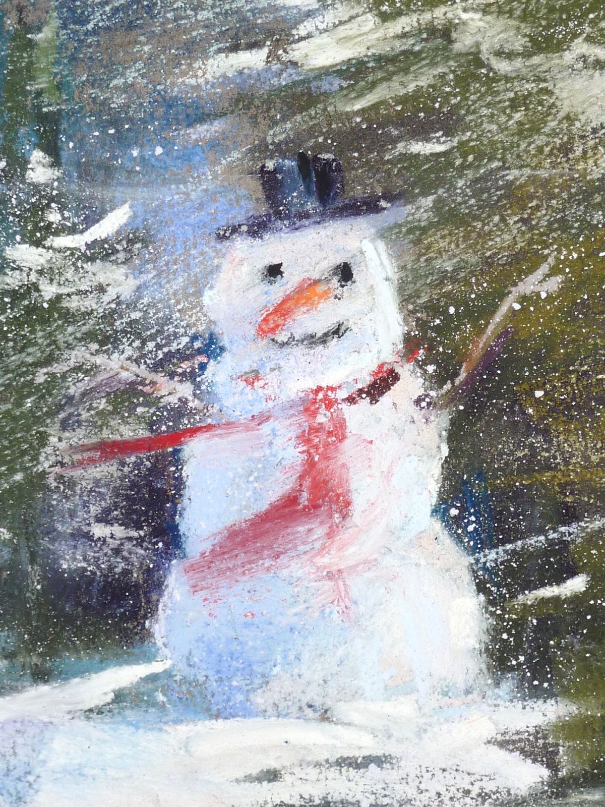
 It's Snowman time! For the past few years I have painted a holiday snowman. It is always fun to create a new snow person and give him or her a personality. This year I decided to put my snowman in the middle of a fir tree forest. It began as a serene scene. A quiet winter day. I wanted to add some gently falling snow. Quiet and peaceful.

I found a new tool to make some snow! I usually just scrape a white pastel with a palette knofe to make some snow 'dust'. This time I use a small grating tool made by Derwent. It is intended to make liquid ink from their Inktense blocks. It made great pastel snow! A nice variety of sizes for bigger snowflakes!


To make the snow I took the grater top off the jar. I put my painting flat on the table and shaved the pastel right on top go the painting. I used a piece of glassine paper to press the snowy bits into the paper. But I had a slight mishap!

The glassine paper shifted while I was rubbing and the result were a couple of smooshed areas. At first I was mad at myself for not being more careful but then those areas started to grow on me. It looked like the wind was blowing the snow. So now my gentle day became a snowy day! 

close up of Mr. Snowman

Thursday, December 15, 2016

The Magic of Black Paper

'Winter Peace II'           6x6         pastel        ©Karen Margulis
available $75
I struggled with the background in today's painting. Funny since I just wrote about painting backgrounds! But I wasn't sure how to approach the background on the black paper. I was working on a piece of Artagain paper by Strathmore.  This is such fun paper to work on.  This paper comes in 6x6 pads and is called Artist Tiles. They are meant for doing Zentangles or pattern drawing or meditative art according to Strathmore. I love this soft black paper for pastels!

A pad of 6x6 black paper. A good value and a lot of fun!

In the end it was the paper that guided my background choice. As I began applying the pastel to the background I noticed how nicely it glided over the smooth paper. It felt great!. It was like frosting a cake! Then I noticed how the black paper peeked through the pastels creating an almost stained glass effect. My intention was to blend the background making things smooth and dreamy.....but when I saw what was happening with the black I decided to stop. I enjoyed the energetic feeling to my marks! Paper choice does make a difference.

Wednesday, December 14, 2016

Thoughts About Backgrounds

'Winter Peace'             5x7         pastel        ©Karen Margulis
available $75
It is always a bit of a dilemma when painting animals. What do I do with the background? Do I paint the animal first or the background?  If it is too busy the subject will be lost. If it is wrong the whole painting will be ruined! Oh what is an artist to do?

I have some thoughts on the background dilemma. First let me share what went through my mind as I painted this chickadee. I have painted from this reference several times. I love it but I always challenge myself to do it differently when I revisit it. That is done easily by changing the background.

For this version I decided it would be a somewhat moody, foggy and  snowy day. I wanted to hint at the tangle of branches so I used very light and muted colors. I actually painted the bird first but kept the colors I used in the bird on my tray so I could reuse them in the background. I did have to go back and refine my bird. The berries were added last to help frame the bird.

Background Tips
  • Plan the background right from the start. Don't wait until the subject is finished and perfect before adding background or you risk having your subject look disconnected or pasted onto the background. I usually block in the subject and then start the background.
  • Use some of the same pastels in both the subject and the background. this helps create color harmony. Consider using different values of the colors.
  • If the subject is complex or busy use a simple background.
  • Try to suggest or hint at 'stuff' in the background rather than painting too much detail. Remember we love mystery so leave something to our imagination!
Tomorrow I will share another Chickadee painting...a fun experiment!

Tuesday, December 13, 2016

Working With Red Pastels

'Winter Joy II'            5x7       pastel        ©Karen Margulis
available $75
It's the season for Red! I love red so it is easy to get excited about painting red things. Red can be overpowering though. And since I like to build up my color with layers of pastel I don't want to jump right in with the 'Power Red'.  I have a technique for working with red that allows the most vibrant reds to really glow.

'Winter Joy I'          5x7        pastel      available $75
The color chart below shows my technique. The trick is to start layering with a duller and darker red. I sometimes even begin with a dark purple. Here I began with a dark brick red. I selected two other dull cooler reds for the middle layers. I reserved the most vibrant and warmest (orange) reds for the final layers. You can see these bright reds better when they are layered over the dark cool reds. In contrast if you just go right to the brightest red it isn't as interesting!

color chart of reds
I am using Terry Ludwig red pastels with some Schminkes as well. The top painting is on white pastemat and the bottom painting is on Uart sanded paper.

Monday, December 12, 2016

Alcohol or Water Wash? Which is Better?


'Up in the Cardinal Tree'        8x10        ©Karen Margulis
available $150
When it works it really works! It is a bit unpredictable but that is part of the excitement. Anytime that pastel is washed with a liquid it creates a whole new wonderful world! The dry pastel turns into paint and interesting things can happen. I love the possibilities!

Pastel can be liquified with any liquid. Water is an easy choice and I use it often. I also love to use rubbing alcohol and odorless mineral spirits. So which is better? It is a personal preference but I give the edge to rubbing alcohol.

The application of dry pastel. I used a few harder Nupastels

  •  Rubbing alcohol dries a bit faster than water. Since it quickly evaporates it doesn't sit on the paper leading to less chance of buckling.
  • Rubbing alcohol can create some interesting spider web-like drips. Click on the photos below to see them closer. The results are unpredictable so I am always excited when I get some good runs like I did here. When I get some interesting drips it becomes my goal to allow as much of this underpainting as possible to show in the finished painting.
Tips for an alcohol wash: You need to use a surface that can get wet. Most sanded papers will work even when unmounted. Some artists prefer Pastelbord by Ampersand which is a board and will not warp or buckle. I use 70% alcohol which has a lower flashpoint than the 90%. Using harder pastels work best. The softer the pastel the gummier the results. If you do use a softer pastel be sure to use a very light touch.

8x10 Uart 500 unmounted. no buckling!

close up of the cool spider web drips
 You can see that in the final painting (at top)  I left much of the bottom left corner untouched . I let the drips become a part of the scrubby field. Now that was fun!

******Do you see the little cardinals in the tree? They are my spice. More cardinals coming!*****


Sunday, December 11, 2016

What Mother Nature Teaches Us About Color

'First Snow'          9x12       pastel         ©Karen Margulis
available $155
The day was cold and dreary. The clouds were getting thicker and the sky was heavy with the promise of snow. We walked through the park at a fast clip anxious to get home. It was actually the type of weather I love.....moody and gray. That is when hidden color really comes to life!  I had my camera around my neck and quickly shot photos as we passed through the park.

I have returned home to Georgia missing my grandbabies but filled with inspiration and excitement. The first thing I decided to paint was a scene from the walk in the park. I loved the little trees with the bright red berries. They teach us an important lesson about color.

All Color is No color!  If you want a color to stand out...to pop or sing...then it is important to surround the color with duller or neutral colors. This provides the stage so the main color can be the star!  Mother Nature does this! All we need to do is look and we will see it.

Follow along my step by step demo to see how I made the red berries the star of my painting.


The block in: Roughing in the trees with a dark dull violet and some gray blues. I am using Canson Mi-Teintes paper.


Adding some dull reds to the trees and some pale pinks to the sky. I am also adding some dull pale pinks and violets to the snow. I indicate a few branches with a dark blue pastel.


I blend in this first layer of pastel to add some soft mystery. I paint the bare trees by blocking in a mass then carving the branches with sky color.


Now I add a brighter red by using a brick red pastel on it's side. This isn't the most intense red I will use. I am gradually building up to the bright red berries. I also develop the snow and shadows on the snow. So far everything is still on the dull side!


I spray the trees with Blair workable fixative so that I can get more texture in the trees. I also add some snow on the branches. The next step is to finally add the brightest most intense red for the berries. I use soft Schminke pastels in a cool red and a warm orange red. I make a few 'berry' marks and call the painting finished!

close up of the berries
It's great to be back in the studio! Thank you all for your patience while I took a Grammie break from the blog!