Visit my Patreon Page for more painting instruction and Paint Along Videos!

Thursday, April 30, 2015

Texas Bluebonnet Painting Demo

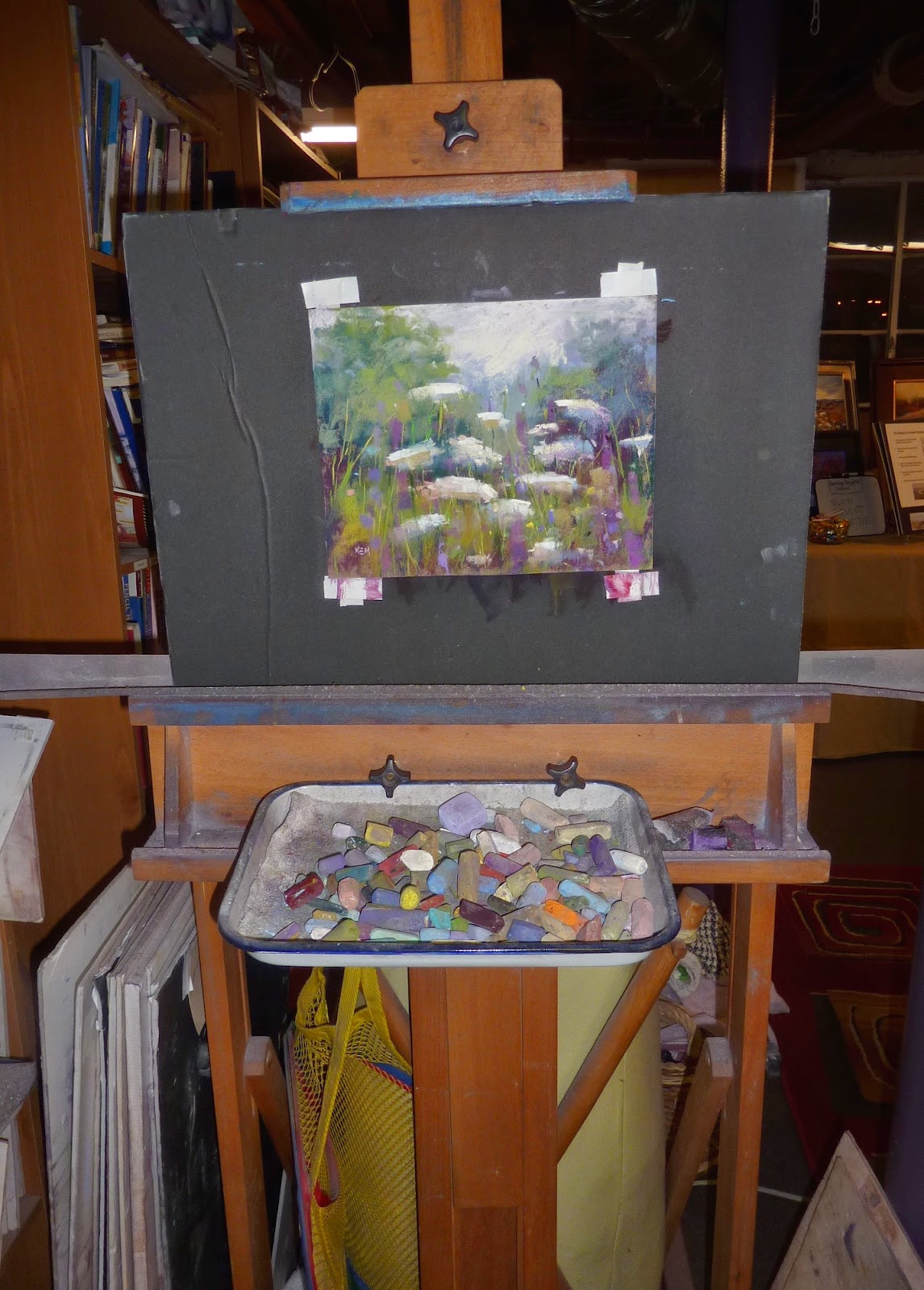
'Bluebonnets in Bloom'             8x10           pastel           ©Karen Margulis
painting available $150 click here
I didn't mean to use this surface for the painting. I wasn't thinking. I had extra oil paint on my palette from another underpainting so I pulled out a piece of paper to do another one. I thought I had picked a piece of white Pastel Premiere paper. It was odd because the oil paint soaked right in....no drips or spiderwebs. It wasn't Pastel Premiere after all. It was Multimedia Artboard....the unsanded kind....oops!  Follow along and see what I decided to do with it.


This is a oil stain underpainting on the Multimedia Artboard. Nice and rich but no cool drips. And it was very smooth. It needs some tooth for my pastels.


 I turn to my favorite tooth maker....Liquitex Clear Gesso. I apply this slightly gritty gesso over the dry oil paint. I use random brush strokes with a cheap brush to create some interesting texture.


Above is the wet gesso. Click to enlarge and see the brush strokes. You can also see my reference photo. I based the painting loosely on the reference photo.


Time for pastel. I begin with the dark areas. I use a dark purple and burgundy to block in the trees and the shadowed grasses in the foreground.


I layer some greens in the distant trees. It is a dense area of trees. I may introduce some sky. I outline the flower shapes so I know where they will grow.


I introduce some green into the grass. I also block in some of the distant and less important flowers with a pale lavender.


More green grass is added. The Bluebells are now blocked in with the darkest blue violet that I see in them.


More green into the shadows. I start to refine the bluebonnets with lighter blues and blue violets. I am choosing which flowers will be the star and which ones will have less detail. They will be the supporting cast.

This is my Bluebonnet Box. I chose a selection of blue and purple pastels that I like for my bluebonnets. Keeping them in a separate box keeps me from losing track of them.


More refinement in the flowers and grasses. It is easy to make them all the same so I have to slow down and think about each mark.


I decide to spray the foreground with workable fixative. I wanted the shadow areas to be darker. I decide to add a touch of sky with some pale blue and lavender.


Once the fixative was dry I scumbled some more green over the dark to create some textured grass. I add the finishing marks on my star bluebonnets and a few bright green blades of grass. Finished! I really liked how the texture of the gesso gives the illusion of texted grasses.(click on photo to see texture) It was a good choice of surface after all.

Wednesday, April 29, 2015

What I did on my Play Date


'The Power of Red'           2.5 x 3.5          pastel             ©Karen Margulis
sold
We all need a play date every once in awhile. It was time for me. I have blocked off the month of May for my summer adventure preparations. That means a little downtime in my schedule. When my VIP friends called me to come play I was ready. 

I am very lucky to have such wonderful friends in my life. We love all of the same things and often don't even need conversation to have a great time. Lately they have been working on paper collaging. My friend's studio is filled to the brim with every art supply imaginable and lots of wonderful papers. If you can dream it...you can create it in her studio. I always love spending time there. But instead of a paper collage I decided to paint some mini pastels.

Working on some wildflower minis
 It was a great test for my Heilman Sketchbox. This is the single sketchbox. It has a great metal kickstand/handle which allows you to do a small painting. I find it easier to work on minis laying flat so I brought a small piece of foamcore. I worked on two paintings at once. Each one measures 2.5x3.5. I finished 8 minis and had a wonderful time.

Playtime with my VIP friends

Monday, April 27, 2015

How I Photograph My Pastel Paintings

'June Meadow'              8x10             pastel             ©Karen Margulis
Painting available $145
It has to be low tech and low maintenance. I want quality photos of my paintings for my blog but I don't want to spend a lot of time taking them. I need to point, shoot, upload and not have to do much editing. I have worked out a system that works for me. It is simple and takes little effort.

All I use is a point and shoot digital camera and take a photo of the painting while it is still up on the easel. Nothing fancy. I just point and shoot and keep the flash on.

My easel and current painting. When I am finished painting I take the photo
 Keep in mind this is the set up I use to take low resolution photos for blogging and for email. I also use them to print small photos and for my business cards.  If I need higher resolution photos I will increase the quality setting on my camera to high (about 10 megapixels)

  • I use a Panasonic Lumix digital camera set on a medium quality setting.
  • I always keep the flash on.
  • I don't use a tripod but I do have steady hands.
  • I stand about 4-5 feet from the painting and zoom into the painting. I don't crop it in the camera but leave a bit of the foamcore showing.(I will crop it when I upload the photo to my computer)
  • I have two fluorescent light fixtures over my easel area. I keep a warm and cool bulb in each.
  • This balance of light along with the camera flash results in color that is very true to my paintings.
  • I upload the photos to my computer. I have an iMac and use iPhoto. I crop the photo in iPhoto. Occasionally I need to adjust brightness, contrast or saturation which is easily done in iPhoto. 95% of the time I don't have to make adjustments.

My fancy lighting!
This system works well for me. Since we all have different lighting situations it will take some experimentation to find the correct balance of light to get the truest colors.  If your photos come out too warm or yellow....try turning on the flash and stand back about 5 feet.

Sunday, April 26, 2015

How to Create a Softer Landscape


'Summer Buzz'             5x7          pastel       ©Karen Margulis
sold
Paper choice does make a difference. I have blogged about paper choice before but it is always a good thing to keep in mind. I choose my paper type and color to help me convey my message. I usually recommend that anytime you try a new paper you use it exclusively for awhile so you can get to know it. Eventually choosing the right paper for a painting becomes intuitive. The more you experience and get to know your paper options the easier it will be to choose the right paper for the job.

The paper for today's painting gave me a distinctly different effect than my usual favorite paper (Uart) for landscapes. It gave me a softer look and feel.

close up detail of my bumblebees
Today's painting was done on brown LaCarte Pastelcard by Sennelier. This paper is sanded but it is a vegetable fiber based sanded surface. This gives it a very soft touch. Yet the paper still holds many layers of pastel. I usually like to use LaCarte paper for animals. The softness of the paper is perfect for painting fur and feathers.
I usually like a crisp feeling in my landscapes. I may paint some areas with a soft focus of soft edges but overall my paintings are crisp with bolder mark-making. I decided to try my same technique on the LaCarte paper. The result was a much softer and dreamy feel to my painting.

Paper choice made the difference! I will be trying more landscapes on LaCarte!

This is a painting done on Pastel Premiere white sanded paper....see the difference?
Purchase LaCarte at Dakota Art Pastels. Click here for the link and more information.

Saturday, April 25, 2015

Painting Poppies....Some Thoughts


'Poppy Heaven'              8x10              pastel             ©Karen Margulis
sold
I went to Texas and was in Poppy Heaven! Yes the Bluebonnets were blooming and they were beautiful but the site of acres of poppies really stopped me in my tracks. The day after my workshop my host Marsha took me on a wonderful tour of the area. I had a 6:30pm flight and we fit in a lot of sightseeing. 

We began with a stop at Wildseed Farm wildflower farm in Fredericksburg. It was a dream come true for me. I had visited their website many times dreaming of my own wildflower garden. When we pulled into the parking lot I was overwhelmed by the fields covered in blooming poppies. I must have taken hundreds of photos. I have a lifetime supply of poppy references.


I love to paint poppies and have discovered some tips to achieve a more painterly flower.

  • I don't draw the flower first. I simply draw a circle shape where I want the flower to go. Then I use the SIDE of my pastel to paint large shapes that make up the petals. If I draw my flowers I tend to want to color them in and they look stiff.
  • I use three or four values of the poppy color to develop the flower. Even if I don't see it in the photo I like to begin with a dark, brick red shape (for red poppies). I add middle values to create the form.
  • I avoid using a pale or very light value red to paint the highlights. I find light pastels with too much white in their makeup lead to washed out flowers rather than vibrant flowers.
  • If I want my poppies to appear sunlit I will use a warm color such as red-orange for the light areas.
Here are a few photos from my visit to Wildseed Farms.


Friday, April 24, 2015

What To Do with Plein Air Paintings?

'Bluebonnet Spring II'                 8x10              pastel               ©Karen Margulis
sold
Not every plein air painting is a success. That is why I like to think of my paintings done on location as studies. It removes the pressure to create a framable painting. The experience of painting outside is reward enough. The experience of involving all of the senses will influence  paintings done in the studio.

I usually have a rule for my plein air paintings. I do not allow myself to touch them back in the studio. I leave them alone so I can learn from them. If I try to fix my 'mistakes' or try to make it better  I will often destroy the freshness and authenticity that they have. I prefer to paint a new variation based on the study. I make note of the things I would change in the study and then start fresh. It is a much better learning experience.

Every once in awhile I break my rule!

The original plain air painting....a demo from my Texas workshop
The painting above was a demo I did for my Texas workshop. It was the kind of painting that turned into an instructional tool. I used it to illustrate a few different concepts and answer questions. So in the end the painting was a confusing mix of things. It served a purpose but it wasn't authentic or true to the scene anymore.

Not one to throw out good paper I decided to use the bones of this painting to create a new interpretation.

  •  I found a photo taken near the demo location. It was a bit closer in and included some bluebonnets.
  • I brushed out some of the pastel and sprayed the bottom half with workable fixative. 
  • Now primed for new pastel I let the photo guide my new interpretation.
The new interpretation works because I already had big simple shapes and a solid value map. All it needed were a few adjustments to the trees and bushes and the addition of bluebonnets in the foreground.


a photo of a scene from the demo location

Brushed out, sprayed with fixative and ready to go!

*******I need your help! ************
I am working on my blogging presentation for the IAPS convention. I want to be sure I answer the questions that a potential blogger might have. If you want to start a blog or revive an existing one what questions would you like to have answered?  Email me with any questions. They will be answered here and in the workbook I am writing. Thank you!

Thursday, April 23, 2015

My Favorite Spicy Pastels


'Texas Spring II'              5x7           pastel           ©Karen Margulis
sold
I love pastels. Hard, soft, square or round. I can find a good use for just about any brand of pastels. Sure I have my favorites. Certain brands work best on certain surfaces. Some brands are better for underpainting. Others are best for finishing touches. I call my finishing marks spices.  Done well, they are the marks that make an ordinary painting into a more intriguing painting.

I was very happy that my recent merit award for my painting 'Sunshine on a Cloudy Day' included two boxes of Schmincke pastels. These are my favorite pastels for adding the finishing spicy touches to a painting.

My award from Chart-pak....a nice box of Schmincke pastels
Schmincke pastels are quite soft. I find them to be very rich and creamy. In fact they are so soft and rich that when applied heavily they can create texture almost like oil paint. I use them sparingly and usually for my final marks. Look at the painting in today's post. I used the yellow and violet Schmincke pastels to paint the flowers. I simply rolled the pastel across the paper and it left a trail of thick creamy marks. The perfect spice...just a sprinkle of rich color.  I like to have a variety of spicy Schminke colors such as bright yellows, reds, violets and greens. I love their blues as well. I'm going to enjoy this new set!

The Schmincke website has a great flyer with information and a color chart of their soft pastels. Click here for the pdf.

Wednesday, April 22, 2015

Reflections on a Plein Air Workshop

'A Special Part of Texas'                 9x12                pastel            ©Karen Margulis
sold
It was everything I imagined it would be and much more. I have always wanted to see the Texas Hill Country during the Bluebonnet season so when my friend Marsha Young invited me out to do a plein air workshop I couldn't resist. Marsha has a wonderful gallery in Dripping Springs Texas, Butterfly Gallery. She hosted the group and planned our plein air locations. She also arranged for our lunches each day. Her hard work and perfect weather ensured the workshop was a great success.

I was excited to meet my group of 12 artists. Many traveled to the workshop. Some from as far away as Minnesota! It was a great group which always makes a workshop fun. We painted hard and laughed and ate and hopefully learned a lot as well. I know that I was impressed with everyone's work!

'Texas Spring'          6x8        pastel
sold

Marsha had selected some great painting locations for the workshop. On the first day we painted in the studio. It was a good opportunity to demo and share my usual working techniques and plein air tips. It was a practice session and we were ready to paint the next morning at the wonderful Mt. Gainor Inn.  Here is a quick video  from our day at the Inn:


Our second plein air day began at Charro Ranch Park in Dripping Springs. This was a great place for some intimate landscape vignettes of trees and wildflowers. My paintings in this post are demos from this location.

We had lunch reservations at the famous Salt Lick restaurant and spent the afternoon painting in the gardens. Here is a quick story which sums up the wonder of this whole experience....Just as we were finishing our feedback session at the end of the day a man strolled up to the group and stopped. I was a bit worried that we had overstayed our welcome and were about to be shown the gate. But I was wrong. It was the owner of the Salt Lick. He wanted to thank us for painting on the property. He shared his story and his dream for artists to come paint. He welcomed us back anytime as well as extended an invitation to paint on their other local properties. It was Texas hospitality at it's finest!

I know I will be back again some day!

Demo at Charro Ranch Park

Monday, April 20, 2015

Dripping Springs Texas Workshop Report Day 2

        
                             'Road to the Bluebonnets '          6x8        Plein air pastel

Time sure does fly when you're having fun! I'm a day behind in my workshop report but we are having a wonderful time. Day two arrived with clear skies and promises of a sunny and hot day. I was relieved after hearing the thunder and rain late into the night. It was our first plein air day.

The crew of twelve students, Marsha and I headed out into the country to the Mt. Gainor  Inn. It is a peaceful spot with views of the Hill Country and bluebonnet meadows. We couldn't ask for a better place to spend the day painting. 

        
                               'Heavenly Hill Country'.             5x7.            Pastel 

We experienced Texas hospitality at its finest all day. The owners of the inn Laurie and Jerry were happy to have us and took great care of us with drinks and a wonderful lunch spread of sandwiches, fruit and hot from the oven raspberry and key lime bars!

The group did some wonderful paintings. It was a relaxed day surrounded by beauty. More tomorrow.


Saturday, April 18, 2015

Dripping Springs Texas Workshop Day 1 Report

  'Beyond the Trees'.     11x14.     Pastel  sold

I'm having a great time in Texas! It was day one of a 3 day workshop in Dripping Springs. I am hosted by the Butterfly Gallery and the talented owner and artist Marsha Young and her husband David. 


Today was our studio day. I have 12 fantastic students who worked very hard and did some great paintings. Tomorrow we head outside for an introduction to plein air Karen's style!  We are expecting good weather so fingers are crossed! 

I did two demos today showcasing an easy 6 step approach to simplifying a painting and also a pastel with a watercolor underpainting.(below)

'Bluebonnet Spring'     11 x 14      pastel         $165


Tuesday, April 14, 2015

One of my Favorite Wildflower Painting Techniques

'Freedom'          11x14            pastel        Karen Margulis
painting available $165
Never has watching paint dry been more fun. There is nothing wishy washy about it.  It's bold. It's rich. It is usually quite magical to watch.  When I want to start a painting with a bang this is the underpainitng technique I turn to.....Oil Stain Underpaintings!

'Save the Bees'            8x10            pastel          ©Karen Margulis
sold
It is simple to do. All you need is a few tubes of oil paints, stiff cheap brush and some odorless mineral spirits (OMS). You also need to use a surface that can get wet. I used Uart for today's paintings.  It is called oil stain because you are basically staining the paper with the thinned oil paint. If the paint is applied too thickly it will fill the tooth of the paper and you won't be able to add much pastel.

detail of painting. Notice the drips of the underpainting
Here are a few tips for Oil Stain Underpaintings
  • Use a limited palette of paint colors. You are less likely to mix muddy color with only a few colors. I use red, blue and yellow.
  • Avoid using black or white paint. You want nice thin and transparent color. Adding white will make it opaque and chalky. Black can be dull.
  • Make sure your paint is thinned with the OMS (I use Gamsol)  I like for the paint to be the consistency of tea.  If you can see your brushstrokes in the paint then it is too thick.
  • If the paint is thin enough, the underpainting should dry in under an hour.
  • Begin with the darkest paint. I like to mix red and blue for a nice dark purple.
  • As the paint dries and the OMS evaporates, you will hopefully see interesting weblike drips occur.
  • When the underpainting is dry,  it is time to add pastel. I use a very light touch and build up my layers... very slowly. I will leave areas of the underpainting untouched if I like the way it is working.


several underpaintings done at the same time

I don't often do oil stain underpaintings because there is a bit of clean up involved. When I do, I often do serval underpaintings at once. Not only does this save clean up time....it is always good to practice underpainting techniques. The more you do....the better they will be.


Monday, April 13, 2015

Quick Tip: How to Sign a Pastel Painting

'Morning on the River'            5x7            pastel            ©Karen Margulis
sold

It is the moment of truth. Signing the painting can be nerve wracking. Will my signature look good? Will to be to big and clunky? How should I sign my name? What should I use to sign the painting?  All of these thoughts go though my mind when I am ready to sign.

I want to get the signature right because it is an important element in the painting. It becomes a part of the composition. If it is in the wrong place, or the wrong color, too big or too small it can effect the painting. It can through off the balance. It can draw too much attention away from the subject. If it is too small or too close to the edge it will not be visible at all!

Quick Tip:  Decide on how you will sign and stick with it. Full name? Initials?  Find the tool that works best (see samples below) Practice your signature over and over until it becomes effortless. When it is time to sign pick a spot that balances the composition and sign with authority and pride!

A few signing tools: pencil, Nupastels, pastel pencil


 The signatures above were done with the sharp point or edge of a hard pastel such as Nupastel.


The signature in the painting at the top of the post was done with a sharp pencil. The pink signature above is a sharp pastel pencil.

My signature choice: I decided early on to use my initials. It was quick and easy. The drawback is that people new to my work can't really look my name up. (if you google KEM artist I do come up second but this has taken some time!) I decided to make my letter 'E' with only three lines because I thought it looked cool. I sometimes use pencil to sign on a very light painting. Usually I choose a pastel pencil or sharpened Nupastel. I choose a color that is used in my painting. I make sure the color stands out from the background. I also make sure my signature is not too dark or too thick and heavy.