Visit my Patreon Page for more painting instruction and Paint Along Videos!

Monday, October 31, 2016

10 Steps to a Yellow Tree Painting


'Walking Past the Yellow Tree'        12x12       pastel        ©Karen Margulis
available $175
It has been awhile since I shared a step by step demo. I decided to take photos as I painted today and here is the result along with my commentary. Enjoy the step by step description of the making of this yellow tree painting.


STEP ONE: I wanted the star of the painting to be the yellow tree so I chose a square format for an interesting way to frame the tree. I placed the tree off center with the plan to add a smaller bush on the left as a balance. I decided to play with the Art Graf blocks for the underpainting. I applied the color and wet with water. The underpainting was cool but I did manage to cover it all up. (it happens sometimes!)


STEP TWO: I started the painting by reinforcing all of the dark areas....the shadows in the tree, the dark foreground and pathway into the field, the tree trunks.


STEP THREE: Next I added some yellows to the tree and the distant tree line. I wanted to establish the placement of these colors before I put in the sky.I used the pale yellow to carve into the tree trunks. I am using Terry Ludwig Stunning Yellow set.


STEP FOUR: Next I added the sky. I used three different pale blues...a blue violet and a blue green and a pale yellow at the horizon. I created a few sky holes with the sky color.


STEP FIVE: I then start to develop the foreground by putting down some oranges for the 'dirt' color. I also start adding greens to the yellow tree. I begin the tree with greens and yellow greens before using the brightest yellows.


STEP SIX: In this step I develop the tree trunks by adding a bit of orange to the sunlit side of the trunks. I also use a thin blue pastel to add some hints of branches in the tree.


STEP SEVEN: I develop the foliage by spraying with Blair workable fixative and adding more yellows from Terry's Stunning Yellow set. I work on the smaller bush as well.


STEP EIGHT: It is time for the foreground. I spray it with workable fixative to make it dark and rich. I used some greens and rusts and yellows to start the suggestion of grass. I also use a pale yellow in the distant tree line to represent the sunlit trees glowing in the distance.


STEP NINE: In this step I worked more on the star....the yellow tree. I added more sky holes and added a few harder edged leaves.


STEP TEN: I add the finishing touches with the linear dancing marks for grass and a few dried flower and seedheads.


Painting notes: 12 x12 on Uart 400 grit with Terry Ludwig pastels.

Saturday, October 29, 2016

Why Paintings Should Have a Story


'A Sweet Ending'          8x10         pastel        ©Karen Margulis
available $125
I keep looking at these paintings. I had placed them on a shelf when I returned home from the plein air event last month too busy to put them away. But I am glad that I didn't. They have grown on me. Not only are they a bit of an unusual subject for me, they have a story. Paintings mean more when they have a story. After all isn't that what painting is all about.....it is an expression of how you felt about something at a particular time and place. Recorded by your own hand and heart.


'An Apple a Day'        8x10      pastel      $125

Let me share the story behind these apple paintings. I was participating in my very first Quick Paint event at the Blue Ridge Georgia Plein air festival. It was September and it was unseasonably warm in the mountains. In fact it was downright hot with not a cloud in the sky for relief. We were scheduled to paint at Mercier Orchard so there was plenty of paintings subjects outside.....orchards, a pond, trees. But no shade. We only had an hour to paint so it wouldn't be too bad.....


My pastel set up with Marsha Savage in the distance
                                            

But then my friend had a better idea! I was painting with Marsha Savage and Nancy Nowak and Marsha decided that she would paint inside the orchard store. A display shelf full of apples caught her eye and she was excited to paint them. I walked around the store with my backpack and gear not too hopeful that I would find inspiration. After all I am mostly drawn to the landscape and store interiors didn't excite me. But it was cool in the air conditioned store so I decided that I would relax my mind and allow myself to find a subject.


When I relaxed I was open to the possibilities and the candy apple caught my eye. I picked it off the shelf with the intention of saving it for a snack but then I realized it would make a great subject....fun, whimsical, delicious!  I set it up on the shelf next to some granny Smith apples and set up my pastels.

We only had an hour to paint so when the horn blew I got started quickly with a watercolor underpainting. Since I had to wait for it to dry I decided to start another painting with just the green apples. No time wasted and two underpaintings done with 45 minutes left to paint.

I applied pastel quickly trying to capture the colors as well as creating a focal area with a suggested background. It must have looked pretty scary with the pastel dust flying but I did manage to finish both paintings in the hour time frame. As the horn blew again to signal the end of the competition a customer came up to me and told me he was very afraid for me while I was painting....he couldn't believe I managed to pull it off! It was a very satisfying feeling.

So that is my story. Understanding what goes on behind the scenes of a painting gives insight into its creation. Without the story it would be just another apple.


Friday, October 28, 2016

The Benefit of Doing Small Color Studies

'Deep into Fall'               16x20             pastel            ©Karen Margulis
available $350
 Color studies give me power.  Taking the time before starting a large painting to do a small color study takes the pressure off. It allows me to approach the painting with confidence. I can ENJOY the painting process secure in the knowledge that I will have pleasing color harmony. I will be confident that the colors I selected will express the mood I want for the painting. I can relax and paint with passion and joy.

Color studies help me choose my color palette. I begin the painting with the pastels I will use avoiding the dreaded problem of too many colors in one painting. Too many colors/pastels in a painting is the fastest way to muddy and dull color.


My reference photo and small color study

Color studies don't have to be elaborate or time consuming. There are many ways that make it easy to pre visualize color choices. Any way that you can see the colors together will work from a simple collection of marks to a fully developed smaller painting. The method I choose depends on the time I have and my mood. Often I enjoy painting small 'mini' paintings in a standard 2.5 x 3.5 size. This small size forces me to be loose and expressive with my marks. It is the perfect size to play with color palettes.

If I like the mini painting I move forward with the same palette on the larger paper. I now have the power and confidence to go large without the worry of color choices! Often I find that I use the color study as a reference instead of the photo which is an added bonus!

2.5 x 3.5 color study
Painting notes: 16x20 pastel on Uart 400 grit paper. I did a value underpainting with a 305 Nupastel and alcohol wash underpainting.

The Landscape in Bloom!!  There are still openings in my IAPS demo. If you are going to IAPS and want to add to your schedule, consider my 2 hour demo. It will be packed with fun and great information on painting the landscape. Even if flowers are not your thing there will be plenty of landscape and general pastel and painting tips that will make my demo well worth your time!

Thursday, October 27, 2016

Art Quote of the Day...Creating Mystery in Your Paintings

'Morning Mystery'         13x18       pastel         ©Karen Margulis
sold
I don't remember where I came across this quote. Sadly I don't even know the author but it is one that often comes to my rescue. It helps me remain true to my desire to paint with more expression....to paint what I feel rather than render every detail as they exist in my reference.

" The human mind delights in soft mystery"   unknown

It really is amazing how we are able to piece together bits and pieces and make them into a whole. We really don't require much information to fill in the blanks. We prefer it that way. It allows us to participate in a painting. If we see a few blades of grass rendered in detail surrounded by larger blocks of grass color we can assume that the entire area is the same type of grass. We don't need every blade of grass to make this assumption.

close up of the trees and moss
Soft Mystery....keeping this thought in mind as I paint reminds me to decide where I will put clarity and detail and where I can just suggest it.  Take the spanish moss in the trees of today's painting. The trees are in the distance so I don't want to paint the moss with detail and hard edges. I want to simply suggest a FEELING of moss in the trees. A gentle brush of lavender pastel is all that is needed. Soft mystery to suggest moss.

Painting notes: This is a commission painting on brown Canson Mi-Teintes paper. I love to paint landscape commissions and have a few openings on my schedule for holiday commissions. Contact me for details! karenmargulis@gmail.com


Wednesday, October 26, 2016

Using Clear Gesso to Simplify Autumn Trees

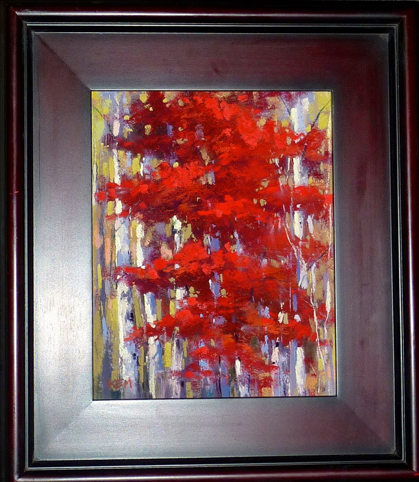
'Call Me Crimson'             8x10          pastel            ©Karen Margulis
painting available $145
 It's a toss up between autumn and spring. Both are challenging to paint. There is so much color and texture. In both seasons the trees put on a show. Some years are better than other but every year I am still challenged by the display.

The biggest problem I have in the fall is wanting to put too much into my paintings. I want the red tree and the fiery orange tree and of course I love the yellow ones.....and they are often found all together. How to edit this overload of information?


  • I first remind myself that all color is no color. I don't want everything to be screaming with color. One of every color tree might be overload for a painting. Why not keep it simple and concentrate on just one tree or a small grouping. I don't need them all in one painting!
  • I keep my trees simple by thinking of each tree as a lump of clay. I shape it into the general shape of the tree and block in the big simple shape. I use negative painting to carve away at the tree making the shape more interesting. (more on this soon!)
  • I don't paint every leaf. Instead of painting lots of leaves I use texture to suggest foliage. One of my favorite ways to get texture is to work on paper prepared with clear gesso. The clear gesso is gritty and provides texture. I apply the gesso with a gesso brush in random strokes. You can prepare the entire board with gesso or just the tree shape. Let it dry and paint. The pastel will go over the rough gesso and will appear textured/broken strokes.


Painting notes: This painting is on a piece of mat board prepared with Liquitex clear gesso. It is 8x10. There is no underpainting though I did blend the first layer to push it into the grooves of the dried gesso. 

Tuesday, October 25, 2016

Three Reasons to Try Instagram

'Dancing Light'         9x12       pastel        ©Karen Margulis
available $165

Are you on Instagram yet? If not I have three good reasons for you to try it. If you already use Instagram I have a reason for you to visit Instagram today!

In case you are not familiar with Instagram it is a social networking app that allows you to share photos and videos on your phone. It is very easy to use. You either take a photo with the app or use a photo / video from your photo albums on your phone. There are filters you can use to enhance your photo. You can write something about the photo if you'd like and add hashtags # that allow others to find your posts. I will share more about using Instagram in future blog articles but for now I want to convince you to try it (or use it more often)


Underpainting on gray Canson Mi-Teintes paper

Three Reasons to Try Instagram
  • It is all about the IMAGERY. Artists are visual and there is nothing more appealing than having the chance to browse a lot of good art without the extra visual clutter that is found on Facebook. I love reading my Facebook feed because of my artist friends and their wonderful art but I often get hung up and distracted by the other stuff.....videos, political stuff, recipes, cat and dogs....and on and on. I follow artists on Instagram and get to enjoy their art and photos without any distractions. Many artists post behind the scenes photos which are always interesting.
  • It is QUICK. Since your feed consists of images with minimal text, it is a a quick way to browse and see some inspiring art and photos. I know many who prefer not to do Facebook because they feel it is a time waster. Instagram doesn't zap as much time since it is fast and easy to scroll through images.
  • It is EASY. Really. Once you sign up and create your profile you can add your artist friends and family and friends if you wish. You will also get suggestions and I have discovered many wonderful artists from these suggestions. Posting a photo or video is also very easy and user friendly. 
Convinced? I invite you to start or revive your Instagram account and see what you've been missing. Instagram can be used for marketing and I will share more ideas in another post but it is also just a simple way to get a quick dose of inspiration!  Download the app today!

***** I am 25 followers short of 2000 and to celebrate I am offering a print of one of my autumn tree paintings. Head over to my Instagram account today and follow me or leave a comment mentioning the print and you will be entered to win the print. Drawing on Friday!  I am @KarenMargulis on Instagram or click here.


Close up detail
About today's painting: 9x12 on Gray Canson Mi-teintes unsanded paper. This is a scene from the monastery in Pecos New Mexico. The late afternoon light was dancing through the grasses teasing the little blanket flowers who were hiding out in the shade.

Monday, October 24, 2016

An Amazing Underpainting Technique

'Autumn Evening'         9x12         pastel        ©Karen Margulis
available $155
I cannot resist an art store. So when my friend and I found ourselves in Santa Fe last week with some extra time to spare we made a stop at Artisans, an art store in Sante Fe New Mexico. We didn't really need anything but you never know what treasure you might find.

And I found a wonderful treasure! My favorite Art Graf squares in primary colors! You may have read about or tired these Art Graf pigment blocks. I have used the earth toned squares for underpainting and I loved the results. They are a strange thing....they feel waxy almost like a crayon but when applied to paper and wet with water or alcohol they EXPLODE with rich color.
It takes very little application to get a rich and dark resulting tone. They are fantastic for toning paper or for underpainting for pastels.


Art Graf squares in primary colors for wonderful possibilities

I had to buy this set of primary colors! I was excited for the possibilities since it is easy to layer and mix the pigment of the squares. I tried the squares for my aspen demo at my workshop  and I was thrilled with the rich results. (see Friday's post here)
One evening at the workshop we had a paper toning party and all of the artists had fun using the Art Graf to tone paper and create underpaintings. We are now all fans! You can find the Art Graf squares on Amazon and I have also seen them online at Cheap Joes. Below you can see how I used the primary color squares for today's painting.


I applied the Art Graf lightly by coloring on my sanded paper (Pastel Premier white)

After wetting the pigment with water and a brush.

Starting to add pastel over the underpainting

The finished painting
Thank you to all of you who commented with their guesses for Friday's painting. Great ideas for underpainting. I love all of the possibilities and I look forward to exploring these Art Graf squares!

Sunday, October 23, 2016

The Secret to Choosing Underpainting Colors...From the Archives

'Sunflowers 2'            5x7            pastel  (complementary underpainting)           ©Karen Margulis

It's like choosing the right wine.  Some wines go better with a dish than others. How do you know? How do you decide?  You can take someone else's advice but then you are taking a chance. Wouldn't it be better if you just knew...if you had experience with the wine and the dish you would be able to make an informed decision. Knowing what something tastes like is the key.  And that is the secret to underpaintings.  Really!

The more underpaintings you do and the more color combinations and paper colors you try...the more intuitive your choices will be.  Are you ready to be an Underpainting Connoisseur?  


You have to be motivated and willing to put in some time at the easel. You have to be ready to try new techniques and try different colors.  One of the very best exercises I ever did to expand my understanding of the possibilities of underpaintings is Richard McKinley's Underpainting Exercise. You can find it in his book 'Pastel Pointers' or on his blog here. I highly recommend doing this exercise.

I just did it for the second time along with my class of hard working artists. We chose simple subjects and painted small (5x7) After four hours we had finished 8 paintings based on the exercise. We did 4 wet underpaintings and chose 4 different paper colors. We used the same color palette for all of the paintings. (see my results below)

At the end of the session we discussed which underpainting/color choice we liked best. The answer was surprising!  I will share the answer with you tomorrow. Which version do you like best? Answer in the comments or on my facebook page.

value sensitive underpainting with alcohol wash

oil stain underpainting


watercolor underpainting with warm and cool

black paper

white paper

cool tone paper

warm tone paper


Friday, October 21, 2016

Guess the Mystery Underpainting

'Just in Time for Gold'          9x12         pastel        ©Karen Margulis
available  $155
How about a little weekend fun? Today's painting was done on Uart 500 grit sanded pastel paper as a demo for my recent workshop in Pecos New Mexico. I am planning on sharing more about the underpainting but I thought it would be fun if you tried to guess what I did. I'll give you some clues and you can write your guess in the comments. I will answer with details in Monday's post. (I have special visitors this weekend)

  • It is a wet underpainting.
  • I used a brush
  • It is an unusual product
  • It was a lot of fun!
I love playing with different underpainting techniques. I am often asked how I decide what technique to use. I will answer what, why and how for this painting on Monday and will share some other underpainting posts from the archives this weekend while I enjoy my granddaughter!

Thursday, October 20, 2016

Do You Have Grass Box?

'Memories of the South'       12x18       pastel        ©Karen Margulis
available $165
I don't know what I would do without my grass box. I know my marshes and meadow paintings would not be as interesting. I know that it wouldn't be as easy to create painterly grasses. Keeping a grass box is a new habit of mine but I don't know what I was waiting for!

What is a grass box you may be wondering?  It is a small box of pastels that I use exclusively for painting the finishing touches in any marsh or meadow painting. Any landscape that has grassy bits can be a challenge. If you paint too many grass blades or make them too thick and regular you risk creating a fence of grass. A grass fence is a visual barrier. It can prevent the viewer from entering or moving back into a painting. A grass box makes it easy to always paint lyrical grasses.

My collection of grass pastels along with a small banker's clasp used for scratching grass marks in soft pastel passages.
What is in my grass box?

  • Some harder pastels such as Nupastels and Rembrandts. These pastels have more binder than softer pastels so they make a crisper mark.
  • Some harder Russian pastels given to me by a friend. These harder and round sticks make wonderful painterly grasses.
  • A variety of earthy colors for both green and dried grass. I add to this box when I find a grass color that I can't I've without!
  • A few 'spicy' greens...greens that are intense for those special bits of eye candy.
  • A metal Banker's Clasp that can be used to scratch grass marks into a passage of thick pastel.
Having a box of pastels that work well for those finishing marks in a grassy area is a useful tool but it also helps to practice making effective and lyrical grass marks. You may be interested in my blog article on painting grass here:http://kemstudios.blogspot.com/2016/02/more-on-painting-grasses-with-pastels.html

Painting Notes: This is one of the demo paintings I did for my recent workshop with the Piedmont Pastel Society. It is on Uart pastel paper with an alcohol wash underpainting.

Tuesday, October 18, 2016

Back From Nature ... A Plein Air Pastel Retreat


I have returned from nature! I am in Santa Fe getting ready to head home to Georgia tomorrow. It was a wonderful week at the monastery in Pecos New Mexico. Internet was spotty so I took a break from the blog to concentrate on the workshop and what a workshop it was!  I had 18 eager and talented artists join me for 4 days of plein air painting surrounded by spectacular scenery.


I was thrilled to have several artists from last years workshop return as well as two artists from my art cruise. It was also fantastic to welcome new friends. We had a great group and their enthusiasm was contagious. In the photo above we are posing after receiving a special treat. Terry Ludwig generously sent a box of pastel hearts with one of our Colorado artists. Everyone was thrilled with them and I know that orders will be placed. Thank you Terry!


The nice thing about having the workshop at the monastery was having all of our needs taken care of. We stayed on the property to paint and ate all of our meals together. We had a big common room available for demos, lessons and sharing. 


We had downtime as well and it was spent walking the grounds or relaxing on the patio just taking in the view. Since there was no tv and limited phone and Internet we had to entertain ourselves with good old fashioned conversation and laughs. Each evening we had an optional get together. One night we had fun toning paper!


I didn't do a good job taking photos of my demo paintings so I will photograph the ones I have when I return home. I am anxious to get back into the studio to paint. I have so many inspiring photos! I'll be back to regular blogging this week! Here is a look at our lodging.