Today our brains hurt! I had two private students in my studio and by the end of the day we had covered quite a lot of pastel territory. They are very talented artists from Russia (more on this later this week!) and they always have such wonderful questions which lead to great discussions. Today one of our focus areas was color. It was a timely topic for me since I am preparing for my Florida workshop on color. I took out the color wheel and used it to help with the first demo painting.
 |
| Trying to simplify |
We discussed choosing colors for a painting....how to move away form strict local color but still have a painting look believable. We talked about using color schemes to jump start ideas for colors. I decided to try an Analogous - Complementary color scheme for the demo. I chose a selection of violets from blue violet to red violet. Since yellow is the complement, I selected a range of yellows from dark to light. (I forgot to take a photo)
This color scheme was the perfect choice to create the moody light in my scene. But I could easily imagine using this simple tree as a subject for color scheme study. Every color scheme would give the tree a completely different mood! Hmmmm I may have to try that!
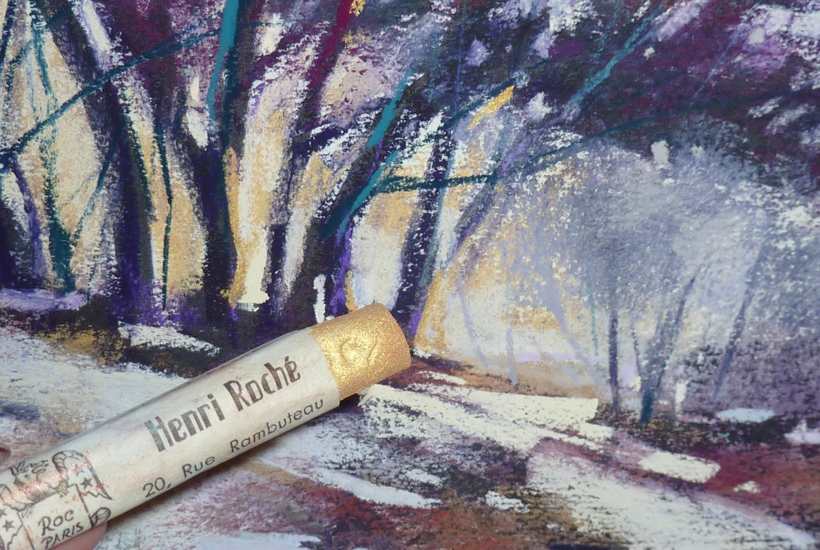
As I came to the finishing marks of my demo I had to stop and think. I wanted to add some punch or 'spice' to the painting. It needed something interesting to draw the eye....a bit of eye candy in my focal areas. But what color is a good spice? Once again I consulted the color wheel. I discovered that the discords for my color scheme were blue-green and red-orange.
Discords are the colors that are equidistant on the color wheel form the dominant hue and from each other. These are the colors that can be great for the spices. I use the Original Hal Reed Analogous Color Wheel which make finding discords simple.
 |
| Adding some Gold! |
Time to add the spices. I wanted to draw the eye to the lower area of the trees where the warm yellow light was streaming through. I added a touch of blue-green to the trunks with a Nupastel. I was finished. Until the subject of Henri Roche pastels came up! I took out my box of three metallic Roche pastels for us to try. It occurred to me that gold is yellow and yellow is a part of my color scheme! Now that is the perfect way to spice up my painting!
It was a great day spent with two artists who are truly passionate about pastels. I will share more about them later this week!


2 comments:
Lovely painting, Karen! I agree, you have a perfect subject for experimentation with various color schemes-not to say this one needs improvement! If you try another, please do post.
Oh, now that's wonderful! I love the Roche' metallics, so rich and lush! Elegant way to use them, glimmering in the light. It's a great painting and an interesting plan starting from the color harmony. Great article.
Post a Comment