
 |
| 'Winter Magic 3' 16x20 pastel ©Karen Margulis available $275 |
That someday was today! The mini sold and I had to ship it to it's new home. It was now or never! So I took out an 8x10 piece of Yi Cai paper. I knew that I had the better chance of getting the same feeling by using the same paper/ color as the study. I already had my winter pastel palette out so I was ready to go.
Look below at the study and my 8x10 version. I had to remind myself that one of the things I liked about the study was the looseness and freshness of my marks. It was harder to replicate in a larger size because I had more ground to cover. I had to make myself stop because I knew I was going too far. Now that I see them both on my computer monitor I can see that I used more of the brighter orange in the larger pieces. I don't dislike it but it doesn't have the impact of the smaller painting where the orange and blue are used in just a small amount. If I were to do another version I would keep this in mind.
 |
| mini study 2..3 x 3.5 sold |
 |
| 'Winter Magic 2' 8x10 pastel available $145 |
Then I decided I wanted to go even larger. I decided to use a piece of brown Canson unsanded paper because I didn't have a large enough piece of the Yi Cai paper. Paper does matter! In this case the unsanded paper didn't give me the same effect as the Yi Cai paper. It's not bad....just different. I tried to keep my marks fresh but again found myself getting caught up in too much detail. made myself stop. I had said everything I wanted to say and I was starting to ramble!
I am not finished with this image. It really is speaking to me so I think I will explore it some more. I have some ideas for variations on this theme and I will share them as they develop. I am sharing my thoughts and ramblings today so that you can see that part of my studio time is play time....it is 'what if' time where I experiment and evaluate and try to learn and grow.
Do you have an image that begs to be explored further? Why not make it a project!
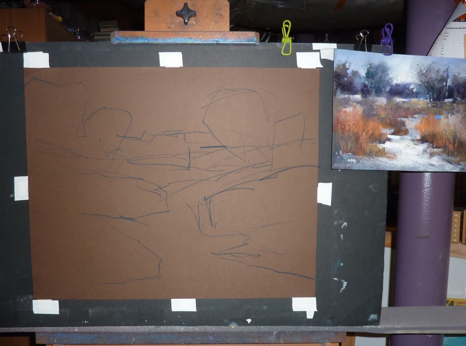 |
| sizing up to 16x20 on Canson Mi-Teintes |
 |
| the aftermath |
1 comment:
This is fascinating! Though I can see an artistic reason for why you used more of the bright orange in the larger painting. What if size makes a difference in how a painting is viewed?
In a mini, every part of the painting is within your focal area visually. So the composition has to be tight to lead the eye. You're not literally going to have the rest of it blur out. In a large painting, as opposed to something in between, your own peripheral vision will mute and diminish the details of the big orange area as soon as you glance away from it. It's less distracting. Seen at a distance it has more punch.
There's just some thoughts, based on some classes I took with Johannes Vloothuis. He was the one who pointed out to me that all the edge softening and focal point composition things are about making the painting more like how you look at reality, guiding the eye, than about reproducing what was there. He helped me to understand how something can "lead you out of the painting."
But it's made me think it'd be a good idea to try to do something like that, follow the same painting at different scales and pay attention to what I do unconsciously to adjust it to its size. What tricks work in large paintings that don't in small ones? What tricks work in minis that would be terrible in large ones? Or medium-size, are there things that work best for 8 x 10 to 9 x 12" sizes?
Post a Comment