Visit my Patreon Page for more painting instruction and Paint Along Videos!

Monday, December 31, 2018

Here is my Instagram Top Nine and Some Deep Thoughts!


My Instagram Top Nine #TopNine2018

Today as I sit at my newly cleaned desk and drink my coffee I am feeling reflective. I went to bed confused. What goals should I have for 2019? Should I have any goals? I have been reading so many thoughts on goal setting for the New Year that it was becoming confusing.  I woke up with newfound clarity.  I have decided how I will approach my Art Life in 2019. I will share that tomorrow. Today it is time to savor the accomplishments and the good things from 2018.
Looking back at my Art Year always makes me think about my own personal journey with pastels. When I saw my Instagram Top Nine something became crystal clear. The seeds for my growth as an artist were planted when I first started painting 13 years ago. I didn't  see it then but others did. 
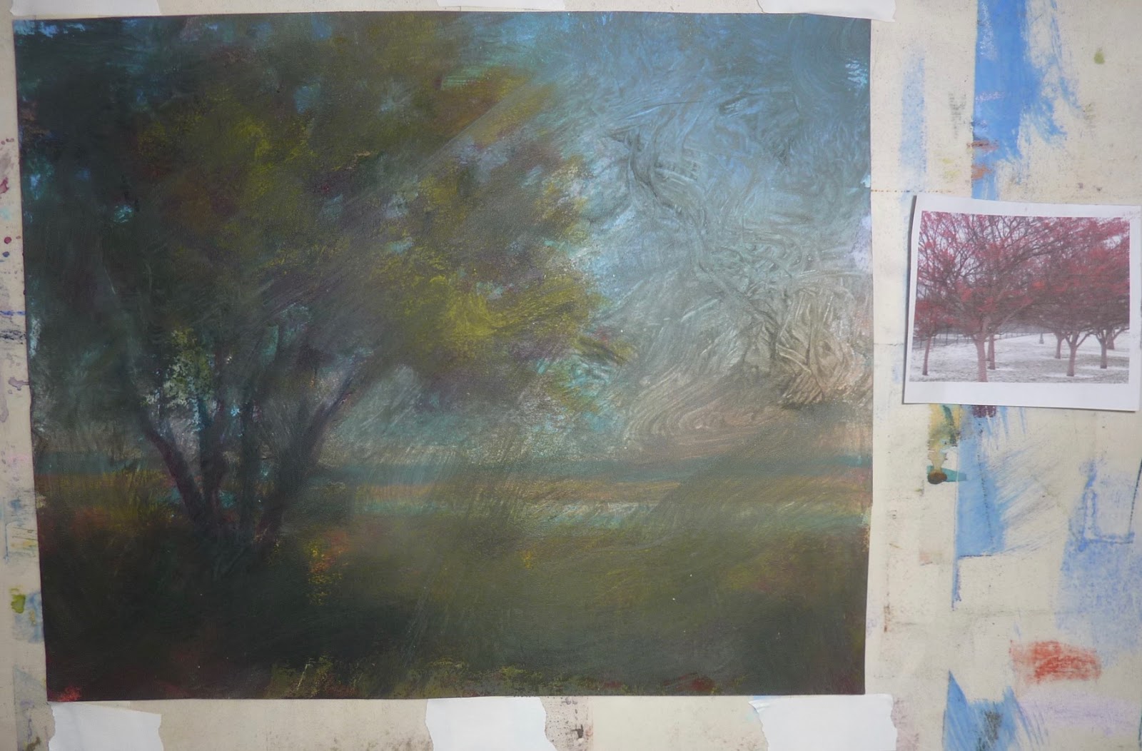
Look at the paintings in the photo above. These paintings got the most interaction on my Instagram account. Do you notice something about them (besides that they are mostly yellow!) ?  They are Trees, Woods and Meadows. These are things I never dreamed I would paint. When I first started painting, my subject of choice were animals and beach related still life. Never trees or landscapes! But I had the chance to attend a 5 day workshop with Albert Handell because he was in the area (even though I had only been painting for 6 months.) Much of the instruction was over my head. But I learned two very important things. 
  • We can only absorb and understand what we are ready for. I wanted it all right away. I wanted to paint like Albert or even some of the other students. I wanted to understand everything. But I wasn't ready. I needed to understand the basics of value, color, edges, composition...and I needed much practice before some of the more advanced concepts within those basics became clear. Fortunately I wasn't defeated. Instead I was motivated and energized to put in the time at the easel to master the basics. I am still learning but I am happy to say that it definitely got easier and those AHA moments were so sweet when they came.

  • Paint the Things You Love. When I first started painting, I painted animals and still life. I love animals but I didn't really like painting them! Back to the Handell workshop......at the end of the workshop we had an individual critique. We could share work done at home and at the workshop which was plain air in North Georgia (trees)  Albert looked at my work and very bluntly told me I should stop painting 'Ducks and shells'. He pointed to my plein air woodland paintings from the workshop and told me to concentrate on this type of subject.....trees, woods, nature.  I left the workshop indignant. How dare he tell me what to paint!  But I noticed that  as the time went on I was drawn more and more to the landscape. I enjoyed painting them and my work got better. I had another AHA moment about subject matter at a workshop years later with Stan Sperlak. That is when I embraced painting 'weeds'.  Looking back I realize that both Albert and Stan were right and they saw things in my work that I didn't see.....my passion for the landscape which translated into stronger paintings. Our choice of subjects matter!Paint what you are passionate about so that you own authentic voice can emerge!


Take time today to look back at your Art Year. What did you paint?  What was successful? What did you struggle with? Did you paint your passion? Do you have a top nine? What goals do you have for 2019? This post originally was created for my Patreon Page. I want to invite you to join us over on Patreon if you haven't already. I am planning a fantastic year of instruction and inspiration and it is only $4 each month. It really is a great value for your Art Life! www.patreon.com/karenmargulis

Saturday, December 29, 2018

Make Time for a Painting Break in Busy Times

'Color in the Park'             8x10                  pastel               ©Karen Margulis
available $150
 It can be done. Carving out some time to paint in the midst of the busy holiday season isn't easy but it is possible. I am in the middle of my annual studio clean up. I have stuff everywhere but I am making progress. On top of the clean up project I am working on plans for workshops and online instruction for 2019. And I am getting the house ready to have my granddaughter come over when my daughter returns to work (she is a 1st grade teacher) I am trying not to get overwhelmed! 

You would think there was no time to paint. But my easel calls to me. I can fit it in if I think about painting time a bit differently. I can certainly find 20 minutes to paint. It is the perfect break from cleaning. Painting a quick study gives me a break, satisfies my pastel craving and allows me to access the intuitive painter in me.  Often we do better work than we thought possible if we limit our time spent on the painting. We don't have time to over- think!


My reference photo

Today I took a break after lunch and spent 20 minutes working on this painting of colorful winter trees in my favorite Chicago park. I had already done the underpainting by coating an old failed painting with clear gesso. I found it in a pile of discards and it made the perfect piece of board for a quick study.

Quick studies are made for busy times. Pastels make it easy to paint and leave things alone. Clean-up is too easy.  It is a great habit to start. Make time for a painting break. You'll be glad you did!

Painting notes:  Mystery paper with clear gesso texture. Terry Ludwig pastels and Diane Townsends for the snow.

I added a coat of clear gesso to seal the failed painting and to add texture

Friday, December 28, 2018

An Easy Way to Fix a Damaged Pastel Painting


'Quiet on the Marsh'              16x20                   pastel           ©Karen Margulis
available $250

It looked bad. The painting was damaged and if I didn't know better I would say it was beyond repair. But I DO know better! I discovered this 16x20 demo painting in a pile during my studio cleanup. I put is aside thinking that it probably could be fixed. Today I saw the painting again peeking out at me and even though I should have been cleaning and organizing I decided to do the repair! (it's no wonder my studio stays unorganized!)

So what was the problem with the painting? It had been stacked against another painting without any protection. During travel home from the workshop the two paintings rubbed together and the result was pastel transferred from one painting onto the other. Look at the photos below to see the large marks in the sky of my painting.

The damaged painting

closeup of the pastel marks on the sky

When I was new to the pastel medium I would have considered this a total disaster. I would have been afraid to try to fix the sky thinking that the dark marks would just make mud if I tried to paint over them. The answer is an easy fix that allows one to simply remove stray marks and unwanted blemishes.

The tool I used was an old stiff inexpensive chip brush. I use this brushes for many things. You can get them at hardware and craft stores for less than a dollar. They are perfect for underpainting and applying pastel grounds and they are also excellent for pastel repairs!

A simple brush off and the painting is fixed!

All I needed to do was use the brush to gently brush away the marks. Since they were not pressed into the pastel by hand the pigment was sitting lightly on the top of the painting. Brushing the marks lifted them easily revealing the underlying sky.  I was able to brush off all of the marks! Some of them were quite dark and I was actually surprised at how easily they could be brushed off.

The sky underneath the marks was revealed and there was no evidence at all of the damaging marks!


The painting was fixed but while I had it on the easel I decided to clarify some of the other areas and give this previous demo and more finished feeling. I started at the back land mass and wired my way forward. I spent about 20 minutes adding the finishing touches. Now I need to get back to the clean up!!

A detail of the finished painting


Thursday, December 27, 2018

Tips for Adding a Figure to a Landscape Painting part 1


'Like Father Like Son'            pastel                 ©Karen Margulis          9x7
available on Etsy 9x7
My Great Studio Clean Up begins today so I am sharing my latest painting and an article from the archives. I had so much fun adding the figures to this painting that I want to do more of this in 2019!  Enjoy this post from the archives!


I am not a landscape purist. I like touches of life in my paintings. Birds, bees, buildings and people all add an element of interest to a painting. Sometimes a small figure or even a telephone wire is just what the painting needs. For me it makes me feel connected to the scene....it invites me to join in.

Adding figures to a landscape or cityscape can be a challenge. I am not a figurative painter so it makes it even more of a challenge. I have a few tips that have helped me. 

Most important tip: I remind myself that a figure is just another shape. If I get the shape and gesture accurate the figure will come to life.

I have two approaches to adding a figure to a painting. I will share one today and the other in tomorrow's blog post.


Blocking in the figure

Adding a Larger Figure:


  • When the figure will be larger than an inch I will block in the figure and work on both the figure and the surroundings at the same time. 
  • I start with a dark value and mass in the entire shape of the figure. I try to get the gesture ...how the figure is moving and posing.
  • After the figure is blocked in I begin laying in the shapes and colors of the background.
  • Back to the figure I add lighter values to give the figure some form. I pay attention to the direction and color of the light source.
  • To refine the figure I use negative painting....I make use of the background color to carve into the figure.
  • I use the edges and side of my softest pastel for the figures....they are simply a collection of marks that I apply with bold strokes.
  • I don't worry about faces or features....I keep the figures simple. SIMPLE SHAPES that SUGGEST

Developing the background and refining the figure
'City Lights'         5x7        pastel      $50


Adding the snow
Below is another cityscape with figure done in the same way....she is a collection of simple shapes.


Wednesday, December 26, 2018

How To Make a Great Homemade Pastel Surface for Winter Landscapes

'Traveling Through the Snow'.           8x10        pastel            ©Karen Margulis
available $150

I love texture! I have an easy and foolproof way of creating a textured surface. I just use clear gesso. For this winter landscape  I added a few drops of liquid acrylic to the clear gesso  and applied it to a piece of Canson Mi-Teintes paper with random brushstrokes. The paper did buckle a bit but flattened out after I placed in under a heavy book. 

I like to tone the clear gesso because it allows me to easily set the mood for the painting. I selected yellow for this painting because I wanted some warmth in my cold winter landscape. I could have selected a cooler color if I wanted a really cold icy feeling!

I have written about other homemade surfaces on my blog. Here are some links in case you missed them:


Clear gesso mixed with liquid acrylic makes a great ground


The start to my winter landscape
TIP: I use Liquitex Clear gesso. It has a slight grittiness to it which gives any surface a bit of a sandy feeling. You can add pumice if you want a rougher grit. You can tone it or use it over watercolor allowing the color to show. Regular white gesso does not do the same thing so be sure to use clear gesso!

Tuesday, December 25, 2018

A Winter Transformation is Easy with Pastels

'Dreaming of a White Christmas'              16x16              pastel            ©Karen Margulis
available $225
I kept looking at the painting up on my spare easel. It was a demo from a recent workshop. It wasn't a finished painting. I was demonstrating clouds and didn't add any finishing touches. As I looked at the painting I kept imagining it as a landscape covered in fresh snow.

 I put on my 'what if' hat and asked "What if I turned this into winter?" Could I do that? How would I accomplish that?

Because a painting can never become precious I decided it was worth a try. I put the painting up on my working easel and sprayed the trees and ground with workable fixative. I wanted to give more tooth to this piece of unhanded Canson paper.

I began by altering the trees into bare branched winter trees. I then worked on the sky, cooling the blues and adding more pinks and violets to the clouds. Finally I worked on the ground planes covering them with snow. Notice how I used different light value pastels to create distance and depth in the snow covered ground?

As I painted and felt colder I knew I was getting the effect I wanted! Altering the seasons in a pastel landscape is easy because of the ability we have to layer pastels. A quick spray of workable fixative gave me all the tooth I needed to build more layers. The fact that I was putting light values over dark worked in my favor. Using a light touch gave me the flexibility I needed to make the changes. In the end, it was a satisfying exercise!

The original unfinished demo painting....a very warm Southwestern landscape
Do you have a painting that is asking for a change of seasons? Put on your 'What If ' hat and give it a try!

Monday, December 24, 2018

Wishing You all a Wonderful Holiday Time!


Thank you for taking the time out of your day every day to visit with me here on the blog and read what I have been up to. I appreciate all of the participation and feedback. It keeps me motivated! I wish everyone a happy and peaceful holiday....whatever it is you celebrate....make it Merry, Happy and Bright!

I am making some great plans for us for 2019 so stay tuned!


Sunday, December 23, 2018

Painting a Winter Wonderland: All I know in One Painting!


'The Path to Happiness'              9x12              pastel         ©Karen Margulis
available $165

I am spending the holidays at home this year. It will be a quiet year without some of my children and grandchildren but FaceTime will bring us together Christmas morning. I have been making time for painting in between baking. I love to bake when it is cold outside! 

I am in a winter frame of mind with my paintings. Everything I paint has to be filled with snow. I do this every year. I go crazy with winter scenes until I feel I have captured it then I move on. Today's painting was done for a demo video fro my Patreon page. It is a good painting to end the year because it covers everything I have shared both here on the blog and on my Patreon Page......planning a painting, choosing a palette, suggesting detail, creating depth, making an earth sky connection, creating a visual path for the viewer...

I used a smaller color study and a bad reference photo as inspiration and I transformed the painting into a more inviting scene. This is actually my tree here in Georgia after one of our unusual snowfall. Below you can see my working board.


If you would like to see the video it is available on my Patreon Page. ($4 pledge) I appreciate your support!!!   www.patreon.com/karenmargulis

Saturday, December 22, 2018

Let it Go with a Snow Person Painting!

'Painting in the Snow 2018'            9x6              pastel            ©Karen Margulis
available $125
He kept me up at night! This year I wasn't sure what theme my annual snowman would take. I thought about it for a week and then it came to me. I wanted a pastel theme this year so I made my snowman painting with pastels. I just realized though that he better clean up the pastels he dropped before they turn into mush!

I love letting go and painting something fun and a bit whimsical every winter. I looked back and uncovered the snowmen paintings from the last several years. Some years I made photo cards with them which is very easy. I get photos made at Walgreens and use the photo mount cards from Strathmore! 


A few years of my annual snowman paintings 

Why not join me this year and paint your own snowman! We are sharing our snowmen over on my Patreon Page but if you haven't joined my page why not share on Facebook and Instagram! If you share your snowman be sure to use the hashtag #pastelsnowman18  in your description!

Thursday, December 20, 2018

What to Paint This Winter: New YouTube Demo

'Breathe'                8x10               pastel          ©Karen Margulis
available $150
It is dark and cold. You might be longing for those warm summer days. Or you might enjoy being cozy in your studio. I enjoy the dark moody days of winter. It allows me to stay inside and just paint. The problem is trying to decide what to paint. It is not for lack of reference material. I have more than enough inspiration.The problem is deciding! I find it helps to give myself an assignment. Here is one assignment that is great to do during those winter days in the studio.

Paint from your plein air studies! Pull out those plein air efforts from the warmer days. Hopefully you didn't throw them in the bin! Use these studies as inspiration for a studio version.

To get you started I created a video demonstration that you can see on my YouTube channel:


The 5x5 plein air study that inspired this painting

An Excerpt from the Archives

 I have been meaning to do more of this. Ever since Richard McKinley suggested I use my plein air studies for studio paintings. That was a few years ago during his Lake Tahoe workshop.  I really haven't done much with that idea though. I usually come home from a trip or plein air outing and throw my paintings in a box.  Once I am home and wrapped up in everyday life I don't take time to revisit these little studies.


I am missing out on one of the benefits of Plein air painting. Making use of the studies. These studies may not always be great or frameable  but they do give you better information than a photo.


I discovered that my plein air studies shows the emotional response I had while studying the scene on location. If you were to compare a photo of the scene and my plein air study  you would see the drama in the sky and feel the wind in the painting.  You can't see that in the photo. When I look at the study I am reminded of the wind and the ever-changing drama in the sky. Now to recapture that drama in a studio painting!

Wednesday, December 19, 2018

The Important of Reference Photos

'Heavenly Peace'.            9x12             pastel                  ©Karen Margulis    
available $165  
There is a bit of a controversy among some artists. It involves the use of photos for painting reference material. Some purists feel that the artist must always paint from life. Photos are unacceptable. Other have no problem at all with using photos. I fall in the middle. I do use photos for 95%of my work but it is my time spent painting from life that helps me interpret my photos.

I recently read an interview with Albert Handell on the Oil Painters of America blog.  Something he said resonated with me. This is also how I feel about working from photos.

" Yes, I paint from photographs. But the painting does not look like the photograph,  yet, there is no painting without the photograph. So what’s happening? I think the photographs touch something inside of me,  which awakens and inspires me…".  Albert Handell

Photos are the same for me. They touch me and they bring forward the memories of the place and time represented in the photo. I am then able to tap into those memories which help me paint with passion, interpreting what I remember rather than copying everything in the photo. 

Photos can be useful if you give yourself permission to make the changes needed to tell the story you remember. But it is important that you only use YOUR OWN photos. And that is a topic for another post!

the small dark reference photo
TIP:  In teaching workshops I have discovered that one of the biggest problems artists have with painting struggles can be traced back to choosing the wrong photo. While I give myself permission to make changes to my photos I have a rule of thumb.......if I have to change more than 3 things then the photo probably isn't a good reference.  I will cover this in much more detail on my Patreon Page as part of our January topic of study!

Join us over on my Patreon Page! Remember you can cancel anytime. www.patreon.com/karenmargulis

Monday, December 17, 2018

Painting a Winter Landscape 6 Easy Steps


'City Kids'                  8x10             pastel           ©Karen Margulis
available on Etsy $150

Greta and Jamie are city kids. They go to their neighborhood park everyday. They have a group of friends already and I am sure they will have a great time this winter on the sledding hill. This painting is dedicated to my grandchildren and all of the city kids out there! 

I took some step by step photos as I painted this one. Here are my steps and my thoughts as the painting developed.


I chose a homemade support which is mat board coated with gesso and pumice mix. It is white. I did a quick drawing with a pink Nupastel. My reference photo inspired me but I made changes to create a better composition.


I blocked in the painting with big simple shapes of neutral pastels. I selected muted colors from my 'neutral drawer'. These are all grayed down muted colors such as blue-grays and muted purples. You can see the texture of the pumice in this photo.


Here is a shot of my Neutral Drawer. I keep these colors together so I remember to use them. Next to other more saturated colors these pastel get overlooked. Some may even think of them as ugly or dirty. I love their soft subtleness.


I decide to rub in this first layer of pastel to fill in the rough texture of the support and to create an out of focus underpainitng.


For this painting I choose to work on my center of interest first. The children going up the sled hill are my center of interest. Anytime you add a figure to a painting the eye looks at the figure first. I want to make sure they are well placed and developed before I spend too much time on the less important parts of the painting.


Next I develop the trees and suggest window in the distant buildings. I am still using my neutrals. I did use some saturated colors on my figures. I also add some blue and lavender shadows in my snow.


 I work on the snow some more. I use a dull rose for the distant snow and some brighter whites in the foreground snow. I also make some footprints in the snow. I also add a few lamp posts and light the lights....since I was going to make it snow.


I add the snow using pastel dust. I decide to add some smaller figures in the distance since my two stars seemed a bit lonely!  I also changed the color of the turquoise sled to yellow to echo the lights in the distance. Now I am finished!


Here is another Chicago winter cityscape. I love painting these scenes!

'Let it Snow'.           8x10           pastel            available $150

Sunday, December 16, 2018

New Video! Have a Sneak Peek!

'Beauty on the Coast'.             9x12.          pastel.       ©Karen Margulis
available in my Etsy shop.    $150

This painting was a struggle! I was painting the tree for a Patreon video so once I started I didn't want to stop. I thought it would be easy to just adjust things as I painted. It wasn't that easy! There are two important lessons here...... 1. Always start with a plan and make sure your initial drawing or placement of shapes is correct. 2. Don't give up and don't make the painting precious. A painting rarely comes together perfectly without some kind of struggle. Sometimes art videos make it seem like there is never a struggle but the struggle is real.

In this video I work through the problem of a poorly placed tree and bad trunk. This is one of my weekly video demos that I share on my Patreon Page. I want to share the video here with my blog readers because it has such valuable lessons. Click on the link below to see the video on YouTube. 


Click link to view video on Youtube https://youtu.be/P_mAAr1MTOs
Please be sure to subscribe to my YouTube channel and check out the Patreon Page. I appreciate your support of my online instruction. Your support allows me to continue to create great content!

Saturday, December 15, 2018

How to Tone Your Pastel Paper the Cheap Way


'Cardinals of Winnemac Park'            8x10         pastel         ©Karen Margulis
available in my Etsy shop click here $150

I knew I wanted to use some neutrals for this winter landscape. I love using those dull mousey 'uglies'! They have a subtle and quiet beauty. They are the colors I use in my family room and bedroom.  I get excited when I find a reference that requires the use of a lot of my neutrals!

The subject of this painting is a Chicago city park near my son & family. I love this park because it has a naturalized prairie area. It is beautiful in all seasons but I especially love it in winter. I knew I would be using many neutrals so I decided to tone the paper with a dull mousey gray to give my painting a head start and to cover up the light tone of the Uart paper.

As I prepared for the painting and pondered how I would tone the the paper an idea came to me. Why not use the pastel dust in my gutter tray from my last painting instead of throwing it out. The dust was a nice blue- gray with bits of red violet. It would make a perfect middle value gray tone.

I use a gutter of scored coated foamcore to catch my pastel dust

I took out a piece of pipe foam and dipped it in the dust and then rubbed it onto the paper. I continued until the paper was covered.  Then I took an old paint brush and some rubbing alcohol to liquify the pastel to mix the dust even more. You can see the result below. I now had an interesting blend of grays to start my moody winter scene! It was a quick and easy way to tone my paper. And cheap! I made use of the precious pastel dust rather than throwing it out.

Note: Many artists save their dust my emptying their dust trays into a jar. The dust can be made into a neutral pastel by mixing it with some distilled water until it forms a paste which can be shaped into a pastel.

This is the toned paper....uart with an alcohol wash using collected pastel dust

Some of the neutrals I used for this painting

Do you see the little surprises?