Visit my Patreon Page for more painting instruction and Paint Along Videos!

Thursday, January 31, 2019

Why Wildflowers Make Good Spices in a Painting

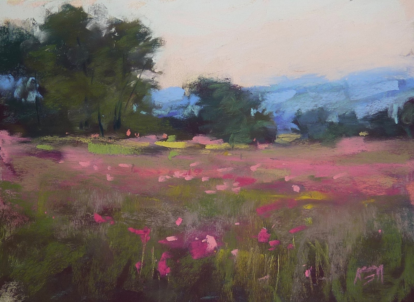
'When Spring Comes'           8x10            pastel.             ©Karen Margulis
available $175

I am working on my IAPS19  demo presentation this week and I had a couple of AHA moments. I love when that happens!  Let me share one with you today.

Not every landscape has or needs wildflowers but when they occur it is always good to exploit them and use them wisely. Wildflowers can be a wonderful spice to an otherwise ordinary landscape. Here is why......spice in a painting is an area of contrast. Contrast acts like an eye magnet. We are drawn to look at areas of contrast.  Deliberately placing areas of contrast (spice) can help create the movement of the viewer's eye around a painting.

Spice = Contrast = Eye Movement

This means that we have control over the wildflowers in the painting. We don't want to scatter them randomly or even copy the way they appear in our reference. Instead we need to take charge and plan where they will be planted! In the bluebonnet painting today notice how I have created areas of contrast within the flower masses. The lighter flowers stand out and draw the eye back into the distance. I have also used other areas of contrast to help create a visual journey.

TIP: Areas of contrast are simply opposites. Here are a few: warm/cool  intense/dull   soft edge /hard edge  thick/thin.  detail/out of focus  light/dark. Plan your areas of contrast. Don't leave them to chance. Don't overdo them. Like a spice a little contrast goes a long way. Flowers everywhere don't have as much impact as a few well placed flowers!


I am excited about my IAPS demo! It will be a fast paced pastel demo production packed with information and fun! Even if you don't care to paint wildflowers most of the information I share and demonstrate can be applied to ANY landscape!  Struggle with grasses? Need to create more depth? Is Mark making your trouble spot? Consider registering for my demo! Here is the official description:

Whether up close and personal or a small part of a landscape, wildflowers add the perfect spice. Learn how to invite your viewer into your paintings with beautiful flowers. Karen will demonstrate and share strategies for painting expressive flowers and grasses that look natural and believable.

Tuesday, January 29, 2019

Some Art Advice from Hemingway

'Wildflowers Roam Free'               10x8        pastel        ©Karen Margulis
ask for availability 
 I have always been committed to painting every day that I am home. But I found that sometimes I was letting other things take up too much of my time. It seems like the more are time we have the less we end up accomplishing. For me it was always....oh I have plenty of time so I'll do it later. I found I painted less for myself, for fun. If it wasn't for a workshop or blog post or class I put it off.

Things have changed in 2019. I am watching my 4 month old granddaughter for a few hours each day during the week. Even though it is just a few hours a day I feel more urgency to be efficient and to get more art done. It's been a productive month so far! I have a little secret and Ernest Hemingway had the same idea!

"At night, never go to bed without knowing what you'll write tomorrow." Ernest Hemingway


These days I am not getting down to the studio until the late afternoon. I don't have time to putter around trying to decide what to work on. I have to have a plan in place.  So every evening before I head upstairs I set up paper and reference photo for the next day. I might even do an underpainting if I have time. This way I have no excuse the next day.....I paint because it is there and ready for me. I know the night before what I will paint the next day. It is the secret to being productive!

Below are two underpainting on the easel. It gave me a head start on two day's worth of daily paintings! Today's painting came from the underpainting on the left. It is an Art Graf underpainting on white Pastel Premier paper.


Monday, January 28, 2019

How to Make Your Own Canvas Like Pastel Support


'Among Good Friends'                 9x12                pastel            ©Karen Margulis
available $175
I haven't made my own pastel ground in awhile. I was lazy. It was easier to use clear gesso for a homemade surface. I decided to give the pumice gesso mix another try last week. This time I applied the mixture in a more controlled fashion and I loved the result!

I usually take a stiff brush and use random brush strokes to make a crazy textured underpainting. This time I used a softer Brush and applied the mixture in smooth level strokes going across in one direction and then again in the opposite direction. The result was a look much like the weave of canvas. It really gave my pastel painting a different look especially up close.
Here is some information on making your own supports. You can see today's painting demo video this week on my Patreon Page. www.patreon.com/karenmargulis

I made my own surfaces on Acid free mat board. I cut a large piece of mat board into smaller pieces. It is easy to score with a utility knife. I coated the back of each board with acrylic gesso to seal it. When it was dry I applied the ground which was made of acrylic gesso, fine pumice powder and water. I tinted this mixture with Golden fluid acrylic paint. There are several recipes for grounds that you can find and you will want to experiment with the ingredients to find mixture you like.
To read more about making your own grounds I recommend Richard McKinley's Pastel Pointer article on Home Grown Surfaces.

Do you like the look of pastels on homemade surfaces?


Making a homemade pastel surface

click to enlarge to see texture

Sunday, January 27, 2019

New Pastel Video Released : How to Paint Rocks and Water


9x12            pastel          ©Karen Margulis.       sold

Do rocks intimidate you? Are you frustrated with the rocks you paint? My rocks used to look like potatoes!  They looked like rounded squishy looking blobs of brown. And when I tried too hard to make them better they didn't look like the rest of the painting. They were overly detailed and they didn't fit in with the looser marks I used for the rest of the painting.  I avoided landscapes with rocks.

Then I learned about the power of suggestion. I realized that I didn't need to render the rocks with great detail. I didn't need to paint every nook and cranny. I also started to look at the planes on rocks. I started to notice the big patterns of light and shadow. If I could suggest these planes of light and dark with simple marks with the side of my pastel....I could suggest the rocks.

"Suggest and let the viewer do the rest"

Look at the photo below. I didn't draw these rocks and color them in. I simply made marks to suggests the darker shadowed areas and marks to suggest the light on the rock planes. Taken out of context they don't look much like rocks. But in the landscape painting the viewer can deduce that these marks are indeed rocks.


close up of suggested rocks


To see the newly released video follow the link to my YouTube channel!

Saturday, January 26, 2019

Spice Up Your Landscapes with the Right Greens


"Summer Delight'              5x7           pastel on board       ©Karen Margulis
available $95 

"You don't have the right Greens"  Albert Handell told me back in 2006. It was my first workshop and I had only been painting with pastels for a few months so I was quite intimidated.  I was also disheartened. After all I had just bought a big set of greens for the workshop so how could I NOT have the right greens! He showed me the greens I was missing and I was shocked!

 
The greens I didn't have in my box. Wow!


They were the brightest most acidic and artificial looking greens you could imagine.  I would have never chosen to use them but as a good student I went out and bought the greens Albert suggested. I really didn't understand at the time why I needed them and how to use them. I wasn't ready for that knowledge. But now several years and many paintings later I finally get it. These greens are my SPICES and they are to be used in small amounts to add interest and excitement to my landscapes. They are not necessarily the greens I would use to paint an entire meadow....but a few marks in the right place with the spicy green will make a big difference in the painting. 


Spice:  interesting element or quality; zest; piquancy
I like to consider these artificial looking (some might even say garish) greens as my spices. They add an interesting element to a painting. And like a spice used in cooking, a little bit goes a long way. I choose to use my spicy greens at the end of a painting when I am trying to pull everything together. A few well placed spicy marks can help lead the viewer around the painting. Just remember not to overdo the spicy marks or they will lose their impact. 

Wednesday, January 23, 2019

Pastel Tip: What Should You do When Trying a New Surface


'Tangled'                 12x9                pastel        ©Karen Margulis
available $165

I have a basket of unused art supplies. These are things I picked up here and there with the intent to experiment with them. I have paper, paints, sketchbooks and more. I never seem to have time to just play with these items. Today I took out a pad of paper that I got at the IAPS convention in 2017! I had never tried this paper but it looked interesting.  It felt unusual....almost rubbery to the touch . But I liked how it grabbed the pastel. I am glad I had a pad of this paper so I could get to know it better.

A few Tips for Getting to Know a New Paper 

  • When trying any new paper or surface it is common to have a learning curve. Not all papers accept pastel in the same way. 
  • Don't give up on a paper after only a few tries. It takes time to get to know it. Make a commitment to paint on the new paper exclusively for a series of paintings. 
  • Paint something you know very well. When you are getting familiar with a new surface the last thing you want to do is have to think about new compositions, color schemes, values etc. Choose a subject you are very familiar with, one that you have painted successfully. I chose daisies. Not only was it easy to paint something I have painted many times.....it allowed me to compare the results on the new surface to my experience on other surfaces.....it was my control painitng. 


Pastellfix paper
I could only find Patellfix paper at Fineartstore online here in the US. Here is some more information:

 170 gsm, cotton rag content 
PastellFix offers artists an incomparable painting experience. You can feel how different it is from other pastel papers straight away. "The velvety looking surface is a totally new haptic experience and your chalk pastels seem to just dance across it. Working with this high quality paper is thoroughly enjoyable right from the start," says artist Monika Mori enthusiastically.
Pastel pigments dissolve quickly and without the application of any undue pressure on the soft, slightly textured paper. The colour pigments adhere beautifully to the surface, where they settle gently but firmly. Blurred lines and carefully nuanced shading can easily be created with different wiping techniques. Developed especially for pastels, 170 g/m² PastellFix paper is also perfect for oil pastel, pencil, sanguine or charcoal works. The pastel painting pad contains two sheets of each of the following colours: ivory, sand, navy, steel grey, dark grey and black. The different shades are protected by transparent dividers. This paper offers professional as well as hobby artists the perfect surface for giving free rein to their creativity. The acid free paper has a cotton rag content and is felt marked.

I chose an orange toned piece of paper form the pad


The first layers


Tuesday, January 22, 2019

An Easy Way to Add Interest to Your Pastel Painting


'A Magical Day'              12x9            pastel           ©Karen Margulis
ask me about availability

 Shave pastels!  Yes that's what I said and if you are looking for a twist on pastel painting then you should get ready to shave some pastel dust!   If you been a regular blog reader then you have probably read my posts on the Dusting technique.  It is actually an old technique of applying pastel to paper. I discovered it a few years ago and I have been having fun with it ever since.


What is Dusting?  It is simply another way of applying pastel. Instead of making lines of thick marks, or dots and dashes, the pastel is shaved with a blade or edge of a palette knife and allowed to fall onto the paper (which needs to be flat)  You can either build up a painting with many layers of this shaved dust or you can use the dust for special effects which I did for this wildflower painting.

Dusting can also be used to create snow or water foam and spray. While it is a useful technique it needs to be used with restraint. Too much and it looks like a gimmick. But just enough and used occasionally it creates a magical surprise. 

Below is a photo of the painting in my most recent video demo for my Patreon Page. This is where the video ended. The video was not about dusting rather it was about using reference photos more effectively. But when I came back to the painting the next day I felt like it needed some punch It was quite blah!  Dusting to the rescue!


The painting at the end of the video. It still need the finishing marks
I have a box of older pastels that I save for dusting. They happen to be Jack Richeson Hand rolled pastels. I like them because they are the right consistency and the colors are intense....perfect to add punch to a painting. 

HOW TO DUST:  It is simple. Lay the painting flat. Hold the pastel over the painting and use a palette knife to shave the pastel letting the dust fall on the painting. After I am finished dusting I use a piece of glassine paper and the palm of my hand to rub the painting which pushes the dust into the paper. 


CHECK OUT THE VIDEO DEMO OVER ON MY PATREON PAGE. 
$4 a month for this video and so much more!

Sunday, January 20, 2019

6 Reasons to Give Canson Mi-Teintes a Try


'In the Mood'               9x9               pastel            ©Karen Margulis
available $160

Like many artists new to pastels I started out using Canson Mi-Teintes paper, some NuPastels and some Rembrandts. And like many I struggled with this combination. I couldn't get the rich colors that I admired in pastel paintings. Mine were muddy. Once I discovered sanded paper and softer pastels I stopped using Canson. Over the years I have revisited Canson and now I love it. What I discovered is that I had better luck when I developed a lighter touch and when I used softer pastels. If you are like me and don't enjoy Canson, let me share what I like about it and perhaps I can convince you to give it another try!
  • It is inexpensive and readily available even in local craft & hobby stores.
  • It comes in many colors so no need to tone your paper
  • It is versatile with a bumpy and smooth side. Use the bumpy side if you want texture. I prefer the smooth side.
  • It has a wonderful soft feel which is so nice to work on.
  • It is easy to blend areas if you like blending. I like to blend in my first layer to give me a 'ghost' image underpainting. It is harder to blend on sanded paper since it grabs the pastel.
  • It is a great teacher...it teaches you to have a lighter touch and to make each stroke count.
Yes it is true that Canson holds less layers of pastel than sanded papers but you may be surprised at how much it can hold. I did a layer test and got 11 layers of soft pastels vs. only 7 layers of NuPastels (harder). Some artists sand their Canson to raise the nap but 11 layers is enough for me! Yes it is true that you can't do wet underpaintings on Canson but I can do a soft, blended dreamy underpainting which is wonderful. 

It may not be as forgiving as sanded papers in that you can't wash off a painting but you can brush out areas and use workable fixative if you want to make corrections. I do love the choice of colors but my favorite color is Moonstone which is a warm medium gray. It works for everything. I will certainly use sanded paper when I want to do wet underpaintings but no longer will I hesitate using Canson. In fact I just ordered some more!

In case you were wondering how to pronounce Mi-Teintes and what it means. I looked it up and it means 'Mid Tones' in French and it is pronounced 'Me Taunts'


The beginnings of the painting....blocking in the darks


Adding a layer everywhere before blending in the first layer.
I did use Blair workable fixative to build up layers in the ground but none in the sky.

Friday, January 18, 2019

New Painting Demo Video Released!


'Island Time'         8x10        pastel        ©Karen Margulis
sold

It is an inevitable result of painting. Pastels wear down. They break. We are left with bits and pieces of once favorite colors. My big studio box is filled with these tiny pieces. I can't bear to part with them. But they are really too small to use. Or are they?

Don't throw them out! Bits and Pieces of pastel can be used. We can always crush them and make new pastels. I have not done this but it is on my list of things to try. I use my pastel bits in two ways. I save them for my tiny travel kits.  I also put them in my 'spice jars'.

My collection of pastel spices
Every painting needs some spice. I consider spices the small finishing touches. Those bits of eye candy that help lead the viewer through the painting. Little spots of color that the viewer can savor. Spices can also be small areas of texture from a heavier application of pastel. Little bits and pieces of pastel are the perfect size to make these small spicy marks.

When my pastels get too small to hold comfortably I put them in little containers. I like to use plastic baby food containers. They are small, can stack and allow quick and easy access to the pastels. Any color can be used as spices. It depends on the painting. If you are organized you can keep colors separated. I am not that organized so I tend to have a mix of colors in my spice containers. I choose the spice color by scanning my containers and choosing the color that I think will work. 

My color choices are mostly intuitive but if I am not sure of the right spice color I will use a color wheel. See my post on choosing spice colors here.

The photo below shows the painting at the end of the video demo I did for my Patreon page. This is before I added the spices. Can you see what I added?


The video has now been released to my Youtube channel. You can watch it here:https://youtu.be/dg8Tdhg9MkY  Be sure to subscribe to my Youtube channel for more videos and Patreon for the latest videos and instruction.


Before the final spices

Thursday, January 17, 2019

What Can You do with Your Pastel Bits and Pieces?

'The Height of Summer'           8x10              pastel              ©Karen Margulis
available $155

 It is an inevitable result of painting. Pastels wear down. They break. We are left with bits and pieces of once favorite colors. My big studio box is filled with these tiny pieces. I can't bear to part with them. But they are really too small to use. Or are they?


Don't throw them out! Bits and Pieces of pastel can be used. We can always crush them and make new pastels. I have not done this but it is on my list of things to try. I use my pastel bits in two ways. I save them for my tiny travel kits.  I also put them in my 'spice jars'.

A few of my Spice Jars
Every painting needs some spice. I consider spices the small finishing touches. Those bits of eye candy that help lead the viewer through the painting. Little spots of color that the viewer can savor. Spices can also be small areas of texture from a heavier application of pastel. Little bits and pieces of pastel are the perfect size to make these small spicy marks.


Before Redoing the painting and adding some punch!

When my pastels get too small to hold comfortably I put them in little containers. I like to use plastic baby food containers. They are small, can stack and allow quick and easy access to the pastels. Any color can be used as spices. It depends on the painting. If you are organized you can keep colors separated. I am not that organized so I tend to have a mix of colors in my spice containers. I choose the spice color by scanning my containers and choosing the color that I think will work. 

My color choices are mostly intuitive but if I am not sure of the right spice color I will use a color wheel. See my post on choosing spice colors here.

Since I just cleaned my big studio box I have replenished my spice jars! Let''s add some spice to our paintings!

Tuesday, January 15, 2019

New Workshop in New Jersey in April!


'Serenity'                 8x10                 ©Karen Margulis
available $160
 This is where it all began! I had been painting with pastels for about a year when I discovered the work of Stan Sperlak. I loved the paintings I saw on his website and noticed he was having a workshop near Atlantic City, NJ.  I had a friend in the area and decided to make  a dual purpose trip.....visit my friend and take Stan's workshop. It was one of the best art things I ever did. I learned so much in that workshop and convinced my friends to go the following year to Stan's Goshen NJ farm for another workshop. They were also converted. Since those early days I have taken three more workshops with Stan including a painter's Passport trip to Iceland. I also had the honor of team teaching with Stan in Normandy, France.

And now I am excited to share that I will be going back to New Jersey this April to teach at the Goshen School of Art. Check out the Facebook page to see photos of this wonderful and inspiring place! This beautiful place has inspired so many of my paintings! https://www.facebook.com/The-Goshen-School-of-Art-1659995084245536/

I hope you will consider joining me for this workshop. The theme of the workshop is "Expressive Pastels'. It is a studio workshop. I will be sharing tips and techniques for painting more expressive paintings with several demos, lessons, handouts and help at the easel.  If you have been wanting to loosen up and paint with passion and more expression this is the workshop experience for you!

April 12-14 KAREN MARGULIS!!!
The Goshen School of Art welcomes a long-time friend and past participant who is returning now as a nationally respected teacher, blogger and artist in the ways of creativity in pastel. This class is sure to fill quickly. As always, a Thursday night demo and reception then three full days! $475
Email: sperlakpastelworkshops@gmail.com to sign up, then print and send in registration


Beginning the painting by simply blocking in the darks.


Monday, January 14, 2019

Daily Painting Tips for Busy Artists

'Beautiful Interlude'              5x7               pastel                ©Karen Margulis
available $95

It's that time of year. Many of us are making the commitment to paint more often in 2019. I have been a Daily Painter since 2006 and I can say it is the best habit I ever developed. I try to paint every day but sometimes life does intervene and painting takes a back seat. But for the most part I have streamlined my painting practice routine so that I can manage some time in the studio most days that I am in town.

Over on my Patreon Page we are exploring the habit of more frequent painting. Today I am sharing the video demo of the painting above 'Beautiful Interlude'.  If you haven't joined my page, I have some Daily Painting tips I'd like to share here:

  • Keep paintings small 6x8 and 5x7 are ideal sizes 
  • Keep them quick. Set a timer for 15-20 minutes
  • Keep supplies set up even if it is just a small set that is easy to access. Precut your paper and select a variety of reference photos.
  • Simplify! start with a few big simple shapes.
  • Create a roadmap of values....decide what is mostly dark, light and mid value.
  • Choose the area of interest and put the most clarity in this area
  • Leave some mystery....don't put in every detail. The time limit helps.
  • When the timer goes off STOP. Paint another one if you still have time but don't fiddle with the first painting. It is a warm up study!
  • Evaluate the painting and decide on 3 marks to finish. place those mark and call it done!


My reference photo


I used only Terry Ludwig pastels for today's painting 

There are still openings in my IAPS Demo! I hope you will consider adding it to your schedule. Even if wildflowers aren't your thing I will be sharing tips and techniques that you will be able to apply to any landscape! www.iapspastel.org


Sunday, January 13, 2019

Key Benefits of Painting the Same Subject

'Garden of Delights'          10x8           pastel           ©Karen Margulis
I don't ever worry about running out of things to paint. Inspiration can be found everywhere. In fact it is often difficult to settle down and pick something from the 33,000 photos in my photo files. Even though I have plenty of choices  I find I am drawn to some of the same images again and again. Some images just seem to speak more loudly than others. I listen!

I remind myself that is is OK to paint something more than once. In fact it is a good thing. Often we resist the urge to paint from the same reference more than once. Maybe we feel we need to try new subjects. After all once we have 'done' it what is left to learn?  There is plenty to learn!


  • Painting something more than once helps us become intimate with our subject. The more comfortable we are the more we are able to take risks.
  • Familiarity leads to more expression. Once we know our subject we have more success with making changes to our references. We can be more intuitive because we are already familiar with the scene.
  • Painting something more than once allows us to explore other solutions. We can try new techniques, change paper size and/or orientation, change the point of view. The sky is the limit!
  • We learn more because we aren't starting from scratch. We don't need to reinvent the wheel....only improve it!
I was asked recently if I had painted pink coneflowers before. That led me to search thorough my paintings and quickly found several purple coneflowers and one pink. So the answer is Yes!  But each time I revisit this favorite motif I challenge myself to create something new. I enjoy the freedom that this old friend gives me to explore and discover new interpretations.

While we are on the subject of painting my favorite motifs,  I am working on preparations for my Wildflower demo for the upcoming IAPS convention. I do have some new openings for my  demo. It is not too late to register! There are plenty of open demos. And if you are already registered you can add sessions now. Be sure to check the IAPS website to see all of the openings. You can add classes online by going to your registration record:

HOW TO REGISTER OR ADD DEMOS TO YOUR REGISTRATION

Here is the link to the convention registration page.http://iapspastel.org/conv19_register.php
Follow the directions to register or add to your schedule. 

Saturday, January 12, 2019

Make Sure You do this after painting!


'Dreams of Summers Past'                 9x12                 pastel                     ©Karen Margulis
available $225

They will stay clean! That is my commitment. I spent hours cleaning and organizing my pastels and it is such a pleasure to be greeted by a box of colors I can actually see. 
But now I want to be sure they stay clean. Sure I can wipe them as I paint which is what I try to do. But inevitably they get filthy! It gets so bad that I can't tell what color or value some of them are.

Not any more!  I got a great tip from a fellow artist who used the same cornmeal method to clean her pastels but she takes it a step further. She keeps a bowl of cornmeal in her studio (tightly sealed to deter critters) After each painting or every few paintings with the same palette she puts the pastels she used into the bowl and swished them around until they are clean. THEN she puts them back into her studio box. Brilliant! Thank you!

I took her advice and cleaned my working palette after a few paintings. They were then ready to go back into the big box ready for the next painting session!  I love this idea!


Dirty pastels after using them for a couple of paintings 

Throw them into a bowl of cornmeal, gently toss them.

And voila.....clean pastels!

Friday, January 11, 2019

Learn How to Critique Your Work

'Undiscovered Beauty'.     16x9            pastel            ©Karen Margulis
available $175
 It seems like such a challenging thing to do. How do we know if a painting is truly finished? How do we know what to do if it isn't finished?  I recently heard a quote that really made me think.

" You can't paint better than you know" Dan Young

Sometimes we feel like we need to know everything about painting all at once. We want to have all the answers and know exactly what every painting needs. But it doesn't always happen. We have to have the experience, knowledge and practice to figure out the answers. And that takes time. But there is something we can do.... we can ask the right questions! Knowing what we should look for when finishing a painting is a good first step!

The painting above is an example of time and practice helping me discover the right answers. I painted it a few years ago and I was happy with the original painting. But I pulled it out the other day and it was just  'nice'.  There was no punch. There was no real visual journey for the viewer. But now, several years later I not only knew the questions....I knew the answers! I put the painting back on the easel and made some adjustments. Unfortunately I forgot to take  a photo of the original version of the painting But it was quite monotonous.


  • I asked myself if I had created a visual journey for the viewer.  Were there pathways or areas of contrast for the viewer to follow?
  • I asked if there was a visual connection between the ground and the sky or did I have two separate paintings?
  • I asked if there was anything distracting that took the eye in the wrong place?
I had some questions to help me critique what I had done and I set about making the adjustments. I added more clarity and punch (contrast) in some of the flowers . I added spice marks (contrast) to pull the eye further into the painting. I made adjustments to the sky and corrected the problem areas. Having the right questions gave me a direction to follow! Time and experience gave me possible answers!

What is happening on Patreon? NEW!! MEMBER CRITIQUE. I have added a new monthly feature on my Patreon Page. Each month I will give an in depth critique of a member's painting. Each month we will also explore tools we can use to become better at evaluating our own work.  Check out my page and see the Video Demo of the adjustments I made to this painting.