Visit my Patreon Page for more painting instruction and Paint Along Videos!

Thursday, October 31, 2019

Don't Be Afraid to Paint Animals!

'French Cows from Life'                5x7          pastel            ©Karen Margulis
sold


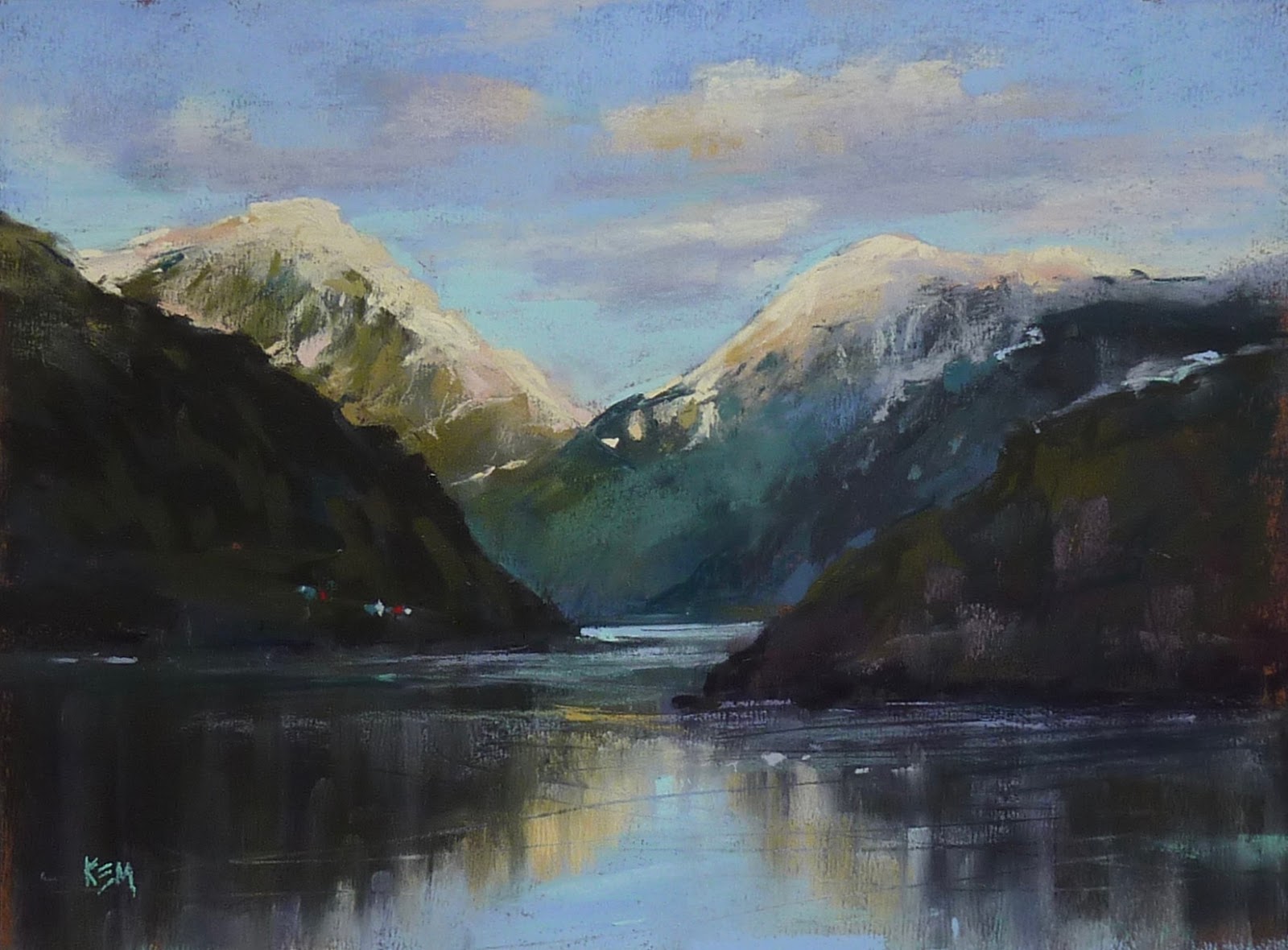
I am getting ready to paint the sheep and goats from my Norway trip and I hesitating. They look hard to paint! But then I remembered and important lesson I learned a few years ago. I am sharing it again here. Now I will tackle those sheep!!


It looked daunting. But I really wanted to paint them. The cows surrounded our home base and wandered the fields near our home. I went out each morning with the intention of painting the landscape but I kept being drawn back to those cows! But I would I paint them from life. They were always on the move or were changing positions. Would I be able to paint fast enough? I hesitated.


But then I remembered advice given to me when I first started painting. I was taking a workshop with Terry Ludwig. And somehow the subject of painting things other than landscapes came up. I expressed my fear of including figures or animals in my landscapes. His answer was simple.

  "They are only SHAPES"


They are just shapes. That made sense. If I stopped calling them by name and just looked at the shapes I should be able to paint the cows. It wouldn't even matter how quickly they moved because I could quickly capture their shape and gesture. Once I focused on the shapes and values within the shapes I was able to get a good impression of those French cows.


Do you want to paint animals too? Starting in November we will be learning tips for painting animals over on my Patreon Page. I can't wait to share with you! Check it out at
here is a recent review of my Patreon Page:
"I am impressed with the way you teach and how you manage to get across some much information, while painting! Your patreon page is a treasure trove of knowledge and insights. I am just a hobbyist and a beginner and I am delighted to learn from you."

Tuesday, October 29, 2019

Have You Seen My Painting in Pastel Journal this Month!?

'When Evening Falls'              16x20                 pastel           ©Karen Margulis
available $375
 It was a dream come true! When I was new to pastels I studied each issue of the Pastel Journal inside and out. I learned so much by reading the articles and studying the paintings. I was in awe of those artists and their work with pastels. I wanted to paint like they did! Never in a million years would I think that I would have a painting in and Pastel Journal article!

A few years ago it became a reality when one of my wildflower paintings made the cover! It was such an honor! (I have that issue framed)  I am proud to say that I have another painting in Pastel Journal. I am in such amazing company in the article about nocturnes in this month's issue.  Thank you very much to Anne Hevener for her wonderful article. I had so much fun painting my favorite subject at night!

I plan to do more nocturnes and it will be one of our Patreon topics in 2020!! Stay tuned and be sure to get a copy of this month's Pastel Journal or subscribe if you haven't already!


Sunday, October 27, 2019

My Favorite Tip for Painting Red Trees

'Autumn Walk ll'             9x12             pastel           ©Karen Margulis
available $175
I am at the beach on my annual artist retreat with friends. Enjoy this post from the archives! 

 Fall color is here!  I love yellow trees but there is nothing more beautiful than a brilliant red tree standing on its own. The red just draws me in. How can we possibly capture this red glow in a painting? Do we even have the right colors?  I have discovered a little tip that has help me capture the brilliant red with pastels. Just consult your color wheel!  Read on for details.

Light vs. warm reds
When I am faced with painting something red that is in sunlight I know I need to paint  a shadowed side and a side in the light. Let's take a red tree for an example. 

  • I choose a dark cool red for the leaves in the shadows and a brighter red for the rest of the foliage. Now there are some areas in the sunlight and my natural inclination is to choose a lighter red....which would be pink. (see photo)
  • Using pink will make the foliage red correctly but they won't have that warm red glow. The pale red/pink just looks washed out. So what should you do?


  • Take out the color wheel and look at red. Now ask yourself if red was going towards the light source (yellow) what color comes next on the color wheel?  Orange! So if I paint the red leaves a warmer color like red orange rather than a lighter color....I will have a glowing red tree!


So think warmer colors rather than lighter colors when you want to paint something lit by the warm sun!


Friday, October 25, 2019

Three Things to Do Immediately After a Trip

'When Summer Slips into Fall'           11x15            pastel         ©Karen Margulis
available $225

An epic adventure needs to be savored. There needs to be a time of reflection and quiet. A time to take a deep breath and let the memories come. Little visual snippets to be enjoyed and processed before the reality of every day life hits.  I always say it would be nice to have a few days after a trip to do nothing but paint, look at pictures and reflect. This time I returned home on a holiday weekend so I do have some free time.

 Sometimes it just isn't possible. Work and responsibilities are calling.  If you are able to spare a day or two after a trip I recommend  that you do three things.


The underpainting for the first painting of Norway!


  • Take out the paintings you did on the trip. This sounds silly but all to often once we get back into our daily life the paintings we did get put in a pile and are never appreciated. These paintings no matter how well they turned out are a true piece of the trip. You put your heart and soul into painting them. You braved weather and experienced the scene with all of your senses. They need to be used. I tape my plein air studies on a big piece of foam core so I can see them as a group. Then I will use each one as a study for a larger studio work. DON'T WAIT to look at these paintings. Take them out right away. Plan to use them! On my recent cruse I didn't do any pastel paintings. Instead I filled a sketchbook with ink and watercolors sketches. I will use them as inspiration!


Ready to put photos in an album

  • Do something with the photos you took. One of the first things I do when I get home from a trip is download my photos and back them up. I also don't ever delete them off the card. I want at least three backups of my photos and I don't want to wait. I don't want to risk misplacing the card!   Next, do something with the photos. Print some out to use for painting references. Make a slideshow on your computer or tablet or YouTube. My Iceland trip deserved an extra step. A real photo album! Remember those?  I used a coupon and uploaded 200 photos to Walgreens and picked up my photos an hour later (I needed to go out for groceries anyway)  Nothing like almost instant gratification. I even lucked out and found a perfect photo album at the thrift store...brand new and sealed!  Tonight I will fill the album and share my trip with family over the weekend.
  • Unpack your Suitcase and do a load of Laundry. You will feel productive and it really does need to be done. I unpacked all non clothing items and put them on a table so I can sort and put away at my leisure. It was more fun to look at my paintings and photos than unpack so I compromised! 

Wednesday, October 23, 2019

How Do You Make Your Mountains Majestic?


'Evening Comes to the Fjords'                9x12            pastel          ©Karen Margulis
available $175

As we slipped silently through the narrow passage in the fjords I was in awe. We sat in the observation lounge of the ship which had panoramic floor to ceiling windows at the bow of the ship. It was the best place to be.... out of the biting wind with the ability to see the majestic snow covered mountains unfold in front of us. We sailed so close to the steep slopes that we could almost touch the waterfalls as they tumbled down the sheer cliffs. 

How would I ever capture this majesty in a painting?!


The observation lounge was the best spot on the ship


When I got home one of the first images I wanted to paint was a view of the fjords as we sailed into the sunset. I chose a piece of 9x12 Wallis paper from my stash. I enjoyed revisiting this scene from my trip but felt the painting was lacking something. SCALE!  I wasn't getting the feeling of how high the mountains really were. I needed to show the viewer how small we were and how tall the mountains were. 

 I needed to add something for scale. I remember seeing  many little red fishing shacks and small cabins on the steep sides of the mountains. So I took out a red Nupastel and made a couple of marks at the bottom of the distant hillside. It was a very subtle mark but the small size of the 'shack marks' started to give a sense of the immenseness of the mountains. 

Next I will paint the fjords on a much larger piece of paper. That will also help show scale! Stay tuned!


Before adding the small red buildings 


A closeup of the marks used for the buildings

Monday, October 21, 2019

This Month's Paint Along is on Purple Paper!


'Old Timers'                 16x20              pastel                 ©Karen Margulis
available $250

I don't know what possessed me. But when I saw this piece of bright purple paper I knew I had to use it. It actually was a good choice for my subject of yellow green trees. The purple paper would make the yellows more interesting because they are complementary colors. The challenge would be getting enough layers on the unhanded surface. This is a piece of Canson Mi-Teintes unsanded paper. 

What I learned: The color of the paper can make I difference in your painting. It can either enhance it or even lead to bad color harmony! Choose the color of your paper with care.

Purple paper!!!

If you are a Patreon member be sure to check out this month's paint along video series. I take you step by step from the planning stages to the finishing marks! Share your work on the community page for feedback.  Join us at www.patreon.com/karenmargulis

Making a plan


Sunday, October 20, 2019

New Video Demo with the Blue Earth Pastels Nomad Set

'A Wee Bit of Ireland'               11x14            pastel              ©Karen Margulis
available $250

It was a cold rainy day yesterday so it was perfect to stay inside the studio and paint! I decided to do a video of one of my paintings. This is a scene from trip to Ireland. I used the Blue Earth Pastels Nomad set and a few Nupastels for the painting.  I invite you to my YouTube channel to watch the demo:


If you liked the video I'd love for you to give it a thumbs up and comment. And be sure to subscribe to my channel! I appreciate your support!! Please share with your artist friends too :)


Blue Earth Pastels Nomad Set available at Dakota Pastels 

You can read all about Blue Earth Pastels on the Dakota website. I do like this set. It is a bit muted which is actually better than it having too many bright intense colors. I will blog more about the set soon!  Here is the link:

https://www.dakotapastels.com/products/Blue-Earth-Pastels


Saturday, October 19, 2019

Painting the Norwegian Woods with a Surprise Spice

'Norwegian Woods'               10.5 x 15.5              pastel             ©Karen Margulis
available $350
It was really a bonus. I didn't expect to stumble upon this magical place. I got off the ship in Bergen Norway with no agenda. I didn't plan to take a tour. I figured that I would wander around the town looking for photo opportunities. I had read about the funicular that went to an overlook on Mount Floyen and thought that might be an option. Fortunately I was off the ship early....even before the town shops were open. So when I found the funicular it had just opened and there was no line. I got on not sure what I would see at the top.

It was definitely worth the trip! Not only was the view of Bergen and the surrounding mountains and fjords spectacular, the wooded area at the top was laced with walking trails.....and goats! It was wonderful. The air was crisp and clear and everything glowed with the early morning sun.

I took a detour up one of the trails and quickly came across a little path that led to a Troll Garden. It was a wonderful and magical place that had hidden troll statues among the trees. It was a wonderful place and I could have spent the day there! Below is one of my photos and you can see the troll. I know I will be painting a lot more of this forest!


HOW COME YOU DIDN'T PAINT THE TROLL?

For this painting I wanted to capture the light in the forest. That was my WHY. I was afraid that the troll would not read like a statue and instead look like a badly painted figure! So I left him out this time and added a small tree in his place. But the painting needed something. I let it sit for awhile and came back to it with fresh eyes and an idea!

Laying in the Art Graf and the Derwent Inktense for the underpainting

I did a wash with some rubbing alcohol. 

I took out my dry erase board and wrote down my thoughts on what I needed to do to finish the painting. I decided to leave out the troll even a hint of him and add some of the wonderful red mushrooms I saw in the forest. Have you ever seen a red mushroom with white spots outside of a story book? I had not! They were simply charming and I decided they would be the perfect spice to complete my painting of this little slice of Norwegian woods.

My finishing thoughts


These red mushroom really exist!!

Doesn't this look like a fairy tale forest?


A close up. 

Thursday, October 17, 2019

Can Pastelmat Take an Alcohol Wash?

'Passing Sheep'                12x12               pastel                 ©Karen Margulis
available $250

I am home from the mystery cruise and finally had time to paint. We missed 5 pdf our ports due to bad weather but I saw enough beautiful scenery in Norway and Ireland to keep me busy for a long time! One of the first images that begged to be painted were the sheep I saw on my bus tours of the countryside around Belfast. I pulled out a sheet of white Pastelmat and cut it into a 12x12 square. I decided to do an alcohol wash. I have heard others say that Pastelmat isn't good for an alcohol wash. I have never had problems with it though. Here is some information from a previous experiment:


Does Pastelmat take a wet wash / underpainting?

Yes it does. I tried both 70% isopropyl alcohol and water with different results for each. But for both wet washes I didn't get the drips and happy accidents that I usually get on my favorite paper Uart. That is because of the cellulose fiber makeup of the paper. It is truly like a sponge. It grabs the liquid and doesn't let it move...or drip or mingle. So the wet wash allowed me to tone the paper but it didn't do anything interesting or exciting.
See blow:
I used alcohol on the left and water on the right.
 NOTE:  The alcohol wash side dried in under 10 minutes...longer than on Uart but much faster than the side washed with water. The water side took about 30 minutes to dry! It was like a wet sponge. The alcohol side also dried FLAT while the side washed with water had a buckle and wave. I was able to flatten it under heavy books.

I have also tried watercolor on Pastelmat in the past and the white paper was wonderful. The colors were bright and vibrant.  The sponge-like surface prevented any blooming or running so again no happy accidents. I happen to like happy accidents!


An alcohol wash underpainting on Pastelmat

close up of the sheep

Tuesday, October 15, 2019

It's Time to Paint Autumn Trees!

'Golden Moments'               12x9             pastel             ©Karen Margulis
available $175
 Every October for the past few years I have taught a workshop in Pecos New Mexico. This year I am going to the beach with friends instead. (I'll be sharing more on this later this week)  My trips to New Mexico in the fall have provided me with much inspiration and plenty of reference photos of fall foliage. I spent some time a few weeks ago creating lessons on painting trees for my Patreon Page. I had fun revisiting my New Mexico trip to paint seem trees for the videos and demos.

Today I released an in depth step by step demo of this aspen tree in its fall glory. I used a piece of 9x12 Art Spectrum Colourfix paper in a buff color. I did a wash with primary colors. You can see the complete demo on my Patreon Page. There is a $4 month pledge but I would love to have you join us! www.patreon.com/karenmargulis


You can also search my blog for Fall Trees to find a lot more information on how I paint fall trees with pastels. The search box is located on the right side of my blog. www.karenmargulis.com


Starting the underpainting


I love yellow!!

Sunday, October 13, 2019

Confessions of a Seasonal Painter


8x10 pastel      sold

Enjoy this post from the archives!

I am a seasonal painter.  I love painting the landscape in every season. Every season has moments that inspire me.  I love the colors of fall. I LOVE painting snow. Spring brings flowers and summer brings long days and Queen Annes Lace.  But.... I only like to paint each season in that season. I can't wait to paint snow but I need to wait for winter. I am funny like that.

Maybe it is because being present in the season inspires me. When I am surrounded by the smells and colors of fall and the first crisp clear days I want to capture these feelings in a painting. Sure I can look at photos of snow in the heat of summer but unless I am on top of a snow capped peak somewhere in the arctic.....I don't feel inspired to paint it.

It's getting cooler in Georgia and the leaves are starting to turn. The smell of Cinnamon brooms and pinecones greets us in the grocery store. This is a sure sign of fall. It feels only right that I should paint autumn landscapes. 

The watercolor underpainting
The wonderful thing about being a seasonal painter is the excitement of revisiting a favorite subject as each new season arrives. It is always interesting to look back on previous years to see how I painted the season. How have I grown as an artist? Are my autumn trees changing? How? The answers to these questions are important. They help me understand where I have been and where I am going.

As fall arrives I begin my annual reflection and begin a new series of fall paintings. After a few weeks I will have exhausted this subject and will look forward to the next season.

Painting notes:  9x12 white Wallis paper with a watercolor underpainting.

Friday, October 11, 2019

Studio Essential: Sticky Notes!


'The Cloud'                18x24               pastel               sold


Enjoy this post from the archives!! It still has great tips!
 

Sticky Notes get a lot of use in my studio. I leave my notes everywhere. They help me stay on track. When they multiply too rapidly I know I need to slow down and prioritize but they do help me get my thoughts on paper.  One of my favorite uses for sticky notes is to help me resolve unfinished paintings.

Have you ever looked at an unfinished painting  and finally figured out what it needed but then forgot what that was once you had time to paint? 

Sticky notes to the rescue!  Yesterday I had a wonderful time teaching a workshop at the Cockerill Gallery in Austell Georgia. Ann Cockerill was fantastic and I had a chance to share with a group of talented artists!  I came home with three demos....almost finished but not quite. Each one served its purpose in my lessons but needed tweaking to be considered finished.


In the morning I set them up on easels in my studio and studied them. What did they need? What didn't they need? What did I need to do to resolve them?  As the possible answers and solutions came to me I wrote them down on a sticky note and stuck the note to my painting board.  Now when I get a chance to paint I won't forget my thoughts about how to resolve each painting!


Later in the day I had some time to paint so I returned to my paintings and notes and was able to put my ideas in action. Thank you Sticky Notes!

Painting notes: This was my lunchtime demo painted while my students enjoyed their lunch. It is on Uart paper 18x24. I blocked in the painting with reds and pinks and rubbed in this layer with pipe foam. I used Terry Ludwig pastels to finish

Wednesday, October 09, 2019

When You Have a Mess....Make Lemonade!

Lurie Gardens          12x12           pastel              ©Karen Margulis.           sold

 Sometimes you just have a mess on your hands. A failed painting or perhaps a study destined for the trash. And that is exactly where these things go....in the trash.  But I have a thrifty side especially when it comes to paper.  I don't like to throw away good paper even if it is covered in a mess!

I know I have written about rescuing a failed painting before but I believe it bears repeating.  If you have a lemon on your hands.....

Make Lemonade!


Here I have a nice piece of Uart sanded paper. I had used it for my You Tube video on Mark Making
I didn't need the demo paper anymore and was about to trash it when I stopped.  I love this paper and I know it takes abuse so why not do something creative with it.

Out came the rubbing alcohol and my stiff well worn bristle brush.  I cut the paper into a square and washed in the pastel marks with the alcohol.  See the results below.


Look at all those yummy drips!  I even like this as an abstract. In fact I almost left it alone. Hmmmm now that gives me an idea! Let me write that down before I forget.
But instead I looked at it to see what it might become. I saw it as the perfect backdrop for some wildflowers.  I took out my wildflower photos and settled on one of Purple Coneflowers from my favorite garden...Lurie Gardens at the Art Institute of Chicago. I turned the paper upside down and took out my pastels.

Next time you have a mess....make lemonade!