We are exploring the easy printmaking technique of the monoprint over in my Patreon group. In preparation I ordered several sheets of BFK Rives printmaking paper. I have occasionaly used this paper in the past for pastels and I remembered how much I enjoyed the feel of this soft paper. It is not the paper we usually think of for painting with pastels but it is an unexpected pleasure! I decided to do a quick series to get to know the paper better. I am sharing the results here along with how I prepared the paper.
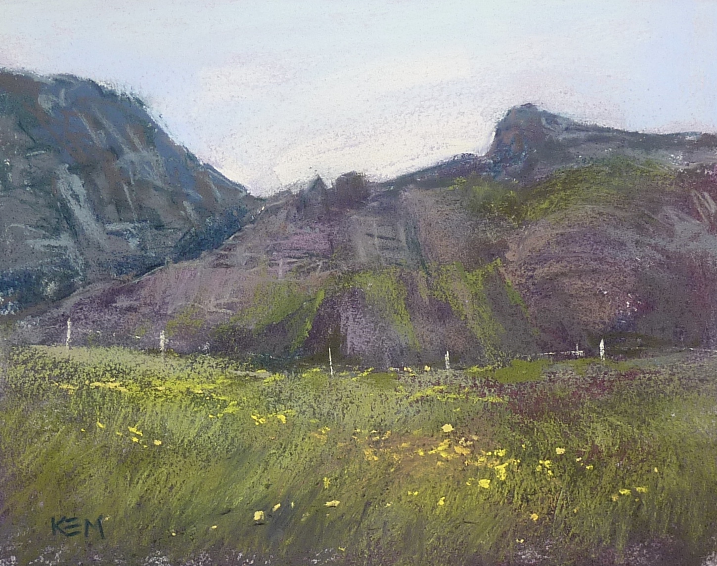
The painting at the top of the post is done on untreated paper. The paper is smooth and soft but still took plenty of layers of soft pastel. I was using Terry Ludwig pastels.
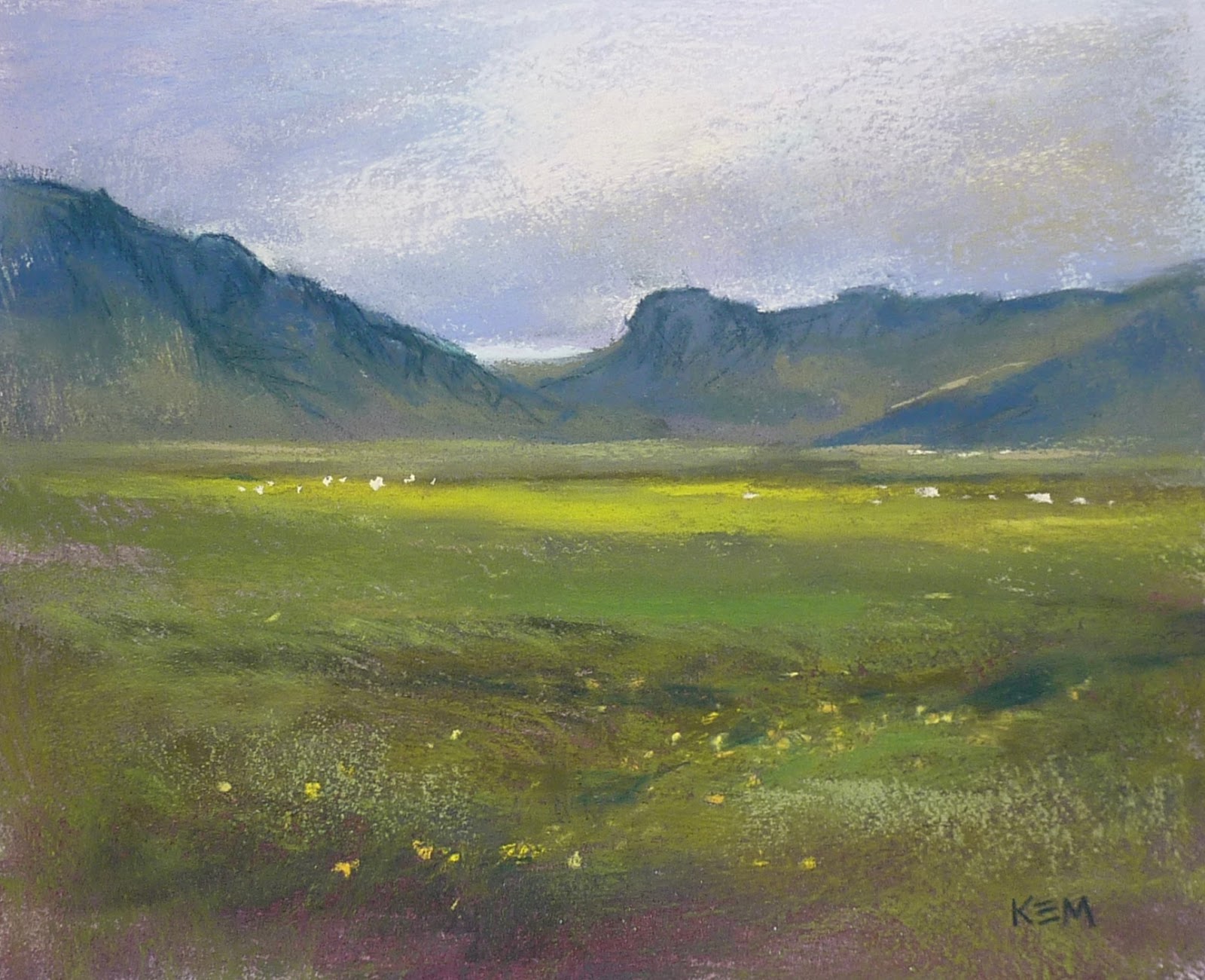
The painting below was done on paper treated with an application of clear gesso. It gave the paper subtle texture and tooth.
 |
| 'Promises II' 8x10 pastel ©Karen Margulis $165 |
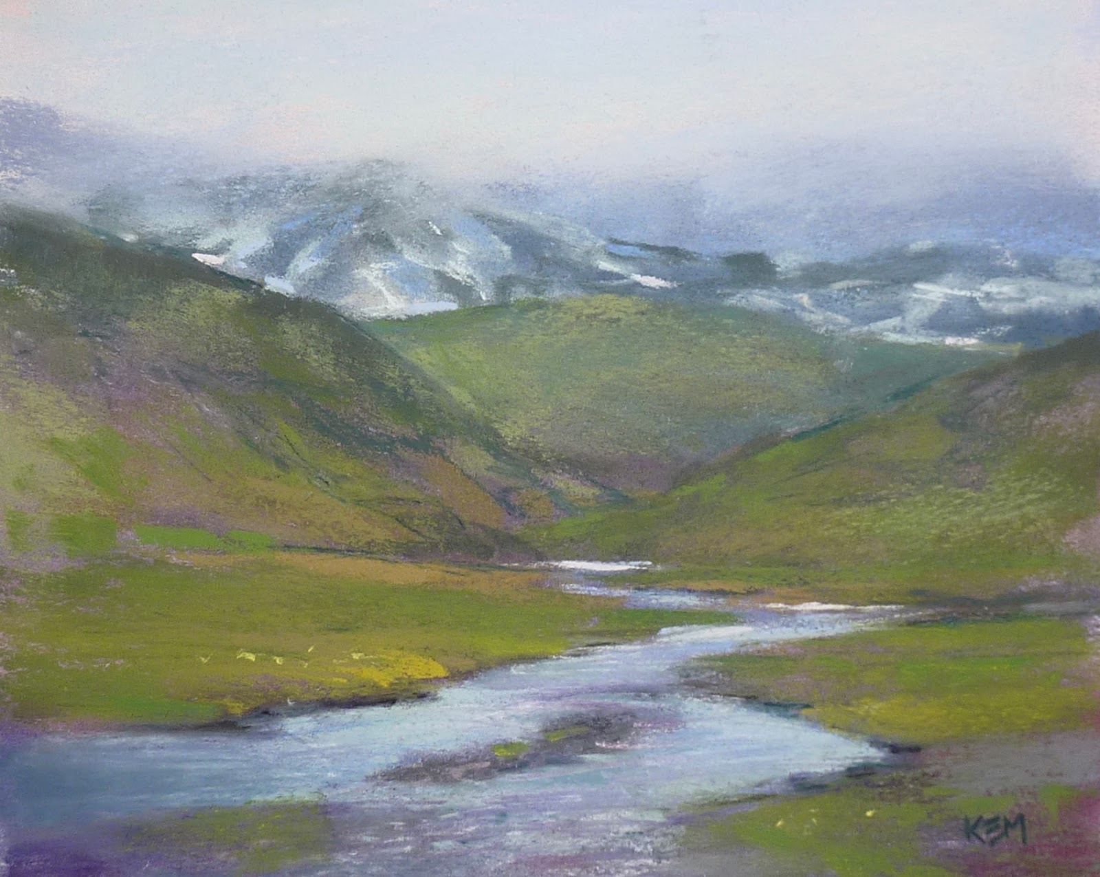
Te painting below was done on paper treated with Diane Townsend Dry Ground. This too gave the paper some subtle tooth without taking away the soft and springy feel to the paper.
 |
| 'Promises III' 8x10 pastel ©Karen Margulis $165 |
Conclusion: I remember liking this paper when I first tried it and now I know why. It may not be for everyone. If you tend to have a heavy touch yet want a lot of layers the smoothness of this paper may be frustrating. But if you like unsanded papers and use a lighter touch you should give this paper a try!

5 comments:
Did you use the same color underpainting on each? It looks like a purple violet. I've had success with Rives BFK, putting pastel over a very finished charcoal drawing (drawing cows).
I used the same color palette for all but no official underpainting. I blocked in the darks with blue and used red violet under the green areas.
Are the motives from your trip to Iceland? Because I'm Icelandic and they look a lot like home to me :)
Elva, Yes they are! I have a dear friend who is Icelandic and I was fortunate to visit her a few summers ago. Your country is so beautiful!
Thank you, and those pictures are lovely - you capture the "mood" of Icelandic nature very well :)
Post a Comment