Visit my Patreon Page for more painting instruction and Paint Along Videos!
Showing posts with label reflections. Show all posts

Tuesday, December 22, 2015

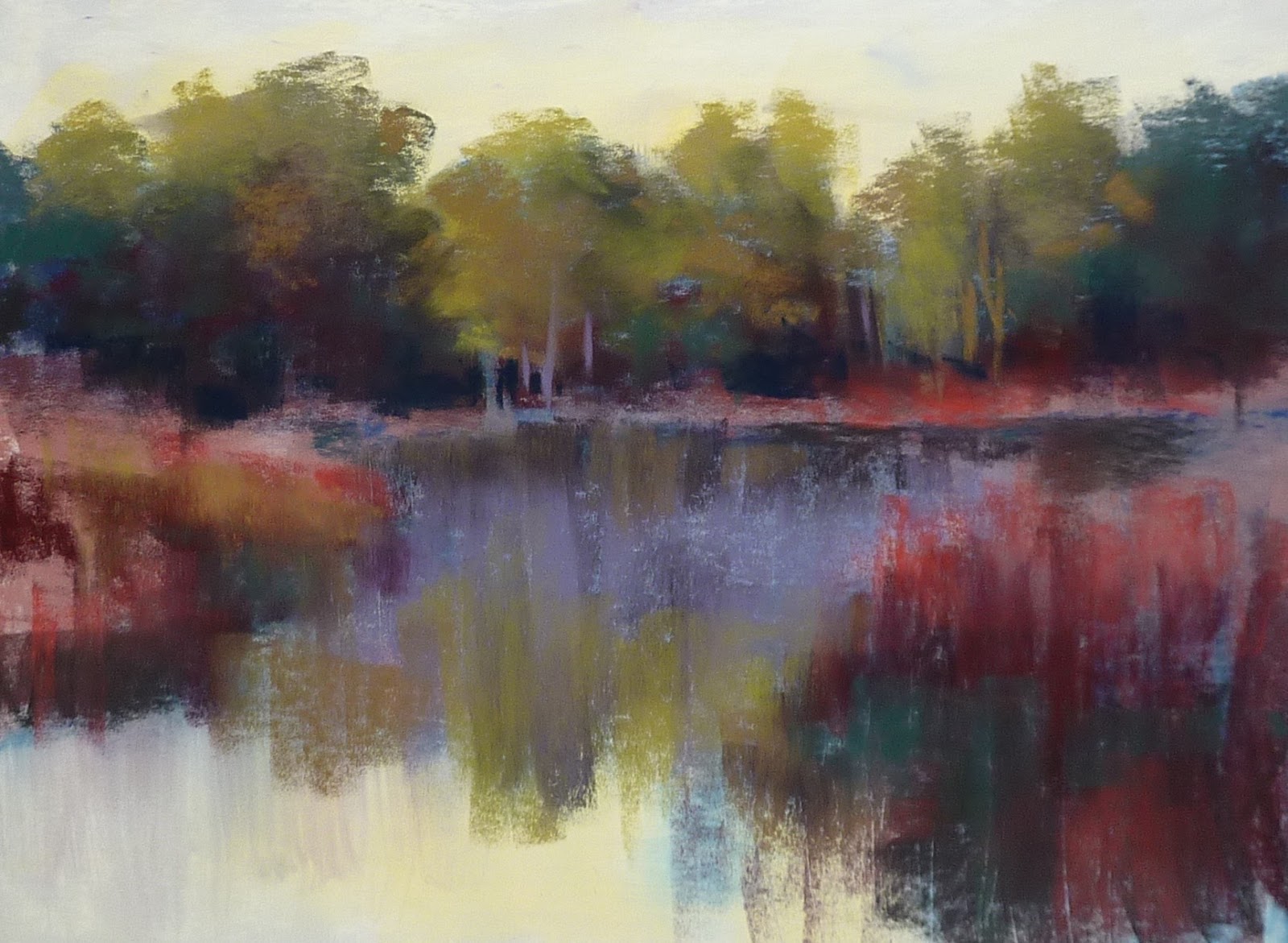
A Quick Tip for Painting Reflections

'Peace on Earth'           8x10        pastel        ©Karen Margulis
available $150
I couldn't resist. I had to paint one more before my studio is transformed into the family dining room for Christmas dinner.  I am working on studies for a hotel project. I will share all of the details soon but I am having fun creating these studies of some of my favorite subjects.

This scene was fun to paint and gives me the opportunity to share one of my favorite tips for painting reflections and making water look wet.  I don't overthink my reflections. I know there are certain 'rules' about reflections. Dark objects will be slightly lighter in the reflection and light objects will appear slightly darker. I don't really consider this as I paint. Sometimes too many rules bog me down.

But I have discovered a technique that tends to make the reflections believable and they end up being  'correct' without too much angst. Read on for the details:

My plan and underpainting

  •  When I put a color in a shape that is above the water I put the same stick of color down into the water. Example.....I put green in a tree then I use the same color in the reflection before I put the stick back.
  • IMPORTANT: I pull the pastel stick DOWN and make a vertical stroke in the water for the reflection. If I were to use the same quality of mark in both the tree and the reflection it would be difficult to know which was the tree and which was the reflection.
  • Pulling strokes down for reflections helps give the illusion of wetness in the water.
  • Next step is to BLEND the vertical strokes so they are soft and 'watery'. I use my finger or a white magic eraser to pull and soften the strokes. *This is the key to success.* The blended marks give the viewer a clue that they are looking at reflections in water and not an upside down tree!
  • I Paint all water in HORIZONTAL strokes. I pull some of the water strokes across the reflection....just in some areas. I don't want to obscure the entire reflection. 

Small color study for the hotel project

Sunday, September 13, 2015

Pastel Demo: Florida Wetlands with Reflections

'Another Quiet Morning'              12 x 15 3/4'              pastel             ©Karen Margulis
sold
It's funny how a picture just calls out to be painted. I was in the middle of several projects and going through my reference photos. One just stopped me in my tracks. I had to paint it and it couldn't wait. It has been awhile since I did a step by step photo demo so I kept my camera handy while I painted this one. Enjoy the progress shots and my commentary.


I am using a piece of white Pastelmat 12 x 15 3/4. I begin the painting with a quick drawing laying out my big shapes. This is a scene from a central Floirda wetlands and there are a lot of marsh grasses. My challenge will be to keep them simplified.


Next I block in the big shapes with some dark, light and middle values. I chose colors that were close to the final local colors. Underpainting colors are fun....sometimes I go with value or maybe bright colors or complements....there are so many choices. Today I felt like keeping it close to the local colors. I use a mix of hard and soft pastels. It is more about the right color and value.


I decide to wet the pastel with water to make a soft and dreamy underpainting. Since I am painting a lot of water and reflections, the wet underpainting gives me a head start. I use a soft wide brush. Pastel mat absorbs the water so you don't get the rips that other papers allow but I still like the soft underpainting.


Once the underpainting is dry I block in the darkest areas of the painting. I use several colors all the same value. I am using Terry Ludwig pastels with a few Unison and Nupastels.


Next I move onto filling out the trees. I use several greens to flesh them out and give them form. I  pull the tree colors down into the water. I also pull some lavender over the reflections to start the feeling of mist.


Once all of the trees and grasses are blocked in I paint the sky. I choose a pale yellow to represent the early morning light. I also put the same yellows in the water. At this point I was too involved in the painting to remember to take a photo! But it was just a matter of refining the painting and choosing where I wanted to put the most clarity and focus. I added tree trunks, sky holes and grass blades. The finishing touched were the current lines in the water.


Finished! I always forget how much I enjoy working on Pastelmat. It really allows for a bolder mark-making which I love.  Below is a close up of the grasses and current lines.


If you like this mini demo please share it with your friends! Click on the share buttons below!