Visit my Patreon Page for more painting instruction and Paint Along Videos!
Showing posts with label Beach. Show all posts

Wednesday, July 05, 2017

Three Simple Tools You Can Use to Blend Pastels

'The Sea Beckons'              8x10         pastel        ©Karen Margulis
available $150

 I don't blend very often.....but when I do I only use the finest tools. 


a few simple and cheap blending tools

Not really!  I don't blend often... that part is true but when I do blend my pastels I use only the most simple, readily available and inexpensive tools!  My favorite tool is always HANDY. Sorry for the corniness but it makes it easy to remember that one of the best blending tools is actually your own palm and fingers. It is all in the technique. (video demo coming!)

Of course you can purchase blending tools of all kinds and I am sure they work great but I have had success with a few cheap tools that you may just have in your home. If not they are easy and inexpensive. Read on for the details!

Putting down the first layer of pastel
The first step in successful blending is to have enough pastel on the surface to blend. I like to blend the first layer of pastel to create an out of focus underpainting. In the photo above I have added pastel to create the first layer. I have used a light touch but there is still enough pastel to blend.

Using a piece of foam core to blend and suggest the sea oats

 TOOL #1  A small piece of foam core board. I used a scrap of foam core and cut it with a utility knife to make into small brush shaped tool. I used this tool to blend the grassy areas of the painting. I was able to pull up some pastel marks to suggest the beginning of some grasses and sea oats.
Tip: I get my foam core at the Dollar Tree. It isn't archival but it is surprisingly decent!


Using a piece of pipe insulation foam to blend the sky

 TOOL #2   My old favorite tool! Pipe insulation foam. I get this at any hardware store and cut it into small pieces. It is a great tool that doesn't shred on sanded paper and doesn't remove too much pastel. It can even be washed and reused!
Tip: use this tool like a brush. You can easily tear it and make thin and thick brush tips!


Using a wadded up piece of Viva paper towel to blend the sky
TOOL # 3  The artist's favorite paper towel brand! Good old VIVA paper towels work great for softening and blending. I used a wadded up piece of paper towel to soften and blend the colors in my clouds.  Viva is strong so it holds up to sanded paper and doesn't leave a trail of paper!

What other cheap blending tools do you use? Please feel free to share with us in the comments!

Painting notes: I used a piece of the YI CAI sanded paper and Terry Ludwig pastels.

Sunday, June 25, 2017

New Sunday Studio Demo: Blending and the Beach

'Sunday Afternoon at the Beach'       9x12      pastel       ©Karen Margulis
available $155
 To blend or not to blend? Since I have been pondering this question this weekend it is only fitting that my Sunday Studio demo address this question. In my informal Facebook Live video I share my thoughts on blending and how you can be a more effective blender.

I demonstrate a beach scene to share some of the ways I use blending in my paintings. I blend sparingly and always with careful thought. Watch the video to learn more and then come on back to read about how I finished the demo painting.

Click this link to watch the video on my YouTube channel

I didn't add the finishing touches to the painting in the video. I like to stop BEFORE I think I am finished so I can make the finishing marks with careful thought.  Below you can see where I stopped on the painting along with my commentary on the finish.

Demo board with my reference photo and color study.

The pastels I used for the demo. Terry Ludwigs (McKinley Landscape set) Diane Townsend Mood for Green and misc. hard pastels for the grasses.

my color study. 4x6

The painting as I left it in the video

  • I refined the sky. I blended it more and added more defined cloud shapes.The finishing mark was the pop of pale turquoise near the horizon leading into the ground.
  • I refined and separated the distant bushes. I add a light cool green to them to push them back into the distance.
  • I refined the grass clumps by adding a rust color. I painted a few pieces of grass in the foreground clumps. I kept the grasses in the distance loose.
  • I refined the sandy path and added a few more shells
  • I added a touch of blue in the distance to suggest the sea.
I hope you have enjoyed the video demo. I will be out of town for a couple of weeks but would love your thoughts on what you would like to see next!

Friday, June 23, 2017

Friday Fun....Let's Break the Rules!

'All Paths Lead to the Sea'             11x14         pastel         ©Karen Margulis
available $195
OK. So it's not really a rule. It's more like a recommendation. It is also a personal preference. But I have always been told NOT to do it. Blending pastels can be a polarizing issue. Should we blend or should we keep our fingers and tools away from the pastels? 

The first workshop I ever took was with Albert Handell. I know...you could say I was baptized by fire.  I was very new to pastel and I will never forget Albert admonishing us..."Touch it Not!"  I learned to let the pastels do the blending and never blend with my fingers or tools.  Over the years I've relaxed and will blend the first layer and occasional a sky or use a finger to soften an edge. But I still never do much more than that.  

It was time to try breaking my own self imposed rule and blend away! By the way there are some very good reasons to avoid too much blending and I will address them in another post. But this weekend let's have some fun and blend our pastels!


Some blending tools...pipe insulation foam, foamcore, viva paper towel, rag
 Today's painting involved a lot of blending. I used my palm and some tools to blend. I began by blending the first layer and softly blended each subsequent layer. I was trying to get a soft and dreamy look to my painting. In tomorrow's post I will show you the tools in more detail. Below you can see the progress shots.

Blocking in the first layer on Canson Mi-Teintes moonstone
 I decided to work on Canson Mi-Teintes paper in the Moonstone color. I knew the unsanded paper would be easier on my fingers than sanded paper. I blocked in the painting with soft pastels (Terry Ludwig) The used a piece of pipe insulation foam to blend in the first layer.

Nicely blended

Next I worked on the sky. I blended it several times to get the sky clam and the clouds wispy.

Start with the sky
As the painting developed I added layers of gold and green rubbing in each layer until I got to the finishing marks. I couldn't resist adding a few grass marks on top of the blended areas. I am going to try another painting that I leave completely blended and see how I like it. It's all about trying new things and having fun!

Almost there!

Finished....then made corrections to the foreground grasses
YOUR TURN!  If you are not usually much of a blender you have permission this weekend to break your rule and blend away!  If you do a lot of blending try NOT blending to see what happens. :)

Wednesday, January 11, 2017

Thoughts Behind a Recycled Painting

'Winter Beach Walk'         9x12       pastel       ©Karen Margulis
available $150
 I just started my yearly studio clean up. I'm a little late but I always like to start the year with a clean and organized studio. Today I began to go through my stacks of paintings from last year. You all know by now that I don't throw anything out. That includes scrap paper! Often I will use a piece of paper to illustrate a point for a student. It is easier to show it than just explain it!

That leaves me with a pile of paper with a few pastel marks. This year I plan to use these 'mini demo scraps' and create recycled paintings. I will share my thoughts behind the process of taking a scrap and turning it into a painting. Enjoy today's installment.

Scrap paper with a mini demo....time to recycle!
 Today's scrap is a mini demo I did for a student illustrating how I paint sand and shadows on the sand. It was on a piece of gray Canson Mi-teintes paper. I decided to stick with the theme of sand and paint a sand dune! I turned the paper to a horizontal format and brushed out the demo as best as I could.

The demo brushed out with a new painting blocked in
I was working from a photo of a dune in North Florida. I liked the moody quality which I wanted to convey. But I also liked the bit of light on the dunes. I blocked in the dune with the edge of a middle value pastel.

my reference photo

  • I selected a few pastels keeping a limited palette of gray-blues, greens and peaches. I started with  dark brown and violet Terry Ludwig pastels and blocked in the dark areas on the dune. This would be the dried grasses.
  • Next I worked on the sky. I wanted to be sure to get the right mood quality so I started with a pale green. I added some pale peach and yellow for the light in the sky and ended with some grayed blues for the clouds at the top of the sky.
  • To keep color harmony in the painting I used the same pastels in the sea and sand. I wanted a connection between the earth and sky.
  • Next it was time to add the light to the edge of the dunes. I used some rich peach pastels to create this light that is breaking through the clouds and illuminating the dunes.
  • The dried grasses at the top of the dunes were created with the edge of a Terry Ludwig pastel. A few touches of orange on some of the grasses were the final touches.
******************Come Paint with me in Florida this February!********************
There are still a couple of spots remaining in my February workshop at the North Port Art Center in Venice Florida. (Feb 11 & 12)This two day workshop will focus on color. It is suitable for artists of any level of experience. I'd love the opportunity to share with you. Here is the link to more information http://northportartcenter.com/product/cooking-with-color-workshop/

Friday, August 19, 2016

When the Underpainting Chooses the Subject


'A Moment of Silence'         9x12       pastel        ©Karen Margulis
sold
Never waste a good piece of paper is my motto. So as I cleaned and organized the studio after my Sky workshop I needed to decide what to do with my scrap demo papers. I had a few pieces of Uart that I used to demonstrate various points about painting blue skies and clouds. Good paper covered in blue pastel!  I don't usually work on a blue toned surface but why not give it a try!

A stiff brush and some turpenoid allowed me to quickly spread the blue pastel and tone the sanded paper. It dried quickly and I was ready to paint.  But I had no idea what I would paint on the blue paper!


Art paper toned blue reminds me of my grandmother's bedroom when I was a child
Most of the time I have a subject and concept for a painting and then I decide on the paper type and underpainting technique. This approach allows me to choose the technique and colors that would help me to express my ideas. For example I love to do an oil stain underpainting for a field or meadow because the unusual drips help promote the illusion of grasses and weeds.

But now I was working backwards....I had the paper but I needed the right subject for the blue paper.  I skimmed through my basket of my reference photos that I recently printed (more on this soon) and one image spoke to me! I love when that happens. It was a photo I took last summer while in Normandy with Stan Sperlak's Painters passport group. We had stopped in a big field overlooking the sea for a photo op and of course I was drawn to the wildflowers. The setting  was special and I was filled with emotion. It was cool and very quiet and very blue. The perfect scene to paint on my blue paper. The blue tone would loan a feeling of softness, quietness and peacefulness to the scene. 


reference photo....Normandy, France

The color Blue: I remember my grandmother's bedroom. I must have been 5 or 6 years old and I wandered into the bedroom. The curtains were open and a gentle breeze blew the curtains. They were blue sheer curtains. Everything in the room was a pale gentle blue and it was very quiet and peaceful. I remember standing there in awe. Was this what heaven was like? I'll never forget that feeling of calm.

Sunday, May 15, 2016

When the Sand is Blue...A Lesson in Observation

'Deep Breath'            9x12         pastel          ©Karen Margulis
sold
Sand comes in many colors.  If you told me there was  such a thing as blue sand I am not sure I would believe it. I've seen white sand, black, yellow, peach, pink and even violet sand but I don't think I ever saw blue sand.  The truth is that the sand can be blue.  In certain light and conditions light colored sand can appear to be blue. Sand in shadows and sand without direct light will appear blue and violet and maybe even green. It isn't the local color we assign it...the color is determined by the conditions.

It is a matter of really seeing the true colors of things and not just jumping to the local color that we have assigned to those things.

When I started painting this sunrise beach scene my brain was trying to tell me that the sand was a pale creamy value...we would consider it  a 'white sand beach.'   But if I were to use a white or pale cream pastel the painting wouldn't look believable. I would have a sunrise sky with daytime 'sunny' sand. To put the sand in shadow I needed to override what my brain was trying to tell me and be a better OBSERVER.

close up detail of sand

When I took a deep breath and really looked at the sand I could see that it was definitely cool and blue. Yes I knew it was 'white sand' but it looked blue in the cool shadows of the sunrise. I painted the sand blue and the illusion of the rising sun was created.

sunrise pastels
It seems strange to paint a blue sandy beach but it is what I saw.  It is important to turn off the part of your brain that gives you the accepted local colors and really allow ourselves to see the color as it really appears. This will result in a painting that is more authentic.

Monday, February 15, 2016

Pastel Demo on Canson Paper...New England Summer


'New England Summer'          16x20         pastel        ©Karen Margulis
sold
I am headed to Colorado for Winter Break but I though we could all use a little taste of summer. I am reposting a demo of a summer scene for your enjoyment.

I thought the painting was finished. I took the final photo and uploaded it to the blog. It wasn't done.  It happens quite often actually. There is nothing like looking at your painting on the big screen to show  all of the issues. So it was back to the easel.  In fact today it was back to the easel 3 more times until I finally was satisfied.

The painting just wasn't capturing the emotion I wanted. It was a beautiful afternoon on Nantucket Island. We came up to the beach and had a view of the distant ocean through a sea of wildflowers. The heady scent of the beach roses filled the air. It was magical.

I decided to remove the beach umbrellas and add more flowers. I softened the sky as well.  These changes helped create the mood I was after. Thank goodness for digital photos! They are so helpful for evaluating a painting. Enjoy today's mini demo.


I began the painting on a piece of 16x20 Canson MiTeintes paper Moonstone color. I blocked in the big shapes with 4 values of pink and rubbed it into the paper with a piece of pipe foam insulation.


Next I block in the dark areas underneath the foliage and then moved to the sky. I layer several blue pastels both warm and cool and dark to light. I tried to get a nice transition from top to bottom.


I work on the clouds layers using pale peach and yellow. I don't use pure white at all. I also put in the band of distant ocean.


I begin putting in the darker greens in the foliage areas and I indicate where the fence is. I end up removing the fence. I also layer some very light value yellows in the sand.


I build up several layers of greens in the foliage area. Because Canson doesn't have a lot of tooth I decide to spray some workable fixative so I could build up more layers and get some texture in the foliage.


I add the beach umbrellas and more greens. I also start to put in a few of the beach roses.


This is where I thought I was finished. I didn't like the texture in the clouds and the cloud shapes were too similar. I also didn't like the umbrellas. They were too small for where they were in the composition. If I kept them they would need to be larger and the painting wasn't about the umbrellas.....so I brushed them out.  I added more flowers and was much happier. (see top photo)


How about summer painting on Uart? can you notice the differences that the paper makes? These two recent studies of done on Uart 500 grade.

'To the Sea Study'         6x8       pastel      ©Karen Margulis
available $75

'Dune Study'          6x8       pastel          available $75

Monday, August 03, 2015

Pastelmat vs Uart Paper ...Test Results

'Sanibel is Calling'            8x10            pastel            ©Karen Margulis
purchase painting $145
Let's go to the beach this week!  I am taking a short break from my Europe trip report to spend some family time at the beach. It is always wonderful to visit one of my favorite places...Sanibel Island in SW Florida. I've painted the beaches of Sanibel many times. In fact when I first started painting, most of my paintings were of beaches and shorebirds. (that is another story!)

Ive been cleaning my studio and came across two paintings of the same scene. I do that often if I am drawn to a place. But I noticed something interesting right away. Even though the paintings were from the exact same photo reference and had a very similar palette.....they appear quite different.

Look carefully at each painting and notice the differences....some subtle.

'In Search of Shells'               10x15           pastel          $165
 What did you notice?

  • The top painting appears to have more texture.
  • The marks in the top painting seem to be applied with a lighter touch.
  • The top painting has more evidence of layering...the colors underneath are visible
  • The top painting feels more painterly and delicate.
  • The painting at the bottom seems bolder
  • The marks in the bottom painting are heavier and seem to be applied with more force
  • The bottom painting has a variety of colors but the layering isn't as obvious.
  • The bottom paintings seems smoother overall.
Did you notice anything else? Why are they so different? It is because of the paper!
The top painting was done on UArt 400 grit sanded pastel paper. The bottom painting was done on a gray piece of Pastelmat sanded paper. Paper choice does make a difference!

This was not really an official paper test. It wasn't intentional but the results give me food for thought. I happen to love both brands of paper. But I have discovered that my painting approach is different when I work on Pastelmat. This paper takes a lot of layers but I don't usually do many layers on it. I love the way it grabs the pastel and keeps it in it's place. It lends itself to bolder and more direct work.

Conclusion: If I am feeling bold, fearless and want to paint directly with no fiddling I turn to Pastelmat. If I want to play with layering and interplay of color or create texture, I turn to UArt.

What do you like or dislike about either of these papers?

Make time to paint this summer! Save 25% on my digital demo PDFs this week only. Paint along with me in these step by step demos. Available in my Etsy shop. See them all here.

Friday, July 31, 2015

The Beaches of Normandy ...Impressions of France part 7

'Peace'                8x10              pastel                ©Karen Margulis
available for purchase $150
We were in Normandy. The connection we have to this place was palpable.  From the US, Canadian and British flags flying alongside the French flag to the expressions of gratitude from the locals, it was hard not to be reminded of history....of D-Day. Even at the manor, a mile form the beach we imagined what it must have felt like to be in the village of Meuvaines during the invasion. Was the home used for the war effort?  We were reminded of history everyday. We felt it and it became real.


D-day was no longer just a movie or a book. The evidence was all around us. It was incredibly moving and emotional to stand on those beaches....now peaceful ... and imagine the bravery of those who fought.

'Normandy Beach Impressions I'            5x7         plein air    $75

 We took a day to visit the beaches of Normandy and pay our respects. We began with a stop at Juno beach. This was the Canadian beach and since there were four Canadians in our group it was important to visit.  Here in an excerpt from www.junobeach.info

"On D-Day, June 6, 1944, “Operation Overlord”, the long-awaited invasion of Nazi-occupied Europe, began with Allied armies from the U.S., Britain and Canada landing on the coast of Normandy. On D-Day, the 3rdCanadian Infantry Division landed on Juno Beach. The Canadian assault troops stormed ashore in the face of fierce opposition from German strongholds and mined beach obstacles. The soldiers raced across the wide-open beaches swept with machine gun fire, and stormed the gun positions. In fierce hand-to-hand fighting, they fought their way into the towns of Bernières, Courseulles and St. Aubin and then advanced inland, securing a critical bridgehead for the allied invasion. The victory was a turning point in World War II and led to the liberation of Europe and the defeat of Nazi Germany."


Juno Beach

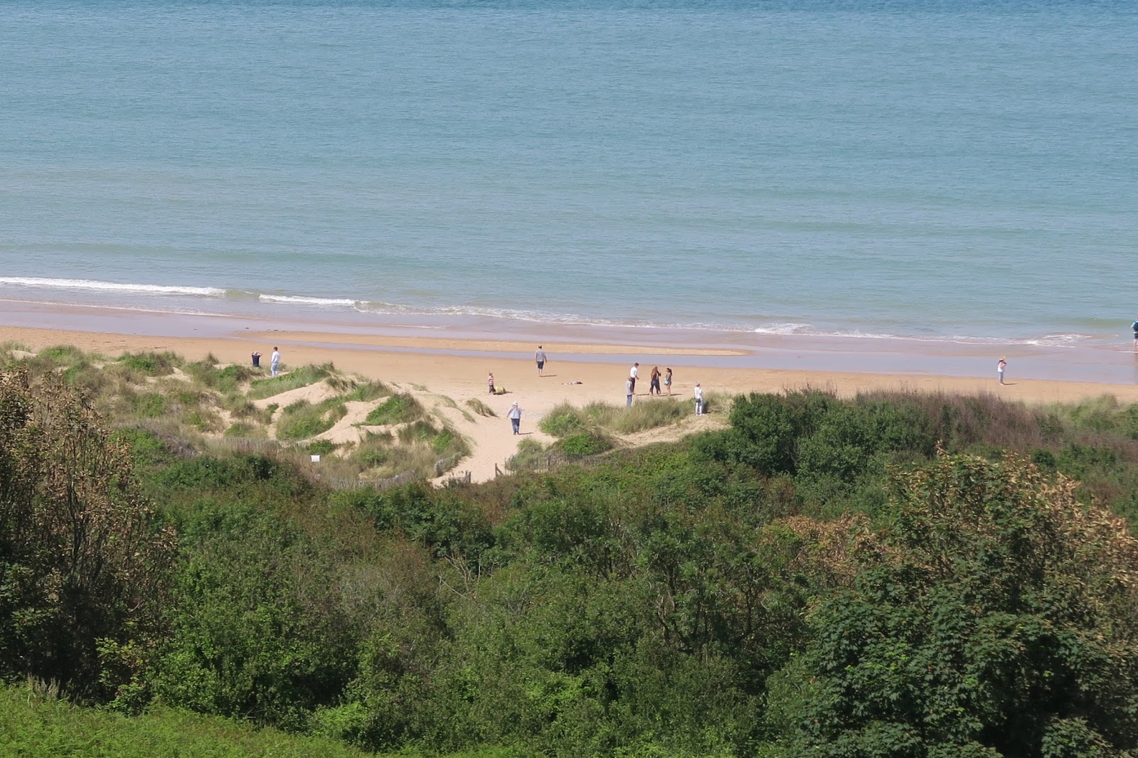
Next we stopped at the American Cemetery memorial.  The cemetery sits high on a bluff overlooking Omaha Beach. I was surprised at how high the bluff was. It was hard to imagine what it must have been like on D-Day. Seeing it firsthand was sobering.  Hearing the bells toll and seeing the rows and rows of crosses and stars was difficult. It was not an easy visit but I am glad we did it.

The bluff overlooking Omaha Beach

"There are two kinds of people who are staying on this beach: 
those who are dead and those who are going to die. Now let’s get the hell out of here."
Colonel George A. Taylor - 16th Infantry Regiment, 1st Division


For an interesting read about the beaches of Normandy and the D-Day invasion check out this article from the Smithsonian Magazine. Click here to read. 


The beaches of Normandy are now at peace. They are some of the most beautiful stretches of sand and sea that I have ever seen. Children now splash in the surf and play in the sand. Artists come to paint. I never really had Normandy on my bucket list but it now holds a special place in my heart and soul.


Make time to paint this summer! Save 25% on my digital demo PDFs this week only. Paint along with me in these step by step demos. Available in my Etsy shop. See them all here.