Visit my Patreon Page for more painting instruction and Paint Along Videos!
Showing posts with label Paint along Monday. Show all posts

Monday, January 26, 2015

Paint Along Monday: Painting a Sea Gull

'Meet Me on the Boardwalk'              5x5             pastel              ©Karen Margulis
purchase painting here $50

Sometimes the painting just paints itself. Sometimes it is a struggle. I painted some Arctic Terns the other day and everything flowed. Every mark was the right one. I had so much fun I thought I would paint a Laughing Gull for today's demo. It wasn't as easy as the terns! At one point I brushed out my gull and started over. Sometimes it's the best choice.


I am using a 5x7 piece of Pastelmat paper. I love the way the pastels go on this paper. It doesn't seem toothy but it really holds many layers.  I like it a lot.


I do the initial drawing with a piece of compressed charcoal.Because I didn't want my gull to be tiny I decide to let his tail go off the paper. I may decide to crop to a square so I draw a line to indicate the square.


My pastels are in a butcher tray. They are from my weekend paintings but looked like they would work for the gull. I add a few grayed purples. I have a mix of Terry Ludwig, Diane Townsend and Mount Vision pastels.


I start the painting with the plan to make a value map. I block in all of the dark areas first. I also start the background with a middle dark purple and a bright yellow.


Next I put in all of the lightest areas. I don't use my warmest, brightest light pastels. I want to reserve them for the ending marks. I pick pale values of purple,  blue and yellow.


Now I fill in the gull with some middle and middle light values. Everything has one layer of pastel. Next it is time to refine the gull and add details.


I decide to work on the background some more. I want to keep it loose and suggestive of  boardwalk.


I continue adding color to the gull. I add the lights. Something is going wrong. I have lost the shape of my bird. I could keep adding pastel layers to try to fix the shape and get the right lighting.....but the more I add the muddier I make it. It is going to be overworked if I don't stop.


Sometimes it isn't about adding more to fix problems.....sometimes it is about TAKING AWAY. So I take out a brush and brush off the gull. Goodbye gull.


I have a ghost image of the gull in place. I use my compressed charcoal to redraw my gull. This time I make him smaller. As I add pastel he will grow so I will start smaller this time.  With the drawing in place I repeat the above steps....darks, then lights, then middle values. I finished with the details of the eye and some spices of pure color.


I am finished. I am trying to decide if I want to leave it as a 5x7 which shows more boardwalk or as  a 5x5 crop? One shows the gull and his environment whereas the crop is more about the gull. What do you prefer?

Monday, January 19, 2015

Paint Along Monday: Painting a Poppy Meadow


'Prairie Music'             8x10            pastel             ©Karen Margulis
sold
It's Paint Along Monday and I am in the mood for wildflowers. I went through my photos and found one that spoke to me. I have painted red poppies but not many pink ones. I also like the moody sky in the photo. Soft, Pink and Moody Sky....that will be the concept for the painting.


I cut a piece of UArt 500 sanded paper and taped it to my board. I spent a few minutes choosing the pastels I will use for the painting. As you can see it is a limited palette...some darks, some dirt, some flower colors, some sky colors and some grass colors. That's it.


Next I open Spotify and choose my painting music. Music influences my mood and how I respond to the painting. I wanted moody and soft so I chose my new favorite soundtrack from  'The Theory of Everything' by Johan Johansson. Time to paint. 


I decide to do an alcohol wash for the painting. I picked an assortment of pink pastels in 3 values. I apply them lightly using the side of the stick. I wash the pastel in with a brush and some rubbing alcohol. Why did I choose this technique? I was painting a tangle of wildflowers and grasses. I wanted the painting to be loose and free. I knew the drips of an alcohol wash would give me a start to some suggested grasses. I picked pinks because I will have pink flowers and also I knew the warm red pink color would make my green grasses more exciting (complements)


After the underpainting is dry I begin the painting by reinforcing the dark areas. I want to create a subtle path for the eye under the grasses with my darks. I also add some more peachy pink over the underpainting. This will be the dirt.


 After I block in the darks I move to the lights. The sky is the lightest part of this scene. I put down some grayed purples for the moody sky and add some yellows. I blend these layers using a pale blue gray pastel. I don't blend with my fingers!  I add some lighter yellow at the horizon. The sky is finished.


Oops. I got into my zone here and forgot to take a photo! What I did was block in the grasses first. I begin with the distant grasses and used a gray green. I varied my greens to create and interesting mass of grasses. See the nice dark shape underneath the grasses? Next I blocked in the flowers with the darkest pink/red that I saw. Dark to light.


I finish the poppies by layering a few different values of pinks using the side of the pastel. I end with the pale pink on the edges of the flowers. This is an overcast day so I want the flowers to be softly lit with cool light. (I so sunlit flowers differently)


I continue adding touches of suggested detail. I put in some yellow flowers. I add some broken 'lyrical' lines for the stems and taller grasses.  I am almost finished. I want to keep the painting fresh so I will stop and step back to see what what else the painting needs. It is so easy to overwork and put in too many blades of grass at this point. Stop to smell the flowers!


I decide to add a few spices. These are marks that I apply with a heavier touch. They are meant to be points of interest in the painting. I put in some heavier marks of coral pink. I add some blue violet flowers. They are not in the photo. Why did I decide to add them? Comment below and let's get a discussion going!

I hope you enjoyed today's demo. Please share this post if you did!


Monday, January 12, 2015

Paint Along Monday....Iceland Landscape

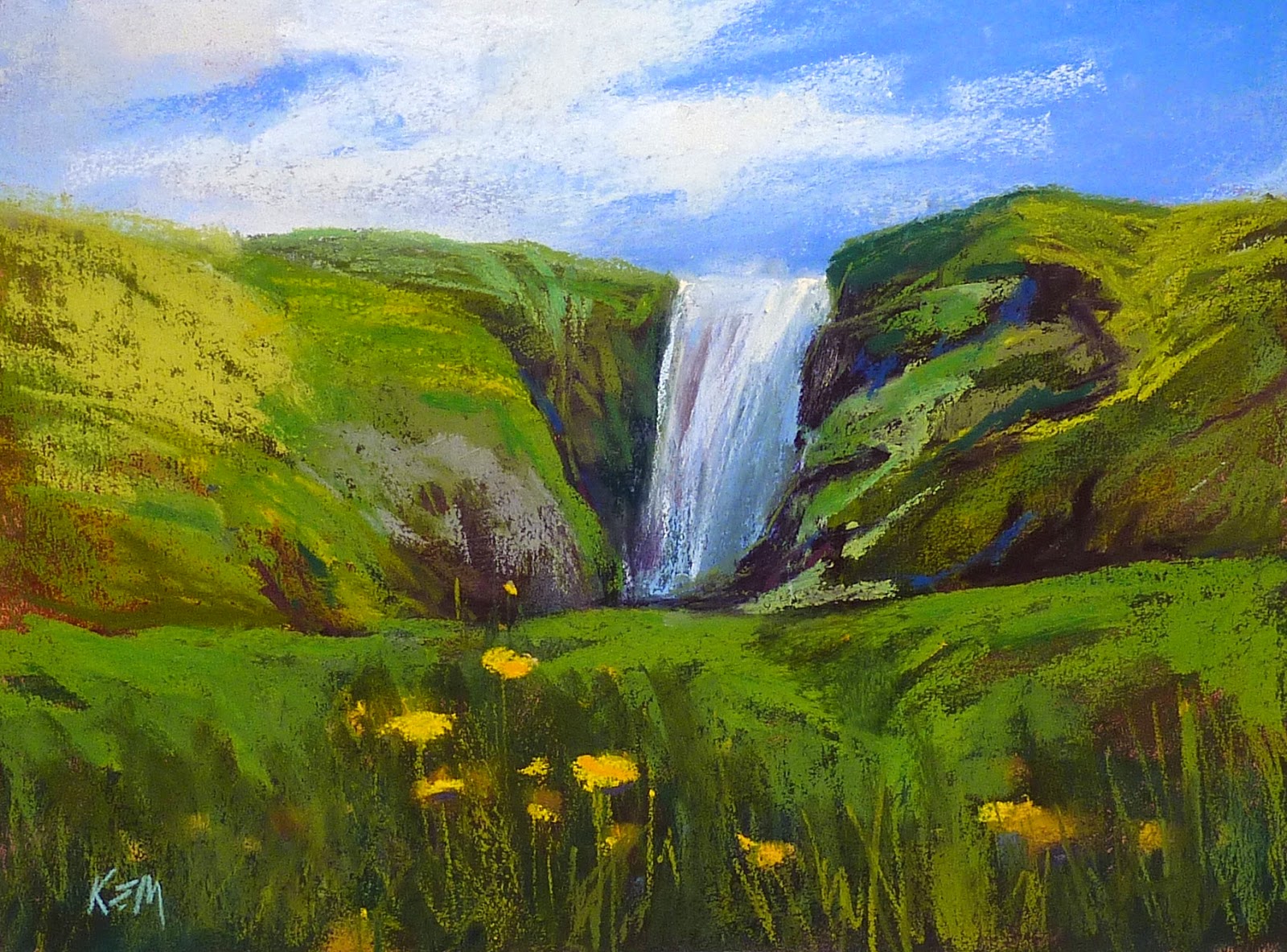
'Summer in Iceland'         14.5 x 19.5               pastel              ©Karen Margulis
$195  available in my Etsy shop    
It's Paint Along Monday. Today I am introducing a new feature for the blog.  I will be dedicating Monday's blog post to a step by step pastel demo. I am calling it 'Paint Along Monday'. I will show my reference photo in case you would like to paint along with me.  I will also share some of the things that go through my head while I am painting.

Today I decided to paint from one of my Iceland photos. I am doing a presentation about my trip to Iceland for the Southeastern Pastel Society in February so I was in an Iceland mood.  My photo was taken on a bus tour in Southern Iceland. This was one of several waterfalls on the tour. It was spectacular and I didn't write down the name of it so if anyone knows please share!


My reference photo

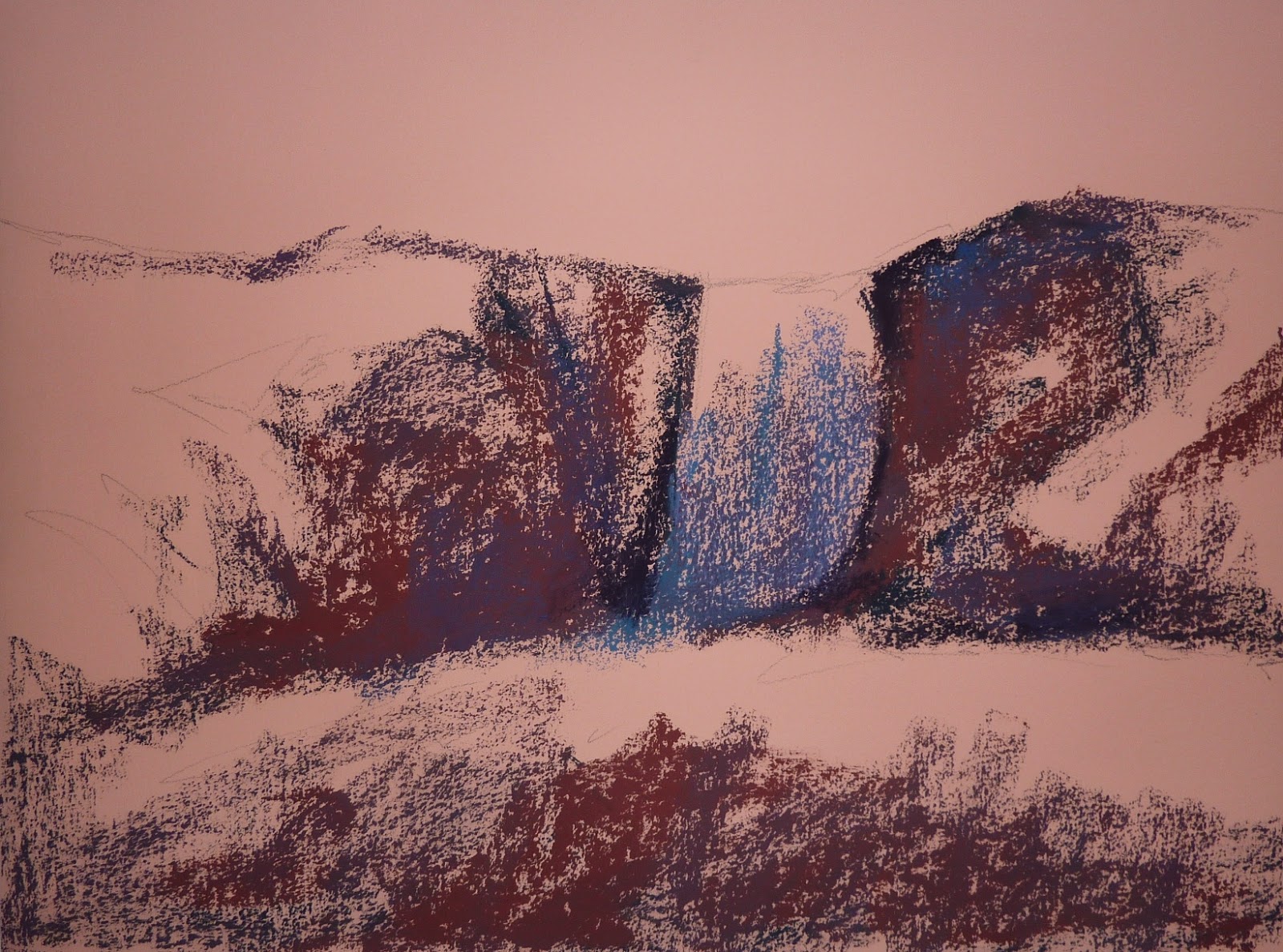
My drawing
Step one:  I chose a piece of Sabertooth paper because it was a nice salmon color and I knew it would be great underneath all of the summer greens.  I did a light drawing of the big shapes with a pencil.


Step two: Using several sticks of dark pastels, I block in all of the dark areas of the painting. I lightly layer them to get a nice rich dark. I used burgundy, blue and purple.


Step three:  I move onto blocking in all of the lightest areas. That would be the sky and the water. I decided to finish the sky while I was at it. I really didn't like the feel of this paper and I didn't like the rough look to the sky so I blended it it lightly with my fingers. I rarely do this but this paper called for it.


Step four: Next I begin adding some 'dirt' colors such as rusts and purples. These will be underneath the greens and in the exposed rocky areas of the hills.


Step five:  I continue adding dirt and then begin putting down the darker greens. I am not enjoying this paper today. It doesn't seem that rough yet it is eating up my pastels. I wanted to use my new set of Terry Ludwig greens but decide to use some harder Mount Visions to fill in some of the roughness. I also decide that it would be a good idea to use some workable fixative to set these first layers before taking out my Ludwigs.  In the photo you can see that wet spots of fixative. I wait a few minutes for it to dry.


Step six: Now the softer greens glide nicely over the darks. It feels better but I still have a way to go. I use a few brighter and warmer greens and more purples. The greens of Iceland in the summer are amazing. It is a lush wonderland perfect for elves and fairies.


Step seven:  I move towards the foreground and add some darker grasses. I also block in the dark yellows of the dandelions.


Step eight:  I finished with the addition of some warm and cool yellows to the dandelions and add a few blades of grass. I think I am done......I take a break and return to the studio with fresh eyes. I see some things I need to change. I decide the waterfall is too wide and so I cut into it with the colors of the hills. I also decide to be bolder with my marks on both the hillside and the sky. I also take out my Diane Townsend green terraces. I used the full arsenal of greens on this painting!
I also cover up some of the flowers which had gotten too fussy. Now I am finished!