 |
'A Walk in the Park' 12 x 12 pastel ©Karen Margulis
sold |
I never use white pastels. Well.....maybe sometimes but very rarely do I ever use a pure white stick of pastel in a painting. I just got a chalkboard and chalk (for fun) and it reminded me of how chalky a pure white pastel can look. I prefer colorful lights. When something is supposed to be white like clouds or snow I first look for the colors that are present. White things reflect the colors that surround them so they rarely appear pure chalky white.
When I am faced with painting something white I reach for my favorite light pastels...Diane Townsend Soft pastels. These lights are almost white but lean towards a pale color. I call them 'Almost Whites'. I actually love Terry Ludwig, Sennelier and Schminke Almost Whites but I seem to reach most often for the Diane Townsends. I like the ever so slight gritty texture and how it they sound scratchy when using them.
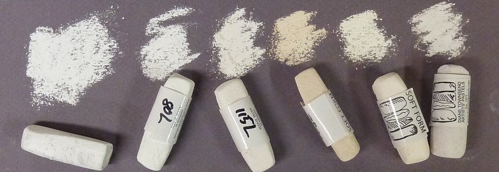 |
| A collection of 'Amost Whites'. The pastel on the far left is pure white for comparison |
I don't use a specific color name but when I am low I just order open stock. I like to keep a pale (almost white) version of each primary and secondary color on the color wheel....red, blue, yellow,orange,violet and green. Basically I want a warm and cool light.
The next time you are painting something white and reach for the pure white....stop and look for the color. Choose a pale light instead of the white. Reserve that pure white for the highlight if it is even necessary.
If you are thinking about painting snow this winter I invite you to look at my Winter/Snow pastel demo download. You can read more about it in my Etsy shop here


