Visit my Patreon Page for more painting instruction and Paint Along Videos!

Friday, January 31, 2014

The Secret to a Good Painting

'Winter Morning III'          6x6         pastel           ©Karen Margulis
sold
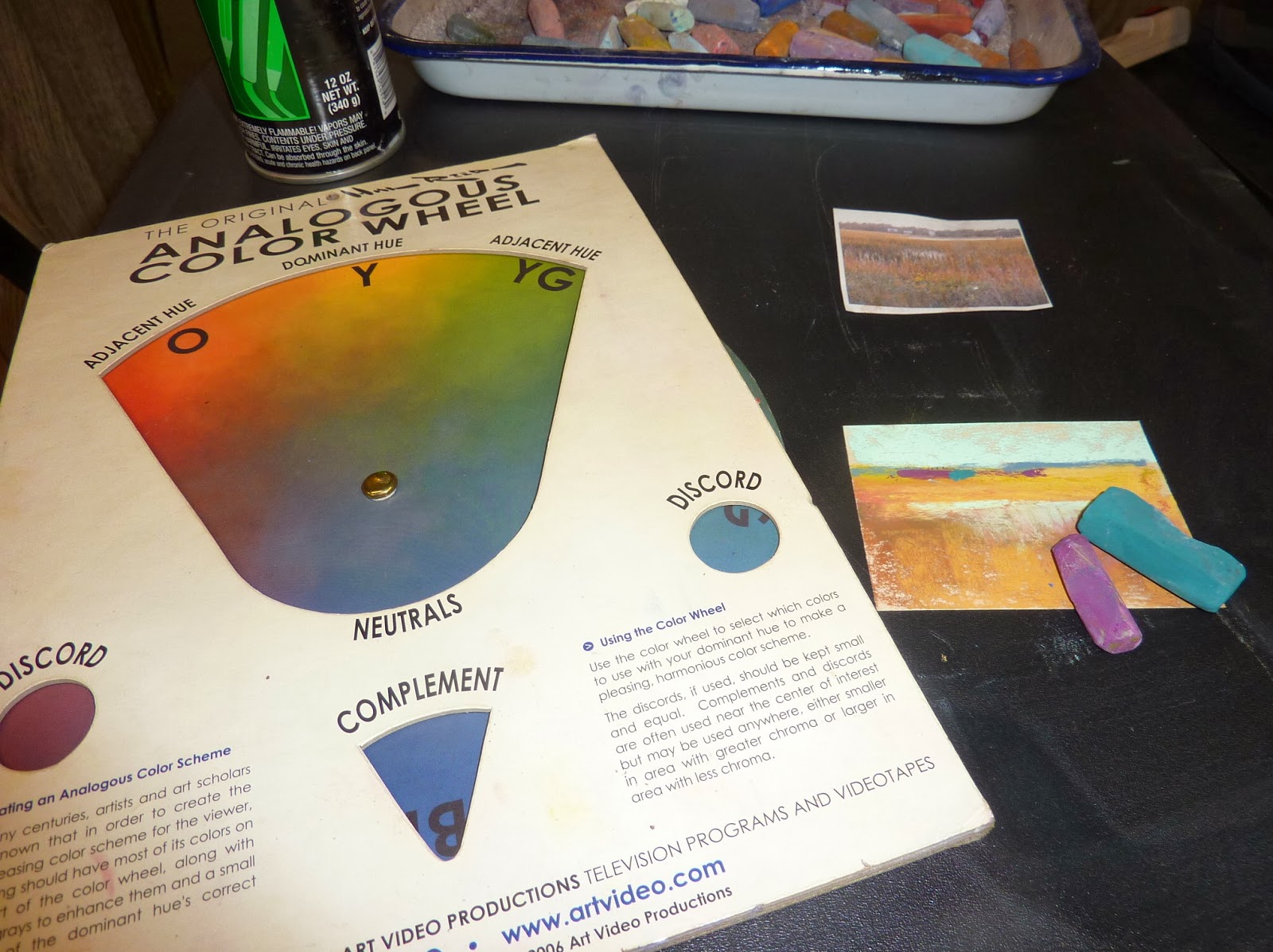
 The Secret to a good painting is a bad photo

That might be an over-simplification but a bad reference photo can actually free you up and allow you to be more expressive.  After all you won't want to copy a bad photo....you can only make it into a better painting!

This is great news for us artists who are not photographers. We don't need to get the perfect shot. We only need photos as Memory Joggers. In yesterday's post I wrote about how I use reference photos. click here to read.  My secret is to work ONLY from my own photos.

So often I hear artists say they don't have any of their own photos. So they use magazine images (not a good idea) or royalty-free images. Both of these solutions aren't as good as using your own photos. If you didn't take the photo then you can't replay the scene in your mind.

Everyone can take a good reference photo....because it doesn't have to be perfect!

'Winter Morning IV'         6x6       pastel
sold
Think of reference photos as snippets of information that can inspire a painting. Maybe it is a color or the light and shadow pattern or maybe an interesting tree. Snap a photo. It can be used in a painting. Here are some tips:

  • Smartphone camera:Any camera will do. In fact I most often use my iphone camera. If you have a smartphone, get to know it's camera. It is usually always handy for a quick photo.
  • Cheap Digital camera: If you don't have a smartphone get a small digital camera and keep in in your bag/purse/pocket when you go out. So many good inexpensive cameras are available. The trick is to get one small enough that you won't mind keeping handy.
  • Automatic: There is no need to get involved with all of the settings (unless you want to of course) Most cameras do an excellent job on auto....besides you don't need perfect photos!
  • Ipad camera:  Don't forget about your ipad camera. Sometimes I see something interesting and the only thing close enough is my iPad....I get the shot! Don't have an iPad? Now you have a good excuse to get one!
  • Printing photos:  If you aren't comfortable with uploading and printing photos don't worry!  I often work right from my camera/ipad/phone screen. The photo is small but even better for me to be expressive. You can't get bogged down with details that you can't even see! Today's paintings are from the photos on my phone.
  • Walgreens: If you do want prints but don't want to fuss with the computer you can email your photos from your phone and Walgreens will print them. Some stores have photo kiosks which allow you to use your camera's SD card to print photos. Other store offer these services but I am most familiar with Walgreens.

So get out there and take photos of the things that inspire you. They will lead you to your best work.

Today's paintings are on black Artagain paper by Strathmore. If you are looking for something to do this weekend and would like to try painting a winter landscape consider downloading my Winter demo for $6. Avalailable in my Etsy shop Here

Thursday, January 30, 2014

My Top Tip for Painting from Reference Photos


'A Great Day for Sledding'              5.5 x 5.5            pastel on Canson         ©Karen Margulis
sold
 I love painting from photos.  Most of my paintings are done from reference photos. My students all paint from photos. I do love to paint from life but I am not a plain air purist. I rely on photos.  I  see students struggle with their paintings and most of the time part of the problem is caused by the reference photo....relying too much on the photo for their painting decisions.

Have you ever heard yourself saying "I put 'x' in the painting because it was like that in the photo"?  

Photos have their own issues and if we copy what we see in the photo we often create problems in our paintings...color, value, composition problems are easily transferred if we try too hard to paint what we see in the photo.  Read on for my tip for avoiding this potential problem.

reference photo used for this painting

ONLY USE PHOTOS THAT YOU HAVE TAKEN YOURSELF AND USE THEM AS A MEMORY JOGGER

Think of your photos as if they were video thumbnails. You look at a photo which is simply a moment frozen in time. You took the photo so you were there. You experienced the scene with all of your senses. If you look at the photo you can turn on the video....replay the scene. Try to remember the colors you saw, the interesting shapes, the sounds, the warm or the cool, the breeze, the smells. Allow the photo to take you back. 

Now when you are ready to paint look at the photo and  try to pull out the things that you recall. These are the things you want to put in the painting. Everything else isn't as important. Allow yourself to simplify or rearrange the elements in the photo to best express your scene.

 How did I use this tip for today's paintings?


'The Top of the Hill'         5.5 x 5.5           pastel on Canson
click here to purchase $50
  • I took these photos of kids sledding on my street after our Atlanta snow storm.  I stood back and watched so the photos aren't that clear. The kids are tiny, the colors washed out and the photos are filled with clutter like cars, houses and telephone wires.
  • I looked at the photo and I replayed the video in my head. I heard the laughter, the crunching of the ice. I felt the cold air and the warmth of the sun on my face.  
  • When it was time to paint I looked at the shapes of the trees and hills and decided how to rearrange them to make an interesting composition. I pulled out some of the color I saw and enhanced it. 
  • I put the photo aside and allowed the painting to develop from my memory. I made it personal and not a copy of a bad photo.


You don't have to be a good photographer to work with your own photos! Tomorrow I will post more about gathering your own reference photos.

Wednesday, January 29, 2014

A Fun New Paper to Try


'Winter Roads'            6x6           pastel         ©Karen Margulis
sold

Four of my Winter Impressions on Strathmore Artist Tiles each 6x6 pastel

It was awful and amazing at the same time. So said my daughter after yesterday's harrowing commute in the snow storm.  Awful for those who were stranded on the roadways. But amazing for the way that everyone came together to help one another. The stories of the good deeds continue to surface.

Despite the storm and the traffic gridlock the mail still managed to be delivered yesterday.  I'm glad because I got my order from Blick!  Perfect timing since today we are not going anywhere with the icy roads.  So today I played with some new paper I ordered. I loved it. Should have bought two packs!

My Art Haul: Strathmore Artist Tiles and some Diane Townsend pastels
 I always look at the paper selection at Blicks. I like to try anything that says 'New' so when I saw these Strathmore Artist Tiles I had to give them a try.  It is really a pad of Coal black Artagain paper. You get 30 sheets of 6x6 paper 60lb. The pads also come in white and watercolor paper.  They are meant to be used for repetitive and meditative art such as Zentangles.  I thought the black paper would be fun for pastels.

I was right!  I have used black Artagain paper with pastels before and I like it. The 6x6 pads are just convenient. I like to work in a square format once in awhile so this paper was a fun change of pace.

The paper is smooth with no tooth so you can't really get many layers of pastel.  I used my softer pastels and tried to be direct and bold with my marks....perfect practice paper for putting down and stroke and leaving it alone!  I like the way the black of the paper adds drama but next I will try some blending to see what happens.

I will definitely work on this paper again. It was a fun way to spend a cold afternoon on the studio. You can get the pads at Blick HERE


sold

 About today's paintings: These are from iphone photos I took yesterday and today of our Atlanta snow. They are each 6x6 on Strathmore Artist Tiles.


Tuesday, January 28, 2014

Looking on the Bright Side...High Key Paintings


'Winter Warmth'             8x10                pastel            ©Karen Margulis
sold
After almost five hours in gridlocked Atlanta Snow traffic it's hard to get excited about our snow.  Maybe after some hot cocoa and cookies I can look at the bright side.  

What did I do for 5 hours in the car in stop and go traffic?  I watched the snow.  I looked at the colors and shapes of the storm shrouded trees. I felt the quiet of the falling snow even through the beeps of impatient drivers. I watched kids with their sled looking for a place to ride. I even saw a man in shorts wearing a monster hat and angel wings running and waving at all of us stuck in traffic. (wish I had a picture of him!)  I saw a wonderful good samaritan out in the road with a garden hoe trying to get cars through the slick spots. 

My Subaru took on the icy roads like a champ. I went up the hills that others were sliding down. I was toasty warm and had a pack of cookies so that made it better.  It was a long day in the car and I was happy to finally pull into my driveway.  Heidi was happy to see me. She really likes the snow!

C'mon mom let's play!
Today's painting is the demo I did for this morning's class (before the snow started)  We talked about value and high and low key paintings. This is a high key version of a winter landscape I have painted before. It is 8x10 on Uart 500.

Monday, January 27, 2014

The Best Travel Tip Ever for Protecting Small Pastels


'Mountain Study I'             4x6          pastel          ©Karen Margulis
purchase here $35
It woke me out of a sound sleep. I get my best ideas when I am drifting off to sleep but this idea woke me up.  I couldn't wait until I could get to the store to see how it would work.  I am happy to say it works as planned and I can't wait to take it on the road (or the high seas)

What is it?  The best way I have come up with so far to protect and transport finished small pastel paintings when traveling.  I love to bring along my small pastel travel kit when I travel. It is easy to stash and set up quickly to paint.  I usually paint minis 2.5x3.5 up to 5x7.  The challenge is protecting and transporting the finished paintings. 

I have used clear bags, small notebooks, foamcore sandwiches and small magazines. All work but once the paintings are finished and put away it is hard to take them back out to share with others.

Not any more!  I will be using thin, lightweight photo brag books!

'Mountain Study II'       4x6      pastel
sold

  • I found a 4x6 photo brag book for $1.50 at Michaels Art and Crafts. ($1.13 with a coupon) 
  •  I can slip each finished painting in the plastic sleeve.  It will be protected but I can now share my finished work with the curious. I can store them in the book once I get home as well.
  • This book holds 36 4x6 paintings or if I am painting 2.5 x3 .5 it will hold 72 paintings!
  • It is very thin and lightweight, perfect for slipping into my pastel kit.
  • The books are cheap enough to use a fresh one for each trip. I need to stock up!


Protecting mini pastels 2 per page

protecting a 4x6 painting


Now I need to find something similar for 5x7 and 8x10s! 

 Just a reminder that this week is the last week to be entered into my drawing for an 11x14 pastel. If you purchase one of my mini pastels you will receive an entry. The drawing is on January 31!  Visit my Etsy shop to see all of the available paintings. $15 each


Sunday, January 26, 2014

Leave the Wrappers on Your Pastels!


'Back to the Island'             8x10           pastel          ©Karen Margulis
click here to purchase $125
I don't want to take the wrappers off my pastels.  I don't even want to take them out of the box they came in. It's a nice wooden box and the pastels are so beautiful all lined up and nestled in the foam.

 Aren't we supposed to take the wrappers off?

You hear it all of the time (including from me)  Take the wrappers off new pastels. Break them into smaller pieces. Take them out of the original box and mix them with your other pastels. Arrange them by value and color to make it easier to paint. 

It makes perfect sense.  It is even great advice. It does help you paint more efficiently.  Using pastels in smaller chunks without wrappers allows you to actually paint with them...make broad marks of color.  When the wrapper is on you only have a small amount of pastel to work with. You tend to draw with them. Sometimes you might even get more detailed than you want.  Which is great if that is your intent.

Keeping the Wrappers on doesn't work for my way of working but I still don't want to take the wrappers off! 

My prize from the PSA show a few years ago
 I have this wonderful 108 piece set of Sennelier pastels that were a part of my prize at the PSA show a few years ago. I haven't used them. Why?  Because I don't want to take the wrappers off! I like to take them out occasionally and just look at them.  That is silly....but I know you understand!   I have plenty of pastels so I don't need to put them in my big box.  So I decided today....

I won't take the wrappers off but I will use them.  I am going to use them for my spices. Read about spicing up your paintings in my blog post here:http://kemstudios.blogspot.com/2014/01/my-favorite-way-to-spice-up-boring.html

I don't need the wrappers off to make the small and bold spice marks.  Sennelier pastels are very soft and very richly pigmented. They are perfect for making juicy spice marks!  Have a look at my marsh painting and see if you can spot the spice marks. I can use them with the wrappers on for the purpose of creating final marks and details.

I am leaving the wrappers on!
I still recommend taking the wrappers off your pastels especially if you are still building your collection. But it sure feels good to leave them on occasionally!


Today's painting is 8x10 on uart 600 with an alcohol wash underpainting using the discord colors for the underpainting.

Saturday, January 25, 2014

How to Paint a Winter Landscape...New Pastel DEMO Download


'Winter Silence'              8x10             pastel             ©Karen Margulis         SOLD
I like to paint winter landscapes in the winter. Some prefer to paint them in the heat of the summer. A bit of respite from the heat. I can understand that. I like to paint a warm summer beach to take the chill off a cold winter day.  But I still prefer to paint winter when it is cold.  I feel like I can relate to the cold iciness of the snow when I actually feel cold. And it helps to be able to observe the snow and the bare winter trees live and in person!

It was cold outside when I painted this demo. It has been cold everywhere including Georgia!  I enjoyed painting it and I am excited to share the detailed demo notes in my latest download available in my Etsy shop.  I love sharing my mini demos here on the blog but these monthly demo downloads allow me to go in depth and share step by step my thoughts and techniques.  

This demo focuses on how to paint the colors in snow and snow shadows and how I create the illusion of detail without really putting in a lot of detail....suggestions of detail is what I try to do.  Bare winter trees are the perfect subject for minimizing detail.

This demo is 22 pages with 40 color photos. It is available as a PDF download for $6. You can view or on your computer or print it out. Here is the link to the Winter Demo

If you haven't tried my monthly pastel demos I have the last 5 available in a bundle for $24 here.


The front of my Demo PDF


suggesting bare winter trees


shapes and colors = suggested detail

Friday, January 24, 2014

4 Easy Steps to Choosing an Art Blog Name

'Winter Whispers'             11x14              pastel             ©Karen Margulis
click here to purchase $155
I never realized how well my blog name would fit.  Painting my World.  I was trying to pick an interesting name. One that would describe what my blog was about. I was painting my world...the things I loved. My world at the time revolved around squeezing painting time  into my schedule of working full time. My subjects were most often taken from photos of past travels.

Now my world is expanding. I am traveling more often and going farther.  My trip to Iceland this summer will be the first time overseas since high school. As my blog as grown and evolved my world is expanding because I am connecting to people all over the world.  I love hearing from my readers and learning where they are from.   The give and take and sharing with you inspires me to paint.   I am happy to say I have grown into my blog name.

 But I would have chosen differently if I knew more about blogging. My name fits but I could have made wiser choices.


Here are 4 easy steps to choosing a name for your art blog:

  • Make sure your blog name includes your NAME.  As artists our brand is our name. We may have a studio name but most people will remember our names before our studio names. Having your name in the blog name will make it easier for others to find you.
  • Make sure your blog name tells others what you do or what your blog is about. If it is a clever name that has no relationship to what you are sharing you may have readers skip your blog. Many times readers will see your blog name first.  If they can tell what it is about from the name they will be more likely to read it.
  • Make sure your blog name is easy to remember. Short and to the point is best.
  • Make sure your blog name is the same as the domain name (your blog address).  Readers may remember your blog name but not the address so if they do a search and put in your blog name they will find it if it is the same.  (I made this mistake by naming my blog Painting my World but having the blog address www.kemstudios.blogspot.com)


Today's painting is on brown Sennelier LaCarte paper. It is 11x14.  A special thanks to my friend Riley from Sweden who sent me some wonderful winter photos. This painting was inspired by one of them. Thank you Riley! I can't wait until Iceland!

Thursday, January 23, 2014

My Favorite Way to Spice up a Boring Painting

'Under the Spell'               8x10               pastel                ©Karen Margulis
click here to purchase $125
 I am not a good cook.  I might be if I cooked more often but I'd rather paint.  So my cooking suffers. I do know a few basics about cooking though and it is always interesting to discover similarities between cooking and painting.

 Every Painting Needs a Little Spice 

I like to say that every painting needs a little spice. Sometimes a color note or a bold mark....something unexpected and enjoyable.  Like herbs and spices when cooking....

 Used properly they will enhance a dish.  Used in the wrong amount or in at the wrong time in the cooking process they can ruin a dish.  The same is true for those color notes.  The wrong colors or too much can hurt a painting rather than help it.

Using the Analogous Color Wheel to find my Spices
 A good cook wouldn't sprinkle an herb or spice on a dish without knowing how it works with the other ingredients.  Well maybe they would and maybe they would get lucky.  But they have a better chance of success with a delicious result if they know their ingredients.

Painters who choose random colors or just keep adding colors to a painting hoping to make it better risk  color chaos.  If you have a boring painting or one that just 'needs' something....you need to know your spices.  It is better to know what colors will work as spices rather than just guess.

I love using the Analogous Color Wheel to Choose my Spices

  • For spices I often turn to using the discords of my dominant colors in the painting.  The Analogous wheel makes it easy to find them, just dial in your dominant color!
  • The discords are colors that located equidistant on the color wheel from the dominant hue and from each other. 
  • They add  visual excitement (spice).  
  • They need to be used in small amounts and in the right place....usually in an area of interest.
  • Like herbs and spices they can be added in the beginning and cooked in the layers of pastel or they can be added at the end.
  • It is very easy to over spice a painting. Go slow and easy and step back as you add spices to make sure you aren't overdoing it.


How did I use the Color Wheel to choose my colors for this painting?  
I worked on Uart 800 and blocked in the painting with Nupastel rubbed in with pipe insulation.  I decided my dominant color was yellow orange with the complement blue.  The discords were red violet and blue green. I used red violet for the block in. It got cooked and only shows in a few places.  At the finish of the painting I added a few small touches of the red violet and blue green for my finishes touches.

Wednesday, January 22, 2014

Don't Throw Out That Box!


'Winter Creek'               10x20              pastel             ©Karen Margulis
click here to purchase $165
Just call me the Box Lady.  I can't seem to pass up a box.  I am always trying to figure out how I can repurpose a box.  Most often it revolves around pastels.  The more my pastel collection grows the more I find uses for a good box.

I have my 'real' pastel boxes...my Heilman Box for classes. My Gogh Box for plain air.  But I also have my homemade boxes. I collect medium and small wood cigar boxes. Lined with foam they make perfect boxes for the pastel sets I don't want to separate.  When I do break up a set I save the box and use it for duplicate pastels.

The other day I almost threw out a good box!

It was a nice sturdy cardboard candy box that held chocolate coconut caramel grahams ( a delicious treat). It had a plastic tray with good size sections.  I finished the candy and was about to toss the box when I stopped myself.  I could use this box. It was a GOOD box.  And it was red! So into my studio it went.


My Work In Progress Box

The other day I found the perfect use for the box....a Work inProgress Box! I had a tray of pastels I was using for my winter landscapes.  I was packing my supplies for class and thought it would be nice to bring along my winter palette but i didn't want to deal with  carrying an open tray.  The BOX!  It was perfect for the job.  My limited palette fit perfectly in the little sections and they stayed safe on the ride to class.

Any kind of sturdy candy box would work well to use for transporting a palette of pastels for paintings in progress to and from classes!

So Don't throw out that box....at least until you think about how you could use it for your art supplies!

About today's painting:  This is 10x20 pastel on Uart 800 paper with a red value block-in.

Tuesday, January 21, 2014

My Favorite Color Tool


'Snowed In'               8x10            pastel                ©Karen Margulis
click here to purchase $125
 It's close to being the best $24 I ever spent on art supplies.  Not including all my wonderful pastels but just all of the extra stuff we seem to accumulate.  My Analogous Color Wheel has gotten a work out over the past few years of painting.

I always choose my color palette before each painting but how do I decide what colors to choose?

That is where the analogous color wheel comes in handy.  I use it to help be decide what colors will make a harmonious and pleasing color palette.  Of course a traditional color wheel can help you choose colors and color schemes but I prefer the color relationships of the Munsell Color System which is what the Analogous Color Wheel is based on.

Analogous Color Wheel Fun!
 I used the wheel to help me choose the colors for today's painting.  I look at my reference photo and decide what the dominant color/temperature is and line it up at the top of the wheel. Now I can see the complement and the discord colors that will work for this painting.

If you look in my tray you can see I have a variety of blues and purples for the sky, shadows and trees. The complement is yellow to yellow orange which I used in the sky and snow.  The discords are the spices. These are colors that add visual excitement but need to be used in small amounts.  I introduced green by starting on a green piece of Canson paper.  The red is used in the distant house.

This color wheel is not only useful for helping me choose my palette it is also useful for helping color gone bad!  More on this later!   I will also be releasing my latest Demo Download later this week. It is a Winter landscape and I will discuss using this tool for choosing colors in more depth.

close-up detail

Monday, January 20, 2014

Winter Warm Up....Painting Sand or Snow?

'Take Me There'                9x12               pastel            ©Karen Margulis
sold

I had a chill in my bones today. Maybe it was the snow painting I was working on. Maybe it was just cold in my studio.  But I needed something to get me warm.  I surfed some cruise websites during lunch and that helped.  But it also made me want to paint some Caribbean sunshine.  I dug out my cruise photos and chose this one from Magen's Bay, one of my favorite beaches on St. Thomas USVI  (only very early in the day before it gets too crowded)

I was lazy to put away my snow palette of pastels from my morning session,  but looking at them I realized they would work just as well for this beach painting.  All I would have to add were the greens in the tree.

I discovered that painting white sand is a lot like painting snow. 

The blues and violets I used for winter skies and snow shadows can be used for the Caribbean sky and sea.  I used the same warm red underpainting that I used in my sunny snow painting. It worked in both paintings to give that warm glow.  I did use a brighter light (almost white) in my snow but that was the biggest difference.


Putting the painting in the magic frame to see if it is finished
On the subject of Caribbean Cruises, I am working on an idea for an Art Cruise most likely next Winter. I have been reading about other Art Cruises and there are a lot of variations. Some are intensive daily workshops, some are more like retreats with optional instruction and sight seeing. Most seem to be at least 7 nights.  I have some ideas but would love your input!

So here is my poll....I welcome your responses to help me plan. I want your ideas!  No obligation, I am just wanting to see if there is any interest. You can respond in the comments or by sending me an email.

  • Would you be interested in a Caribbean Art Cruise with me?
  • How many nights?
  • Any particular Islands you would like to visit? Cruise line?
  • Would you like a structured daily plan or a more relaxed cruise with optional instruction?
  • Would you be interested in Plein air painting at the ports or just sightseeing?
  • Any other thoughts or ideas are most welcome!

Sunday, January 19, 2014

Why Have a Weekly Play Day

'Winter in Lincoln Park'        2.5 x 3.5           pastel             ©Karen Margulis
sold


Today was a Play Day.  I sat in my studio in front of my space heater and painted mini pastels. I tried new subjects.  I worked with some rediscovered Girault pastels.  I let go of all of the things I was supposed to do and just painted for fun.  The to-do list will still be there tomorrow.  But today I made a mess and had fun doing it!

I am going to make a Play Day a weekly event. It will be my time to try new things or to just to enjoy the process of creating without trying to fulfill a specific goal.  Why make time for Play?

A Day's Pastel Play

"Play is your route to Mastery"  Robert Genn

When I read the 11 steps in Robert Genn's letter this week this was the step that spoke loudly to me.  I don't ever want to take my work so seriously that I forget to have fun.  If it is no longer fun and becomes a chore or something to fear or avoid....no progress will be made.  But if it is fun we will paint more often....and that is what leads to mastery.

So today I spread out my pastels and played. The dust was flying!  But in the process I was learning and who know what may come of my little play session. Some of these minis may be used as studies for larger paintings even though that wasn't my plan.


All of theses playful new minis are available in my Etsy Shop for $15 each. Don't forget that for the month of January every purchase of a mini will give you an entry into my drawing for an enlargement of your mini up to 11x14.
Click here to visit my Etsy shophttps://www.etsy.com/shop/KarenMargulisFineArt