Visit my Patreon Page for more painting instruction and Paint Along Videos!

Tuesday, January 31, 2017

When a Plein Air Painting isn't Successful

'Bluebonnet Spring II'                 8x10              pastel               ©Karen Margulis
sold
Not every plein air painting is a success. That is why I like to think of my paintings done on location as studies. It removes the pressure to create a framable painting. The experience of painting outside is reward enough. The experience of involving all of the senses will influence  paintings done in the studio.

I usually have a rule for my plein air paintings. I do not allow myself to touch them back in the studio. I leave them alone so I can learn from them. If I try to fix my 'mistakes' or try to make it better  I will often destroy the freshness and authenticity that they have. I prefer to paint a new variation based on the study. I make note of the things I would change in the study and then start fresh. It is a much better learning experience.

Every once in awhile I break my rule!

The original plain air painting....a demo from my Texas workshop
The painting above was a demo I did for one of my Texas Hill Country workshops. It was the kind of painting that turned into an instructional tool. I used it to illustrate a few different concepts and answer questions. So in the end the painting was a confusing mix of things. It served a purpose but it wasn't authentic or true to the scene anymore.

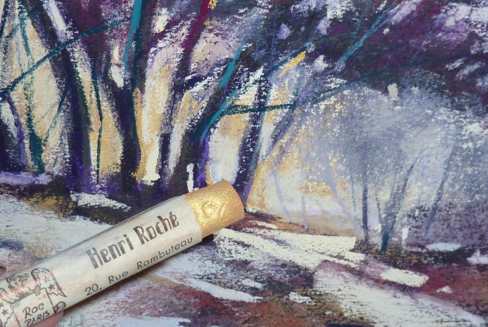
Not one to throw out good paper I decided to use the bones of this painting to create a new interpretation.
  •  I found a photo taken near the demo location. It was a bit closer in and included some bluebonnets.
  • I brushed out some of the pastel and sprayed the bottom half with workable fixative. 
  • Now primed for new pastel I let the photo guide my new interpretation.
The new interpretation works because I already had big simple shapes and a solid value map. All it needed were a few adjustments to the trees and bushes and the addition of bluebonnets in the foreground.


a photo of a scene from the demo location

Brushed out, sprayed with fixative and ready to go!


I am returning to the HillCountry this April 7-9 for my 3rd annual plein air workshop. It will be an intimate group this year and I'd love for you to join us. Any level of experience is fine. We always have a great time in this beautiful corner of the world! Email me to register.


*******I need your help! ************
I am working on my blogging presentation for the IAPS convention. I want to be sure I answer the questions that a potential blogger might have. If you want to start a blog or revive an existing one what questions would you like to have answered?  Email me with any questions. They will be answered here and in the workbook I am working on for my 2017 presentation.  Thank you!

Monday, January 30, 2017

Why You Need Colorful Darks

'Beneath the Setting Sun'          18x24         pastel        ©Karen Margulis
 We need the darks. A light shines brighter when it is surrounded by dark. When I want to create the illusion of light...the intense glow of sunset...I know I need to surround the light with strong darks. Pastel paintings are traditionally done by layering the darker values first. I embrace these darks and love starting a painting with a rich dark pastel. But I don't want to use any dark color and I never use a black pastel for my darks (I do have an exception to this which I will share later this week)

I love to use COLORFUL DARKS in my paintings.

I consider a colorful dark to be a very dark value that may be close to black but just a darker value of a color. In my pastel collection I always like to have a a dark version of each color on the color wheel. I love to use Terry Ludwig dark pastels. You can get a great collection in his dark sets.
I also like using Diane Townsend soft form pastels. I usually purchase these open stock. I consider a dark blue, green, purple and red must have pastels! See photos of my dark pastels below.


The underpainting with texture applied
Today's painting is a good example of the power of rich and colorful darks. This scene demanded rich darks to allow light of the setting sun to look bright enough. I used a variety of darks to build up the dark and shadowed area of the painting. I began the painting with a dark underpainting using Art Graf blocks and water. I applied some gesso and pumice mix to build up the texture of the grasses in the meadow.


In the photo below you can see the layers of dark. I like to build up the dark areas with several sticks of color that are all the same value. If you look closely you can see that there is one dark eggplant color that is a bit darker. This is the famous Terry Ludwig Eggplant pastel. It is a must-have pastel but I reserve it for accents only.

Layering those colorful darks
With pastel we start with the darks and build up layers and gradually get lighter. This allows for a strong base on which to build the lights and the details. It is much easier to tone down a dark area than to try to introduce it in an area that is too light. That is a sure recipe for mud. Start dark and rich with colorful darks! 

close up detail
Painting Note:  This is an 18x24 version of one of my favorite paintings from last year. I wanted to challenge myself to size up form the original 9x12 painting. It was great fun to let the texture of the ground suggest the texture of the grass! I used Uart paper.


Sunday, January 29, 2017

Have You Tried Going Big Lately?

'Passing Storms'         16x20          pastel         ©Karen Margulis
available $225
I fall into a rut with painting sizes. It is too easy to pull a piece of 9x12 paper out of the pad or use a piece from the pile of 8x10 paper that I have precut. It takes more thought and effort to work larger. But when I do make the switch I alway wonder what I was waiting for. I was reminded about the fun and value of painting large after painting this demo for a private class last week. We had already painted 3 smaller studies and it felt so strange to go big! But it is so worth it.

Painting larger is Liberating.

Painting larger allows you to put your whole body into the painting. Dare I say it is easier to get involved and become a part of the painting? Instead of making small marks to define a tree or cloud you are making large sweeping marks. It is different and it feels great.


'Back to the Beach'         18x24       pastel        ©Karen Margulis
available $350
Have you painted something large lately? Give it a try!

Painting a large skyscape is one of the best ways to improve our  skies and clouds.

The sky is larger than life. It isn't easy to fit it into a small space and give the illusion of how grand it really is. Clouds are free and constantly on the move....appearing, disappearing, changing.  When we have a larger space to work on we are free to create this grandeur and movement with larger and sweeping marks. When our whole body is involved in painting it often translates into  looser more expressive marks. When I paint large I "feel large'. It is hard to explain but this feeling of freedom can be carried into smaller works once it is experienced.

cloud close-up
Try a Big Sky Painting ...Here are some tips

  • Work on a full sheet of paper. I used 18x24 sheets of Uart for these paintings. (Don't be afraid to use the paper. If you decide you don't like the painting you can cut it up and have readymade underpaintings.)
  • Plan your painting before starting. Decide on the composition and select your pastel palette. This will help you get into the 'zone' and really respond to the painting.
  • Do some kind of underpainting or tone your paper. This will allow you to use less pastel.
  • Use hard pastels for much the painting. Save your super softies for final marks. If you are worried about using up precious pastels you won't relax and enjoy the process! I love using Mount Vision pastels for my largest paintings.
  • Make sure you have a lower horizon if the painting is about the SKY and downplay the stuff on the ground.


'Storms End'        18x24      pastel     $400

see my cloud demo on etsy for more sky tips

Saturday, January 28, 2017

A Lesson from a Pot of Pansies

'A Summer for Pansies'         8x10         pastels        ©Karen Margulis
available $125
I don't know why I resist. It isn't really difficult to find something 'live' to paint. But I always turn first to my stack of photos when I want to paint. I read a post not too long ago by Jimmy Wright who encouraged everyone to paint from life at least once a week. I can't find the post so I don't remember exactly what it was about but that one thought resonated with me.

Paint something from life at least once a week.

What brilliant advice. We all know the many benefits of drawing and painting from life whether it be the figure, still life or plein air. We see colors and values more accurately. We train our eyes to see subtleties. We improve our drawing skills. We learn through observation how much the camera lies and distorts. It is such a valuable exercise. Why do I resist?

I am usually quite disciplined when it comes to making time to paint so I am going to make a commitment to paint at least one thing from life every week. That isn't too much to ask! Why don't you join me!

Painting note: This bowl of panises was painted from life while I was visiting my dear friend in Iceland last summer. She has a wonderful greenhouse full of beautiful flowers. We selected these pansies as one of our subjects. What a wonderful time that was!

Friday, January 27, 2017

A Tip for Better Color Choices

'Wanderings'         8x10        pastel        ©Karen Margulis
available $150
 It has become an important part of my painting process. I am a firm believer in having a plan before starting a painting but I didn't always take time to make a plan for color. I would do a value thumbnail and plan my composition. I would also choose my palette of pastels. But I didn't really have a plan for what colors to use. I would pick them intuitively so it was hit or miss. Sometimes the colors would work and sometimes they didn't .

It isn't fun trying to rescue a painting with bad color. It would be nice to know in advance if my color palette would be pleasing. Lately I added another quick step into my painting planning and it has been a big help.

It isn't rocket science and I am sure many artists do it but it is a new habit for me.....creating color swatches with my potential palette of pastels.

color test swatch
I just use a small scrap of the paper I am working on and make marks with the colors I might want to use. I just make big simple shapes of the colors in the approximate size and location of those shapes in the painting. These few marks allow me to visualize what the colors do next to one another. If it is exciting or pleasing I proceed. If something looks off or wrong I try another test swatch. This small step saves a lot of time and frustration.....as well as helps prevent experimenting on and overworking the painting.

A few layers into the painting
TRY THIS: Choose a painting you have done recently with success. Now paint another version this time using a different set of colors. Do a color swatch to test your color choices before you start painting. Share your work to social medial using hashtag #Painttime2017

Thursday, January 26, 2017

Another Try at Adding Some Gold Accents to a Pastel


'Gilded Afternoon'         11x14       pastel         ©Karen Margulis
available  $155
I am enjoying some bling this week. The other day I rediscovered my precious Henri Roche metallic pastels and it whet my appetite for more go the shiny stuff! I remembered I had a jar of gold powder form Schmincke. It is called Tro-Col-Bronze. It is a metallic powder with a dry gouache base. I bought it several years ago because it was beautiful but I had no idea what to do with it!


I tried sprinkling it into clear gesso but it lost its shiny glow and turned yellowish. That was not successful. For this painting experiment I sprayed some workable fixative where I wanted some golden shine. I then loaded a small brush with the gold powder and tapped it over the fixative. 

That worked well! In fact it worked so well that I ended up with more gold than I wanted for this painting. I ended up adding more pastel to tone down the gold but I will keep this technique in mind for future subjects where I want more gold.

Note: I am reading the directions on the jar which recommends adding to water to obtain the brilliant bronze color. Hmmm now that gives me some ideas!  How would you use this shiny gold powder?


A UFO from the pile on Multimedia artboard
Today's painting actually began life as a discarded workshop painting. It was the start of a raven on Multimedia artboard.  I did an alcohol wash to tone the board and started over with my tree.

adding some rubbing alcohol to wash in the pastel
Below is the painting after adding the gold powder. It was too much for one spot but look how shiny it is! 
Adding the gold powder in the sunlit parts of the painting


Wednesday, January 25, 2017

A Compact Set Up for Plein Air with Pastels

'The Path on the Left'             6x6             plein air pastel           ©Karen Margulis
sold
In response to some questions about my plein air set up I am sharing this post from the archives!

 It has to be compact and light. Everything has to fit in my backpack. Over the years I have continuously downsized my plein air set up. I remember the days of dragging a rolling cart filled to the top with painting supplies. Set up took forever. I could never find what I wanted in the cart full of unnecessary stuff.  It was discouraging and plein air wasn't something I enjoyed.

Until I downsized! Now I have several different downsized plein air set-ups. I keep them always ready. The type of painting situation helps me decide which set up to bring.  Today I will share my Compact Travel Light Set Up.

'Blue Ridge Memories'          6x6       $65
Travel Light Kit: Heilman double sketchbook pastel box, Heilman easel attachment,  Oben AT3400 tripod


Everything fits in my Orvis backpack with room to spare. I will always carry this on the plane. I have room for extra travel needs such as my toiletries and iPad mini.  I use an Oben AT3400 tripod which folds up to 16". It will fit in the backpack but sometimes I put it in my checked bag if I want extra room in the backpack.


Heidi checks out my set-up. Here you can see the inside of the Orvis backpack. I love this pack because it sits so well without flopping over. I used it to weigh down my tripod using a mini bungee cord. It also has plenty of outside pockets.


This is all of my gear. I am using a Heilman double sketchbook pastel box. I put the metal ease attachment into a small stuff sack to keep it protected. I have my backing board with bankers clips. This is actually a hard plastic board which will hold paper. It is called an Artworks Book from Easel Butler.  I have a pouch for baby wipes, a zippered pouch for miscellaneous supplies such as tape, watercolor set, alcohol, fixative. I also have 2 black portfolio folders by Itoya. I use these to store my paper and the finished paintings.


Here is the Heilman box open. I have an assortment of Terry Ludwig pastels on the left and Girault pastels on the right. I do vary the selection depending on my location.  I don't preselect my pastels before I start painting since my palette is already limited!


Here is the entire set up. I was asked about the stability of this set up. I did notice some shaking but I am a fairly aggressive plein air painter so I did hold onto the board to steady it some. If I was a kind and gentle painter it wouldn't be as noticeable. It really didn't bother me. I am trading size and weight for complete stability and to me it is well worth it!

In April I will be taking this set up with me to teach a plein air workshop in Dripping Springs Texas. There are still a couple of spots available for this fun workshop in a beautiful place. Come paint the bluebonnets with me!

If you'd like to see this set up in action watch my plein air demo video on YouTube click HERE

Resources:

Heilman Designs
Easel Butler Artworks Book
Itoya Original Art Portfolios
Orvis

Tuesday, January 24, 2017

Behind the Scenes: Landscape on a Textured Surface


'Sunny Days'          10x14          pastel         ©Karen Margulis
available $155
I needed a little sunshine today. After painting snow for the last few weeks it was time for a landscape filled with sunshine. There is no better way to showcase the sunlight than with the addition of shadows! With that thought in mind I made a plan for today's painting. I'm taking you behind the scenes and inside my head as I share the thoughts behind the making of this painting.


a home made board with some fun texture
I had  leftover clear gesso and pumice concoction. I am working on a big painting and added texture this morning with the gesso and pumice powder. I didn't want to waste my concoction so I covered a piece of mat board with the leftovers. I added some gold Schminke powder just to see what would happen but I think I was too stingy with it and it didn't do much of anything.

After the board dried I drew my scene with a piece of Nupastel. I was drawn to this scene because of the wonderful light on the grasses and bushes. It would be a fun challenge to paint the shadows so the sunlit areas would be the star.

Blocking in the big shapes with mostly warm and cool colors

Next I blocked in the big shapes with one layer of color. I selected warm colors for the sunlit areas and cool colors for the shadows. You can see the ridges of the ground created by my brushstrokes. I didn't want the white of the board to be a distraction so I rubbed in this first layer with a piece of pipe insulation foam.

Rubbing in the first layer
Now I was left with a soft out of focus landscape. It was just a matter of adding detail and clarity where I wanted it. I began by reinforcing the colors in each shape.The texture of the board created an instant suggestion of grass and foliage. It also made it easy to keep my shapes simple.

Reinforcing the big shapes
It was now time to layer the colors in the trees and grasses. I reminded myself to use cooler blues and greens in the shadows and warmer oranges and yellows in the sunlit areas. I gradually added warmer and brighter colors in the sunlit grasses until I felt like they were sunny enough.

Ready for the details
Once all the colors were in place it was time for the smaller details. The texture already suggested grass so I only needed to put in a few  pieces of grass and hints of flowers.  I also reinforced the light and shadows on the pathway.

Not quite satisfied
 With the addition of a few bright green spices I called the painting finished. I took a photo and was getting ready to upload it to the blog when I realized the blue shadows on the path were not quite right. They were too light and bright. It didn't look like shade. So it went back to the easel for a correction! It was an enjoyable afternoon immersed in the sunshine!  What's on your easel today?

close up of the texture

Monday, January 23, 2017

What Color is a Good Spice?

'Golden'          9x12        pastel           ©Karen Margulis
available $150
Today our brains hurt! I had two private students in my studio and by the end of the day we had covered quite a lot of pastel territory. They are very talented artists from Russia (more on this later this week!) and they always have such wonderful questions which lead to great discussions.  Today one of our focus areas was color. It was a timely topic for me since I am preparing for my Florida workshop on color. I took out the color wheel and used it to help with the first demo painting.

Trying to simplify
We discussed choosing colors for a painting....how to move away form strict local color but still have a painting look believable. We talked about using color schemes to jump start ideas for colors. I decided to try an Analogous - Complementary color scheme for the demo. I chose a selection of violets from blue violet to red violet. Since yellow is the complement, I selected a range of yellows from dark to light. (I forgot to take a photo)

This color scheme was the perfect choice to create the moody light in my scene. But I could easily imagine using this simple tree as a subject for color scheme study. Every color scheme would give the tree a completely different mood! Hmmmm I may have to try that!

As I came to the finishing marks of my demo I had to stop and think. I wanted to add some punch or 'spice' to the painting. It needed something interesting to draw the eye....a bit of eye candy in my focal areas. But what color is a good spice? Once again I consulted the color wheel. I discovered that the discords for my color scheme were blue-green and red-orange. Discords are the colors that are equidistant on the color wheel form the dominant hue and from each other. These are the colors that can be great for the spices. I use the Original Hal Reed Analogous Color Wheel which make finding discords simple.

Adding some Gold!
Time to add the spices. I wanted to draw the eye to the lower area of the trees where the warm yellow light was streaming through. I added a touch of blue-green to the trunks with a Nupastel. I was finished. Until the subject of Henri Roche pastels came up!  I took out my box of three metallic Roche pastels for us to try. It occurred to me that gold is yellow and yellow is a part of my color scheme! Now that is the perfect way to spice up my painting!

It was a great day spent with two artists who are truly passionate about pastels. I will share more about them later this week!

Sunday, January 22, 2017

When the Star Wants to Shine....Thoughts on Focal Points


'Nestled'               11x14           pastel           ©Karen Margulis
available $175
The evolution of a painting is such an interesting thing. Sometimes the painting takes on a life of its own and moves away from the plan....no matter how hard you try to bring it back! Sometimes the star of the painting just has to shine. Even it was supposed to be the star!  This happened to me yesterday during the demo at my winter workshop.

I selected the subject because it checked all the boxes of winter landscape elements. I had covered my top 10 tips and techniques for painting winter landscapes and this particular reference photo covered many of them.....evergreen trees, bare trees, distant trees, sunlit snow, shadows in snow. I was excited about it.

I made my plan. I did a value thumbnail and a small color study. I chose my pastels. I started the painting with a warm and cool dry wash underpainting. My intention was to showcase the sunlit trees at the left end of the stand of trees. These trees would be the stars and I would direct my snow path to them. 

But the little evergreen tree grew larger as I added layer to my tree stand. I should have know it would happen by looking at my color study. I didn't intend for it to be the star but it was making its presence known. Once I added the snow to the branches it was all over. The tree was the star....or was it?

Painting with a Plan: thumbnail, photo and color study
After the morning session we took our lunch break. I studied the demo painting wondering what I would do to finish it. Back on the easel for the afternoon session I discussed the finishing process with the group. We all agreed that the evergreen had become the star. I had two choices.....make it the star and direct the viewer's eye to the tree of downplay the tree and clarify my original star.

With a flourish I took a piece of pipe foam and scrubbed the little tree until it was a shadow of its former self. I pulled some of the orange tree over the evergreen further diminishing it. (see photo above)  I made my point....have a plan and stick to it even if it means brushing out a perfectly good tree. But the story isn't over.

a quick color study 2.5 x 3.5 
This morning I was looking at the painting and it bothered me. I wasn't sure what it was but something was wrong. It was the evergreen. It really didn't look right hidden in the woods. It WANTED to be the star. So against the plan the painting started to come alive as I restored the tree to it's place as the star. I orchestrated some marks in the snow to bring the eye back to the tree. I added a  bit of bright now on the branches and called it finished.

Moral of the story: Listen to the painting. Don't fight it. When it starts to stray from the plan let it happen and make the new plan work!


Winter Painting Sale!
I have 25 pastel painting in all prices and sizes inspired by winter. I am offering a discount of 25% on these paintings for one week only. See them all in my Etsy shop and use coupon code WINTERART at checkout.  Link here:https://www.etsy.com/shop/KarenMargulisFineArt?ref=hdr_shop_menu&section_id=19718587

Saturday, January 21, 2017

Having Fun with Textured Boards

'City Lights'         8x10       pastel         ©Karen Margulis
available $125
Today was such a fun day!  It was a rainy day in Georgia but a wonderful group of pastel artists joined me in my studio for a one day workshop. The topic was Painting the Winter Landscape. I meant to take pictures to share but the time just got away from me. Eight hours went so fast!  I started the day with some 'Rapid Fire' demos and tip sharing talk. I shared my top 10 tips and techniques for painting a winter landscape. I followed this with a demo and then the 13 artists painted for the next couple of hours. They were amazing!! I was so impressed with their work and loved their enthusiasm!

After lunch we changed gears and I shared some more winter fun. One of my favorite techniques for painting winter scenes is to use textured surfaces. I love how the random brushstrokes help give the illusion of falling snow and adds interest to a snowy patch.

I wanted to share this fun technique with the group. Since we had limited time I made the surfaces in advance and give everyone the recipe. It is simple and there are many variations. All I do is mix some gesso with a few spoonfuls of powdered pumice and add drops of water until the mixture is the consistency of thin cream of wheat. I tinted my mixture with Golden liquid acrylics. I made some yellow and some red violet.  I applied the mixture to mat board with a cheap brush. I demonstrated a cityscape on a red violet board.

It was such a fun day made even better with a talented and friendly group of artists! I love to teach and it is always gratifying when artists really embrace what I share and have success!

Friday, January 20, 2017

Exploring Underpaintings. Try This!


'Changing'           9x12         pastel         ©Karen Margulis
available $225
It came to me in a dream last night. I woke up with a vague memory of painting. I don't remember what I was painting but I did remember that I had started with a a very specific underpainting.  Of course I had to try it today!

In my dream I did a combination warm and cool underpainting. I used cool colors in the shadows and warm colors in the areas lit by the sun. It is such a simple way to give your painting a head start in capturing the light. I was excited to give it a try.

Blocking in the painting with big shapes of warm and cool colors

I chose a photo from my favorite park. It was late afternoon and the trees were catching the last fiery rays of the setting sun. It was late autumn so there was a chill in the air. But the warmth of the trees made up for the cold.

I took out a piece of dark gray Canson Mi-Teintes paper and my box of Nupastels.  I dis a simple block in with oranges for the sunlit trees and blues for the tree and grasses in the shadows. I added a pale blue-green for the sky.

adding the trunks and branches

I developed some of the branches with my Terry Ludwig eggplant pastel and then continued layering with soft pastels. All I had to do was follow the warm and cool block-in colors. With each layer I refined the trees and grasses. I used the sky color to further refine the trees. It was fun to work on a painting that I started in my dreams! I know I will use this underpainting technique again. How about you?


my tiny reference photo in the top left corner

Underpainting for pastels is a complicated subject. There are so many ways to start a pastel painting. There are so many underpainting choices with no right or wrong way to go about it. I have put together a three day workshop on underpainting so I have much more to share than I can in this one post. But a quick point....every underpainting choice you make will influence the painting. I encourage you to experiment and play so that your underpainting choices will become intuitive.

Thursday, January 19, 2017

A Tip for Creating Depth in a Pastel Painting


'Marsh Music'         8x10         pastel          ©Karen Margulis
available $125
It still amazes me. The idea that we can take a flat piece of paper and create the illusion of a three dimensional reality. Imagine that! All we have are paper and a few sticks of pigment and yet if done properly we can create a painting that has depth. Creating depth is always one of my top goals for a landscape painting. There are some things we can do to help create this illusion of depth. Understanding aerial or atmospheric perspective it the key.

As objects recede into space the atmosphere causes their appearance to change.....things tend to get lighter, color, less intense, less detailed and there is less contrast.

In today's painting I tried to cover a few of these ideas with my focus on the level of detail I used.

The addition of clear gesso to provide more texture. It will dry clear.

In the foreground we can have as much detail as we want. It is in front of us so we can see all of the detail. As we go into the distance the level of detail decreases. Things get fuzzier! In my painting I purposely painted the distant trees as simple cool shapes. There are no details in those trees even though I saw details in my reference photo.

To emphasize the depth I wanted to have more clarity and detail in the foreground. It was a tangle of grasses and brambles at the edge of the creek. I wanted to capture this tangled feeling with some texture. I used my usual technique for creating texture in grass with some workable fixative. It just wasn't enough! I had an idea! A 'what if' moment!
  •  I took out some clear gesso which has a slight grit and brushed it allover the foreground. I used random brushstrokes to convey the tangle of grasses. Once the gesso was dry I repainted the foreground. The pastel glided over the grooves leaving a nice 'grassy' texture. Click on the painting to see the detail.