Visit my Patreon Page for more painting instruction and Paint Along Videos!

Sunday, June 30, 2019

Have you Tried Micaceous Iron Oxide for Pastels?


'Summer Love'           10x8            pastel            ©Karen Margulis
available $165
I love my artists friends! They have the greatest ideas. Every time I teach a workshop I come home with a new tip. And now with my Patreon Page I am learning things every day from my patrons! Last month I got a great tip from a Patreon artist. She uses Micaceous Iron Oxide to make a home made pastel support. I had no idea what it was but it sounded intriguing. I looked it up and the next time a placed an art supply order I added a jar of the stuff. I just tried it for the first time. WOW! Thank you for sharing this with us! 

I made a video of my first experiment with the Micaceous Iron Oxide. Click on the link below if you'd like to see. If you are a Patreon member I will be sharing this video with EXPANDED commentary at some point this month. 


So what is this magic material? It is actually a metallic acrylic paint by Golden. The makeup of the paint has metallic pieces that are like mica sense the name. When it is applied to a surface it is a dark metallic with a slight grittiness and sparkle. Very cool! You can thin it with medium or water but I used it straight from the jar. A little went a long way. I applied it to a piece of Multimedia Artboard but you can use any surface that can take wet paint!


Applying the MIO


Look carefully for the sparkle!

Saturday, June 29, 2019

How to Paint a Sunny Landscape with Pastels

'Roadside Delight'                 8x10             pastel           ©Karen Margulis
available $165
Painting a sunny day is all about having the right colors. The right color choice is important for both the underpainting and for the pastel layers. I have learned the hard way with muddy and dull results! Here are three tips for painting a landscape that captures the warmth and clarity of a sunny day.


  • Kiss your painting with sunshine! By this I mean use warmer and more intense colors when you paint the sunlit side of any element in your landscape instead of just using lighter values of the color. For example if I want a red poppy to look like it was in a sunny meadow I would use a warm red orange to paint the sunlit portions of the flower (not a pale red which makes the blooms look cool and washed out)
  • Use warm colors in the underpainting. You can get a head start on a sunny landscape by using warm colors....reds, oranges, yellows in the block- in or underpainting. The warm colors peeking through the pastel layers will add a bit of sunny warmth and interest to the landscape. 
  • Make sure your sky represent a bright clear sunny day. Be sure to use clear blues rather than dull gray blues. Make sure the values of the blues you use are not too dark.  Clear pure blues will give the sky a sunny feeling whereas the gray blues make the sky look 'dirty' or moody. Save them for an overcast or moody day. 

My new Terry Ludwig pastels 'Floral Landscape set' has the pastels you need to paint a sunny day and a moody day. Stay tuned for the next post to see a moody day painting.


starting the painting on MingArt sanded pastel paper

Midway through the painting and you can see the warm underpainting colors

The column of blues on the far right are the clear blues and the second column has some grayed blues. 

Friday, June 28, 2019

How I Curated a Pastel Set for Terry Ludwig Pastels

'Summer Days'               8x10              pastel             ©Karen Margulis
available $165

I got the call from Terry Ludwig Pastels a year ago. I was surprised and curious and quickly returned the call. It was exciting news. Geoff Ludwig wanted me to put together a set of 60 pastels for a new set. It was to be a set that would give artists the pastels needed to paint landscape with flowers of all kinds. I was thrilled and a little daunted. Where would I begin? How would I narrow down my choices to 60 sticks?

It was a process and I worked on narrowing down my choices over the fall and winter months. By early spring I had made my final selections and I was using the set for my spring workshops. I made a video explain the steps I took to make my selections. Click on the link below to see the video. 

It was such an honor and pleasure to work with everyone at Terry Ludwig Pastels. So much love and care go into every pastel they make. Not only are the pastels wonderful to use  (The BEST) it is wonderful to know that we support a family business who's care and support of the pastel medium is so evident!


Head over to Terry Ludwig Pastels to have a closer look at the set. It is available at an introductory price until June 30, 2019

Thursday, June 27, 2019

Great News! My Terry Ludwig Floral Landscape Pastel Set Is Here!

A Few Test Paintings using the Floral Landscape Set
The set has been released! I have been teasing you about the new set for months. It has taken that long to select the pastels for the set and put them through testing. But I am thrilled to share that the set is now available and on SALE until June 30, 2019  on the Terry Ludwig website. https://terryludwig.com/products/60-floral-landscapes-karen-margulis

I will be sharing more about the set in the days to come to celebrate this milestone in my art journey. As you might imagine it is a dream come true for me to have the opportunity to put together a signature set for my favorite pastel maker!  We are calling the set Floral Landscape because it includes pastels that will allow you to paint a typical landscape that includes flowers of all kinds and colors! It is also a comprehensive set for landscapes without flowers...I painted some beach scenes as well as desert landscapes in my testing and the set performed admirably.

I'd love to answer any questions you might have about this set or Terry Ludwig pastels in general. Ask your questions in the comments!


Wednesday, June 26, 2019

Yes You Can Paint on Canson Mi-Teintes Paper!

'Walk into The Light'            11x14              pastel              ©Karen Margulis
available  $250

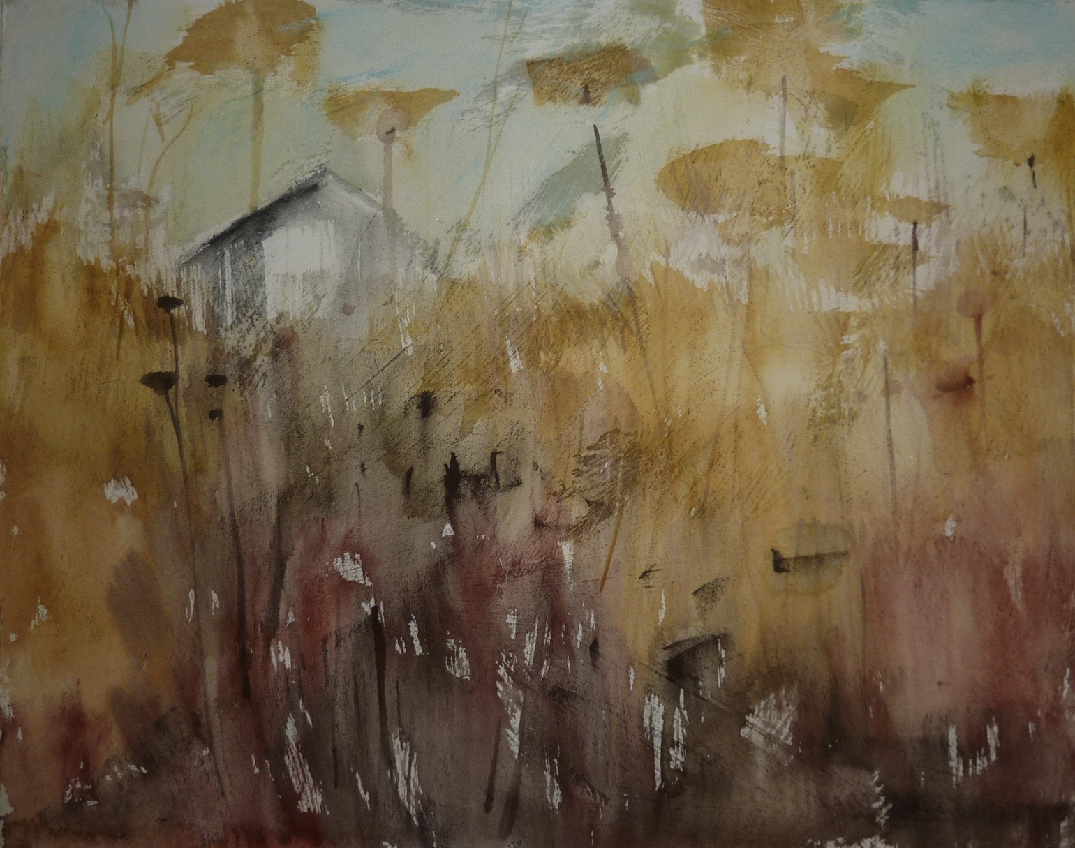
 It's the paper we love to hate. It is often the paper we use when we first discover pastels. Canson Mi-Teintes paper. It is inexpensive and readily available. We often choose it over sanded paper because of these reasons. It is the 'training' paper of choice. But when we discover sanded paper it is often hard to go back to Canson.

I happen to love Canson Mi-Teintes paper. It wasn't always the case. I struggled with it. It seemed as though my colors weren't as fresh. I filled the tooth too quickly and my paintings quickly turned muddy and dull. I stopped using it and turned to sanded papers.

Curiosity and seeing other wonderful work done on Canson encouraged me to give it another try. This time I was ready for it. I had learned more about pastels and refined my touch. That was the key! Now I understood how to get the effects I wanted. I loved the soft feel to the paper. It is now one of my favorite papers.

Give it another try! Here are 3 tips to get you started:

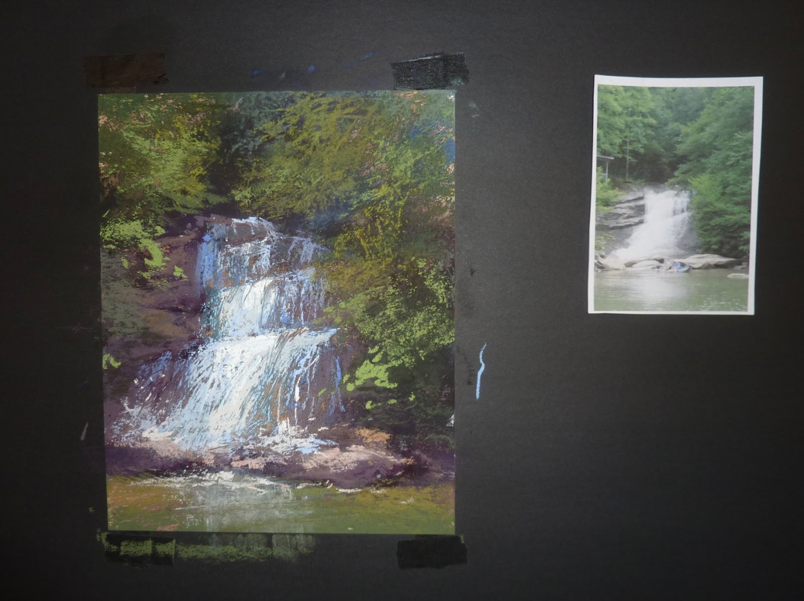
 1. Choose the correct side.  Canson has a smooth side and a bumpy side. The official correct side is the bumpy side. Most pastelists prefer the other side which is smooth. If you like a regular texture throughout your painting then you want the bumpy side. If you don't want any texture choose the smooth side. TIP: Hold the paper under a light to better see the little dimples of the bumpy side then tape it down right away! (before you forget which side you want)

2. Work with a LIGHT TOUCH. Canson paper does not have much tooth or grabbing power. It is easy to get too much pastel on the paper. When that happens you are finished! The more you try to add the muddier the painting will be.  If you start the painting with a very light touch and whisper your pastel strokes you will be able to build more layers. Let the tone of the paper show through. If you can't see the paper in your beginning layers your touch is heavy. For more layering... whisper don't shout.
The heavily applied pastel looks thick and muddy. The lightly applied pastel looks light and airy.
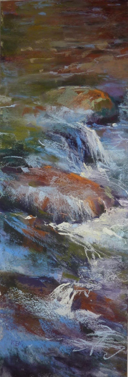
3. Use Softer pastels. You can certainly use hard pastels such as NuPastels and Rembrandts on Canson but they don't give you the same look as the softer pastels. I have more success with softer pastels such as Terry Ludwig pastels.  Diane Townsend pastels work especially well since the pumice in them opens up the paper.

A light touch with softer pastels on the smooth side of the paper is my recipe for success.

Bonus tip: Try lightly sanding the surface of the paper to rough it up some and provide more tooth.

Here is some information about Canson Mi-Teintes from the Canson website:
Canson® Mi-Teintes® is a pulp-dyed colour paper that has won worldwide recognition for its qualities. An authentic art paper: it is gelatine stock-sized which limits the absorption of pigments in order to show colours at their best.
It has the highest cotton content (more than 50%) on the market, combining mechanical resistance and a sensuous feel. In addition to its qualities as a drawing medium, Canson® Mi-Teintes® complies with the ISO 9706 standard on permanence, a guarantee of excellent conservation.
Furthermore it has the advantage of having a different texture on either side: a honeycombed side characteristic of Canson® Mi-Teintes®; and fine grain on the other.
It boasts the richest range of colours on the market, with 50 light-resistant tones.


See this painting and Paint Along with me in a 4 part video series on my Patreon Page. www.patreon.com/karenmargulis


Tuesday, June 25, 2019

What Can You Paint in 10 Minutes and Why You Should Try

'Poppy Abstraction'         7x5             pastel             ©Karen Margulis
available $100
 You know you should. But it is hard to find time. And even when we do have the time it is often wasted as we try to figure out what to paint. We all have heard the benefit of painting practice and how painting smaller and more frequently can help us improve. Devoting time to put in those important 'miles of canvas' can be a challenge. But it can be done if we take some simple steps.


  • Lower your expectations. Try not to approach every painting as if it were your last! Don't make it so precious. Calling your practice paintings 'studies' can take the pressure to perform off your shoulders.
  • Work smaller. It might seem awkward at first especially if you are used to working large but you will learn to manipulate the pastels to make the marks you need for smaller papers. It also gives you a greater feeling of accomplishment because you can get more done faster on smaller paper. 
  • Work faster and set a timer. I developed my painting speed which I prefer to call efficiency because I only had time in my work schedule to do small fast studies. At first they were terrible but with practice I became more efficient in how I approached and finished a painting (study) Try setting a timer for 10 minutes. You will be surprised at how much you can do in that time. Be sure to have your paper and subject ready before starting!

How about some inspiration and some ideas on how you can paint something more efficiently. Check out my poppy demo on my Youtube channel. 


The finished painting and the reference photo

Sunday, June 23, 2019

The Beauty of a Hand Made Pastel Surface

'Summer on the Island'               16x20             pastel           ©Karen Margulis
available $450
 I don't know why I don't do this more often. Making my own pastel surface is not only cost effective it is very satisfying. And even more importantly the results can be wonderful! I am giving myself a painting play day once a week and for this play painting I decided to make my own surface using regular printmaking paper and clear gesso. That's all! I loved the result and I enjoyed working on the paper which had a satisfying softness with just the right touch of grittiness. Read on for the process and the supplies needed.

My Supplies


  • Arches 88 Printmaking paper. I also like Rives BFK printmaking paper
  • Liquitex Clear gesso
  • Inexpensive paint brush
  • Art Graf pigment squares, earth colors
  • Terry Ludwig pastels
  • Assorted Nupastels

The Process


  • I cut a piece of the printmaking paper to size 16x20. I used the paint brush to apply a coat of clear gesso. I use random brush strokes but you can apply it with a roller sponge to get a smooth coat. I wanted the random texture. Clear gesso has a bit of grittiness which is just enough to give the paper tooth for pastels. 
  • I did a light pencil drawing on the dry paper. I then blocked in the big shapes with the Art Graf squares. You only need a light application of the Art Graf. A little goes a long way.
  • I washed in the Art Graf with a brush and water. I also used the squares to draw back into the wet underpainting. I made sure to stretch the paper and retape as the paper dried. This kept the paper from buckling. 
  • When the underpainting was dry I started to apply my pastels. My goal was to exploit the texture and to use a light touch through the painting process. 


The first layer of Art Graf before washing with water


The photo below shows the finished underpainting. Look carefully to see the texture. 


Starting the pastel application. I began with the house so that I could hide it in the weeds!


A closer look at the texture of the paper


I hope you enjoyed a look at my process. If you look carefully at my painting you might discover some hidden friends! If you want to learn more about the various pastel papers we have to work with check out my Patreon Page in July. We are exploring paper all month! www.patreon.com/karenmargulis

Friday, June 21, 2019

An Unusual Twist on a Nocturne

'Fireflies in the Meadow'              9x12              pastel                 ©Karen Margulis
ask me about availability 
 It was play day and I was looking for a challenge. I wanted to do something different. How about a nocturne? That would be a challenge. But I wanted it to be MY nocturne. It needed to be a landscape in the evening. I wondered what a meadow of Queen Anne's Lace would look like at dusk. This would be my challenge.

I needed to do some homework first. I wasn't sure exactly if the low light of early evening would allow me to see anything that wasn't illuminated in some way. The only way I would know is through direct observation. Michael and I went out to a spot near the house that was filled with Queen Annes Lace. It wasn't the most picturesque spot at the base of giant electric towers. But it would have to do. We spent about an hour taking photos and watching how the light changed. By 9:20 the last of the sunlight was gone and the sky took on the wonderful deep blues of early evening.

But what about the flowers? I could still see them but the colors were dark and dull. It is interesting that I saw so much more than the photos showed. Look at the photo below. You cannot see the tangle of grasses and flowers. Yet in real life I could see them. That is the power of direct observation. And it guided my color and value choices for the painting.

As we were leaving the 'meadow' the fireflies began to emerge. It was the perfect ending to the evening. I knew that they would have to become a part of the painting.


The meadow as dusk

A got from a friend came in handy. More on this soon!

Wednesday, June 19, 2019

Video Demo Fix it or Trash it? How to Recycle a BAD Painting

'A Summer in Ireland'            13x18            pastel              ©Karen Margulis
available on Esty. Click here for details.
 It was close. I almost threw away a painting. I never throw them away. Even the bad ones. I recycle them. But this one was giving me fits and I couldn't bear to work on it any more. So I put is aside for a few weeks. But then I needed a candidate for a new series on my YouTube and Patreon channels.....Fix it or Trash it?  This painting was perfect.....perfectly BAD.  You can see what I did to recycle the paper in my new video. Click the link below to watch.


Here is one of the main points I make in the video: It is not always what you add to a painting that fixes it but instead what you take away!


Expanded commentary on this video coming soon on Patreon. Stay tuned!

Tuesday, June 18, 2019

A Fun Tip for Painting a Waterfall

'What a Rush'              10x8           pastel          ©Karen Margulis
available $165
I took a pair of scissors to this painting but not for the usual reason. Usually we take out the scissors when we want to crop a painting to make a more interesting composition. It is so easy to cut pastel paper and get a few good paintings rather than one failure. But this time I wasn't using scissors for cropping.

How did I use scissors? I was adding the finishing touches to this waterfall. I realized that in some areas of the rushing whitewater the pastel was too thick and covered too much of the rocks. It didn't look natural. I wanted to have some of the rocks peek through to make the waterfall a bit more delicate.  I looked around my easel and spotted a pair of scissors. Perfect!

I used the tip of the scissors as a scraping tool. I started scratching through the light pastel (the whitewater) which revealed the rocks and toned paper underneath. It was just the right touch and allowed the waterfall to appear painterly rather than overworked. If I had added more rock color rather than taking away the water it would have potentially looked overworked and muddy. 


My demo board

A closer look at the scratching. 

WHAT'S HAPPENING ON PATREON
This week you can see a video demo of this painting as well as directions for creating the textured surface. Join us! www.patreon.com/karenmargulis

Monday, June 17, 2019

Overcoming My Fear of Painting Rocks


'On the Rocks'         18x6       pastel       ©Karen Margulis
available $150
Just like trees I avoided painting rocks. It is funny how we sometimes avoid the thing that we struggle with instead of doubling down and making an effort to improve. Sometimes the struggle isn't even real....it is something in our head, something we told ourselves we couldn't do. Then we start to believe it and it becomes a reality.

For me it began with my first pastel classes and workshops. The instructors excelled at landscapes and trees and rocks in particular. I would look at my own poor renditions and would be frustrated. I had much more success with flowers. So I convinced myself that I was a flower person and trees and rocks were beyond my reach.

It took years but my trees gradually started to improve. Much of this came about because I was learning things such as not having spotty values and how to make green more interesting and how to create depth. Mastering basic art concepts definitely helped. And that takes time. It also takes practice. I painted every day so these concepts became intuitive and I became a more confident painter. I started to apply what I did well with flowers to my trees. But I still avoided rocks!

I had to convince myself that I COULD paint rocks if I wanted to. I simply had to observe them carefully and apply what I have learned over the years. I had to remind myself that rocks were like flowers.....shapes of color and value and edges.....If I could paint a flower I could paint a rock!

A close up of my rocks

Saturday, June 15, 2019

Step by Step to Beautiful Clouds: Photo Demo

'They Dance in the Sky'           9x12         pastel        ©Karen Margulis

I am in a Sky Painting mood! Maybe it was the wonderful skies I just experienced in New Mexico but I have several ideas going for sky and cloud paintings. I will share them this week. I thought you might enjoy this mini step by step demo from my blog archives. If you want to see a similar painting come to life in a video demo be sure to check out my newly released Sky and Cloud video on my YouTube channel. https://youtu.be/F2_BqYRDjJ8


Enjoy this demo!
I decided to paint from one of my photos from the Southwest. I took photos of my progress so enjoy the step by step demo.


I am working on a piece of great Canson Mi-Teintes paper on the smooth side. I begin by blocking in the big shapes including the bog cloud shapes since they will be large cumulous type clouds.


Next I paint the blue sky. I leave room for the larger clouds so I don't have to paint the light values of the clouds over the blue sky.  I make sure there is a transition of color from darker cooler blue to a paler warmer blue at the horizon.


After the sky is blocked in I work on the ground. I used a dark brown and dark green to block in the shrubs. I use three different ochre pastels to lay in the desert sand. I don't rub in any of this first layer because the gray tone of the paper works to unify the painting.


Time for the clouds! I begin with the shadow areas of the clouds and I layer ochre and violet to make a gray.


I add the lights on the clouds with a very pale yellow and peach. I lightly cover the shadow areas so they are not so dark and stormy.


Next I brighten the larger clouds with a vey light yellow (almost white) and pure white in a few spots.
The brightest clouds are directly overhead or at the top of the painting.


It is now time to work on the ground. The painting is about the sky so I need to downplay the stuff on the ground. I simplify the tangle of desert shrubs using simple shapes of greens.


I add some lighter sand colors to the ground and a touch of blue for a spice. I call the painting done and upload it to the blog. Then I realize I am not really done. So back to the easel for more work.


Now I am finished! I didn't like the bare hill in the center of the painting so I added some shrubs and a darker sand color. I also liked the hint of blue and how it suggested a little peek of water. I decided to extent the 'water' by adding a couple of marks of blue. I also used a darker color for my signature. I didn't like how bright it was.

Friday, June 14, 2019

When You Just Have to Paint the Clouds


'Clouds over New Mexico'           5x7               pastel                ©Karen Margulis

I am still recovering from an amazing time at the IAPS pastel convention in Albuquerque New Mexico. I am getting caught up but I am also reorganizing my studio to create a kid art section for my grandchildren. (more on that soon!) I will be doing a more comprehensive review of the convention but I wanted to share one of the quick paintings I did in my hotel room on the last day of the convention. 

We had a room on the 10th floor with an amazing view of the Sandia Mountains and a panorama of the sky. We were also blessed with some amazing skies while we were there.  On the last afternoon of my stay I was busy packing. I happened to glance out the window and saw the most picture perfect TEXT BOOK clouds and sky!  The clear blue sky was making the transition from dark and cool to lighter and warmer and the clouds were stacking up and getting more colorful and smaller as they approached the horizon. It was so cool to see these features in action. In fact it was so inspiring that I had to pull out my pastels to paint them!

I did a quick 5x7 study on white Pastelmat with Terry Ludwig pastels. I can't wait to paint some of the other wonderful skies that I experienced in New Mexico!

Picture perfect clouds over Albuquerque


Do you like to paint the sky and want some tips?

I just released a video that premiered last summer on my Patreon Page to my YouTube channel. Every once in awhile I will release an older video to keep my channel active. However new exclusive videos and video premieres are released each week on the Patreon Page. I hope you enjoy this video which was part of our month long study of the sky! Click on the link below to watch the video on painting the sky and clouds!

https://youtu.be/F2_BqYRDjJ8


I used my set of Terry Ludwig pastels...available June 27!


Monday, June 10, 2019

Three Rules for Painting Commissions

'Majesty'.    11x14         pastel          ©Karen Margulis


You either love them or hate them. That seems to be the consensus regarding painting commissions. Some artists welcome commissions and enjoy creating custom work. Some prefer to steer clear of them. I happen to love them. I just finished a nine painting commission project which has been a a lot of fun.(today's blog paintings)  I have developed some simple rules to guide me through the commission process. This ensures that the entire process is stress free and enjoyable.

Whether you are a full time artist or just painting for fun sooner or later you will be asked to paint something special for someone. Having some rules or guidelines in place will make it easy! Here are mine.

  • No Down Payment. I like to keep things simple. I don't have a lot of requirements. I don't ask for a down payment before I start a painting because I will only paint something that others might want to purchase. In other words it cannot be so unique or bizarre that it would never sell. I have done many commissions and only one time was a commission cancelled while in progress due to illness of the client. That painting went on to win an award in an exhibition! Being free of any money takes the pressure off. I am simply painting for enjoyment and if the client is pleased then they pay.....I never have any problems with payment.
  •  Be Clear and upfront about what you will paint. I will only paint subjects I am comfortable with. I will only take commissions of places I have visited.  I prefer to work from my own photos of the place. I don't mind having the client suggest colors or give input but I decide if those suggestions will result in a painting that will stand on it's own....that someone else might like as well! A commission painting has to be something I would choose to paint on my own. That is what makes it fun and less pressure for me!
  • Emphasize that the painting will not be an exact copy of something else. It could be similar to a painting I have already done but it will never be an exact copy. I make sure the client knows this before I start. I usually paint small studies before painting anything large and email photos for approval before I start. This eliminates misunderstandings although it is important to also emphasize that the painting will not be an exact copy of the study either.
 Painting commissions has added a wonderful dimension to my life as an artist. Even though most of the contact with clients is online or by phone it has been great to get to know those who choose to purchase my work.  As long as I am clear about my expectations and my 3 rules.....commissions are very welcome!