Visit my Patreon Page for more painting instruction and Paint Along Videos!

Tuesday, December 31, 2019

Making Time for Art in Busy Times


'Magic'                    9x12                pastel                   ©Karen Margulis
available $195

It can be done. Carving out some time to paint in the midst of the busy holiday season isn't easy but it is possible. I am in the middle of my annual studio and home clean up. I have stuff everywhere but I am making progress. On top of the clean up project I am working on plans for workshops and Patreon content for 2020. I have other trips and projects to prepare for and I am trying to get ahead of the eight ball! 

You would think there was no time to paint. But my easel calls to me. I can fit it in if I think about painting time a bit differently. I can certainly find 20-30  minutes to paint. It is the perfect break from cleaning. Painting a quick study gives me a break, satisfies my pastel craving and allows me to access the intuitive painter in me.  Often we do better work than we thought possible if we limit our time spent on the painting. We don't have time to over- think!


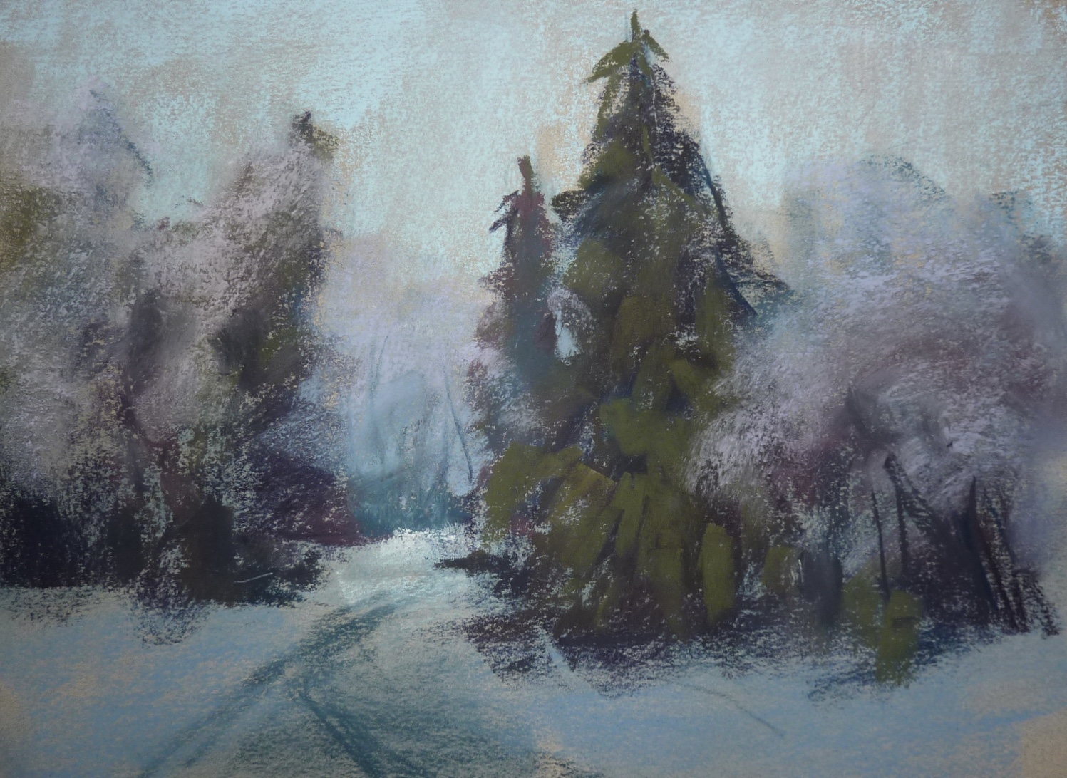
A quick alcohol wash gave me something interesting to respond to


Today I took a break after lunch and spent 30 minutes working on this painting of weeds at sunset....one of my favorite intuitive paintings . I had already done the underpainting by doing an alcohol wash over a Patreon demo color swatch chart. I never waste a good piece of paper! And because I was intimately familiar with this subject it was easy to slip in and paint. I also used the palette of pastes that I had out for the Patreon demo. 


The block in done in the first 5 minutes. The rest of the time was for resolving the details. 

Quick studies are made for busy times. Pastels make it easy to paint and leave things alone. Clean-up is too easy.  It is a great habit to start. Make time for a painting break. You'll be glad you did!

Happy New Year!! Wishing everyone a wonderful creative and inspiring new year!! 


Consider joining my Patreon group this year! I have some great content in the works and it is a great way to connect with other pastel artists! www.patreon.com/karenmargulis

Sunday, December 29, 2019

Finding Inspiration In Small Pieces

'Lavender Magic'            9x14         pastel            ©Karen Margulis
available $195
 It was a quiet day. My studio was clean and organized and I was looking for something to paint. I am not usually at a loss for inspiration. My problem is the opposite. I have too many ideas for paintings! I sometimes can't decide because I am overwhelmed. One of the things I do is keep an Inspiration Jar which I have blogged about . Click here to read.  But today I came across another great idea for inspiration shared by Tony Allain.

Tony shared his tip on Facebook and I am so glad I saw it today. I adapted it a bit but here is the main idea: Make a small viewfinder. Matboard works great. Use the viewfinder on your reference photos to discover small areas that could be made into paintings. I have done this in the past but I use artist tape to tape off my new composition within the photo.

This is a great way to find simple areas in complicated reference photos or to get more milage from a favorite reference!  I found a long narrow section of one of my Provence photos. It was the perfect size for a piece of black scrap  paper I had. See below. 

Thanks Tony for sharing your tip! I am sure I will use it more often!

My 'new' reference photo ad paper. It is Black Canson Mi-Teintes paper. 


This is the first layer of the painting, 

Friday, December 27, 2019

A Fun Look at my 2019 Instagram Top Nine

My 2020 Instagram TopNine

I love doing my yearly Instagram Top Nine. It is a good way to look back at my work and to see what resonates the most with people. (The top nine makes a collage of your Instagram posts that got the most likes during the year). I am happy to say that all of these paintings have found homes this year!

This year seemed to be the year for wildflowers!  Which is fitting since I introduced my Floral Landscape set of Terry Ludwig pastels in 2019 and I presented a wildflower demo at the IAPS convention in June. I painted a lot of wildflowers! What is surprising is the color palette! My orange and pink wildflowers made the top nine  They got more than 1600 'likes' each. It makes for a very cheerful top nine collage!


What is Instagram Top Nine? If you have an Instagram account (it is fun and something to consider if you'd like a diary of your work!) you can go to the website https://topnine.co  and enter your user name for a free collage of your top nine posts. Use the hashtag #TopNine2019 when you post your top nine. 

In the past few years my tree paintings and the color yellow were my most popular paintings on Instagram. Here is a look back.


Wednesday, December 25, 2019

Painting a Snowy Landscape in 4 Easy Steps

'Walking in a Winter Wonderland'             9x12            pastel             ©Karen Margulis
available $165

What do you do when the shopping and wrapping and baking are done? Go down to the studio and paint! I put on some Christmas music and pulled out a photo that I took after one of Atlanta's rare snowstorms. It is hard to believe that this winter wonderland was our street! The sun had come out after the storm dumped inched of heavy snow. We went for a walk and watched the magical transformation as the clouds cleared off and the sun began to illuminate the snow. I took a few photos and filed them in my winter photo file. Today was the perfect time to paint this scene!

Step One: 
I began with a 9x12 piece of Canson Mi-Teintes unsanded paper in Moonstone. I did a light drawing with a piece of blue Nupastel placing the main shapes. The star of the painting would be the evergreen tree covered in snow. Next I used three blue pastels to do a bold block in. I used a dark blue for the dark tree shapes and the path in the snow. I used a light blue for the sky and a cool blue gray for the foreground snow in shadows.


Step Two:
 I add layers of color to my tree shapes. I used a couple of violets and some dark greens. My plan was to block in the dark trees first and then add the snow....like frosting a cake!
I also add some dull mauves to the frosted trees on the sides of the treeline.


Step Three: 
Next I work on the sky. It was a beautiful blue sky and I use three different blues to Crete a sky with depth. Later on in the painting I add a pale yellow to the horizon to suggest the warming of the sky. At this point I needed to develop some texture in the lacy trees so I spray workable fixative and add more light blue and violet over the fixed areas. This created some suggestion of branches covered I snow. I repeated this process a few times. 

Next I added the light snow blanketing the evergreen trees. I used pale blue in the shadows and pale peach and yellow in the sunlit snow. I press hard to get thicker marks.  I also worked on the foreground snow and the path. I used cool blues since this part of the snow in the foreground was still in the shadows. I used pale peach in the distant snow where the sun was hitting. 


Step Four:
Everything was in place. the last step was just a matter of refining the painting. Look at the photo move and compare it with the finished painting below. What finishing marks did I make? 


Wishing you a very Merry and Peaceful Christmas!

Monday, December 23, 2019

Watch my Annual Snowman Painting Come to Life!


'Mr. Snowman Goes Shopping 2019'           7x5            pastel             ©Karen Margulis
available $145
It's snowman time! Every year for the past 7 years I have painted a snowman. It is just a fun way to let go and paint something fun and whimsical! This year we made a video of the snowman painting. You can watch him come to life in this short video! Click on the link below to see the video on my YouTube channel!

                          https://youtu.be/K_CHqer6DCA


Here is a collage of the some of the past years snow people paintings! Which one is your favorite?


Saturday, December 21, 2019

How to Simplify Winter Trees

'Winter Visitor'            9x12                pastel       ©Karen Margulis  
available $165
It wasn't the best reference photo but in the end it held an important lesson about choosing reference photos and making them work.

Photos are best used for inspiration. But you need to know what the inspiration is!

I was drawn to the photo that inspired today's painting. There was something about it that was exciting. It certainly wasn't the multitude of tangled branches and trees. I was so captivated by the wonderful contrast of the yellow light at the horizon agendas the darks of the trees. In fact I didn't even notice how busy and complicated the photo looked until my friends pointed it out. "I would have never chosen that photo! " they told me.


the original bad reference photo!


I didn't notice the challenging aspects of the photo because I was so focused on the light at the horizon. That was a good thing though because I had a concept for the painting. I wanted to portray this light and the drama of the touch of warm light against the dark and cold. Knowing what I wanted to say allowed me to decide how I would say it.


I took a few minutes to think about how I would go about getting my message across. I decided I needed to simplify the trees and branches and even the snow on the ground. I would go crazy trying to put in all of those branches and they weren't really necessary.This would allow me to focus on depicting the light.

How to simplify?  I blocked in the big tree shape with a piece of black Art Graf. This gave me a nice two value underpainting....dark and light. I added some darker value neutrals to the tree mass before breaking up the big shape with the sky color. It was a slower than usual process as I used negative painting to carve the branches into the tree. I had more control this way and didn't get a tangle of  branches that looked stiff and unnatural.

For the distant bare trees I didn't paint individual branches. Instead I used a very light touch and added a middle value shape. This light touch allows the sky color to peek through giving the illusion of bare trees.

Starting with big shapes of light and dark and gradually carving into the shapes was a great way to depict winter trees. It helped me keep them simple and I didn't go crazy trying to copy all of the branches in a way to busy photo. The fun part was capturing the subtle yellow glow that drew me to the photo in the first place.

Thursday, December 19, 2019

An Essential Color for your Pastel Box


'Over the Ridge'              12x9               pastel           ©Karen Margulis
available $225

When in doubt add some purple. This is advice that I take to heart. I probably have some form of violet in every painting. It comes naturally to me because it happens to be one of my favorite colors. My other favorite is turquoise. But I don't use violet just because I like it....I use it because it just works.

Violet can be a great unifier especially when used in a grayed down muted or neutral form. These gray violets are essential components to a successful landscape. 
  • They knit more intense colors together and allow those colors to pop.
  • They are great for painting distant trees and mountains. They are essential to create believable depth in a landscape.
  • Use a form of violet anytime you are tempted to reach for a gray pastel (made from back and white) 
  • Mix vibrant purples with the gray purples for added interest. Spices!
  • Essential color for your box? As many violets as you can afford....red violets to blue violets, intense to muted. We can never have too many!


Today's painting began with a purple underpainting. I used Jack Richeson squares and did and alcohol wash. I used my set of Terry Ludwig pastels for the painting. Plus a few extras.


a couple of Terry Ludwig 'message' pastels from workshops
Last year I was excited to find these nice violet Terry Ludwig squares in my annual studio cleanup. I must have put them away for safe keeping. I think its better to use them! I am in the midst of this year's clean up so I wonder what goodies I will uncover.

Tuesday, December 17, 2019

What We can Learn about Color from Mother Nature


I am camping at Disney World with my grandchildren so I am posting a favorite from the archives. Enjoy!

The day was cold and dreary. The clouds were getting thicker and the sky was heavy with the promise of snow. We walked through the park at a fast clip anxious to get home. It was actually the type of weather I love.....moody and gray. That is when hidden color really comes to life!  I had my camera around my neck and quickly shot photos as we passed through the park. 

I have returned home to Georgia missing my grandbabies but filled with inspiration and excitement. The first thing I decided to paint was a scene from the walk in the park. I loved the little trees with the bright red berries. They teach us an important lesson about color.

All Color is No color!  If you want a color to stand out...to pop or sing...then it is important to surround the color with duller or neutral colors. This provides the stage so the main color can be the star!  Mother Nature does this! All we need to do is look and we will see it.

Follow along my step by step demo to see how I made the red berries the star of my painting.


The block in: Roughing in the trees with a dark dull violet and some gray blues. I am using Canson Mi-Teintes paper.


Adding some dull reds to the trees and some pale pinks to the sky. I am also adding some dull pale pinks and violets to the snow. I indicate a few branches with a dark blue pastel.


I blend in this first layer of pastel to add some soft mystery. I paint the bare trees by blocking in a mass then carving the branches with sky color.


Now I add a brighter red by using a brick red pastel on it's side. This isn't the most intense red I will use. I am gradually building up to the bright red berries. I also develop the snow and shadows on the snow. So far everything is still on the dull side!


I spray the trees with Blair workable fixative so that I can get more texture in the trees. I also add some snow on the branches. The next step is to finally add the brightest most intense red for the berries. I use soft Schminke pastels in a cool red and a warm orange red. I make a few 'berry' marks and call the painting finished!

close up of the berries

Sunday, December 15, 2019

My Workshop Schedule for 2020


I guess I am just a perpetual student. I love to learn new things. I am happiest with my nose in a book or listening to a good lecture and taking notes. Maybe that is why I also love teaching. It gives me the chance to be creative with the information I share and design workshops that lead to lifelong memories! This week I am preparing for several upcoming workshops so I thought I'd share my thoughts on why taking workshops is a good thing.


One of the things I love about painting is that artists are never done learning. It is not something we totally master. We may develop technical skills but there is always room for learning and growth. I like to take workshops.  I choose my workshops carefully and make sure I don't take too many too closely spaced. Time is needed to digest what is learned. Too much information from too many sources can be confusing. But chosen wisely a workshop can have many benefits.

  •  A workshop exposes us to new ideas and techniques which can lead to new discoveries even for the most experienced artist.
  • We often learn just as much from the other artists in the workshop. I always learn tips from my fellow artists...not to mention meeting new friends who are as passionate about painting as I am.
  • It's good for your brain!  It is important to go back to learning mode every once in awhile. Hearing things you know explained in a different way can lead to breakthroughs and aha moments and we are never too experienced to have those!
  • Workshops can be a time of forced immersion in art. Sometimes life gets in the way and we don't get to paint as much as we want. A workshop gives your days of uninterrupted painting time. It can really jumpstart a good routine.
  • Workshops help me learn how to be a better teacher. It is humbling to be a struggling student...going back to that place helps me understand my students and what they are feeling in my classes.
  • Workshops lead to lifelong friendships and memories. These experiences add to the fabric of our experiences. The more we experience the richer we will be and the better we will be able to express ourselves through our art.

I love taking workshops! I also love teaching and the many workshops I have taken over the years have made it possible for me to grow as an artist and now to be able to share the things I've learned with you! I have a busy year ahead with workshops and other fun travel (more on that soon) and I hope it will be my pleasure to have the opportunity to meet and share with many of you!

Have a look at my 2020 workshop schedule and see if there is one near you. Workshops are all studio workshops except for one plein air workshop in Pennsylvania. Each workshop will include two demos each day with plenty of time for you to paint with my help at your easel. The focus of the workshops will be on painting with more expression and I have plenty of helpful and fun lessons planned. The workshops are suitable for artists at any level from beginner to advanced!

Each group has their own registration procedures and time tables for registration. Consult the flyer below for more information. I am not handling any registrations for these workshops but I will do my best to answer any questions you might have. 


Friday, December 13, 2019

I am So Excited About My New Postcards!


My order from MOO! I lLove the Postcards!

I have had my eye on the postcard by Moo.com for awhile. I just wasn't sure what I would use them for.  When a sale popped up a few months ago I decided to try the postcards and I made them into thank you cards. I would use them as an additional thank you for collectors of my paintings.

I am so glad I did! The postcards were wonderful! My paintings looked vibrant and the color was accurate. The cardstock is heavy and feels expensive. The best part was the ability to choose multiple images for the cards with no extra charge! I have been getting my business cards from Moo for several years and I am never disappointed! Now I have another product to reorder....post cards!

What else could you use the post cards for? 

  • Exhibition or show announcements
  • Large business card...make a statement and give out a card that goes on the fridge rather than the trash can!
  • General thank you notes
  • Make a postcard address grid and give them out to collectors, friends and family for them to use as postcards
  • Leave them blank for handwritten notes


If you would like to try Moo.com for your business cards, postcards or other printed materials use my referral code for a 25% discount on your order!

https://refer.moo.com/s/kemstudios26

Wednesday, December 11, 2019

Don't Miss this Sale and See How Versatile my Set Is!

'Morning Majesty'                9x12              pastel              ©Karen Margulis
available $225

When I was testing my pastel selections for my Terry Ludwig signature set (Floral Landscape) I pushed the limits. Even though the set is intended for flowers in the landscape I have painted marshes, clouds, water and more. I find the set to be quite versatile!  But I had not yet tried to paint snow or mountains so when I was setting up for my Patreon demo I decided to use my Floral Landscape set exclusively.

The result? I could have painted exclusively with the set but I did add a darker turquoise, a darker yellow ochre and two blue Nupastels. These weren't even critical but the Nupastels were good for the detail in the mountain shapes. It is so nice to have a set that I can rely on for multiple subjects!


Do you need some Terry Ludwig pastels? Now is the time! The End of the Year Sale is on now through December 31! All sets are 20% off retail! visit www.terryludwig.com


The reference photo from my trip to Norway this fall

My signature set of Terry Ludwig pastels 'Floral Landscape' with a few extras I used for the painting. A couple are part of the set but out of their places. I only added the turquoise. dark ochre and two blue Nupastels. 

SEE THE COMPLETE DEMO OF THIS PAINTING OVER ON MY PATREON PAGE

Monday, December 09, 2019

A Magical Surprise Addition to Your Winter Paintings

'Winter Hush'              2.5 x 3.5 inches        pastel         ©Karen Margulis
 I had a surprise this week!  I decided to paint a few mini pastels to use for holiday gifts. I started out doing a series of magical winter forest scenes. I started with dark blue and built up layers of green in the fir trees. Then I spotted a small sparkly green peeking out at me from the box.  I felt the excitement build as I took it out of the box.

And then I made a mark with it. It felt wonderful as I added some of this iridescent green to my trees. It was soft and smooth and let a sparkly trail that added just the right color and punch to my trees. It was magic! 


A fun little pastel.....Diane Townsend iridescent pastel 503D

I have other iridescent pastels but for some reason I love the green ones the best. They tend to add just the right touch to trees. I have another one in my plein air box and everyone in awhile I use it and I always enjoy the effect. 

Tip: The trick to using a sparkly pastel and making it work is to make sure you are using the right value and color. This way the sparkle is subtle and blends right into the surroundings.


Wrapped and ready for last minute gifts


Friday, December 06, 2019

A Tip for Painting Small Pastel Paintings

'Fairytale Forest'              2.5 x 3.5 inches     pastel     ©Karen Margulis

I am getting back into painting minis. I call the small artist trading card size paintings 'mini's'. They are a standard 2.5 x 3.5 inches and they are so much fun to paint. I tend to paint these little guys when I travel and want to bring pastels but don't want my regular 'big' supplies. I also like to paint them when I am very busy with life but still want to paint. I can paint at the family room table and multi task!

But painting small can be a challenge. Especially if you are a detail oriented artist. It is possible of course to get fine detail especially by using pastel pencils but I like to paint in a loose and expressive manner so the pencils don't work for me. I will use my regular full size pastels but these are a bit unwieldy and take practice to get them to make tiny marks. I have a tip to solve the issue!

TIP: Make up a MINI Kit. I take a box lid and line it with a paper towel. I then pull out the little bits and nubs of pastels from my regular boxes and put them in my mini box. You know these bits.....the pastels that have either broken or are well used. They tend to fall in the cracks and get lost in my box so it is better to put them together. Whenever I come across one of these pastel pieces I throw it into the mini box. Now I have a box of assorted pastels that are just the right size to paint minis!

My mini kit also included precut paper, a piece of foam core support board, a pencil and some clear bags and precut foam core backing boards.

My set up when I paint mini pastels

WHAT'S HAPPENING IN THE PATREON GROUP

This week on Patreon we are working on minis. I have shared videos and demos and plenty of tips. Join us and try the weekly challenge! Pledge just $4 a month for all this and much more!
www.patreon.com/karenmargulis

Wednesday, December 04, 2019

Help! My Painting Has Chicken Pox!

'One Peaceful Morning'               8x12              pastel               ©Karen Margulis
available $225
My painting had chicken pox. But I found a cure. It didn't last long. Let me explain! I should have been cleaning. (I'll start tomorrow) but a painting I had started yesterday was calling to me. I am very much into painting from my Norway photos these days. I started a fjord painting by doing an alcohol wash with some Jack Richeson handrolled underpainting pastel blocks.I used rubbing alcohol to liquify them. I will review these soon! Here is the underpainting.

8x12 on gray sanded paper
I gave myself permission to paint rather than clean and happily worked on the fjord painting. Let me set the scene. I was one of the first off the cruise ship and I made my way to the shoreline where I had spied a  beach from the ship. It was perfect timing. The sun had yet to make itself known to us at the head of the fjord. It was cold but I was bundled up so it was bearable. The beach was silent.  I watched as the sun rose behind me slowly illuminating the distant mountains. It creeped into the fjord slowly and soon everything was kissed with light and warmth. It was truly magical.

On the walk back from the beach I was greeted with so much paintable scenery. If course I had to get some photos of the lingering wildflowers. I crouched down low to take a few photos.  This is what I saw....an abundance of yellow flowers blowing in the breeze.

I painted what I remembered but studying the painting I realized that the floral abundance wasn't working. It looked like my painting had chicken pox! There were too many little spots of yellow and they were all over. I didn't know where to look. It was just too busy and overwhelming.

The paining after my first 'finish'

So I took out my old paint brush and began brushing out most of the flowers. Never be afraid to brush areas out. Sometimes it is not what you add but what you take away that improves a painting.
I also gave the grassy area a spray of workable fixative so I could redo the area. That was better but when I took the photo of the finished painting and loaded it onto my blog, it still was bothering me. Now I didn't have enough flowers!

The painting after the second 'finish'

So I added a few more yellow flowers and some more grass blades this time being more careful about their placement. I cured the chicken pox and now I am happier.  Remember if you have a painting with too many randomly placed flowers you will have a case of the chicken pox. A simple brushing with a stiff paintbrush is the cure!

The final finish!