Visit my Patreon Page for more painting instruction and Paint Along Videos!

Sunday, December 27, 2020

New Video Demo Release! Working with a Budget Limited Palette Set of Pastels

                       9x12 pastel on Uart 400 with Daler Rowney Pastels         ©Karen Margulis       sold  


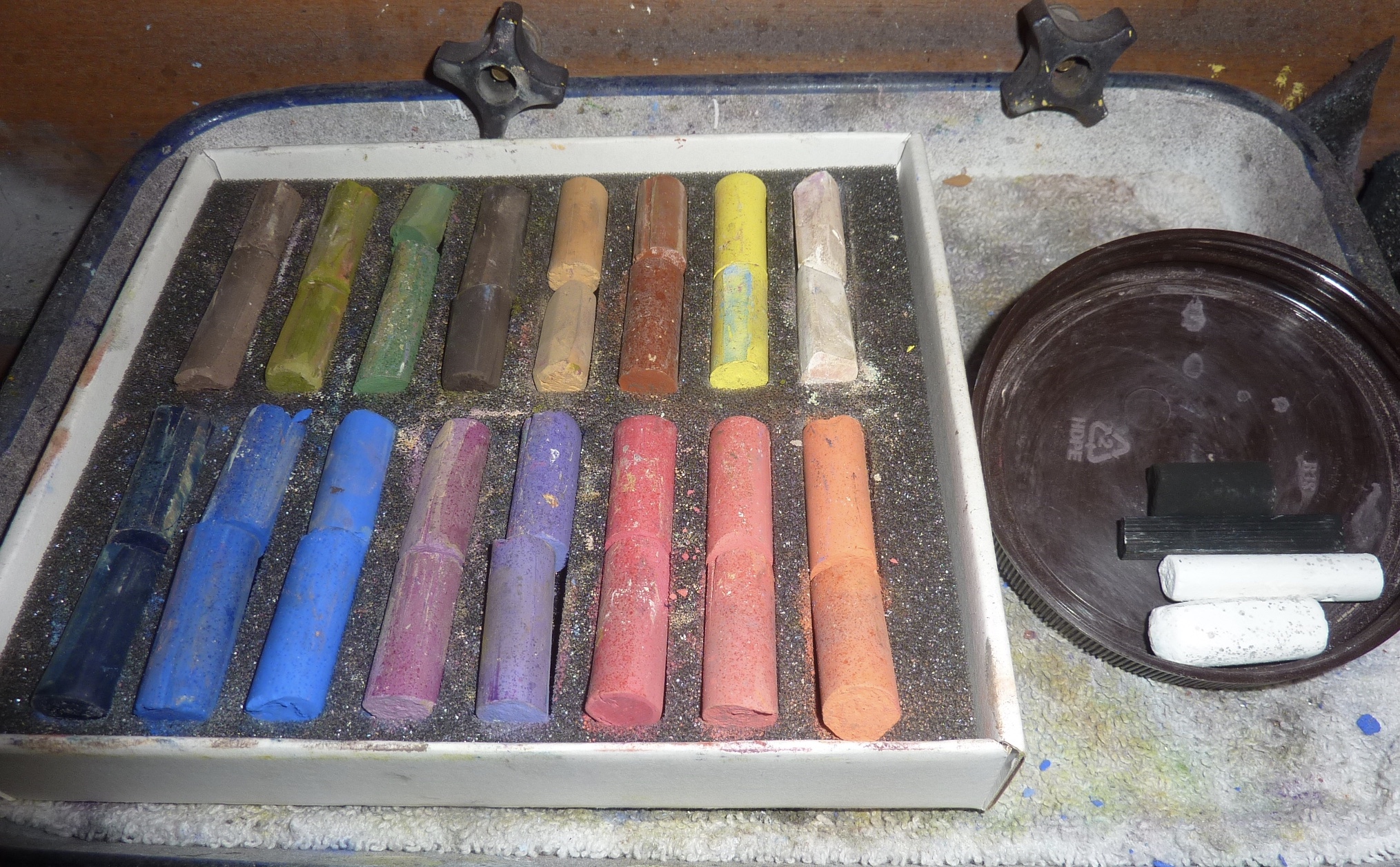
If you are just getting started with pastels you may not have many pastels or you may not wish to invest a lot of money right away. You can paint with a small set of limited palette pastels! In February 2020 on my Patreon Page we explored a budget set of 16 pastels. I am now releasing this Patreon demo video to show you how you can paint a marsh with a very limited set of pastels! Click here to watch the video on my YouTube channel:


Consider joining me on Patreon for much more on working with budget pastels sets! This year I will be reviewing moderate priced sets! I just ordered 3 half stick sets from Dakota Pastels and I can't wait to use them! 


I used the Daler Rowney set of 16 pastels for my demos and lessons. I am told that the Blick brand soft pastel is the same. You can find a similar set here:  https://www.dickblick.com/items/blick-artists-soft-pastel-set-assorted-colors-set-of-15/


Tuesday, December 22, 2020

Challenge: Use ONLY Nupastels!

        'Winter Comes Softly'                 8x10                 pastel                 ©Karen Margulis      $255 on Etsy

I have box lids filled with Nupastels in various states of use. I tend to use them at the end stage of a painting especially those with a lot of grass and weeds! But I do also use harder pastels such as Nupastels for wet underpaintings. Hard pastels don't fill the tooth of the paper as quickly as the softer pastels and don't get gummy when wet.

Last week I was doing an alcohol wash underpainting with Nupastels when it occurred to me that it would be a fun challenge to keep using the Nupastels for the entire painting. I know there are many artists who do this but I tend to want the softer pastels to give me more variety and thicker marks. Would I be frustrated with just the Nupastels?

After a successful start and a few additional layers I was tempted to end the challenge. I wanted to grab my softer pastels for the snow. But I persisted. I just pressed much harder when it came to painting the thicker snow drifts. In the end I was able to stick with the challenge and I liked it so much that I painted three more winter scenes with Nupastels only!

Will I retire my softer pastels? No! But it is great to know that it is possible to have success with the less expensive harder pastels.  Note that I used LuxArchival sanded paper which is a dream! I need to now expand my challenge to Nupastels on Canson unsanded paper!


                                        a selection of Nupastels that I used for this painting      


The painting after the first layer and an alcohol wash
                                          

Join us over on Patreon for more on using hard pastels! www.patreon.com/karenmargulis                                  


Friday, December 18, 2020

Hold Back on the White when Painting Snow!

       'Winter Sun'                   8x10                 pastel                 ©Karen Margulis      sold


I never use white pastels. Well.....maybe sometimes but very rarely do I ever use a pure white stick of pastel in a painting.  I recently bought a chalkboard and chalk (for fun) and it reminded me of how chalky a pure white pastel can look. I prefer colorful lights.  When something is supposed to be white like clouds or snow I first look for the colors that are present in the surroundings. White things reflect the colors that surround them so they rarely appear pure chalky white.

When I am faced with painting something white I reach for my favorite light pastels...Diane Townsend Soft pastels. These lights are almost white but lean towards a pale color.  I call them 'Almost Whites'.  I love love Terry Ludwig, Sennelier and Schminke Almost Whites but I seem to reach most often for the Diane Townsends. I like the ever so slight gritty texture and how it they sound scratchy when using them.


I don't use a specific color name but when I am low I just order open stock. I like to keep a pale (almost white) version of each primary and secondary color on the color wheel....red, blue, yellow,orange,violet and green.  Basically I want a warm and cool light.

The next time you are painting something white and reach for the pure white....stop and look for the color. Choose a pale light instead of the white. Reserve that pure white for the highlight if it is even necessary.


Monday, December 14, 2020

A Tip for Working on a Textured Surface with Pastels


                         ' City Sidewalks'          10x8            pastel            ©Karen Margulis     $250


I am working on a winter cityscape series and I am hooked on this surface!  I have used these home made boards in the past and I love them but I am finding them to be a great choice for these cityscapes. I made the boards by using tinted clear gesso on Canson art boards. I tinted the gesso with some mid value warm brown acrylic paint an applied it with random brushstrokes onto the board. I also prepped some boards with acrylic micaceous oxide paint which is a gritty dark gray paint. 

After working with these textured boards for awhile I have discovered some techniques that work to make paintings on the boards more successful. It can be a challenge to paint on the rough surface. Not only does the texture eat up pastels faster than smoother surfaces, the texture can be frustrating. It is difficult to get fine detail. This is one of the reasons I love the texture but if you are used to painting with fine detail the boards just don't allow it!

One of the ways I overcome this texture issue is to use hard pastels for the first few layers of the painting. I like to apply a layer of Nupastels and rub in this layer into the surface. This starts to fill in the grooves of the surface making it easier to apply subsequent layers of pastel. The texture will still come through in the final painting but it will be subtle and will add interest. The subsequent soft pastel layers go on the surface easily without getting used up as quickly!

Here is a photo of the surface before any pastel is applied. I used a variety of Nupastels to paint the first layer. I then use a piece of pipe insulation foam rub in this first layer. I love this surface and this technique and can't wait for my next painting!


 Head over to my Patreon group for a step by step demo of this painting. It is only a $4 monthly pledge that you can cancel at anytime! www.patreon.com/karenmargulis

Thursday, December 10, 2020

It is Time to Add to Your Pastel Collection!

                          'Old Town Memories'              12x9             pastel        Karen Margulis.     $275


I have a big studio box of pastels. It is a comprehensive set made of a variety of pastels covering a range of values and colors. However I like to keep some special sets separate and I take them out when a subject calls for the palette of the set. I keep my curated Floral Landscape Terry Ludwig set, the Richard McKinley set, the Marsha Savage set and the Red Rocks Landscape set. This is the set I used for the demo painting in this post. 
Here is a description of this set from the Terry Ludwig website www.terryludwig.com

From The Garden of the Gods to the Ridgebacks, this set was inspired by the majestic Colorado red rocks to capture the vibrancy of the landscape.  This 60 piece set includes all new colors and was designed as a stand-alone for the artist to work straight from the box to capture water, land and sky.  This set was released, July, 2018.

Of course it is perfect for red rock country but it is also great for a lot more landscape settings. I have put it to the test with many paintings! I decided it would be great for this recent Patreon demo. I knew the colors would be good for the adobe buildings. I did have to add a few bright pink flower colors but otherwise the set was all I needed! The full demo is available on Patreon. 


 Terry Ludwig is having a sale! All sets are 20% off until December 30th. Now is a great time to add to your pastel collection with my favorite pastels! www.terryludwig.com

Monday, December 07, 2020

My Favorite Pastel Paper for Winter Birds

             'Winter Peace'                      6x8                  pastel                  ©Karen Margulis       $135


I love to paint birds. Every once in awhile I like to take a break from landscapes and paint some birds. When I want to paint birdsI turn to my favorite surface for animals...Sennelier La Carte Pastel Card. It has just the right feel and tooth that allows me to get a soft painterly look in my animals. I can get fine detail if I want or soft dreamy edges. La Carte paper does have pros and cons but it is definitely worth trying.

La Carte is a sanded surface made by hand application of vegetable flake and cork to a 200lb card stock. It comes in 14 colors. The surface is very uniform and is able to accept many layers of pastel. I got 50 layers on my test. I would never even come close to applying that many layers.

The paper does have some drawbacks but for me the benefits outweigh these issues. It is important to know that the binder will dissolve in water so this paper cannot get wet. That means no wet underpaintings and you even need to be careful not to blow or even sneeze on the paper. Make sure your hands are dry! The vegetable sanded surface can be rubbed off if you brush it or rub too hard so I prefer not to hand blend and let my pastels do the blending. It can also be easily dented so if you press too hard with your drawing tool then you may have indented lines. I use a Nupastel for my drawing and I use a light touch. I find that I prefer to use my softest pastels for this paper and I never do an underpainting.

I don't want to scare anyone away from this paper because I actually really love it. Give it a try and see what you think! 

Information about Sennelier LaCarte Pastel Card from the Blick website:

Sennelier applies finely ground, pH neutral vegetable flakes by hand to a 200 lb, pH neutral board stock, creating a paper that is slightly abrasive, yet has a perfectly smooth and uniform tooth. This greatly enhances pigment adhesion, so that less fixative is required. It offers an excellent surface for any dry media.
Individual sheets measure 19" × 25" (48 cm × 63 cm). Use of wet media not recommended.

       'Winter Peace II'                       6x8               pastel                ©Karen Margulis          $135
 

Please consider joining my Patreon group for a $4 monthly pledge. Today I am sharing a demo of the chickadee painting! www.patreon.com/karenmargulis

Friday, December 04, 2020

New YouTube Video Release! How to Paint a Moody Winter Landscape


          'Winter in the Park'                 9x12                pastel              ©Karen Margulis          sold

This is one of my favorite winter paintings. I painted it last year for my Patreon group. I am now releasing it to my YouTube channel!  It is a 9x12 pastel painting on Uart Dark sanded pastel paper. I used a variety of pastels including the Blue Earth Nomad set which has wonderful moody neutral colors.  Click on the link to see the video. Be sure to give it a thumbs up or make a comment and I would love for you to subscribe to my channel!

                                                https://youtu.be/l7UpaxYQid8               

 Below is a photo of my demo board. I had done a small study before painting the demo. 


Here is a photo of the painting at the end of the video. I did spend a few minuted after the video stopped to add some finishing details. Look at the finished version to see what details I added. 


Wednesday, December 02, 2020

Which Comes First? Buildings or Snow? Painting a Winter Cityscape

    'Winter in the City'               9x12              pastel            ©Karen Margulis                    sold


 I love painting snow and winter and one of my favorite winter motifs is the city in winter. My son and family used to live in Chicago and I would alway make sure to make winter visits. Sometimes I was lucky and we had some snow. I cherish these reference photos as they now live here in Atlanta. (I will give up the snow pictures for that!) Today I painted from one of these photos and I had to make a decision.

What should I paint first? The buildings of the city and the trees or the snow?

The answer for me is to completely paint the buildings and trees and then cover them with snow. It looks and feels odd as the painting progresses but it is necessary so that the light values of the snow can be crisp and clean. I gradually build up the layers of pastel with wide marks to suggest the buildings and back and forth marks to paint the evergreen trees.  

Then the fun begins and I can build up the snow on the grounding on the tree branches. The final touch is to add the falling snow which I do by shaving some white pastel and creating a dusting of snow over the painting. I press this dust in with my hand with the painting under glassine paper. 

                        Here is the painting at an early stage. I have blocked in all the main shapes. 


Here is a close up of the dusting process. I use the edge of a bankers clip or palette knife to shave some soft pastel letting it gently fall over the painting. 
 

I have the complete demo of this painting over on my Patreon site. www.patreon.com/karenmargulis