Visit my Patreon Page for more painting instruction and Paint Along Videos!
Showing posts with label Autumn. Show all posts

Sunday, October 15, 2017

Sunday Studio Time: Intimate Autumn Landscape Demo Youtube Video

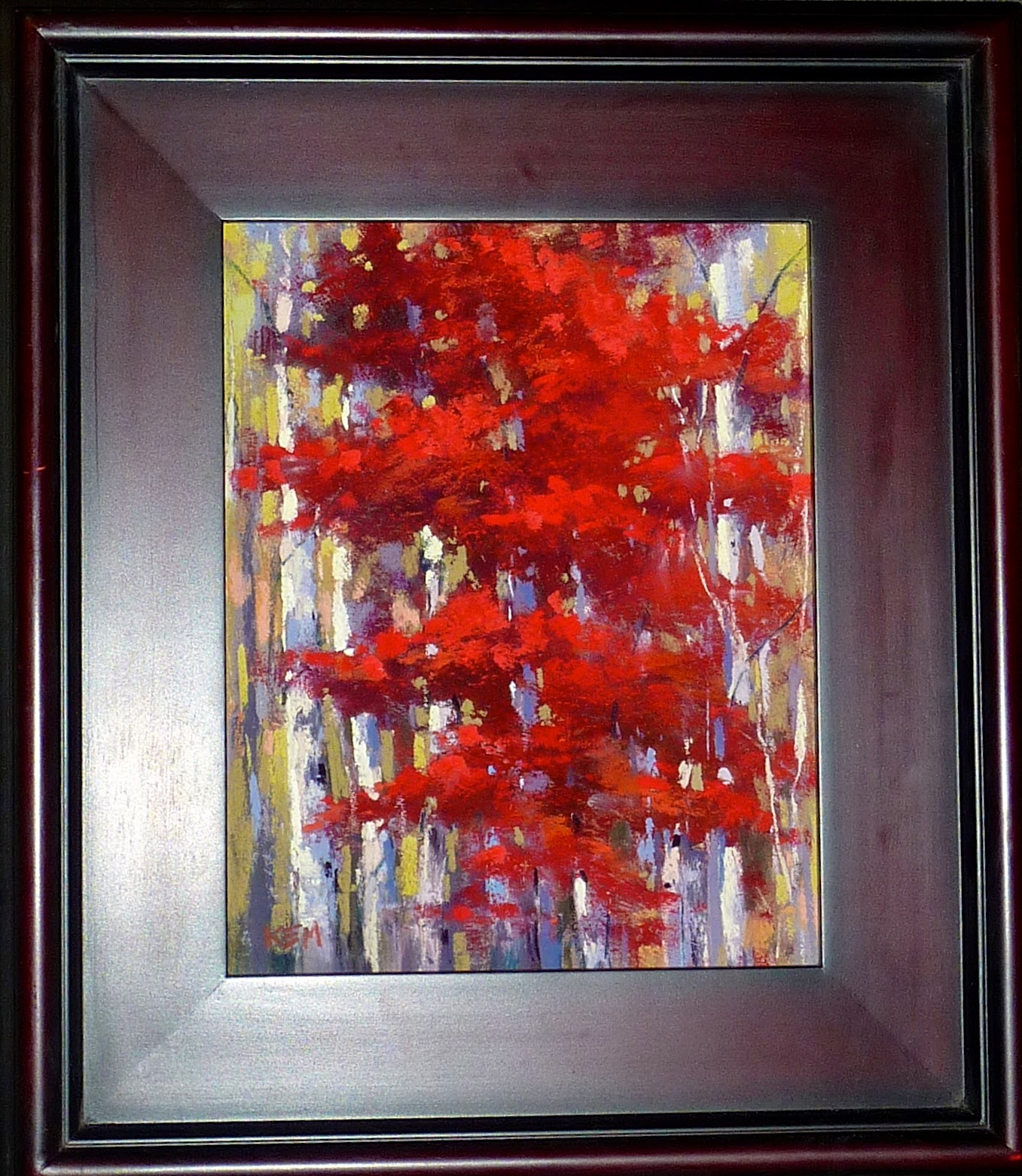
'Maine Woods'           9x12         pastel          ©Karen Margulis
available $145
I was so inspired that I had to get down into my studio to paint. The chores had to wait. Once I am home from a trip often life gets in the way of inspiration. This time I didn't let it! I threw in the laundry and immediately downloaded the photos from my New England and Canada cruise.

Once in the studio a printed put a few photos and pulled out my pastel palette for the intimate autumn landscape that begged to be painted. I thought it would be fun to paint live so we set up the iPhone to do a Facebook Live video of my painting. I had no idea how the painting would turn out but my goal was to show you how I respond to inspiration. Everything gets put on hold until I paint!


The small reference photo that inspired today's painting 

The photo above was my inspiration. You can watch the video demo here on my YouTube channel.
https://youtu.be/T6Yn2gmLH7c

Click here to see the video on YouTube
We also filmed two more videos for my new Patreon page. I have over 200 patrons now who are enjoying the extra pastel and painting instruction and inspiration. If you haven't had a look at the Patreon page you can visit it here. www.patreon.com/karenmargulis

Monday, September 19, 2016

The Ultimate Inspirational Experience

'Changes'       8x10      pastel       ©Karen Margulis
available $145
If you love pastels please keep reading. Tuesday 9/20 at noon ET is the day to reserve your hotel room for the ultimate inspirational experience for pastel artists of all levels....IAPS 12. This year the Hotel Albuquerque opens reservations before convention registration so be sure to call to book your room.


Update from IAPS: The only number that will work for IAPS reservations is 866-505-7829. Please do not try to call the main hotel number, you will not get our IAPS rate, and they will not take your reservation.


If you have attended the convention then you already know the many benefits.....great demos and workshops by the pastel rock stars, the candy store (pastel vendors), the fun and friendship of the artists, the beautiful location in New Mexico....I could go on. But if you have not yet attended the convention please consider coming in 2017.

It doesn't matter how new you are to pastels. You will be inspired!

The year I first began painting with pastels the IAPS convention was in North Carolina for the first time. An easy drive away. I could have attended but I didn't feel like I was 'ready'. I know better now. There is something for everyone and everyone will welcome you and make you a part of the pastel family. Every time since I have gone to the biennial convention. (now as a part of the faculty) Every year I leave motivated and inspired.

Make your room reservations and start a special piggy bank labeled IAPS INSPIRATION. Save your pennies for the ultimate pastel inspirational experience!


The start....big simple shapes
I welcome your questions about the convention. If I don't have the answer I will do my best to find out.  Please send your questions to me at karenmargulis@gmail.com and I will answer them in an upcoming post.

Today's painting: I used a piece of white Pastelmat. I always forget how much I enjoy this paper!

Friday, October 30, 2015

A Must Have Pastel Set for Autumn Landscapes


'Sheltered'               8x10               pastel                  ©Karen Margulis
available $145
I needed a reprieve from yellow. I enjoy yellow but two weeks of painting yellow trees left me seeking something less brilliant. I needed some soothing colors. I knew just the set to take off the shelf. I have a few special sets of pastels that I leave intact in their original boxes. I take them out when I know they will be a good fit for a subject.

The Terry Ludwig Shades of Nature set was just what I needed. It is the perfect set for the calm and soft colors of an overcast Autumn day. 

Not every fall landscape is screaming with color. It is true that on a bright sunny and crisp fall morning or afternoon the colors can be vibrant and technicolor. Everything screams for attention. It is one of the reasons why fall is a difficult season to paint well.


My Terry Ludwig Shades of Nature Set available at www.terryludwig.com

 I like the challenge of painting a colorful fall landscape but I also like to paint the quiet fall days. The days when the colors are soft and muted. The days when the ground is carpeted with wet and fragrant leaves and the cool air hints at the winter cold to come. This quiet landscape is equally challenging to paint but the Shades of Nature set make it easier. This set of 30 pastels has a wonderful assortment of the quiet neutrals that we need for the landscape. 

The underpainting is an alcohol wash on Uart 400 with a 305 Nupastel
 For today's painting I challenged myself to use ONLY this set of 30 pastels. Since there isn't a really strong dark in the set I decided to make my underpainting be the darkest value of the painting. I used a #305 spruce blue Nupastel and did an alcohol wash on Uart paper. This gave me a rich dark base for the lighter muted colors in the Shades of Nature set.

I developed the painting with a light touch so I could preserve these darks. I was pleased with the variety of neutral colors in the set and how they allowed me to interpret my photo. They were just the right pastels to give me the break I sought.

reference photo
TIP:  While the Shades of Nature set can certainly be used on their own the true value of the set is to use them in conjunction with other more vibrant colors. They will then provide the quiet spot or rest that vibrant colors need in order to pop. 


Tuesday, November 11, 2014

Mini Week: 10 Reasons to Paint Small

'Fall Fantasy 1'            2.5 x 3.5            pastel            ©Karen Margulis
sold
Why would you want to paint so small?  This is one of the questions I get when someone sees me painting these mini pastels. I can think many reasons to limit the size of my paintings every once in awhile. I've boiled them down to 10.  Enjoy my latest mini pastels as I share 5 of the top ten reasons to paint small (2.5 x 3.5 inch artist trading card size)

1: Simplify. Limiting the size of the paper limits how much I can put in. It forces me to simplify and pick out the big simple shapes. It is easier to suggest details in a smaller space. This is great practice for seeing simply that can be transferred to larger paper.

'Fall Fantasy 2'   2.5 x 3.5    

2. Color Studies: Trying out color schemes on small paper saves time and frustration. It is quick and easy to try several color scheme possibility in a mini painting. I get a good idea of the color choices before investing time and supplies on a larger painting.

'Fall Fantasy 3'         2.5 x 3.5

 3. Affordable: I love having small affordable originals for my collectors. These minis are affordable for anyone to add fine art to their home. It's a win-win. I learn from painting them and collectors enjoy collecting them!


'Fall Fantasy 4'       2.5 x 3.5 
4. Gifts:  Not only are mini pastels affordable for collectors they are great gifts for anyone. I love to gift my minis throughout the year but especially for the holidays. They are great to give to children as an introduction to collecting original art. I have also used them as table place cards for the holiday table. Put them in small frames for a great party favor!

'Fall Fantasy 5'          2.5 x 3.5 

5. Portable: This is probably my favorite reason for painting small.... I can take them with me anywhere!  I have a small pastel kit that I keep in a zippered book cover. It holds a small box of pastels, 2.5 x 3.5 inch papers, wipes and a small piece of foam core.....I can throw this in my car or backpack and I am ready to paint anywhere!

I will share 5 more reasons and 5 more Fall minis in tomorrow's post.  All of the minis are available for purchase in my Etsy shop. $15 each. click here to purchase

Sunday, November 02, 2014

Changing the Mood of a Landscape Painting

' Autumn Moods'            12x18              pastel               ©Karen Margulis
sold
It was a blustery autumn day. The heat was on and it was warm and cozy in my studio. I was painting some fall trees as a demo for a private student. We did an oil stain underpainting and then resolved with pastel. It was a great morning and my student enjoyed the demo and did a very nice painting herself. The original demo painting is below.

Demo painting version #1
 After my student left I returned to the demo. Something about the painting was bothering me. It didn't fit the mood of the day. The painting  had a blue sky and crisp bright fall foliage. It represented a sunny fall day. But I was in the mood for moody! So I decided to change the painting. It went through several changes before I settled on the final version. I thought you might enjoy a behind the scenes look at the evolution of this painting.


Version #2 

The first thing I did was brush off much of the pastel to restore some of the tooth of the paper. I then sprayed the whole painting with workable fixative. I wanted to simplify all of the trees.  I felt like they had gotten too fussy. I then made some of the trees a darker orange. I simplified the bank with some bigger strokes. No. This wasn't what I wanted. (version #2 above)

Version #3

Maybe the trees were too dark and red. I decided to make them a duller orange and added some dull greens in some areas. I added some purple to the shadow areas. Hmmmm. No that isn't it either. It was still too sunny and bright. How could I make it cooler and moodier?  How could it match the feeling of the weather outside my studio?


Final Version
I sprayed the painting again with workable fixative. I decided that to change the mood I didn't really need to focus on the tree color alone. I needed to change the SKY. The sky sets the mood and tone of the painting. I took some lavender and a dull pale blue-purple and changed the color of the sky and the water. Then I addressed the color of the grasses and foliage. Ahhh now that's what I wanted!

There may not have been a need to change the original painting but it wasn't what I felt. It was a copy of my student's reference photo. The final version represents how I wanted to imagine the scene. It just took me several changes to get there!

Wednesday, October 29, 2014

Tips for More Lyrical Trees


'October's Song'           11.5 x 16             pastel            ©Karen Margulis
painting available $175
 Skyholes and Lyrical Limbs. Two of the things that I concentrate on when painting trees. When a tree is the focus of my painting I want to be sure it stands out as the star. I want this tree to have life...to dance....to be lyrical. Slowing down for skyhole placement is key and I will address this in another post. Then there are lyrical limbs.  What are Lyrical Limbs?

Below is a photo of non-lyrical limbs. This is a stiff and rigid tree trunk and branches.  We often create this type of tree when we draw the trunk and branches with a thick/soft pastel and we use too much pressure.

Stiff and boring trunk and limbs

This type of tree skeleton often leads to stiff and ordinary looking trees.  I try to avoid these dark and heavy trunks and branches in my trees. Below I have done some more Lyrical Limbs. These trunks and branches are drawn with a lighter hand and with the edge of the pastel stick.

Lyrical limbs dancing on my paper

How To Create Lyrical Limbs
  • Relax your grip! Hold the pastel stick loosely in your hand so that you can draw with more freedom. 
  • Dance. Use a light touch and allow the pastel to dance across the paper creating broken lines. 
  • Avoid pressing down to hard which leads to dark and heavy lines.
  • Use the sharp edge of the stick. I sometimes will use the sharp edge of a hard pastel to paint the thinnest branches.
  • Keep repeating "Lyrical Limbs, Lyrical Limbs, Lyrical Limbs" to remind yourself to loosen up!
  • Play some music to get you in a relaxed state of mind.


skyholes and lyrical limbs together


my reference photo
Painting Notes: Painting is on mat board with clear gesso toned orange. Workable fixative was used in the build up of the pastel layers.

Tuesday, October 28, 2014

Simplify Autumn Trees with Clear Gesso

'Call Me Crimson'             8x10          pastel            ©Karen Margulis
painting available $145
 It's a toss up between autumn and spring. Both are challenging to paint. There is so much color and texture. In both seasons the trees put on a show. Some years are better than other but every year I am still challenged by the display.

The biggest problem I have in the fall is wanting to put too much into my paintings. I want the red tree and the fiery orange tree and of course I love the yellow ones.....and they are often found all together. How to edit this overload of information?


  • I first remind myself that all color is no color. I don't want everything to be screaming with color. One of every color tree might be overload for a painting. Why not keep it simple and concentrate on just one tree or a small grouping. I don't need them all in one painting!
  • I keep my trees simple by thinking of each tree as a lump of clay. I shape it into the general shape of the tree and block in the big simple shape. I use negative painting to carve away at the tree making the shape more interesting. (more on this tomorrow)
  • I don't paint every leaf. Instead of painting lots of leaves I use texture to suggest foliage. One of my favorite ways to get texture is to work on paper prepared with clear gesso. The clear gesso is gritty and provides texture. I apply the gesso with a gesso brush in random strokes. You can prepare the entire board with gesso or just the tree shape. Let it dry and paint. The pastel will go over the rough gesso and will appear textured/broken strokes.


Painting notes: This painting is on a piece of mat board prepared with Liquitex clear gesso. It is 8x10. There is no underpainting though I did blend the first layer to push it into the grooves of the dried gesso. 

Wednesday, October 22, 2014

Confessions of a Seasonal Painter


'Reflection'             9x12            pastel            ©Karen Margulis

I am a seasonal painter.  I love painting the landscape in every season. Every season has moments that inspire me.  I love the colors of fall. I LOVE painting snow. Spring brings flowers and summer brings long days and Queen Annes Lace.  But.... I only like to paint each season in that season. I can't wait to paint snow but I need to wait for winter. I am funny like that.

Maybe it is because being present in the season inspires me. When I am surrounded by the smells and colors of fall and the first crisp clear days I want to capture these feelings in a painting. Sure I can look at photos of snow in the heat of summer but unless I am on top of a snow capped peak somewhere in the arctic.....I don't feel inspired to paint it.

It's getting cooler in Georgia and the leaves are starting to turn. The smell of Cinnamon brooms and pinecones greets us in the grocery store. This is a sure sign of fall. It feels only right that I should paint autumn landscapes. 

watercolor underpainting
The wonderful thing about being a seasonal painter is the excitement of revisiting a favorite subject as each new season arrives. It is always interesting to look back on previous years to see how I painted the season. How have I grown as an artist? Are my autumn trees changing? How? The answers to these questions are important. They help me understand where I have been and where I am going.

As fall arrives I begin my annual reflection and begin a new series of fall paintings. After a few weeks I will have exhausted this subject and will look forward to the next season.

Painting notes:  9x12 white Wallis paper with a watercolor underpainting.

Monday, December 01, 2008

A Touch of Gold

'A Touch of Gold' 8x10 pastel
This is my demo painting from my Autumn workshop a couple of weeks ago. I did get to paint in between cleaning out the studio this weekend but it was on a big commission. I will share it when I am finished...hopefully later this week!

Friday, November 14, 2008

Painting the Autumn Landscape

'A Peek of Red' 8x10 pastel

Tomorrow I am teaching a mini workshop on painting the colors of Autumn and I am looking forward to a fun day of art. Our fall colors have been great this year and just last week we took a drive to the mountains and I came home with 350 photos! I have lots to share with my students and will report back on the workshop later this weekend.

Check out the post below for more information about my Daily Painting Sale which is on until November 30th.

Wednesday, October 29, 2008

Autumn Field

'Autumn Field' 8x10 pastel
I was surprised to discover this little bit of summer in the middle Autumn. There were still a few blooms among the rusty colored dried flowerheads and they looked so pretty against the soft colors of the fields. I enjoyed painting my kind of Autumn landscape!

Saturday, October 11, 2008

Autumn Pond ACEO

Today's painting is a mini....aceo collectable size painting that is 3.5 x 2.5 inches. This was a very busy autumn scene that I tried to simplify. There were so many trees surrounding this pond in so many wonderful Autumn colors. I can't wait to get out and do some plein air paintng this fall! I have my new artcomber and easy-l easel so I am ready to go!


Buy this painting on PayPal
Price: $35 USD
Or, send me an email

Wednesday, September 10, 2008

A Taste of Autumn

'A Taste of Autumn' 14x11 pastel
Fall has not yet come to Georgia but I am ready for it! I am looking forward to opening the windows and taking out my fall clothes! This is painted on UArt paper which I am really enjoying!