
 |
| "Morning Drama' 5.5x5.5 pastel ©Karen Margulis sold |
I like to travel light. Dragging around several pieces of luggage and a pile of art supplies can get old. For each trip we take, we pare down more than the last one. We have gotten to where we can fit our clothes into a tiny duffle bag that Jayne found for us at Walgreens of all places!
When it comes to art supplies I want the bare minimum. Just enough pastels and paper to allow me to do a quick study everyday. The kit I made for my Southwest trip was perfect. See it here. Now we have Stan Sperlak's Gogh Box which is a bit bigger but it is self contained. The box comes with an empty Terry Ludwig box for 30 pastels. Now comes the hard part.
How do you choose just 30 pastels for a painting trip?
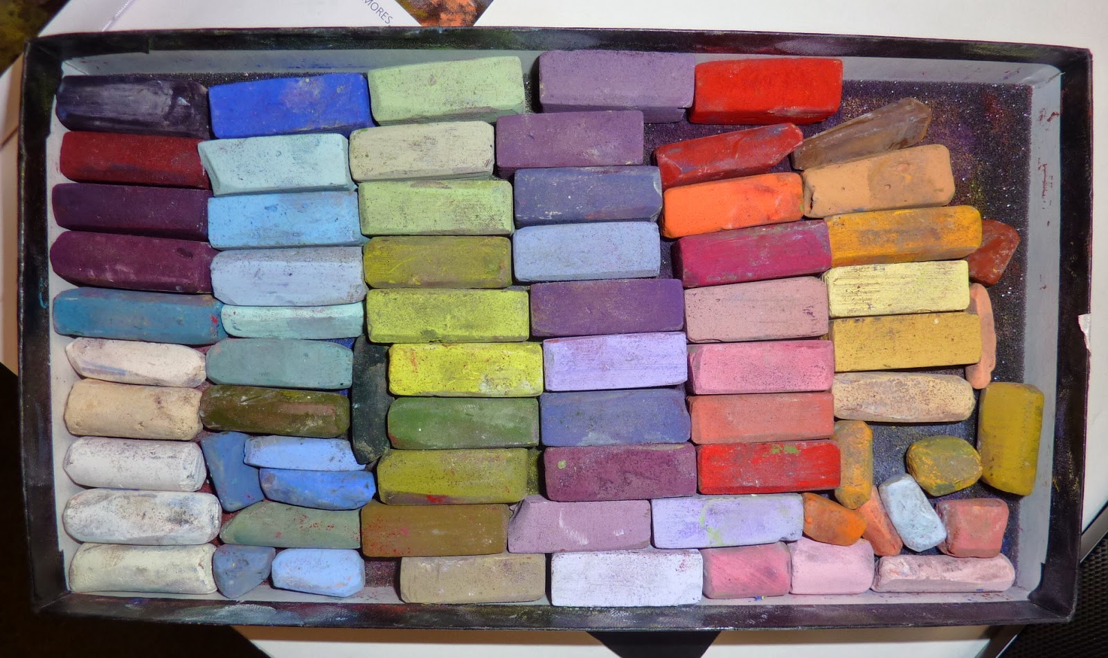
- I started by removing the foam divider in the box so I can fit more pastels and odd size pieces.
- Next I choose a few darks....maybe a blue, green, purple and red.
- Then I choose a few light values of these colors.
- I put in a super rich dark such as a Terry Ludwig Eggplant and a couple of very light pink, peach and yellow (almost whites)
- Now I need to fill in my set with some middle values. I know I want some grayed down colors such as mauves and dull purples.
- I make sure I have some good blue sky colors since I will be focusing on the landscape.
But how do I decide what the majority of these middle value colors will be? I need to know what the landscape of my destination will look like. At many locations the colors will change with the season so the colors for the Fall will be different for the colors of Summer. This is very true of coastal and marsh areas. The grasses are quite different in each season.
Here's my Tip....... Check to see if there is a WEBCAM of your destination. This will give you up to the minute photos of the area. I am watching the webcam of the marsh near Pawleys Island and can get a better idea of the colors If the landscape in real time! OR even better if you have a friend or contact in the area ask for a current photo. One of my friends is already at Pawleys and she sent me this photo shot this morning.
Now I have a better idea of what colors I will choose to fill in my travel set. I will have a wide enough range of values to allow me to paint just about anything but with colors tailored to the current colors in the landscape.

BONUS TIP: After you choose your colors try them out on a small study...paint from the webcam image. Make adjustments to your set based on what you discover. Today's painting is a study done from the photo my friend sent me this morning.
5 comments:
what color is your paper for this painting, Karen?
Gloria, it is on a piece of dark brown La Carte paper.
Great tip about the web cam Karen. I too can't stand humping around every color of the rainbow every time I go out. (Even with watercolors.) I'm always looking for ways to pare down. Thanks for the hint.
Thank you. I like the way the background frequently shows through in your paintings. I have started using other pastels to "smooth" over areas, instead of my fingers at your suggestion, too. It is funny to me because I have always had a compulsion to cover every bit of the paper. But I am starting to like it.
I am also trying to use a lighter hand.
Hi Gloria,
Thanks for sharing! I'm glad I have been helpful!! Keep on painting!
Post a Comment