Visit my Patreon Page for more painting instruction and Paint Along Videos!

Saturday, August 31, 2013

Making Time for Quiet Contemplation

'A Place to Unwind'         6x6        oil on panel         ©Karen Margulis
sold
I took a last minute trip to the mountains this weekend.  I needed a brain dump.  I have been working at a frenzied pace for the last two months. I needed to. I came back from my Southwest trip so inspired and recharged and I had to act on all the things that were percolating in my head.

 I am not done either. But I need to take a break even if for a couple of days. I know artists who force themselves to take a break once a week. They won't paint on this day off and will do something else they enjoy. I know that may sound crazy.  Don't I always encourage you to paint often!  But when you spend 12 hours a day in the studio (and love every minute) sometimes you need to break away for your own good.

What I've learned from my month aways from the studio is that the time in a new environment allowed me to completely relax and be receptive to new ideas. I came back renewed and refreshed.  It also allowed for a bit of a technology break...no radio, tv or constant internet. No constant chatter. This allowed my own thoughts to come forward. Quiet contemplation is necessary for growth.

So this weekend I will spend time with family and friends and a good book. I will bring my road trip pastel kit just in case but I won't feel like I have to paint.


Friday, August 30, 2013

Miles of Canvas Revisited

'There is Beauty'          6x8           pastel            ©Karen Margulis
click here to purchase $100

"If you look into the past of a successful painter you will find square miles of canvas"
-Charles Hawthorne

 Old friends are golden.  The scene in today's painting is an old and dear friend.  If you know me or have followed my blog for any length of time you may be familiar with it.   It is the subject of my 'Miles of Canvas' variation challenge I did back in the fall of 2009.

I painted this scene from a black and white photo 100 times.  100 5x7 paintings completed over a 3 month period. I used many types of paper. Many pastel techniques. Many styles and color palettes. It was the best thing I ever did for my art. I recommend it to anyone who is seriously committed to being a better artist. (see some of my original challenge paintings here)

Today I was looking for something to paint and came across the original black and white photo from the challenge.  It was time to revisit my old friend and put a new spin on it. To see how I have grown as an artist. To see how I would approach something I knew like the back of my hand.  It was a wonderful visit. I can't wait to visit the actual place in September....and see it with fresh eyes. I am thinking much more is to come!


What are you waiting for?  Start your own variation challenge. I promise you will learn more than you could ever hope for!

Thursday, August 29, 2013

Studio Tip: Keeping Your Pastels Clean

'Walk with Nature'          9x12            pastel           ©Karen Margulis
click here to purchase $150
"In every walk with Nature one receives more than he seeks."  John Muir

I may have a dusty box of pastels but I do have to paint with clean ones.  In a perfect world I would carefully wipe each pastel clean after each use and put it neatly away in it's spot. It would be fresh and clean and ready to go for the next painting.  But I am not that neat or organized.  I paint with passion and when I am painting the dust may be flying and there is no time to be neat.

I can't paint with dirty pastels though.  I may contaminate an area or make unwanted marks in an area. I may not even know the color I am using if it is very dusty.  So I have a system.  I simply wipe off the pastel in between every passage. It has become second nature.....put down a mark, lift and wipe. It is rote by now.  Even if you are neater than I am it is a good habit to get into. It keeps your paintings fresh and clean. Think about painting a sky for example. As you get close to the treeline your pastel may pick up the colors of the trees. If you don't wipe and keep painting the sky you will dirty the sky with tree color. So, make a mark, wipe and continue painting.

 Some artists use paper towels for the wiping but I prefer to use a soft dish towel. I have a basket of old dishtowels and I use a clean one for each painting.  I throw it over my shoulder where it is handy for wiping my pastels.  At the end of the week I throw the dusty towels in the wash and they come clean!


Recently I came across a set of seven dish towels with the name of the weekday on each one. I had to have them. (only $5.99 at Bog Lots)  Now I have a new towel for each day of the week!  Sometimes it's the little things that make me happy!


Today's painting is a variation on the black and white photo exercise I did earlier this week. For this version I decided to make it Autumn!  This is 9x12 on Wallis Belgian Mist. See the Summer version here,

Wednesday, August 28, 2013

Making Lemonade with Pastels...Painting Lurie Gardens


'Garden Respite'           10x10         pastel       ©Karen Margulis
click here to purchase
 Sometimes you just have a mess on your hands. A failed painting or perhaps a study destined for the trash. And that is exactly where these things go....in the trash.  But I have a thrifty side especially when it comes to paper.  I don't like to throw away good paper even if it is covered in a mess!

I know I have written about rescuing a failed painting before but I believe it bears repeating.  If you have a lemon on your hands.....
Make Lemonade!

Late me share my latest attempt at saving a piece of paper.


Here I have a nice piece of Uart sanded paper. I had used it for my You Tube video on Mark Making
I didn't need the demo paper anymore and was about to trash it when I stopped.  I love this paper and I know it takes abuse so why not do something creative with it.

Out came the rubbing alcohol and my stiff well worn bristle brush.  I cut the paper into a square and washed in the pastel marks with the alcohol.  See the results below.


Look at all those yummy drips!  I even like this as an abstract. In fact I almost left it alone. Hmmmm now that gives me an idea! Let me write that down before I forget.
But instead I looked at it to see what it might become. I saw it as the perfect backdrop for some wildflowers.  I took out my wildflower photos and settled on one of Purple Coneflowers from my favorite garden...Lurie Gardens at the Art Institute of Chicago. I turned the paper upside down and took out my pastels.

I worked hard at not covering up all the green and approached it incrementally as suggested by Richard McKinley. See Richard's timely post on underpaintings here.

Next time you have a mess....make lemonade!

close up detail

Tuesday, August 27, 2013

How to Change the Mood of a Painting

'Wander Here in Summer'         9x12           pastel         ©Karen Margulis
sold
 Early morning and we were up looking for moose. Or Bear or Elk. Any creature would be just as exciting. It was chilly with dew on the grass. But the air was pure, crisp and exhilarating. The promise of another wonderful summer day and we wandered around taking photos.

So when it came time to finally paint this scene (which by the way is a fresh in my mind as the day I took the reference photo 3 years ago.) I needed to try to capture this mood. ..One of soft, cool quiet contemplation. That was my 'what'.  Now I had to decide how I would accomplish that.  start with my paper choice.


I chose a piece of Wallis sanded paper in Belgian Mist color. This is a nice medium gray surface that works well for anything. And it was already cut to size 9x12 so an easy choice.

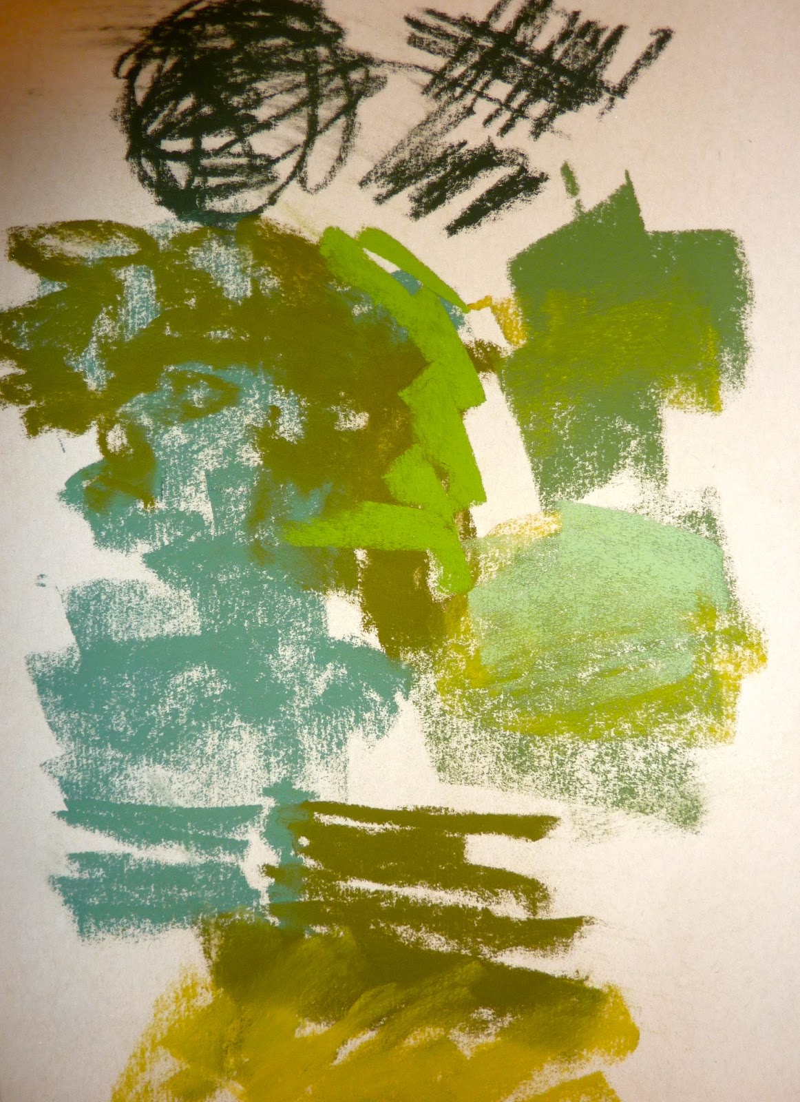
I did a quick drawing with compressed charcoal. This keeps me loose yet committed. I like the charcoal  when I want to be bold.
 Now for the Block-In colors....I like the term Block in for the first layer of pastel instead of calling it an underpainting. Some think of underpaintings as being wet even though they aren't always wet so 'Block in' prevents this confusion.


Block in with cool colors...Nupastels

I often write about block in colors and how they influence your color choice and the ultimate look of a painting.  But so often we don't take the time to think about our first layer color choices and just start right in with the local colors we see. We are missing out on an opportunity to make our paintings more interesting.

I often choose warm block in colors...reds and oranges... when I have a very green landscape. It introduces the excitement of the complement but it also lends a sunny warm feeling to the painting.

For this painting I wanted a cool crisp mood and not warm and sunny. So this time I chose cool colors for the block in. I used blues and purples and a bit of red purple. These are all good colors to lend a touch of cool to my scene. I also ended up using a lot of cooler greens and purples in the top layers.

If I had used warm colors for my block in the mood would have been different! Take time to think about how the colors of your block in layer will effect the rest of the painting!

Anyone care to guess where this landscape is?

Monday, August 26, 2013

Pastel Mini Demo...Landscape Painting from a Black & White Photo


'Keep Close to Nature's Heart'        9x12         pastel         ©Karen Margulis
SOLD
"Keep close to Nature's heart... and break clear away, once in a while, and climb a mountain or spend a week in the woods. Wash your spirit clean."
- John Muir quoted by Samuel Hall Young in Alaska Days with John Muir (1915) chapter 7


 Are you up for a challenge?  Want to have fun with color?  Want to feel liberated from your reference photo?  I have a good exercise for you to try. I did it myself today and had so much fun.  Take your reference photo and make it black and white. You can do this in most photo programs or simply make a black and white copy or print out a color photo in black and white.

The idea is to rely on the value of the shapes to choose your colors. Remember that if you get the value correct then you can get away with any colors even if they are not what we consider the real color of the thing we are painting.  So if you want a purple landscape....go for it. The black and white photo makes it easy to be creative with color.  You aren't influenced by the colors you see in the photo. Read on for my mini demo.

My reference photo....Hope Valley California
This photo was taken in the Fall. The grasses were dry and turning color....they were very much golden in color. No more greens of summer present. I decided to make the landscape a summer scene with lots of green. Since I only can see the dark and light areas and not color it will be easier to do.

Dry Underpainting and charcoal drawing
I start with a rough drawing with compressed charcoal. I like this when I want to be bold and direct. I then choose a warm underpainting in reds and oranges to complement the greens I will be using. This is a dry underpainting using Nupastels rubbed into the paper.


Adding the darks

I am using terry Ludwig pastels for this painting. I begin by blocking in all of the dark shapes. I use purple and dark blue and dark greens. I use a cool blue green in the shadowed areas of the grass.

Putting in the sky, trees and mountain

The next step is to establish the sky.  I chose a combination of blues for a nice summer sky. I block in some warmer greens in the trees keeping the light consistent for the light source.  After that I used some distant mountain blues for the mountain shape. I added some air holes of this same blue behind the trees.

Finishing touches
 The rest of the painting progressed with me putting in the green grasses and path.  I started in the back and worked my way to the foreground.  I used cooler greens in the distance and cooler darker greens in the shadows. I used a dark peach for path shadows and lighter peach for the sunlit areas of the path.

The final touches included a few blades of grass and some pebbles in the foreground and some punctuation marks of blue and orange in the trees. These are my little touches of eye candy.

I just might use this same black & white photo and paint it in each of the four seasons. Now that would be a fun challenge!


Sunday, August 25, 2013

Why Bother with Underpaintings When They End Up Getting Covered?


'Just Another Beautiful Day'            11x14          pastel         ©Karen Margulis
click to purchase

Is it a waste of time and effort?  I spent an hour doing an alcohol wash underpainting and waiting for it to dry.  I chose colors and carefully brushed it in. I ended up with a vibrant underpainting with some great drips.  I was excited to start adding the pastel. 

But in the end most if not all of this underpainting was completely covered by my pastel layers. What's the point?  I am often asked about this. Why bother with an underpainting if you're going to cover it up anyway? It isn't a waste of time at all. Here are  my thoughts on this....


First of all with some planning and restraint you can leave a lot of the underpainting showing if that is your goal. Often it is my goal but I get carried away with pastel and the next thing you know the underpainting is hidden.

Restraint is the key. 

If there is an area of the underpainting you really like don't touch it!  Try working in your area of interest with the pastel and then you might not need to add much pastel to the unimportant areas.  Or add a very light layer of pastel in the same color and value of the underpainting you like. This way you have added some pastel but preserved the feeling of the underpainting.

But if you find yourself covering everything up don't fret about it. I believe the colors, values and movement that you established in your underpainting will have influenced and guided the choices you make with the pastel layers.  It gives you something to work with and respond to. It is less intimidating than a blank piece of paper.  It is a set up for the painting. I often say it feels like cheating because with a wet underpainting down, half the painting is finished already!

Unless you use very heavy strokes chances are that bits and pieces of the underpainting will be peeking through your pastel layers so there is a definite influence! And you can always add back the underpainting colors to your top layers of pastel as I did in this painting. I covered up the underpainting but I introduced the same salmon color in the final layer.


Do you have any tips for preserving an underpainting? Share them in the comments!

Saturday, August 24, 2013

First Steps in Painting a Bird ... Great Blue Heron Painting


'Great Blue Waits'             12x12               pastel            ©Karen Margulis
sold

I was in the mood to paint a bird. I just never know what I will feel like painting when I go into my studio. Sometimes I have ideas planned and something will catch my eye and the plan goes out the window!  So today was for the birds!  I wanted to do another 12x12 closeup of one of my Pawleys Island birds. I chose this juvenile Great Blue Heron. (He doesn't have as much white on his head and his dark band isn't as dark as an adult)


Here are the steps I take once I decide on my paper and subject.  
  • I look at the photo and do a quick pencil sketch. I have to be accurate with my drawing and will measure as needed.
  • Next I use a piece of compressed charcoal to redraw the bird. I just enjoy the bold lines of the charcoal so it is a personal choice to put them in.
  • Now I decide how I will treat the background...I decide it will be water so I put down a thin layer of orange and blend it in. This will be the underpainting. I put some of this orange in the heron so the two areas will have some harmony.
  • The first thing I paint is the heron's eye!

Putting in a light underpainting of orange to help harmonize the heron with the background and finishing the face

Deciding on the background and painting the main features are important first steps. It is the eye of the bird that brings it to life. I want to be sure I get the eye right. I like to focus on the eye and beak area since it is usually the area of focus.....we are drawn to the face. It also is disconcerting to try to paint a bird with no eyes! So they go in first.

I also like to at least begin the background.  First because the colors you have in the background will effect how the colors will appear in the bird so if I were to wait until the end of the painting and then throw in a background, all of the color relationships I have already established will change. I need to work on the background at the same time as the bird.

Waiting to put in the background at the end can also lead to the bird looking cut out and pasted on a background. It is hard to get them integrated. We are often too tentative around the edges of the finished bird and might even end up with a halo effect.

Midway through the painting process
Once the features are refined and the background is started I just continue to layer colors in the heron. I work by building up each area of light, dark and middle values. I can layer several colors lightly to get more interesting color....so my heron is made up of several blues and purples and not just gray!

If you would like to paint a bird or animal using the step by step method I use you may be interested in my demo download on painting animals. The demo is a cat but the technique can be used for any animal Check out the painting demo in my Etsy shop here

Friday, August 23, 2013

3 Tips for Painting the Magic Hour from Photos


'They Call it Magic'           9x12            pastel         ©Karen Margulis
painting available $145 on Etsy
They don't call it the Magic Hour for nothing. You know, that wonderful time of day when the sun is low in the sky....ready to set...and sets everything on fire with warm color.  Photographers love it. Artists love it. But it is often too fleeting to capture it in a painting on location.

The light changes so quickly and often so dramatically that it is a challenge to paint fast enough to capture the glow. (technically the Magic Hour last more than an hour and is a great time to paint outside but when the sun is about to set or has just set this is a time of rapid change)

Photos can help but sometimes even photos fail to capture the magic of being there.  Have a look at my reference photo for today's painting. It doesn't come close to capturing the wonderful orange glow that I remember. It hints at it. It reminds me of what it felt like to be there at the edge of the marsh on that evening. But I know I will have to exaggerate things in my painting. Read on for my tips.


my reference photo

reference, small color study and underpainting

During the Late afternoon Magic Hour the light becomes very warm. This warm light imparts the orange glow you see.

  • The first tip is to take time to study the light and color changes during the magic hour. Go outside and sit in one place for awhile. Pick out a tree or something in the landscape and watch the color shift. Make mental notes or jot down your observations. Consider making color swatches of the colors you see.  The time you spend observing will help you better interpret your photos. Sorolla said that painters need to be truthful cameras...to be able to see colors as they actually are and not what we think they are. For example a green bush at sunset can look orange not green. We have to be able to see this and not just use the known local color of the object.  Actual observation will help us see better.
  • Consider starting the painting on a warm toned surface or doing an underpainting with warm colors as I did for my painting.  This puts down a warm color that will tied the whole painting together. Allowing bits of the underpainting peek through helps give the sparks of late afternoon glow.
  • When you see a color at the Magic Hour feel free to exaggerate it.  This is the time to use your pure reds. oranges and yellows.  Even colors in the shadows can be more vivid.  
You may be interested in my post about the magic hour here.  Thank you also to Robert Genn's weekly letter about the magic hour for these thoughts.

Thursday, August 22, 2013

Jumpstart your Painting with this Color Idea


'Magic Happens at the Day's End'              11x14          ©Karen Margulis
purchase painting with Paypal HERE $165
Sometimes it is the color that inspires me.  I'm often asked how I come up with my painting ideas every day. I don't always feel particularly inspired and I might go through piles of photos and nothing speaks to me. But color can get the creative juices flowing and jumpstart a painting.

Yesterday I came across a fabric swatch I liked online. I can't find it now but I liked the colors so I made a little color notes of similar colors with my pastels on a scrap of paper.

I still didn't have a subject in mind! And I wasn't sure what I was in the mood to paint. I went through several more piles of photos and nothing was clicking. Finally I came across the photo below and I knew it would be a good subject to use with my color swatch.  The color swatch did it!

Now I had a scene I could get excited about and I had color palette to inspire my color choices.  I was ready to paint!

reference photo, color swatch and underpainting
 I decided I would put some of the colors in the swatch in an underpainting. I used some red, orange and purple  Nupastels rubbed into Canson Mi Tientes paper.  I then blocked in the darkest shapes with my soft pastels. I used all Terry Ludwig pastels.  Below is a shot of the underpainting and the dark block in.


I had my camera out but neglected to take any more progress shots. Sometimes you just get into a painting and forget to stop for photos!  But I finished the tree lines next and then finished the sky. The lower dead marsh grasses and water came next. The distant marsh grasses were put in last.

How did the color swatch influence me? I would say it inspired me and got me started.  I didn't use exact values of the swatch but variations instead. I didn't use the pale blue and I added a bit of green.
The most important thing it did for me was inspire me to do a painting. The colors excited me enough to get up from the computer and paint!  And anything that can whet your appetite for painting is a good thing indeed!

The next time you are at a loss for something to paint or aren't feeling motivated....start with the color first!


Wednesday, August 21, 2013

Read this if You are Frustrated with your Paintings


'Where the Bison Roam'             11x14         pastel              ©Karen Margulis
sold
 It is easy to get frustrated with your paintings. Even if you are not frustrated I have some great advice to pass on.    When you are learning often the visions of how the painting should look don't match what you actually paint. Your skills don't yet match your visions.

Even if you are an experienced artist you can have moments of frustration. Sometimes it seems as if you can't paint anything decent. Frustrations can lead to artist block.  We all go through this and there are many reasons.  But there is one really good remedy for overcoming frustrations.....

Just keep Painting! 

 Yesterday's letter from Robert Genn was a gem that I just have to share. If you aren't familiar with Robert Genn and his Twice-Weekly Letters  , be sure to check him out and sign up. I always enjoy what he has to say but yesterday's letter really struck a chord.  I meet so many artists who struggle with frustration and painter's block and his advice is one I will be sure to recommend.


In his letter Robert shares that one of the causes of this blockage is something he calls "Educosis" which in his words is too much theoretical knowledge with very little actual easel time.  We all know how important it is to put in those miles of canvas. It is really only with lots of paintings under our belts that the education and theoretical knowledge starts to become intuitive and we begin to make paintings that consistently please us. We need to balance the knowledge with practice time!

Robert has exercises he uses in his workshops to bypass these blockages and he shares one in his letter. It just so happens to be one of the things I love to do. Set a timer (his is for 37 minutes) and paint a painting in 37 minutes. Depending on how much time you have in the studio paint several smaller paintings or if you have less time set the timer for less time and just paint one. The point is.....paint! Even if it is just for 30 minutes. 

If you want to experience less frustration than you need to make that commitment to spend more time actually painting and not fretting that you can't paint!   (and if you are new to painting or a new medium, it is just as important to paint often)

Thanks Robert for the reminder!

underpainting for today's painting which is on Wallis Belgian Mist

Today's painting is from a wonderful trip I took with my art friends to Grand Teton National Park a few years ago. I am feeling the pull to return and explore this gorgeous area again.

Tuesday, August 20, 2013

The Benefits of an Unorganized Palette

'Rich Silence'             8x10            pastel        ©Karen Margulis
click here to purchase $145

It looked like someone had dumped out my pastels.  I looked down at the messy pile of pastels I have been working with lately and wondered what on earth had happened.  I am usually very organized with my pastels keeping them in a somewhat orderly arrangement by color and value. I usually choose the pastels I am working with and line them up neatly on a butcher tray.

But the past few months I have gone astray. I have been working from a big messy pile of random pastels.  And I am enjoying every minute! 

My Energizing pile of pastels
It reminds me of something I heard Albert Handell say at the very first workshop I ever attended. I was so new at painting and pastels that a lot of what he said didn't click until years later including this.  In the workshop he talked about the importance of having an organized box of pastels. He showed us the Heilman box and how to organize our pastels by color and value.   I embraced this idea (and bought the Heilman box) and it was one of the best things I ever did for my art. I highly recommend it too.

But the funny thing I remember is that Albert didn't work from a neat organized box. In fact it was a box full of pastels much like my messy pile if memory serves me correctly.  And he said an interesting thing. He liked working from the unorganized box so his eyes wouldn't get sleepy. That's what I wrote down. I had no idea what he meant.  How could you find the color or value you needed in that mess!?

I get it now! My messy pile has been energizing.  I have to work at finding colors that will work in the painting. I find I make unexpected choices this way. In my organized box I know where everything is and I often tend to make the same choices over and over. I choose my best friends to play with!

In a messy box I might see a color that I have overlooked or I might need to dig around for the right value and choose a value that works but not the color I would have ordinarily chosen.  Working from a messy box keeps me on my toes and keeps me from being lazy with my palette choices.   I get it now.


detail from today's painting
I probably will clean up my box and start my pile over again. But it was a fun way to work.  I got to thinking that as pastel artists we go through a sort of bell curve.  We start out collecting pastels and they are unorganized and in many boxes. Then someone tells us we need to get them all together and organize them by color and value ( a must do in my opinion) So we get a box and get organized. Then we get to a certain point where we get so comfortable with our box of colors that we need something to shake us up and get us out of the box! (and our same old color choices)  And just maybe a messy pile will be energizing for a change of pace!

Monday, August 19, 2013

New You Tube Video...Do Your Pastels Whisper or Shout?

'An Island Walk'            6x6          pastel         ©Karen Margulis    $75 click here 

 If a picture is worth a thousand words than a video is even better. Especially when it comes to art demos.  I am often asked to explain how I make my marks with pastels. It is a challenge to explain it with word and pictures. It is so much better to show!

So the topic for my new You Tube video is Mark Making. I talk about the way I prefer to apply pastels and show you the various ways I make my marks.  I also discuss the issue of the amount of pressure I use.....whisper vs. shout.  It is a 12 minute video and I'd love for you to check it out!


Today's Nantucket Island paintings illustrate some of my favorite ways to apply pastel.


'The Evening Glow'        6x6         pastel         $75

In this painting I used a variety of marks. I used light whisper strokes to layer colors in the sky and sand.  I used heavier shouting marks in the sunlit foliage and the water. I also used some linear marks both in the grasses and in the sky.

chart of the various ways I apply pastel

Now Available: If you would like to see a complete landscape demo in PDF booklet format it is available in my Etsy shop. I plan to introduce a new demo download every month so I can share more than space allows here on the blog!

Sunday, August 18, 2013

New Marsh Painting...Interpreting a Photo


'Into the Tall Grass'         11x14         pastel      ©Karen Margulis
sold

"To interpret what we see before us, to distill its essence, to point out the wonder and omit the mundane, these are the greater truths that make up the artist's long and honored tradition"  Ted Goershner

Photos are great for bringing the memories back. They are great in a photo album or a slide show....memories of times past.  But photos are not always so great for painting references. Especially if we try to copy exactly what we see.  Do you ever put something in a painting just because it was there in the photo?  Do you ever have to explain something in your painting by saying "it was like that in the photo".

 I think we are all guilty of this at some point but as we learn and grow as an artist it becomes easier to let go of the photo and just use it as a starting place....as inspiration.

Today I am sharing my reference photo for this painting to show you how I chose to interpret it.


reference photo...Pawleys Island South Carolina


The photo has some problems common to bad photos. More on this in a future post.
  • The sky is over exposed...you can barely see it. I don't want to paint it this pale washed out color!
  • The horizon is slanted. Marshes have to be straight and level so I don't want to copy this slant!
  • Bright spot of grass cuts off the left corner. Not the best composition.
  • Color of grasses is uniform throughout....hard to establish a sense of depth.
What do I like about the photo:
  • I love the blue water and how it leads into the scene.
  • I like the colors in the grass.
  • I love the sense of the wide openness of a marsh.
  • I remember that chilly morning walk where it felt good in the sunny spots.
Now look at the work in progress photos and detail photo below to see how I resolved these issues with the photo.


  • I decided to do a warm underpainting since I wanted it to have a touch of the warm sun as I remembered. 
  • Taking my cue from the meandering creek I slightly altered it's path and brought it into the foreground. I wanted to prevent a look of a fence or barrier of grasses that is present in the photo.
  • I made the sky a gentle blue with a deeper blue at the top so that it would make sense to reflect the blues in the water. I also added a warm pale yellow n the sky to relate to all of the yellows in the grasses.
  • I straightened the horizon and changed the shapes of the distant land masses so they would be more interesting. In the photo it is heavily weighted to the left.
  • I added touches of color in the distance to suggest buildings and boats.
  • I developed the grasses first as shapes of color. I decide to put in some individual stalks of grass in places that I hope will lead the viewer through the painting.
  • I purposely lef the immediate foreground dark and without detail so it wouldn't stop the viewer from entering the painting. This is in contrast to the photo which has LOTS of grasses and stuff in the foreground!  I tried to exercise restraint but it is so easy to get carried away! You have heard it before....leave something to the viewer's imagination!