Visit my Patreon Page for more painting instruction and Paint Along Videos!

Saturday, May 31, 2014

Get People Talking about your Paintings

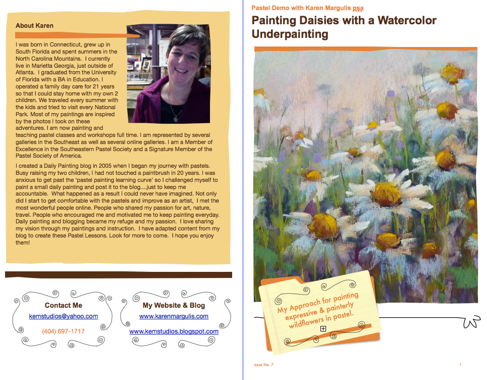
'Simple Pleasures'         5x7        pastel
purchase on etsy $45
It's time to put on our business hat. Artists wear many hats and as much as we might prefer to stay in the studio and paint, sometimes we have to tend to the business side of things. One of those things is marketing....we need to promote ourselves and our work if we want to sell or get noticed.  That is often a tough thing to do. It is hard to put ourselves out there and say "Look at me and my great paintings!"

It helps to have an Icebreaker and I have a great one for you!

Try Moo.com and get 10% off your first order click here

A fabulous business card holder that is sure to spark interest and conversations about your work. It is called The ShowCase and it is only $10.99.  It is sold by Moo.com which is where I get my business cards. Moo does a fantastic job with my cards. I've reviewed my experience HERE.  Once you have your wonderful cards with 50 different images.....you need a good way to share them.

The ShowCase card holder is perfect.  It holds up to 15 business cards. You open it up by flipping the lid and fanning it out like a deck of cards. Now when you are sharing business cards you are able to show a variety of your images.  People love having a choice and it always sparks conversation. They want to pick their favorite image.

The bonus for you is that you are showing off more of your work and the ice has been broken. The little card holder has done that for you now it is easy to talk about what you do.


Here is the card holder in action. That is my dog Heidi in the background.


Here is a little blurb and link  from the Moo.com website about the cards.

Business Cards should always be something special. Less a method of handing out your phone number, more a way of starting a conversation. They're an introduction to you, your company and your work. A good business card should intrigue people, get them interested, invite them to ask you more.

Visit Moo.com to see all of their great stuff and get 10% off your first order.

Friday, May 30, 2014

Packing Pastels for a Cruise

'Back to the Islands'              8x10          pastel             ©Karen Margulis
available for purchase $155

Painting my World is living up to it's name.  It seemed like a good blog name at the time I started this blog. I was sharing the paintings that were inspired by my travels even if they only took me a few miles from home. These days I am fortunate that I get to travel farther from home.  After a Caribbean cruise next week I will be gearing up for my trip to Iceland at the end of June.

Packing my pastels for both trips presents a challenge. They are both very different trips with different painting agendas. I have two piles of supplies....one for the cruise and one for Iceland. I finally decided on my cruise set up and I thought I'd share it . (I'll be sharing my Iceland set up soon)


My Caribbean pastels 

Everything I need to paint fits in this soft sided lunch box
I love to paint while I am on a cruise but I only paint small 2.5x3.5 or 5x7's.  I want my kit to be extremely portable. I want to be able to throw it in my beach bag and bring it up on deck or even on the islands. I don't want to drag around an easel or tripod.  I want everything I need to be on ONE Bag. I have tested this lunch box set up and it is perfect!
  • This soft sided lunch box holds a 5x7 foam core backing, some bulldog clips for attaching paper to the board, a selection of papers in 2.5x3.5 and 5x7, a small photo album to store the finished paintings, two small boxes of pastels, a washcloth to protect the tables or chairs, and a pack of wipes.
  • Pastel selection: I packed two small Terry Ludwig boxes (I save ALL of my pastel boxes) filled with an assortment of small pieces of pastels...mostly Ludwigs and Great Americans but probably others. My main concern was to get a good assortment of darks, lights and middle values and a balance of intense colors and grayed colors. I have taken just one box and had plenty but I am going to try two boxes this time.


Have you tried my Caribbean Beach pastel Demo yet?  I cover my approach to painting a tropical beach scene complete with tips on painting sky, sand and water. It is available as a PDF download in my Etsy shop for just $6. Click here for details.

Thursday, May 29, 2014

Three Good Reasons to Do Your Thumbnails


'Back to the Mountains'         9x12            pastel           ©Karen Margulis
sold
It is friendly reminder day! Maybe you have been very good and consistently do thumbnails or small value studies before painting. Or maybe you are like me and often skip this important step.  I don't know why I don't make it a part of my studio painting routine. I do thumbnails for plein air and I know they help.  As I shared the importance of doing black and white thumbnails with a student it reminded me just how much they do help!

Remember to take the time for thumbnails. They don't take long and it will be worth the effort. Here are three reasons:


1.  Thumbnails save you time and paper.  It is much better to figure out if your composition will work in a quick study than to waste good paper making corrections to a composition with issues. In my thumbnail (above) I saw immediately that the mountain shape was the same as the shape of the treeline. I also didn't like the shape of the water. I made adjustments when I blocked in the painting.

2. Thumbnails help us simplify a busy reference. My photo was filled with lots of bushes and trees...lots of spots of light and dark. The black and white thumbnail allowed me to simplify the busyness into a few bigger simple shapes.

3. Thumbnails make you a better artist. Doing thumbnails is like doing pushups....they make you a stronger painter. They are  exercises that gradually build your ability to see value and shapes and what makes a good design.  Thumbnails add up...so don't neglect them!

If you would like to explore more about doing thumbnails and a method for using them you might like to read my thumbnail posts here:
Five Steps to a Good Thumbnail
How to Make Thumbnail Studies Fun

Wednesday, May 28, 2014

A Quick Way to Add a Bird to a Landscape Painting

'The Morning Meeting'          18x24          pastel        ©Karen Margulis
sold
 It's all about the birds. One of the things I love most about the marsh is the wildlife.  When visiting Pawleys Island my favorite time of day is the early morning when the herons and egrets congregate across the creek. One morning we counted at least 15 birds putting on a show for us.

I have painted the marsh many times but lately I am enjoying putting the birds in my paintings.  After all they are an important part of the landscape. They make it complete.  I have been hesitant to add the birds for fear of messing things up. What if they are the wrong size or in the wrong place?  I had to overcome this fear and did it by practicing!

Close up photo of my birds. They are  2 inches tall in my 18x24 painting

If you want to put some birds in the landscape and they are going to be a small part...mere suggestions of birds and not portraits of them.... here are some tips that have helped me.

  • Paint the entire landscape first. The bird will come last. They are the decorations. Once the landscape is finished it is easier to judge where they should be placed for the best composition. Note: they aren't always in the best placement in the reference photo. You need to evaluate how they will fit in and be balanced with the landscape.  If you paint the birds first and try to add the landscape around them they may end up looking pasted on rather than a part of the landscape.
  • Be Bold and Confident...even if you aren't feeling that way. You are going to make a quick 'bird shape' with a bold heavy mark of soft pastel. I don't draw the bird first. I am interested in getting a quick impression of the shape.  I want it to fit in with the rest of my marks.
  • Paint the bird shadow side first. For white birds I use two soft pastels. I start with a pale blue and add a pale warm creamy light on the sunlit part of the bird....two quick marks.
  • Paint the beak and legs with the sharp edge of a hard pastel. I used orange.
  • Use a steel pushpin to scratch in an eye. You can also use the pin to refine the bird shape by removing excess pastel.
  • If you have to paint a reflection remember that the reflection goes in the same direction as the bird (see photos)


Three pastels for an egret

Tuesday, May 27, 2014

Pastel Painting Makeover #1 ....Adding Texture


'Deep in the Meadow'          8x10         pastel          ©Karen Margulis
sold
I didn't want to start from scratch today.  I wanted to paint but I couldn't decide what to paint. I know this is a common affliction. I have so many ideas it is sometimes hard to settle on one. So instead of starting a new project I went to my discard pile.  This is the pile for unfinished, overworked just plain bad paintings. I never get around to throwing them away and many are on good paper and just need to be recycled.

I like to repurpose everything so giving an old painting a new life is a fun challenge. I will share these repurposed paintings in my new blog feature Pastel Painting Makeovers. Here is the first one.


This is an interesting painting. It is on a piece of gatorboard with a homemade grit. I had painted some Queen Anne's Lace but they were not working.  So I used the painting to show a class how to restore tooth on an overworked painting. You can see in the photo that I brushed some areas off. I applied matte medium for texture. I used workable fixative in other areas. But I never got around to painting over it. It was just a sample.

Today I pulled it out and was inspired to rework the flowers using a different color palette. I decided to have the blooms emerging from a dark background with some warm light bouncing around them. I wanted a change from the greens and sometimes these flowers look this way in late summer.

I like how the texture of the matte medium and fixative helped create a 3D effect on the flowers and parts of the background. I will be trying this again!


Monday, May 26, 2014

Pastel Demo on Canson Paper...New England Summer

'New England Summer'          16x20         pastel        ©Karen Margulis
purchase painting $225 on Etsy
I thought the painting was finished. I took the final photo and uploaded it to the blog. It wasn't done.  It happens quite often actually. There is nothing like looking at your painting on the big screen to show  all of the issues. So it was back to the easel.  In fact today it was back to the easel 3 more times until I finally was satisfied.

The painting just wasn't capturing the emotion I wanted. It was a beautiful afternoon on Nantucket Island. We came up to the beach and had a view of the distant ocean through a sea of wildflowers. The heady scent of the beach roses filled the air. It was magical.

I decided to remove the beach umbrellas and add more flowers. I softened the sky as well.  These changes helped create the mood I was after. Thank goodness for digital photos! They are so helpful for evaluating a painting. Enjoy today's mini demo.


I began the painting on a piece of 16x20 Canson MiTeintes paper Moonstone color. I blocked in the big shapes with 4 values of pink and rubbed it into the paper with a piece of pipe foam insulation.


Next I block in the dark areas underneath the foliage and then moved to the sky. I layer several blue pastels both warm and cool and dark to light. I tried to get a nice transition from top to bottom.


I work on the clouds layers using pale peach and yellow. I don't use pure white at all. I also put in the band of distant ocean.


I begin putting in the darker greens in the foliage areas and I indicate where the fence is. I end up removing the fence. I also layer some very light value yellows in the sand.


I build up several layers of greens in the foliage area. Because Canson doesn't have a lot of tooth I decide to spray some workable fixative so I could build up more layers and get some texture in the foliage.


I add the beach umbrellas and more greens. I also start to put in a few of the beach roses.


This is where I thought I was finished. I didn't like the texture in the clouds and the cloud shapes were too similar. I also didn't like the umbrellas. They were too small for where they were in the composition. If I kept them they would need to be larger and the painting wasn't about the umbrellas.....so I brushed them out.  I added more flowers and was much happier. (see top photo)


Sunday, May 25, 2014

Why Learning to Paint is a Lot Like Gardening

'How Does Your Garden Grow?'           8x10          pastel          ©Karen Margulis

 I will not let the weeds get the best of me.  They may have taken over the garden but with some hard work and attention I can make room for my flowers to flourish.  So I spent the morning pulling weeds and was thrilled to see my intrepid flowers filling in the garden beds. They are coming back bigger and better than last year.

As I pulled the weeds I realized that gardening is a lot like learning how to paint.

Think about it. When we decide to start a garden we have visions of this wonderful lush oasis filled with beautiful color harmony and textures.  We devour gardening books and magazines. We go to the garden center and fill our wagons with plants...one of every thing we can afford. We plant the flowers with excitement but somehow.....it never matches the visions we have.  It may be a mishmash of colors and doesn't quite look as lush and professional as we would like.


How do we make our gardens grow into the beautiful garden of our dreams?


  • Time and Attention. It takes work and lots of it to ensure our plants flourish. It takes daily attention and if we neglect it the weeds and bugs will take over.
  • Knowledge and Experience: It takes lots of study and experience to understand how to care for the plants and design the best garden....soon we will be moving plants around to make the garden better.
  • Each year the garden gets better and stronger and more mature.... as long as it is not neglected.
Can you see the parallels between getting the garden to the mature garden of your dreams and having paintings that please you?  It takes learning the basics and lots of practice  and your paintings will match those visions in your head.

When I was new to painting I found I learned best by watching demos. I needed to see what was underneath and how an artist got to the finished paintings. This is why I am creating my digital PDF demos. I want to share my painting process.  If you haven't had a look at my demos consider givng them a try. This week only I am offering a savings of 20% on any of the demos.  You can see them in my Etsy shop and use coupon code DEMO2 at checkout.


Saturday, May 24, 2014

Why Painting is a Lot Like Cooking

'Afternoon at the Refuge'         8x10         pastel        ©Karen Margulis
purchase painting $145 on etsy
 Don't laugh!  Those of you who know me are aware that I don't cook.  It's not that I don't like to cook. I don't make time to learn. It isn't a priority or a passion.  I love to watch Food Network though. After the workshop this past week I unwound in the hotel room by vegging out to Food Network. Something occurred to me....

Creating a painting is a lot like cooking a meal!

To cook a delicious meal you need to know the basics of cooking and assemble the freshest and best ingredients. You need a recipe or at least a plan for your dish. You need to orchestrate the plan, check on the progress and not overcook it!  It takes a some intuition and confidence to take an ordinary recipe and make it your own. Can you see the parallels?


Chop Your Way to Success

My current favorite Food network program is Chopped. It is a cooking competition show where the chefs have 30 minutes to create a dish from a basket of mystery ingredients.  I love watching the chefs create under the pressure of the clock. I think it is something we should try as painters for a good exercise.
  • Take a photo and piece of paper and set the timer for 30 minutes. 
  • Now paint. You have just enough time to formulate a quick plan and then just respond. There is not enough time to overwork the painting. 
  • There is a time to slow down in a painting but we also need to learn how to respond intuitively and trust ourselves. This exercise is to help us avoid 'fiddling'.
  • This exercise is a good warm up or even cool down after a day of painting.
  • If you really want a challenge have someone else choose your subject and a limited palette...you have to make it work!


Today's marsh and egret painting (at top of post) was done in the last 30 minutes of day one of the workshop (Liz Haywood-Sullivan)  I could have kept working on my other paintings but then I would risk overcooking them. So instead I decided to paint a new one with the clock running. I like it best!

'Autumn Marsh II'         12x18     pastel   $195

'Autumn Marsh'          12x18        pastel  $195

Friday, May 23, 2014

Try This After Taking an Art Workshop...Word Clouds


'Under a Big Sky'              10x13            pastel              ©Karen Margulis
purchase painting on etsy $145
It makes good sense.  You have gone through the time and expense of taking a painting workshop. There is something you need to do before you slip back into the real world. The truth of the matter is the workshop isn't over....your work has just begun.  Even if it was a challenge or frustrating or didn't seem helpful there will be information that will resonate sometimes even years later.  Taking time to organize your notes while it is fresh will help cement the lessons you have learned.

I have a great idea to try after a workshop....Make a WORD CLOUD with your notes. Here is my word cloud from the Liz Haywood-Sullivan workshop.


A Word Cloud is a great way to summarize your notes and experiences from the workshop. I can look at my word cloud and the words will remind me of something that was said or made an impression on me during the workshop.

I made the word cloud by going through my notes and handouts and writing down any word that stood out and summarized a portion of my notes. This exercise helped me review my notes. Too often I get home from a workshop and get busy with other things. I always intend to reread my notes but sometimes it doesn't happen.  Making a word cloud was a quick and easy way to review the workshop before life got in the way! I plan to go back through my other workshop notes and make word clouds for each of them.

Of course I had to have a fancy word cloud so I googled word clouds and found several websites that allow you to make one. I used WordItOut to make my cloud. To save it and post it I simply took a screen shot and saved it in my photos.

If you's like to play with Word Clouds here is a link to 9 word cloud generators. Have fun!

Thursday, May 22, 2014

Liz Haywood-Sullivan Workshop Report ... Day Three


'A Change of Seasons'           18x18             pastel            ©Karen Margulis
sold
 If only this could have lasted a week! Today was the last day of our workshop on Sky and Water with Liz Haywood-Sullivan. Liz packed a lot into three days and I can only imagine how much thicker my notebook would be in a longer workshop!  The workshop experience was all I expected and more. It was fun to meet new artist friends and learn from them. I picked up a few great tips from my fellow artists that I'll be sharing here. Sometimes that alone is worth the price of admission but in this case, I gained so much from Liz's thorough demos and critiques.

I have a notebook full of helpful information but what stands out for me is how pleasantly surprised I was  by the grid. I was dreading the grid. Let me explain.....

My reference photo with my crop marks
I took a 4 hour class at IAPS several years ago with Liz and all I remembered was that we had to grid our cloud photo before painting. Those of you who have seen me paint know that I am not a grid person. I use teeny tiny awful photos so that I won't want to copy them. I couldn't imagine having to grid my photos.  I have had a change of heart.....sort of.  After this week's workshop I can see the value of Liz's method and understand it much better.

And we didn't need a ruler!  All we did was put crop marks in quarters on our photo and on our paper. The crop marks are in place to help us find our way through the reference and to simplify it into simple shapes. (see photo below)

The crop marks help us size up our drawing to our paper and get the shapes in the right location and proportion. The nice thing for me is that you can just eyeball the crop marks. They really do help! It is so easy to loose your way in a painting....where does the water end and the land begin? How tall are the mountains? and so on.  The crop marks helped me make sense of my marsh especially in the distance with the ribbons of land and water.

Liz's sketchbook with her thumbnail and value sketch using crop marks
Will I always use crop marks and waypoints from now on? It will depend on my subject and mood. If I have a complicated subject AND I am happy with the composition of the reference photo I will use the crop marks.  If I am just in the mood to interpret a photo loosely and don't care if I change elements around...I won't be using crop marks. They are just another tool in the toolbox which is a wonderful thing about taking workshops!

More tomorrow!

Wednesday, May 21, 2014

Liz Haywood-Sullivan Workshop Report Day 2

'LowCountry Life'. 12x18. Pastel

The paintings were wonderful! Everyone kicked it up a notch and did some beautiful work. I have to thank Liz for her excellent instruction and demo. She broke down the steps of painting water into an easy to understand process that she calls the Layers of Transparency. I appreciate how she responded to the needs of the class by calling attention to various tips and mini lessons throughout the day as we painted. At the end of day critique it was obvious that the lessons were making an impression!

We had to choose references that had water with ripples or movement. This helped with getting the idea of painting water from the bottom up which is also how I paint wildflowers! We began with wet under paintings (alcohol or water washes) then added the ripples or current lines then added the sparkles or whitewater. Here is my first painting.

'Down in the Marsh'. 12x18. Pastel

I did three paintings today. I tend to paint fast so sometimes it is challenging in a workshop because I feel like I should be slowing down. When I do I often overwork or second guess my intuition. Today I just let myself go and paint at my own usual pace. At critique there were a few other artists who also had their paintings come together quickly. I appreciated hearing Liz say that a good painting doesn't have to take a long time. I would much rather learn from doing several paintings than trying to work on just one and overworking it because there is time left in the class.

Tomorrow is the last day of the workshop and we will combine sky with reflections in the water.... Putting what we have learned together! I wish this was a week long workshop! Liz has so much to share!


Tuesday, May 20, 2014

Workshop Report Day 1...Liz Haywood-Sullivan

'California Cloud Study'. 2.5 x3.5. Pastel

It's hard work being a student! I love it though. I left the first day of the workshop with my notebook full of notes and fired up enough to go back to my hotel room and paint! This is a three day workshop on painting skies, clouds and water. Liz said she could take six weeks to cover it all so this is a condensed version!

Today we focused on skies with clouds. Liz began the day with a talk about her 'Good Bones' approach to a painting. She stressed the importance of understanding the basics of painting and good drawing. The Good Bones approach allows you to plan the painting and takes you step by step through the process of thumbnails, value sketches and doing an alcohol wash underpainting. These are my paintings from today (below)

At the end of the day we gathered for critique. Liz stressed that critique is an opportunity to learn from one another and not to see who did the best painting. We are all there to learn....not to compare ourselves to one another. It was fun to see everyone's work. I always love seeing how different we all paint similar subjects!

Liz was hard on me which I welcomed! I am in the workshop to stretch myself and learn. She suggested I avoid using colors that are too white (pasty looking) in the land. I needed to use more richly pigmented pastels. Also my sky in the beach painting is too light. So I decided to come back to the room after dinner and paint another version of the first painting. I left all of my supplies at the workshop location but I had my trusty mini kit. I like the new version better.

TIP: Liz suggested that we save our workshop pieces as they are. If we want to make corrections we should paint it again...otherwise if we keep working on the workshop painting, the lessons may be lost. I will redo both of my paintings when I get home.


Monday, May 19, 2014

How to Paint the Beach...New Pastel Demo PDF


'Tropical Dreams'           8x10          pastel           ©Karen Margulis
purchase painting $155
It was 17 degrees below zero when I saw the billboard. It was an ad for a Caribbean cruise.  Now this was a well placed billboard!  I could definitely see the allure of a Caribbean beach. After this harsh winter many of us are having dreams of spending some time by the sea.

It is time to paint the beach!  Even if you don't have a beach trip in your future (or maybe you are fortunate to live by the water) learning techniques for painting the sea and sand and sky can come in handy. You can even apply these ideas to painting other landscapes that include these elements.

I like the challenge of painting a seascape or beach scene because it has it all....water, sky, sand and foliage. Now that is a landscape challenge!  I decided to take the challenge for my next downloadable demo/lesson. I am releasing it just in time for late spring and summer vacations.


screen shot of my latest demo download

The latest demo is available in pdf format so you can view it on a computer or tablet or print it out and make a booklet.  This demo has 44 full color photos of each step of my painting and 23 pages which include text on each step. These demos are what I would share if I was painting in front of you with even more information because I can take my time and write down all the details of each step. For this painting I have used a Dry Underpainting technique. I share tips on painting clouds, sky, sand and foliage. 

The demo is available in my Etsy shop . Click here for details.  I have 8 demos available and they can all be viewed in my etsy shop here. 


A few sample photos of my painting in progress