Visit my Patreon Page for more painting instruction and Paint Along Videos!

Thursday, May 31, 2018

Question for You About Signatures

'Spring Breeze'            8x10        pastel        ©Karen Margulis
available $145
I am contemplating a signature change. I have been using my initial in a block letter format since my very first painting. I have my reasons for thinking of a change. Signatures are more important than we sometimes believe. At least I never gave too much thought about the impact my signature has on my painting and my art journey.

I want to explore this subject in more detail and I'd love your input for a future post. If you can help me by answering the following questions in the comment section below.

How do you sign your paintings? Full name, initials, one name?
What do you use to sign a pastel painting?
Where do you place your signature?


Thanks in advance for your help!  If you'd like to see a video demo of this painting you can see my Facebook live replay over on my Facebook page. Link is here.


Wednesday, May 30, 2018

Why Plein Air is Important


This quote from Eugene Boudin says it all. Painting outdoors from life makes a difference. Your results may not be the paintings you imagine they should be or what you want them to be. But if you persevere and spend some time painting outdoors you will have gained valuable information. Information that cannot be found from looking at a photo.

Plein air is important but it doesn't have to be the only way to paint. I am not a die hard plein air painter. I do believe one can make beautiful and strong paintings from photos but only when one understands the limitations of the photos. Plein air practice gives you this needed insight. Here are a couple of things you can do that will give you the benefit of plein air painting if you can't get outside.

  • Paint with your mind. Overtime you go outside slow down and spend a few minutes carefully observing something around you. Try to describe it using art words.....color, value, light, edges, etc. Try to imagine how you might paint it. 
  • Paint from the window. Sometimes conditions don't allow for painting outside. Look out the window and paint what you see. If you don't have an interesting view then paint the sky which is always changing.

If you are convinced that plein air is important and you'd like to learn strategies for more successful plein air experiences come join us on my Patreon page this month. For just $4 you will get tips, videos, demos, handouts and more! www.patreon.com/karenmargulis


Tuesday, May 29, 2018

Two Keys to Help You Create the Illusion of Depth in a Landscape

'The Road to Iceland'        16x20       pastel       ©Karen Margulis
available $250

It is really like magic! When I finally figured out how to use the principles of aerial or atmospheric perspective, it made all the difference in my paintings.  For the longest time I knew what aerial perspective was. I read John Carlson's book on painting the landscape. I could tell you what it was. But I didn't always use it well.  I found there are two keys that helped me the most:
  1. We often have to exaggerate the effects of aerial perspective. Aerial perspective deals with  way things appear to change as they go back into space....they tend to get lighter, cooler, duller, less detailed, less contrast. We don't always notice thhese changes and often they are subtle. Especially if we are working from photos in which everything is crisp and clear with no color shifts. So when I realized that I would have to push or exaggerate these  effects I was able to create more space/distance in my landscapes.
  2. Remember to change your pastel stick as you go into the distance.  What I mean by this is to be sure that you don't use the exact same stick of pastel in the foreground and the background if you are trying to get atmospheric perspective. For example if you are painting a green field the green you use in the foreground needs to change as you go into the distance...it will be cooler and lighter in the distance. If you use the exact same pastel stick of green all over the field it will look flat.
Zones help me remember the effects of aerial perspective
 So how do I remember to make the changes due to the effects of aerial perspective?  I divide my scene into four zones: foreground, middle ground, background and sky/ground transition zone.  I then know that in each zone I will need to make changes to the color temperatures,values,detail level, color intensity.  I just need to be sure that my transitions between the zones are blended. I don't want an aerial perspective parfait!
**remember that the effects of aerial perspective occur most of the time...there are always exceptions that you will have to deal with **
To read more about aerial perspective you might like my recent post. Read HERE

Monday, May 28, 2018

Don't Miss this Opportunity for a Free Workshop!


'Garden Party Time!'           6x6          pastel   ©Karen Margulis
sold
It is in your hands. There isn't just one simple answer to becoming a better pastel artist. But there is actually a simple way to make great progress. It is called IAPS.  If you aren't familiar with IAPS let me introduce you. I owe much of my growth as a pastelist to this wonderful group. IAPS stands for International Association of Pastel Societies and it is a non-profit organization uniting pastel societies worldwide. IAPS holds exhibitions and a fantastic biennial convention all designed to promote the luminous medium of pastel.

The IAPS biennial convention is the secret to becoming a better pastel artist and it is almost time to register for the next convention to be held June 4-9,  2019 in Albuquerque New Mexico.  Attending the convention has so many benefits and I will be sharing them in upcoming posts....but the most important thing it did for me was to introduce me to my Pastel Family.

That's right! Did you know you had a pastel family?

Family support and help is so important for our success in any endeavor. Being an artist can often be a lonely journey. Many of us have art friends but few of us are fortunate enough to live in an area with many pastel friends. We are often on our own when it comes to pastels and learning how to improve. When you attend an IAPS convention you will be among your pastel 'peeps' . We take over the Hotel Albuquerque and the rooms and halls are filled with everything pastel for the week. Take classes and workshops, attend demos and seminars all from the best instructors. Shop for the latest pastel supplies in the candy shop, trade tips and share with other artists from around the world. Everyone at the convention shares your passion for pastels. The effect this experience can have on your growth is huge!


Details for the 2019 convention will be released this summer but here is an opportunity to win a scholarship for a workshop at the convention. I encourage you to apply and of course to plan on attending the convention. Start saving now! Here is the link to the scholarship information: http://iapspastel.org/ed_uct.php

Sunday, May 27, 2018

Poppies for Memorial Day


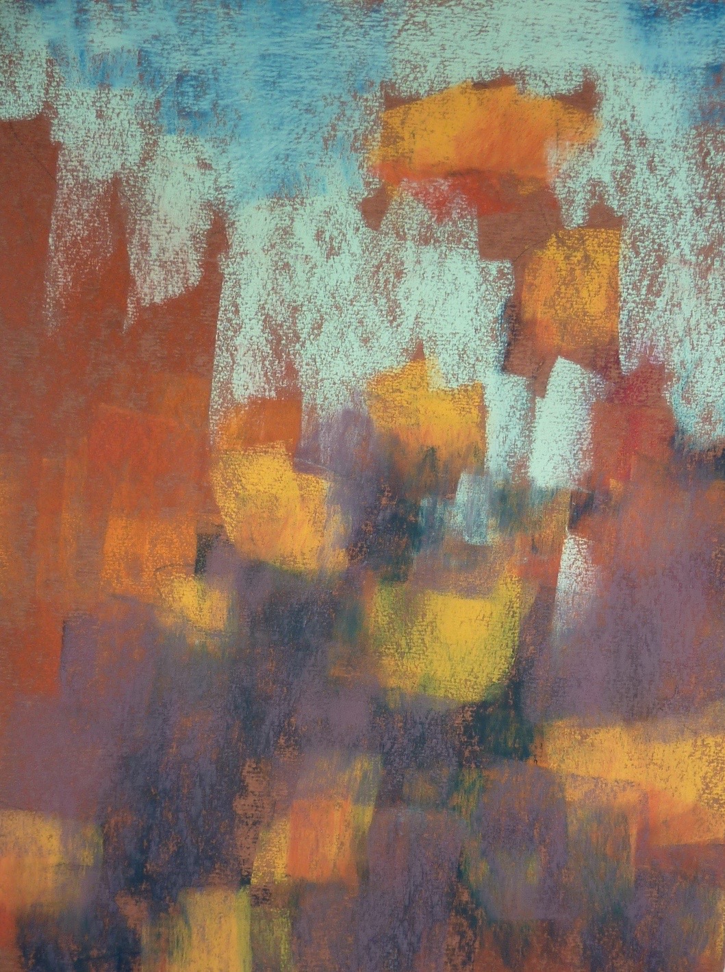
'We Keep the Faith'             8x12          pastel         ©Karen Margulis
sold

It is Memorial Day weekend.  I will be painting poppies. I am going to dedicate my paintings to the brave men and women  who gave their lives for our freedom. What better inspiration for my Memorial Day series than my photos from a past trip to Normandy.  Today's post takes you behind the scenes as I share my inspiration and process for the first poppy painting.


My reference photos from France

I printed several photos from my trip. I like to use small 2x4 inch photos. I chose to combine two photos for the painting. We were staying near the English Channel surrounded by barley fields. There were many places where red poppies made an appearance. For my painting I wanted to show the view of the water and expand the fields of poppies. 


I toned my 8x12 piece of Uart with a mixture of beige acrylic paint mixed with clear gesso. I wanted a warm beige underpainting and the texture of the gesso. I hoped that the gesso would give me texture for the grasses. The paint was Toning Grey Yellowish by Interactive Acrylics. Isn't that a great color name?


I began to lay in the pastel starting with the dark areas. As you can see my darkest values are more of a middle dark. I wanted to keep the painting slightly higher key than usual to capture the feeling of summer.  You can also see that the little bit of clear gesso that I used really did give me a more textured surface.


Next I worked on the sky. I wanted to set the mood and light quality  of the scene. I would later go back and tone down the violets and add more reds up in the cloud shadows.  Next it was time to put in the greens. I already had good dirt color with the mauves and violets.


I layered some greens in the fields and trees. I used darker greens in the immediate foreground to throw it into shadow. At this point I have a big empty field and it was time to add the poppies!  This was the fun part. The poppies are my spices. They needed to be planted so that they would lead the viewer's eye into the painting.  The photos I used gave me inspiration and visual references but ultimately it was my job to design a painting that worked to draw the viewer in and allowed them to participate.


I had to use my 'spare' orange pastels for my poppies

Saturday, May 26, 2018

Plein Air Tip: What to do When you are Overwhelmed


'Poppies in Iceland 2'            5x7           pastel             ©Karen Margulis
sold
Since we have been exploring the world of plein air painting I wanted to share this helpful post from the archives:

I was ready for it. I packed my supplies and chose my pastels carefully. I had practiced with my setup and confidently opened my paint box and attached my paper. I was ready. Then it hit me.  Iceland was overwhelming. I stood before the perfect painting scene. It had it all....water, rocky cliffs with stark houses lit by the sun, a rolling flower filled meadow leading to the sea and a gorgeous sky.  How was I to choose what to paint in the face of a landscape painter's dream? Plein air painting can be a challenge!

What is a plein air painter to do? Sometimes we just get so overwhelmed that we freeze....and then nothing works. Or we get so excited that we forget the basics...and nothing works. I have some advice.

'Poppies in Iceland'          5x7         pastel           ©Karen Margulis

  • First, take a deep breath and relax. It is important that you remember why you are painting. You don't want to be so tense that you forget to enjoy the scene or the moment! 
  • Next, don't be so quick to get started. Take a few minutes to shoot some photos and walk around. See what really catches your interest. Then set up. 
  • Now go ahead and paint but allow yourself to paint a dud for your first painting. Remind yourself that you don't have to only paint one perfect painting. You can paint more than one so it is OK if the first one doesn't work. You are getting warmed up.  I usually choose the grand view for my first painting.  When I am overwhelmed I want to paint it all....in one painting. So I try. It usually is a dud! But that is OK. Now I am relaxing and ready.
  • When you don't know what to paint because you are overwhelmed and the choices are too many...try to focus on just one thing. Maybe it is the sky that interests you...minimize the land then. Maybe the light on the building catches your interest...paint just the building. Ask yourself WHY and then focus on that one thing. Or, paint what you know. Paint what you are comfortable with before trying new things. And finally remember that the more you work on smaller motifs the more confident you will feel. Don't try to put it all in one painting!
For me, I was drawn to my favorite thing to paint....flowers in the landscape. I was drawn to the Icelandic Poppies. At first I resisted painting them. After all I could paint these anywhere. Shouldn't I be painting the cliff and the water? I wanted to paint the poppies so I did and it felt good. (I did paint the rest of the scene but painting what I know helped me to warm up!


Friday, May 25, 2018

What Happens When You Use Your Least Favorite Color

'Reach for the Sky'           12x9         pastel          ©Karen Margulis
available $160
 Interesting things happen when you are forced to use your least favorite color. In one of my workshop exercises the task is to use your least favorite color. At my recent workshop one of the students had a dilemma. They didn't have a color that they didn't like. I had to agree. I really like all colors for different reasons. But the color I use the least would have to be orange. I just don't paint too many things that are orange. Until now!

Beautiful Orange Pastels
I was so excited to see the California poppies in bloom on my recent trip to Santa Barbara. I couldn't wait to get home to paint them even though they were orange-ish! Would I have the right pastels?  I discovered that most of my orange pastels were hardly used. I used some of the yellow orange pastels for sunlit grasses and flower centers and an occasional sunset. But otherwise they were untouched. 

A funny thing happened as I painted my first orange poppies. The orange made me happy! I enjoyed building the layers of dark orange to yellow orange. In fact I enjoyed using these colors so much that I didn't want to stop! So instead of overworking my painting I just painted another variation. This time I included the sky. I don't think I have orange out of my system yet! 


A dry underpainting on Wallis Warm Mist sanded paper

close up detail
Try This: Do you have a color that you don't like or find that you rarely use? Try to use the color in a painting this weekend. You might surprise yourself!

Thursday, May 24, 2018

A Good Use for Your Plein Air Studies


'Chasing the Clouds'         8x10         pastel        ©Karen Margulis
available $145

 I have been meaning to do more of this. Ever since Richard McKinley suggested I use my plein air studies for studio paintings. That was a few years ago during his Lake Tahoe workshop.  I really haven't done much with that idea though. I usually come home from a trip or plein air outing and throw my paintings in a box.  Once I am home and wrapped up in everyday life I don't take time to revisit these little studies.


I am missing out on one of the benefits of Plein air painting. Making use of the studies. These studies may not always be great or frameable  but they do give you better information than a photo.


I discovered that my plein air studies shows the emotional response I had while studying the scene on location. If you were to compare a photo of the scene and my plein air study  you would see the drama in the sky and feel the wind in the painting.  You can't see that in the photo. When I look at the study I am reminded of the wind and the ever-changing drama in the sky. Now to recapture that drama in a studio painting!


the 5x5 plein air study used for inspiration
The plain air study definitely captured the colors I saw in the sky and grasses so I kept the same palette for the studio painting. I chose to lower the horizon so that I could focus more on the sky.
What else did I change from the study?

If you would like to see the video demonstration of this painting head over to my Patreon page. We are focused on the topic of plein air for the month of May. www.patreon.com/karenmargulis


Wednesday, May 23, 2018

Four Steps to a California Poppy Painting

'California Dreaming'          10x8          pastel       ©Karen Margulis
sold
 It was a wonderful trip. I am home from teaching a workshop in Santa Barbara California. I will be giving a full review of the workshop when my demo paintings arrive back home and I can take better photos. Today I just had to paint!  I downloaded the photos I took on the trip and printed out a selection that piqued my interest. It is not surprising that the last photos I took before heading to the airport were the first I was compelled to paint......Poppies! But not just any poppy. I had never painted the wonderful orange California poppies and I was excited to get painting. Follow along with me!

Cretacolor Hard pastels along with my reference photos
 STEP ONE:  I decided to do a wet underpainting so I would have a base of drippy grass-like pastel to respond to. I pulled out a set of hard pastels by Cretacolor. I haven't used these much but they were just the right colors for my poppies. They worked great with the alcohol wash. Look at the photo below at the interesting drips I got from the underpainting.

The alcohol wash underpainting
 STEP TWO: I begin the pastel application by reinforcing the dark shape behind the flowers. I used middle dark values of grayed down purples. This dark shape will be covered by the greens but I need to establish it early to act as the dirt that holds the flowers in place.

Reinforcing the dark shape
 STEP THREE: The flowers are blocked in by the underpainting.I needed to develop the background before finishing the flowers. I layered several greens that were mostly neutral or cool. I varied the marks to add interest to this  tangle of stems and grass.

Building up the grasses with greens
STEP FOUR: The last thing I did was to paint the stems and the poppies. I used dark green pastels on the sharpe edge to put in the stems. I used several values of orange and yellow orange to paint the poppies.  I began with the darkest red orange and layered the oranges. The yellow orange was the last color added. I made my strokes in the direction of the petal growth. You can see these steps in the next two photos.

Was I finished after these 4 steps? Scroll up to the top of the page to see the finished painting . Can you see what I added?  That was fun. I think I'll paint some more California Poppies.

Putting in the stems

Painting the orange poppies 

Tuesday, May 22, 2018

Plein Air Made Simple: A Quick Video Demo

'Spring is in the Air'               5x7               plein air   pastel               ©Karen Margulis
available $50
It still is my plein air set up! It has been overseas three times and all over the country. I have put it to the test.  Since we are focusing on demystifying plein air on my Patreon page I thought it was timely to share this video again.

It was a beautiful Spring day in Atlanta. The perfect opportunity to try out my new plein air set up and shoot this week's video.  I packed my new baby Heilman box (the double sketchbook), my tripod and some paper and my husband and I headed to the river.

Michael volunteered to be the cameraman. That was great for me because I needed to get familiar with my new set-up. We decided to go the a park alongside the Chatahoochee River.  I did a warm up painting and we decided the light would be better if I faced the opposite direction. I really wanted to find some blooming trees so we moved to another spot.

The best spot happened to be right where we parked. There was a wonderful row of blooming redbud trees. Sure they were alongside a busy road. Yes there were houses and 'stuff' behind the trees. But it was a great exercise in simplifying and editing!


That was fun!
I thank you in advance for watching. I am working on new updated videos which will be available later this month on my Patreon page. www.patreon.com/karenmargulis

Sunday, May 20, 2018

Podcasts! Listen and Watch Plein Air with Pastels Tips!

Quick Plein Air Study       5x7       pastel       Catalina Island
I never imagined how much I would enjoy making a podcast. I guess I like to talk once you get me started and I love to talk about painting and pastels!  I have been experimenting with doing a weekly podcast on my Patreon page. Some topics don't require the visuals of a video but are too much to write about in a short post. The podcast or audio recording is the perfect answer. I can chat about a topic and share important points and you can listen and multitask!

This month we are exploring the world of plein air over on my Patreon page. I love painting outside especially when I travel but it wasn't always easy. In fact it was quite challenging and I didn't enjoy my plein air outings. I have shared plein air tips here on my blog and you can do a search for relevent posts in the search box. If you want more then check out the Patreon page.  The information on Patreon is focused and expanded.

I invite you to listen to one of the podcasts as a guest. If you enjoy the information you might like to become a patron for $4 a month.

Hear the podcast at this ink: https://www.patreon.com/posts/18609309


Painting on the go doesn't have to be hard! See the video on my Patreon page.

My small plein air box Heilman single sketchbox

The View
Join me on Patreon www.patreon.com/karenmargulis

Friday, May 18, 2018

Advice for Surviving A Juried Art Exhibition


'Garden Party'         9x12       pastel       ©Karen Margulis
currently on exhibition at Oglethorpe University Museum of Art

You have probably heard it before. A painting that was rejected for one show gets in another prestigious exhibition. Or a painting that doesn't win an award wins Best in Show in another exhibition. It happens. I've had something like this happen.  So if your painting was rejected or you don't get a prize it is helpful to keep this in mind. It might ease the sting a little.

I have been rejected from many shows over the years. I have had paintings accepted and not won a prize. ( I am always happy just to get in though) It can be an emotional roller coaster and it can really get you down if you let it. I usually allow myself a day to feel disappointment but then I put those feelings aside and concentrate on becoming a better artist. It is all a part of the growth process.

This week is the opening reception for the Southeastern Pastel Society's 18th International Exhibition. There are some fantastic paintings in the show and many more great paintings that didn't get in. Some will win awards and some will not. A juried show is full of ups and downs for everyone. Sometimes the whole process of entering, rejection, winning, and not winning can seem overwhelming .

I happened to come upon this quote today which is a good one to keep in mind for those who are entering or are considering entering juried shows.

" Prizes are nice, but the real competition is with yesterday's performance."     Irwin Greenberg

Prizes can be acceptance into a show as well as prizes given at the show.Both are nice but they are not a measure of your success as an artist.  Competition can be good if you can keep the ultimate prize in mind....your own personal growth as an artist. Be the best artist you can be at the moment and the rest will fall into place.


Thursday, May 17, 2018

Three Tips for Framing Pastels for an Exhibition


'Summer by the Sea'          18x24         pastel         ©Karen Margulis
currently on exhibition at Oglethorpe University Museum of Art
Thursday night is the opening reception of the Southeastern Pastels Society's 18th International Juried Exhibition. I am honored to have two paintings in the exhibition but sad to miss the opening as I am on my way to California to teach a workshop. It is a good time to share this post from the archives on framing pastels for an exhibition. Enjoy!

Framing pastel paintings is not my favorite thing to do. In fact on the list of things I do as an artist it would probably rank second to last. (last is accounting and record keeping)  I'd rather be painting.  But every once in awhile I need to frame a painting and it is usually approached with dread.

I have new insight and appreciation for framing after this week and my experience at the Southeastern Pastel Society Exhibition.  At the opening reception our judge Liz Haywood-Sullivan did a walk-through of the exhibit. She covered a lot of valuable information and insight into her judging process. It is always helpful to know what a judge may be looking for in a winning painting. (Even though different judges have their own criteria any insight is appreciated) Liz was very generous and thoughtful with her remarks which added a wonderful dimension to the works in the exhibit.

One of the criteria Liz considers in judging a show is the presentation and framing of the painting. I didn't write down her exact words so I am summarizing what I heard in my own words. 

One thing that stood out to me is that the presentation and care in framing is given 10% weight in the evaluation Liz gives each painting.  It is more important than many artists realize! A painting may not receive an award or lesser award due to presentation. Based on some of the thoughts Liz shared I am offering three tips to consider when framing a painting for a show.


My 2nd place painting was framed by Mayra Loeber at Thompson's Framing

 TIP 1: Choose the right frame.
  •  Frames can enhance a painting or they can take away from the painting. It is important to take the time to choose a frame that complements the painting. You don't want a frame that fights the painting. Ideally you shouldn't even notice the frame. If it is a poor quality frame or  says 'cheap' it might call attention to itself. This takes away from the painting.
  • Many artists have their 'show' frames that are used over and over for shows. It is important that the frame work with each new painting and be in perfect condition (more on this below) 
  • If you aren't confident in your eye for choosing the right frame work with a framer who you trust. For my winter scene I worked with a framer with a lot of experience because I was having trouble finding the right frame. The dark frames were too dark. Silvers and gold didn't look right. When Mayra put the very deep frame on the painting I knew it was want I wanted...the effect of a window looking out into the snow.


This frame is from King of Frames with no mat and TruVue Museum Glass
 TIP 2: Make sure your frame is in excellent condition.

Liz feels that the care the artist takes in the framing and presentation of the work reflects the respect they have for the exhibition. If the frame is in poor condition or the mat is filthy it shows that the artist didn't take the time and didn't care enough to put in the effort. The painting might be wonderful but a frames and mats with issues reflect poorly on the artist.
  • Take the time to make sure the frame is in excellent condition. Dings and scratched glass matter!  (Liz does make allowances for things that obviously happened during shipping that were out of the artist's control)


This painting was shipped to an IAPS Exhibition and back with no issues. I used a frame by King of Frames
with Tru Vue Museum glass.  I used an Airfloat box to ship the painting.
 TIP 3: Be careful with Mats if you are shipping your work to a show.

  • More and more artists are now framing pastels without mats. I prefer no mats for my paintings. I like the look of mat-less pastels but I also like not worrying about pastel dust on the mat. No matter how careful you are a painting gets a lot of handling in a show. Every time it is moved around there is a risk of pastel dust becoming dislodged and falling onto the mat. 
  • Be sure you have proper spacers or an area for the dust to fall. Especially if you use heavy layers of pastel which has more risk of fallout. Work with a good framer or learn from the best!
  • If you are shipping the painting seriously consider going mat-less.

Tuesday, May 15, 2018

What I learned from 10 Years of Painting Practice

'Return to Purple Haze'            9x12           pastel         ©Karen Margulis     2018
available $155
 I forgot all about it. It was a fun discovery though! I found a stash of old reference photos and decided to use one for todays painting practice. I didn't realize that I had painted this scene almost exactly 10 years ago until I stumbled on the old blog post from 2008. It was very interesting to see the old painting and compare it to today's version.

It was gratifying to see that I have made progress and grown as an artist in these 10 years. I could see many things that I didn't see 10 years ago.

  • I know I was much to literal to the reference photo. I have learned to let go of the photo and let the painting express how I feel about the subject. 
  • I wasn't aware that I was making everything the same shape, size and with even spacing.
  • I have learned so much more about how to create the illusion of depth.
  • I certainly didn't know how to create a visual journey for the viewer. I created a fence of lavender and didn't give a pathway through the painting. 
Look at the 10 year old painting below and compare it to the new version at the top of this post. What else can you see that I did differently in the new painting?


8x10     pastel    done in June 2008
It is clear to me that I have learned a lot. My daily painting practice has helped! But what I think I learned most of all is that I was enjoying the painting back in 2008. I didn't know what I didn't know! I loved painting then even though I wasn't getting the best results. I just enjoyed the whole process. I was in the moment and I didn't worry that I still had a ways to go on my painting journey.

So often we get frustrated with our progress ....or lack of progress. We know we need to work hard and practice but it seems daunting and frustrating. I don't compare myself to other better artists because I know that I still have work to do. I intend to enjoy every painting. Each one teaches me and advances me further.

Try This:  Take out an older painting. Try to go back as far as you can. Even if you are a new painter find one of your first efforts. Now look at some of your recent paintings. Enjoy the progress you have made no matter how large or small. Enjoy your own personal painting journey!

Sunday, May 13, 2018

Permission to be a Messy Painter

'A Summer for Hydrangeas'          18x24        pastel     ©Karen Margulis
available $250

I admit it. I am a messy painter.  My pastels are not pristine and yes I put them away dirty!  When I am caught up in the passion part of a painting, dust will be flying and I'll end up with a pile of messy pastels. I wear a painting apron because if I didn't my clothes would be covered in pastel. The only time I do clean my pastels is when I wipe them on a dish towel before making a mark.  I'll also clean my whole box once a year.

Sometimes when I see a neat and organized painter I feel bad.....and inadequate.  Shouldn't I be neater and more careful?  Would it make me a better painter? Today a friend and I had a discussion about this.  She is like me.....happy with a semi organized box of pastels and not afraid to spread our stuff all over the table and make a mess when painting.  We decided that if it worked for us and we had fun ....then why sweat it.  We gave ourselves permission to be messy!


I have to work hard at being neat and tidy.  So when it comes to painting I tend to get caught up in the moment and forget all about being organized and keeping my supplies clean. It is all about the process and enjoying the painting session. I have decided that this works for me. When I try to stay neat and clean it shows in my work.  Give yourself permission to make a mess and see what happens.  It is liberating!  Clean up after the painting session if you must but have fun and see what develops from your mess!


Today's Hydrangea painting is a large one for me 18x24 and I had fun making a mess with the alcohol wash underpainting and the wetting and layering of pastels. I used several layers of pastel and fixative and more alcohol.   I ended up with a dusty pile of pastels, dirty brushes and a smile on my face!