Visit my Patreon Page for more painting instruction and Paint Along Videos!

Friday, May 31, 2013

Packing Supplies for an Art Trip

'Red Rocks Calling'         24x36           pastel      ©Karen Margulis
 I feel like I have been packing for a year!  There is a lot to consider when you will be away for close to a month. And my travel companions and I agreed that this trip we will downsize! A few years ago we drove out to Wyoming and we had way too much stuff. Every stop we had to spend time re arranging our gear so it would fit in the car. And it was all so heavy!  So this year I have been trying out all kinds of solutions and I think that I am good to go!

So the lesson learned from the last big road trip...Down Size and Keep it Light!

My stuff for month long road trip
Unless your trip is strictly a plein air trip where painting is the focus I recommend downsizing your supplies.  I plan on taking photos, sketching and just contemplating each place we stop. I won't always have time to set up and paint so I want to keep it simple.  I have packed all of my supplies in a black messenger bag. I could have gone with a smaller bag but I needed extra supplies for IAPS.

 I have put together a small kit of pastels (see this post) and will be painting 5x7's.  Last trip we carried easels and tables and big boxes of pastels.....and spent more time rearranging the gear in the trunk than using it!
This year I will find a rock or a table and just paint on my lap. It is all about capturing the light and the colors and my paintings are simply studies so I don't need my full set up.

What else I need for the Road Trip

  • Suitcase...I am packing enough for a week and then we will do laundry. I went through several bags before I settled on this one. It is a feather weight nylon suitcase that is super light. It has 4 way wheel and a large handle. It is going to be very easy to deal with. No Bellman carts on this trip!
  • Overnight bag...I got a great travel bag from Coldwater creek that hold my toiletries, ipad and electronic chargers. I can also fit in my clothes for each one night stop so I don't have to take in my suitcase.
  • The Navigator's bag....I am the official trip planner and navigator and while we will use technology and GPS....we love paper maps so this small bag will stay in the car and it hold all of our maps, guide books and Nature guides (important!)
  • Rolling Cooler....we like to find a beautiful spot outside for our lunches so this year we have a rolling cooler to take to our picnic sites....no dragging heavy coolers and food bags!
  • Inflatable mattress....some of our lodging will have three beds but some only two so this will come in handy.
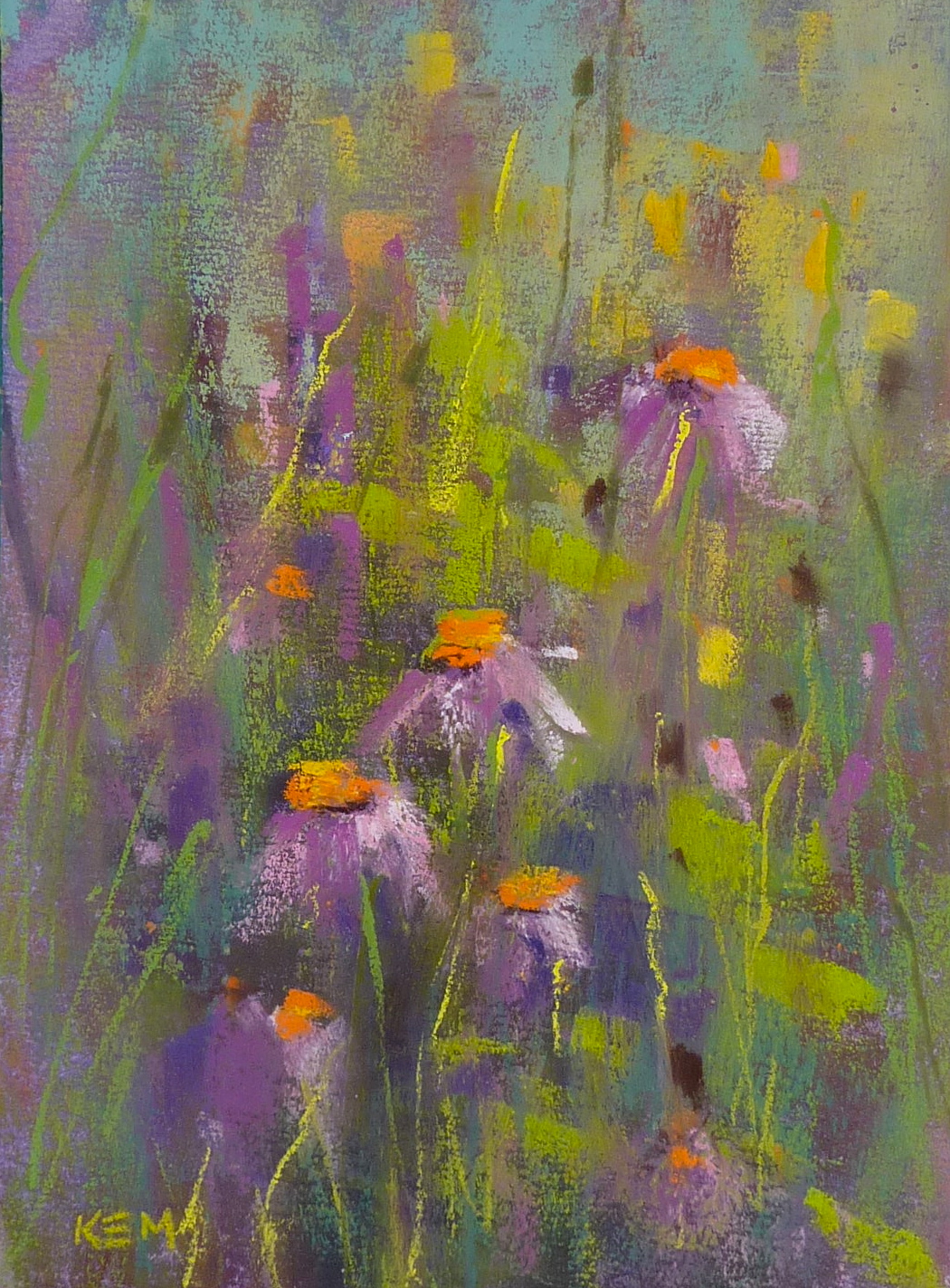
About today's painting:  This was a large 24x36 commission I did last month. I was damaged slightly in shipping...UPS pierced the box through two layers of cardboard and foam core!.  My client and I have decided on another painting so I will try to repair the tear in this one. In the meantime I am enjoying it in my studio!


Thursday, May 30, 2013

Tips for Painting a Sunset

'Quiet Evening'         9x12         pastel     ©Karen Margulis   $145 Etsy
I am looking forward to the wide open spaces of the Southwest. I am hopeful for some gorgeous sunsets. I remember when we took our kids out west we chased the sunset every night.  I was into photography at the time so the Magic Hour and sunset were not to be missed.

Taking photos of the sunset is exciting but it is even better to be able to paint a sunset. Sunset photos can be challenging. It is hard to get good exposure in both the colorful sky and the dark ground. But when we paint the sunset we can easily make adjustments.  There are a few things I like to keep in mind when I paint a photo. My goal is to create a painting that isn't cliche or hokey looking.

  • Understand the limits of most point and shoot photos. Often the foreground is underexposed and reads as very dark or even black. You would see more color in real life so be sure to compensate for this.  Sometimes the sky is overexposed and the photo doesn't show the intensity of the sky colors.
  • Colors in the dark ground tend to be dark and dull. I like to use browns, dark ochres, dusky purples, dull reds and greens. I never use black.
  • I like to push the colors in the sky and start with bright intense reds and oranges. If I need to quiet the color down I can but it is difficult to put this intensity in if you have too many layers of lighter colors down first. Of course sometimes you might want a nice soft pastelly sky but if you want a fiery sky....start bold!
  • If you have dark clouds in the sky....avoid using gray. Make your own gray by layering several colors until they turn the shade of gray you need. 
  • I like to scumble a light layer of warm color...orange, red or magenta on top of some lower dark clouds.
  • If the sky is already getting dark I like to use rich blues and purples for the sky. I don't use black.
Maybe I will try to paint a sunset on this trip!  I hope you will follow along with me on my journey. We leave on Sunday and I will post as often as I can depending on our internet service!

Wednesday, May 29, 2013

Painting on a Road Trip...Follow Along with Me!

'Desert Dreams'      24x36       pastel      ©Karen Margulis  
purchase painting with paypal here $700
The time has finally arrived.  After two years of planning and dreaming,  our road trip to the Southwest is here. Just a few more last minute packing before we leave on Sunday!  We are driving from Georgia to Albuquerque and will arrive in time for the opening of the IAPS juried exhibitions. After the IAPS convention we will be adventuring our way across the southwest for three weeks.  

We have some stops planned but nothing is  written in stone so we will see where we end up. Stops planned are:  Canyon de Chelly, Monument Valley, Capitol Reef National Park, Bryce Canyon, Zion Canyon, North Rim of the Grand Canyon and Sedona. Some places I have visited and some will be new and I am excited to experience it all!

I invite you to follow our adventure. Starting on Sunday I plan to post a daily trip report with photos and my daily 'Painting from the Road'

Take a look at my Road Trip painting set up.


I converted a binocular case into a travel pastel box. I will be keeping each daily painting in between the papers in this sketchbook. I made the cover.  I have stocked the book with 5x7 pastel papers. When I am finished with a painting I will put it back and I can use the sketch paper page to write the date and notes about the painting location.


I am planning on offering each daily Painting from the Road for sale by auction on Daily Paintworks. I am excited about this project and hope that you plan on following along with us and see what I choose to paint each day of the trip!

Tuesday, May 28, 2013

Going to IAPS? Who Wants to Trade ATCs?


'Summer Dreams'     2.5 x 3.5     pastel      ©Karen Margulis
It occurred to me in the shower today (where I get most of my ideas) that the IAPS convention would be a great opportunity to trade paintings with fellow pastelists. But it would be challenging to deal with carrying work to and from the convention.  So why not trade small paintings?  Little ATC sized originals have been traded by artists for many years.  They are portable (only 2.5x3.5) inexpensive and quick to paint.

What are ATC's you may be asking?
  • What are Artist Trading Cards? - Artist trading cards (commonly referred to as ATCs) are miniature pieces of art that are traded around the world. Artists create, trade and collect art at organized "swap" events, either in person or online. The only official rule for ATCs is the size: 2.5" × 3.5".
  • How did the movement start? - In 1997, M. Vanci Stirnemann, a Swiss artist, created 1200 cards by hand as part of an exhibit. On the last day, he invited others to create their own cards and trade with him during the closing reception.
  • How do I trade cards? - Today there are ATC swaps in almost every major city around the world. You can locate an in-person swap in your area, find an online swap, or organize your own swap. There are a number of Web sites that others have created to help artists get started.

'Southwest Impressions'       2.5 x 3.5    pastel
 If you have never painted these small 2.5 x 3.5 paintings you are in for a treat!  They are such a fun way to play with colors and compositions and try new techniques. I love to paint them. And I love to trade them too. Every year my group of artist friends have an ATC swap at our Christmas Party. It is fun to collect one another's work this way.  If you are attending the IAPS convention I would love to trade with you!  Read on for more information:

'My Secret Place'       2.5 x 3.5        pastel 


A collection of pastel Artist Trading cards
WHAT:  The Unofficial Artist Trading Card Swap at the IAPS convention in Albuquerque.

WHEN:  The convention kicks off on Thursday June 6th with a welcome celebration in the courtyard of the Hotel Albuquerque. Bring your ATC's to the party to trade.

WHERE:  I will be in the lobby 1/2 hour before the party begins with an orange bag and sign.

HOW:  If you just want to trade one card you can put your card in the bag and take out another artist's card. If you have multiple cards to trade you can  meet and mingle to find other artists to trade with. Artists who wish to trade can gather in the lobby. This is an unofficial meeting but it will be a great icebreaker to meet our fellow artists and share our work in mini form!

DETAILS:  The only rule is that the cards need to be 2.5 x 3.5 inches and they need to be Originals. Please protect your paintings either in a clear bag or wrapped in glassine paper. Be sure to sign them and include a business card if you have one.

So if you would like a way to meet and share at the convention consider paintings some ATC's to trade. You have a week to get them done!  By the way I just cut up my scraps of pastel papers to use for the cards. Check out my YouTube video for ideas on storing them. (on sidebar)

Comment or email me to let me know if you are planning to trade so I can be on the lookout for you!

Monday, May 27, 2013

Practicing the 'What If' Attitude


'Flowers by the Roadside'           8x 7 3/4"         pastel       ©Karen Margulis
sold
I took the day off yesterday and took a drive up to Lake Hiawassee in North Carolina. Michael and I took the dog and planned to stop at my moms to meet her new dog Harry before heading to the lake.  As we turned onto Highway 64 near my mom's place I remembered that one summer the medians were full of wildflowers.  That was several years ago and I had not seen them since. They seem to feel the need to mow them down so I always miss them.

I was excited to see that the medians had not been mowed yet. And there were a few sprinkles of wildflowers. As we got closer the amount of flowers increased until this glorious spot appeared....a section of the median just filled with wildflowers. It was overcast and the reds and pinks and purples were so vibrant. But....I had forgotten my camera.  My phone came to the rescue and my husband let me out while he circled around.  I took as many photos as I could while the cars rushed past. When Michael came back around I jumped in the car and we were off.  I am so happy I got to see the flowers this year!  Today's post shows my first painting. There will be many!

a work in progress that I chose to rework
 I looked at this little painting I had been working on. I wasn't really happy with it. But as I was walking past it it jumped out at me and I wondered "What if"  I used it as the underpainting for my first roadside wildflower painting?  So I pulled up a photo and got to work.  I didn't have to do much to it to make it match my vision.  I asked myself a series of what if questions....what if the sky was a different color...yellow. What is I changed the shape of the trees and added another bush for balance? What if I darkened  the foreground so the flowers would show up? As I asked myself the questions, I would try the suggestions and they helped guide me through the recreation of this painting.

To read more about the 'What if' attitude read my post here


reference photo from the highway median
My dog Heidi (the blond) and her cousins Harry, Haley and Hanna at the lake

Saturday, May 25, 2013

3 Reasons Why it is Great to be a Landscape Painter


'Unexpected Beauty'            8x10        pastel      ©Karen Margulis
purchase painting on Etsy  $145
 1.  Landscape painters see things that many others miss. We are extra sensitive and tuned into the subtle beauty that surrounds us. We notice things like the color of the sunlight on a path.

2. Landscape painters have the ability to share their vision with others through their paintings. There is nothing more satisfying than having someone look at your painting and express joy and surprise....and thanks for pointing out the beauty they missed.

3. Landscape painters can improve and rearrange nature to make a better statement.  If it is our job to show the beauty and wonder of our natural world then sometimes we need to show it off it's better side.  Photographers have to work with what is there....painters can make changes and rearrange things! I love this ability.  Here is a little story and painting to illustrate this point:


A couple of years ago my artist friends and I were driving across Kansas on our way to Jackson Wyoming.  We saw a sign for a lavender farm and since we break for beauty....we got off the highway and found our way to the farm.  We were disappointed though. The lavender either wasn't quite in bloom or had seen better days.  That didn't stop me from taking some photos. (we did find some wonderful dragonflies!)

But since I am a landscape painter and not a photographer....I had the opportunity to paint the lavender field the way I imagined it would look in it's prime.  If I wanted the lavender to bloom I could make it happen. All I needed were some purple pastels!


Using my boring and uninteresting photo, I did a black and white thumbnail sketch and then blocked in my painting with four values of purple. I used a combination of Diane Townsend and Terry Ludwig pastels for the painting. I have used these reference photos to paint several Lavender paintings. In each one I have rearranged things and made the flowers bloom. It's great to be a landscape painter!

Friday, May 24, 2013

The Right Attitude for Painting

'Marsh of Dreams'         7.5 x 9.5       pastel      ©Karen Margulis
purchase on Etsy $75 
 I have always believed that being fearless is the way to approach painting. Whether you are a beginner or a seasoned pro it helps to be brave and confident when painting. Even if you don't feel like you have the skills to match the visions in your head about your paintings.  Being fearless helps you take more risks and try techniques without worrying about 'messing up'.

You've heard it before "It's only paper or canvas". And that is so true. If you don't let go and take chances you won't see the growth you want.  Sometimes you might have to just pretend to be fearless. It may be an attitude adjustment but it will empower you.  Something Elizabeth Mowry said in her workshop might help....

She said we should paint with a "WHAT IF" attitude.

This means approaching a painting by always remembering to ask yourself  "What if"  and not to be afraid to try these ideas.  It gives us so much freedom to have permission to make changes to our references, to our compositions and to our color palettes.  It make painting fun and puts US in charge of our paintings.  So give it a try and ask yourself What if....and be fearless to try your ideas!

My idea for this painting was to work on my own prepared surface. I asked myself what if I did a very loose acrylic underpainting and put a thin layer of pastel on top. I had fun with my idea and will be trying more.  I love the 'what ifs' !


On another note I had a reader ask how they could find a blog post on a certain topic. I don't have my posts indexed but the best way to find something is to search within this blog. There is a search box on the side bar. Just type in what you'd like to find and hopefully you will get some results!


Thursday, May 23, 2013

Dealing with Green in a Pastel Painting

'Feeling the Peace'         6x12          pastel     ©Karen Margulis  sold
Green is upon us here in the Southeast.  We live in the Land of Green here in Georgia and I look forward to my trip to the Southwest for a little relief from all the green.  Don't get me wrong. I love our landscape. I love all of the variety of trees and flowers, the rolling hills covered in green. But it is a challenge to paint.

It really hit home at the Elizabeth Mowry workshop. It seemed that many of the artists expressed the same thoughts about the challenge of dealing with green.  Over the last few years I have gathered tips about green that have helped me. I have blogged about many of them but thought it would be timely to just sum up some of my favorite tips and techniques for painting green landscapes.  These are not all my ideas but tips I have gathered from reading and studying with other artists.


My Green Chart

  • Take stock of the green pastel you have. It is best if you can put all of your greens together. I like to organize my pastels by color and value so I have a green section. This allows me to see them all together and better judge the value and temperature of each green compared to one another.
  • I take this a step further and make a chart showing my greens from lighter and cooler to warmer and more intense. This helps me achieve better atmospheric perspective.
  • Make sure your greens include some cooler blue greens to warmer yellow greens. You also need some grayed down neutral greens.
  • The green pastels that come in many introductory landscape sets tend to be very much middle value and often bright pure greens.  These greens can be too intense almost garish in a landscape. I like them but reserve their use to smaller areas....I consider them my spices. Be sure to supplement these greens with grayer more neutral greens.
  • That being said....it is nice to have some bright artificial looking greens to use in small doses....again like a spice.
  • Richard McKinley tells us the secret of green is orange and violet is the friend. So True!!!  I like to introduce some oranges to red and some violets into my green landscapes. These colors provide relief from all of the green and makes them more interesting
  • I introduce these colors to green in either the underpainting or in building up the layers of pastels.
This is just a few of my random thoughts on dealing with green. I hope that you find them helpful!

Wednesday, May 22, 2013

Elizabeth Mowry Workshop Day 3

'Winter Walk'         12x12          pastel      ©Karen Margulis
Today was the last day of the workshop and we sure did fit a lot of painting and information into three days.  Credit goes to Elizabeth Mowry for her organized plan for the workshop and to our wonderful Volunteers from the Southeastern Pastel Society. Their hard work made it easy for the artists to concentrate on painting. Breakfast and lunch was provided and so no time was wasted.  It made for such a pleasant and relaxing workshop experience.

Today was a day spent on painting. We were able to finish what we had started or start something new. Elizabeth was able to give everyone plenty of individual help.  She also took shared with us one of her teaching exercises called Learning Circles. I am going to give it a try so I will have to leave you with that little tease until I can get to it!  The workshop ended with another longer feedback session. Elizabeth encouraged everyone to share their thoughts so we all left with lots of ideas.

It is usually my goal to come home from a workshop and work on the ideas and techniques I've learned. I don't know how much time I will have to do that since I am gearing up to go to IAPS and our big Southwest Adventure in a about 10 days!  I have a lot of organizing to do before I go but one of the big things I got out of the workshop is to learn to slow down and observe. That I will be practicing on this trip so the timing of this workshop was perfect for me!

Today's painting..... I chose a winter scene from my ipad and was challenged to simplify the very busy background. It was filled with trees, stone walls and lamp posts!

Tuesday, May 21, 2013

Elizabeth Mowry Workshop Day 2


'Beach Dreams'. 9x12. Pastel

It was another wonderful day at the workshop. Elizabeth opened up the day with a quote about nature. She then did a wonderful demo of some Autumn trees. She called it a tree study because the painting was all about the tree. Elizabeth's demo was sprinkled with her pearls of wisdom about painting trees such as:

  • It is important to really study trees and get to know them.
  • Slow down and really observe the tree...how does it grow,what colors,what is it's character.
  • When you are painting the edges of trees really slow down and pay attention to the edges. The edges can tell a lot about the tree.
  • In looking at my notes I guess the most important thing is slowing down! That is good advice I intend to take

Elizabeth Mowry's palette for her tree demo

After the demo we spent some time looking at some of Elizabeth's work as she shared her method of critiquing our own work. I will share this another time and will definitely be using it. After lunch we painted and finished the day with another group sharing/feedback session. I enjoyed the whole day but especially enjoyed our lunch with Elizabeth where she shared stories of her time on her New York farm. I can't get the picture of her goat stuck up on the roof out of my head!

One more day so stay tuned! Oh and I painted the beach today. I think I'll do a tree tomorrow!


Monday, May 20, 2013

Elizabeth Mowry Workshop Report Day 1


'Looking Inward'. 9x12. Pastel

I am so glad I decided to take this workshop with Elizabeth Mowry. What a wonderful artist and gentle spirit she is. As she spoke so eloquently about her love of nature I felt a special kinship. When I talked to the group about the painting I did during the sharing time, I spoke about how I like to look inland at fields and meadows for inspiration. Elizabeth understood this! I know I will come away from this workshop inspired and enriched.

The workshop began with Elizabeth doing a 2 hour demo. She feels it is important to show how she resolves a demo painting and not just how she starts. I found her demo very interesting and very different from how I usually work. She uses wallis paper and Girault pastels. She goes right in with local colors and works from the sky down. When she saw how I was starting my painting she said "oh you are one of those color people" I smiled. Yes I guess I do love color!

After lunch we painted for 2 hours then had a chance for sharing and feedback. The day ended with Elizabeth's slide presentation of her journey as an artist. I enjoyed hearing about her life and work! I can't wait to go back tomorrow.

I learned an interesting use for pastel pencils and I will share this with you when I can do a more complete post.


Sunday, May 19, 2013

Studio Tip: A Great Use for Pill Containers


'My Dream Garden'            5x7        pastel        ©Karen Margulis sold
I love boxes, bags and containers.  I am always looking at them trying to find ways to use them for my art.  The other day I was on a thrift store binge and came across the cutest little pill case. It was bright orange faux croc and had a plastic pill carrier that fit inside. It even zipped close!  Best of all it was only 77 cents.  I had to have it even though I didn't need it for pills.

I kept on shopping.  A few aisles later it came to me.....I could make it into a travel watercolor set!!!  It was the perfect size. I went home and filled the 8 wells with tube watercolor paint. I put in my favorite colors of Daniel Smith and Schminke watercolors. It took a few days for the paint to dry but now all I need to do is wet the wells when I am ready to paint. I am thrilled with my little set.  

I even picked up a small black pouch that will fit the paints, a few brushes, a spritz bottle and colapsable cup for a truly portable watercolor set! 


I don't do watercolor paintings but I often use them for underpaintings for my pastels as I did in today's painting.

Monday I am attending a 3 day workshop with Elizabeth Mowry. I will do my best to post and I am hoping to review my time at the workshop so stand by!

Saturday, May 18, 2013

A Great Idea for Wedding Favors...Mini Paintings

'Kiawah Gold'      2x2  acrylic on canvas

I love commissions.  I enjoy working with art lovers to create the perfect painting.  I have many stories of fun and interesting commissions.  It would actually make a fun book with the paintings and their stories. The paintings often push me out of my comfort zone but it is always fun trying to paint what my client is imagining.  Of course the best commissions are the ones where I am given free reign to paint with a minimum of guidelines....like these mini acrylics.

The Collection of Kiawah Paintings
I was asked if I could paint six 2x2 inch paintings of Kiawah Island to be used as wedding favors. What a great idea!  I offered the bride to be a choice of mini pastels which would need to be framed or acrylic on canvas which could be placed on mini wooden easels. She chose the acrylics and shared a few of the Lowcountry marsh paintings of mine that she liked.

I used Interactive Acrylic paints which are slower to dry than regular acrylics (though I found that the Golden Open acrylics stayed wet much longer. In fact they took a couple of days to dry!)  I used a small brush and a tiny palette knife.  They were a lot of fun to paint and I hope I get more of these commissions!

Interested in trying some of these mins? Here are some tips:

  • Keep it simple. I used a limited palette of alizarin crimson, ultramarine blue, cad yellow medium and white.
  • For reference material I used photos of my previously finished paintings on my ipad. This way I had already worked out colors and composition.
  • I worked on all 6 at the same time. I began by blocking in the darks with a thin mix of the alizarin and ultramarine
  • I then worked on each one individually until it was finished. I started with a thin layer of color and finished with some thicker paint applied with a palette knife. 
  • I wrapped the paintings around the edges. Another option would be to paint the edges black or a dark color. 

'Kiawah Summer'    2x2   acrylic

'Kiawah Twilight'      2x2     acrylic

'Kiawah Marsh'    2x2     acrylic


'Kiawah Dawn'      2x2     acrylic

'Kiawah Dreams'       2x2      acrylic

Thursday, May 16, 2013

Painting Inside the Box

'Our Friends Across the Creek'           8x8           pastel      ©Karen Margulis
sold

Creative people think outside the box. Always seeing things in a different way. When I paint I am always trying to find my own unique and personal way to interpret my subject.  But it is often too easy to fall back on what is comfortable.....using our favorite papers, painting with the same 'go to' colors, using the same formats for every painting.

Why not change it up this weekend. Start by painting Inside the box.....that is try painting in a square format!  If you haven't tried it it will be a fun challenge. There is something about the tension in a square that makes composition interesting.  I came across a great blog post on composition from the Will Kemp Art School. Here is a quote about square formats:

The square format: This can work extremely well or very badly. You very rarely see a square old master painting. This is because it is harder to balance a painting that has lots of elements within, for example, a collection of figures in a landscape within a square format. It can look awkward very easily. However, using a square format for a more contemporary subject, an abstract or a minimalist seascape, can be very effective.


sold

sold

sold

Tuesday, May 14, 2013

Painting a Sunset....When Photos Lie

'Canyon Country Magic'          11x14          pastel
click here to purchase $145
 I am a sunset chaser.  When I travel I find out the sunset times so that I can arrange dinner around sunset and the surrounding magic hours.  Before I painted I took photos. I had the whole 35 mm set up with filters and several lenses. I even shot slides. I learned how to take sunset photos that were properly exposed (not always successful)  So I tend to be extra critical of my point and shoot sunset photos. They don't always make good references for painting. Take the example below:


My point and shoot reference photo
Unless you can adjust the settings most point and shoot cameras on auto don't do a good job at capturing the sunset. It is hard to get the proper exposure for the bright intense sky and the dark ground. Either the ground is properly exposed and the sky is too light and 'pastelly' Is that a word?  Or the sky is exposed for the bright intense colors in the sky and the ground is too dark. In fact the ground is often so dark it can print black.

If you paint from one of these reference photos and you don't pay attention to how the photo lies...then your painting will be missing the truth.  Take an underexposed foreground for example.  If you were standing there in real life in front of the sunset you would realize that you would be able to see lighter and more color in the foreground. It won't look black to your eyes.

Avoid Painting the ground Black in a Sunset Painting!

closeup of my foreground showing the colors I've used
The colors in a dark 'sunset' foreground will tend to be dull colors.  I don't use much brown in a painting but this is a perfect time to use those dull colors....dark yellows, dull greens, grayed purples, rusty reds, dark blues and burgundy. These are some of my go to colors for a dark foreground.  It is much more interesting than using black silhouetted shapes.

Monday, May 13, 2013

Fast and Loose...Ideas for Painting Fresh Flowers


'Grandmother's Garden'          8x10        pastel        ©Karen Margulis
click here to purchase $145
 I like my flowers fast and loose.  I don't have the patience to paint every petal. So my flowers tend to be more of an impression of the flower and not photo realistic.  I certainly admire artists who are able to paint flowers and have them look lifelike but I know that it is not a style that fits me. So I embrace what comes natural to me and try to improve it with every painting.

Flowers are the perfect subject to practice being loose and painterly. They can be quite complicated with all of the petals and tangle of foliage. It is all too easy to get caught up with all of this detail and end up with muddy overworked flowers.  Here are some of the things I try to keep my flowers fresh:


  • Start with a wet underpainting.  I love doing a drippy watercolor underpainting for a flower pastel. Because it is a bit uncontrolled and unpredictable it forces me to react to this underpainting rather than getting too fussy and dissecting my reference photo.  In a wet underpainting the flowers and foliage are already impressions or suggestions....it is my job to refine them a little. My goal is to leave as much as the underpainting showing as possible....I will often use only one thin layer of pastel over the underpainting. In this painting I glazed a light blue over the green background and left it alone.


  • Count your strokes.  See how few strokes it takes to paint a blossom. A great exercise to try is to paint small single flowers and count the strokes. See how few it takes to suggest the flower. Don't try to make a painting...just practice!  
  • For the Hollyhocks I started with the darkest color I saw in the bloom and I added three or four more colors on top of the dark.I used the side of my pastel to make fat juicy marks. 
  • Put a stroke down and try to leave it alone. Muddy looking flowers often come from too many layers and too much fussing. Again....do some practice flowers!

Sunday, May 12, 2013

Finding A Painting Subject that Speaks to You


'Desert Color'        4x4      oil on panel      ©Karen Margulis
sold


What is your most favorite subject to paint?  I have always found it hard to decide. So many things interest me. I don't believe we have to choose only one subject. Why not experiment and paint what you are drawn to? You will figure out if it is a good fit.  The more you paint, the more you will understand what speaks to you. You will know!

For some artists, it isn't about the subject matter at all....it might be about the light or the shapes or line quality that excites them to want to paint a certain thing.  In yesterday's post I talked about finding our Visual Voice. I shared when I discovered the subject that really spoke to me and that was Queen Anne's Lace.  But as I reflect on this discovery and try to understand what it means I realize that it isn't just Queen Anne's Lace that I want to paint with passion.

For me it is about finding the beauty and the interesting in the most unexpected places.  Those places that are often overlooked. They are the places and things I want to paint.  My husband calls them my weed paintings. Many people overlook the patches of wildflowers that grow along the roads and in parking lots. But to me they are just calling out to be painted.

'A Splash of Red'     5x7    pastel   Bid here
'Sego Lily Blooms'      5x7      pastel    Bid here
I find I am drawn to these overlooked and passed over places. I always manage to find something intriguing.  Take the desert....another one of my favorite places.  When I tell people I love the desert, not everyone gets it. "It's just all dry and brown" they tell me.  But I know better. The desert is filled with subtle beauty such as these cactus blooms. As Renoir said,

"There isn't a person, landscape or subject that doesn't poses at least some interest - although sometimes more or less hidden.   When a painter discovers this hidden treasure, other people immediately exclaim at it's beauty"  Pierre Auguste Renoir

If you need help in figuring out your visual voice I recommend the book 'Finding Your Visual Voice' by Dakota Mitchell.